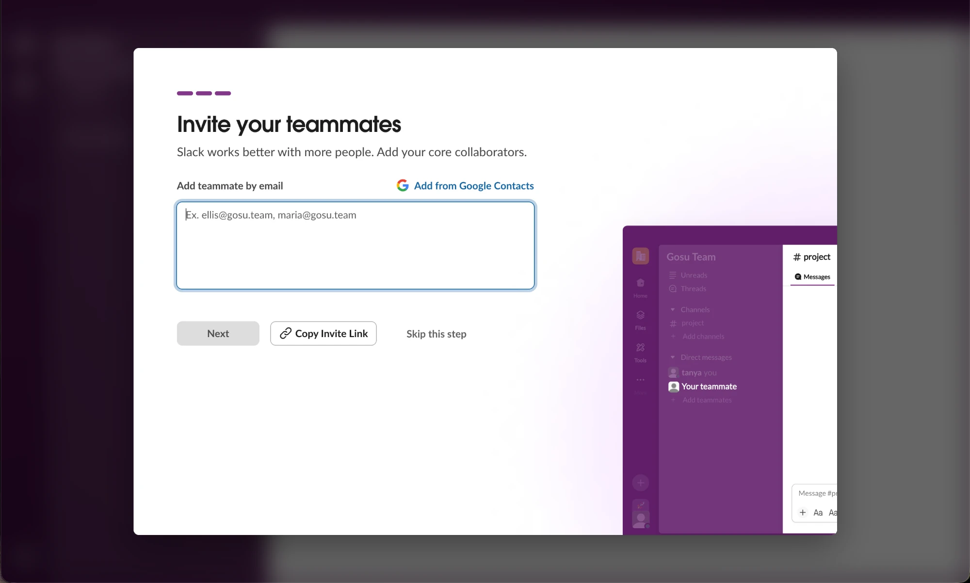
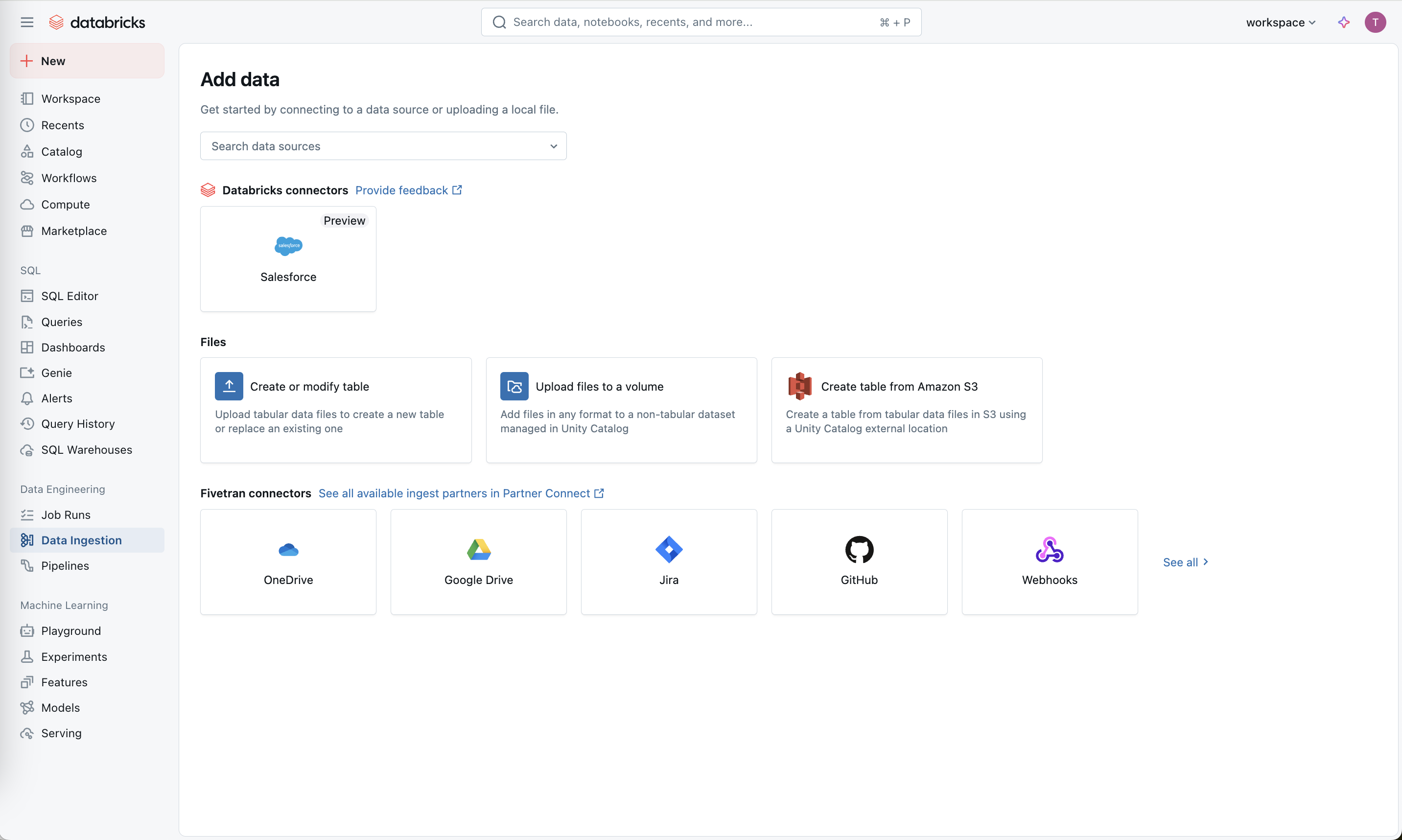
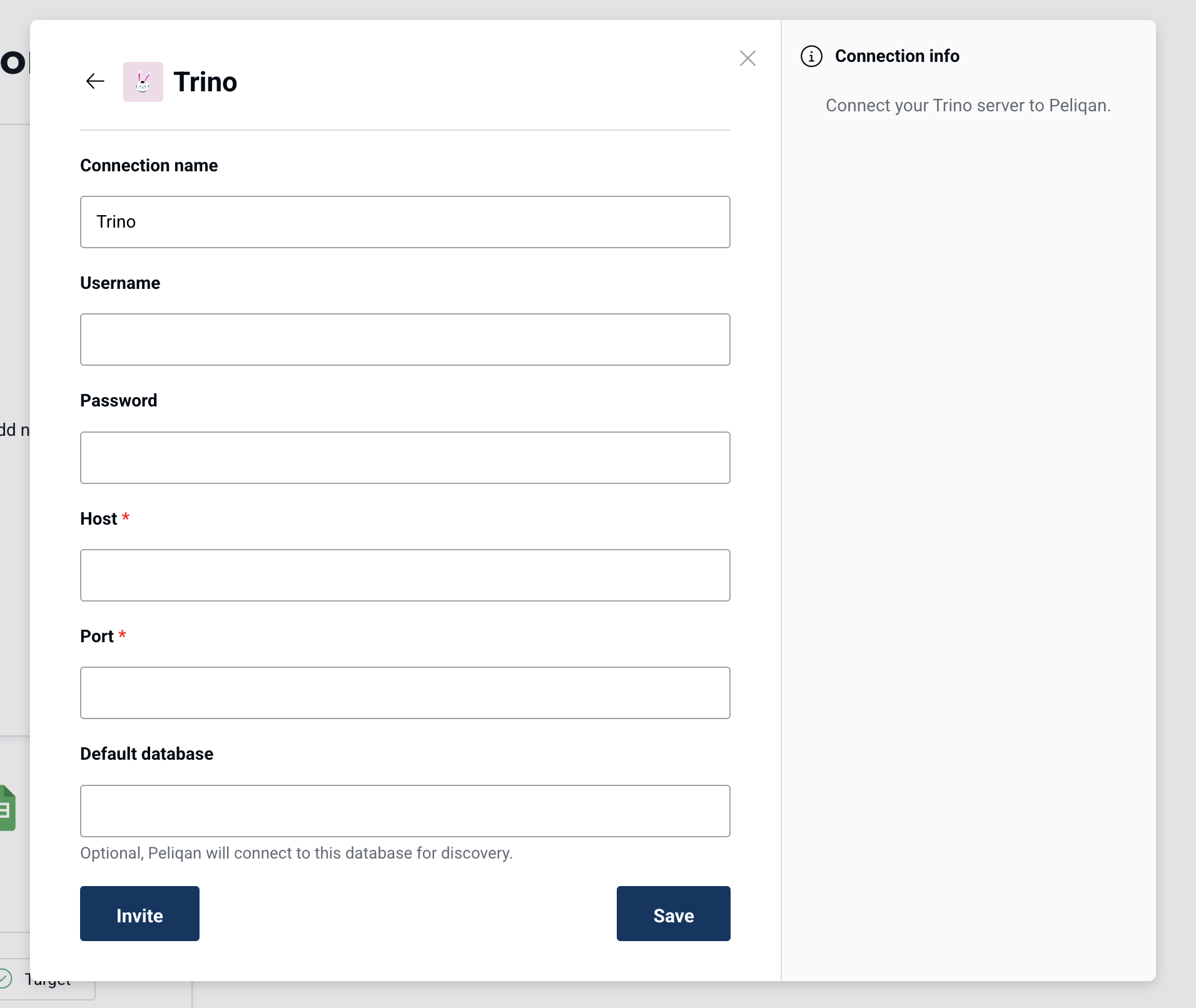
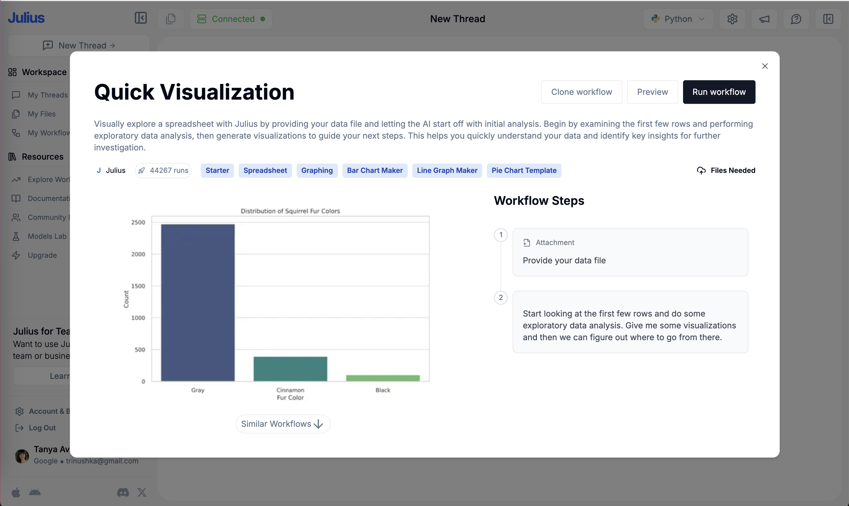
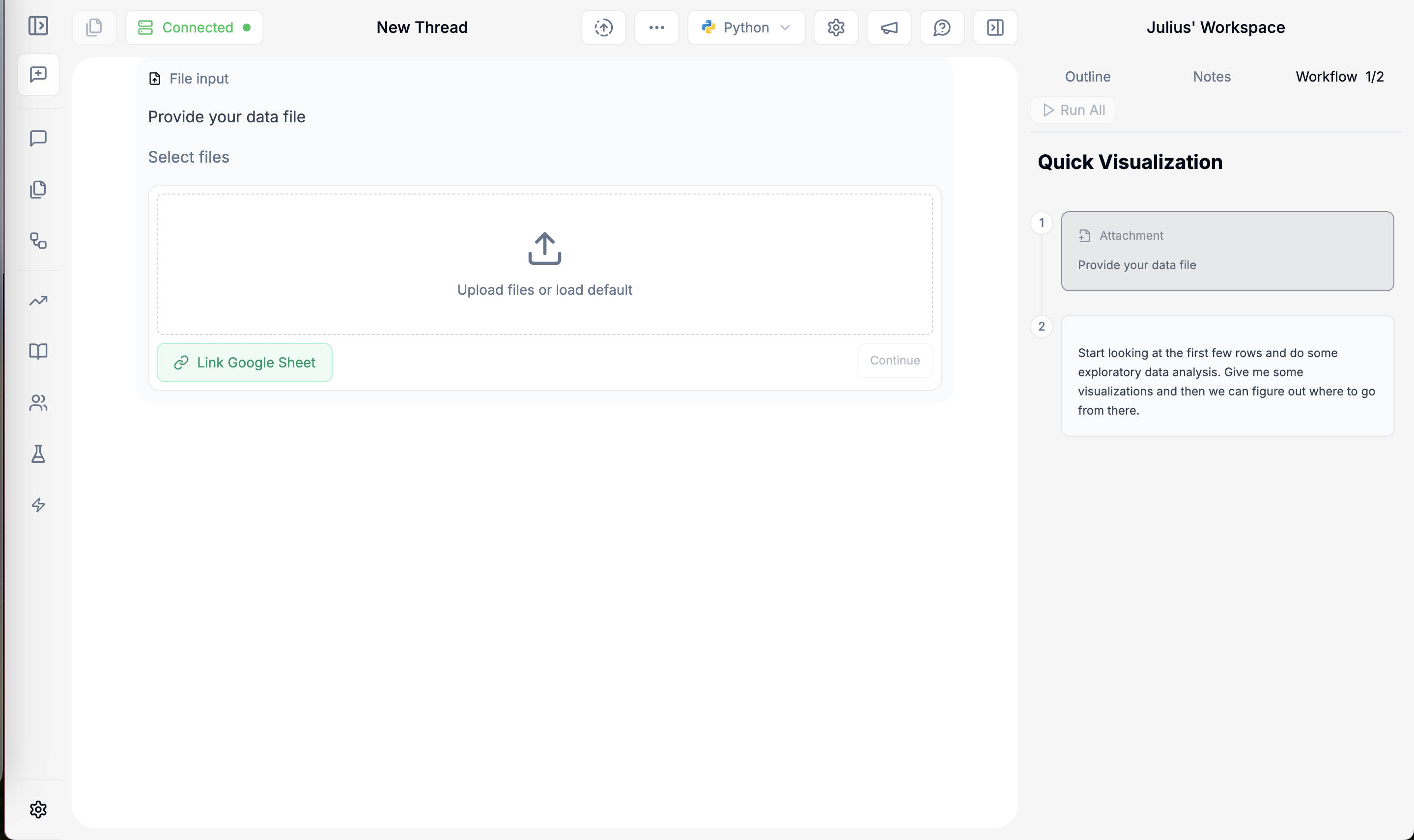
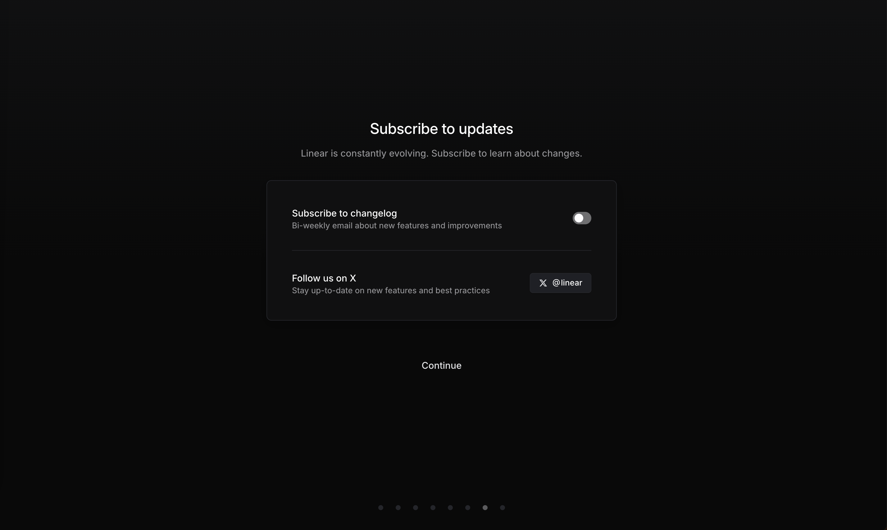
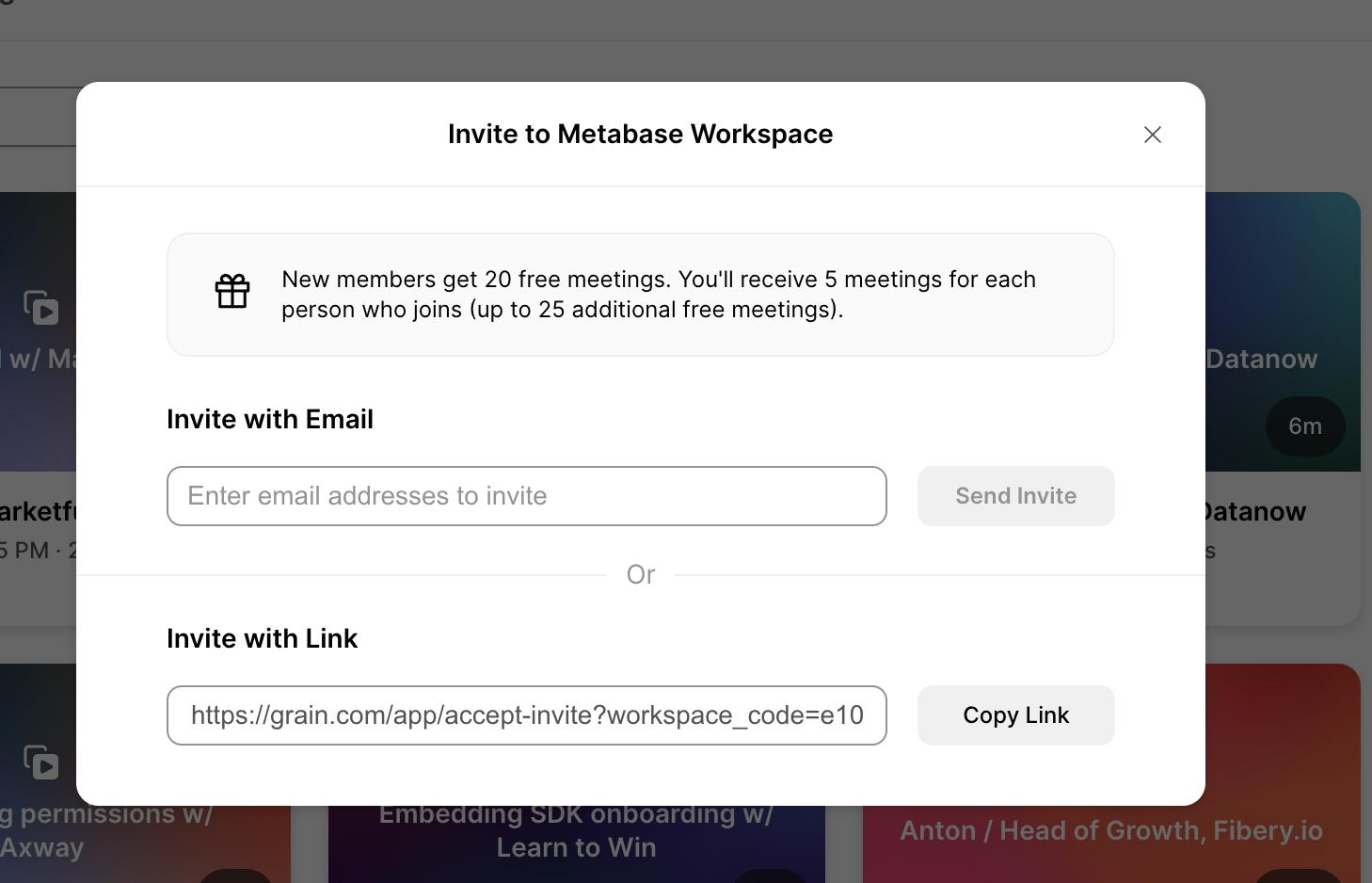
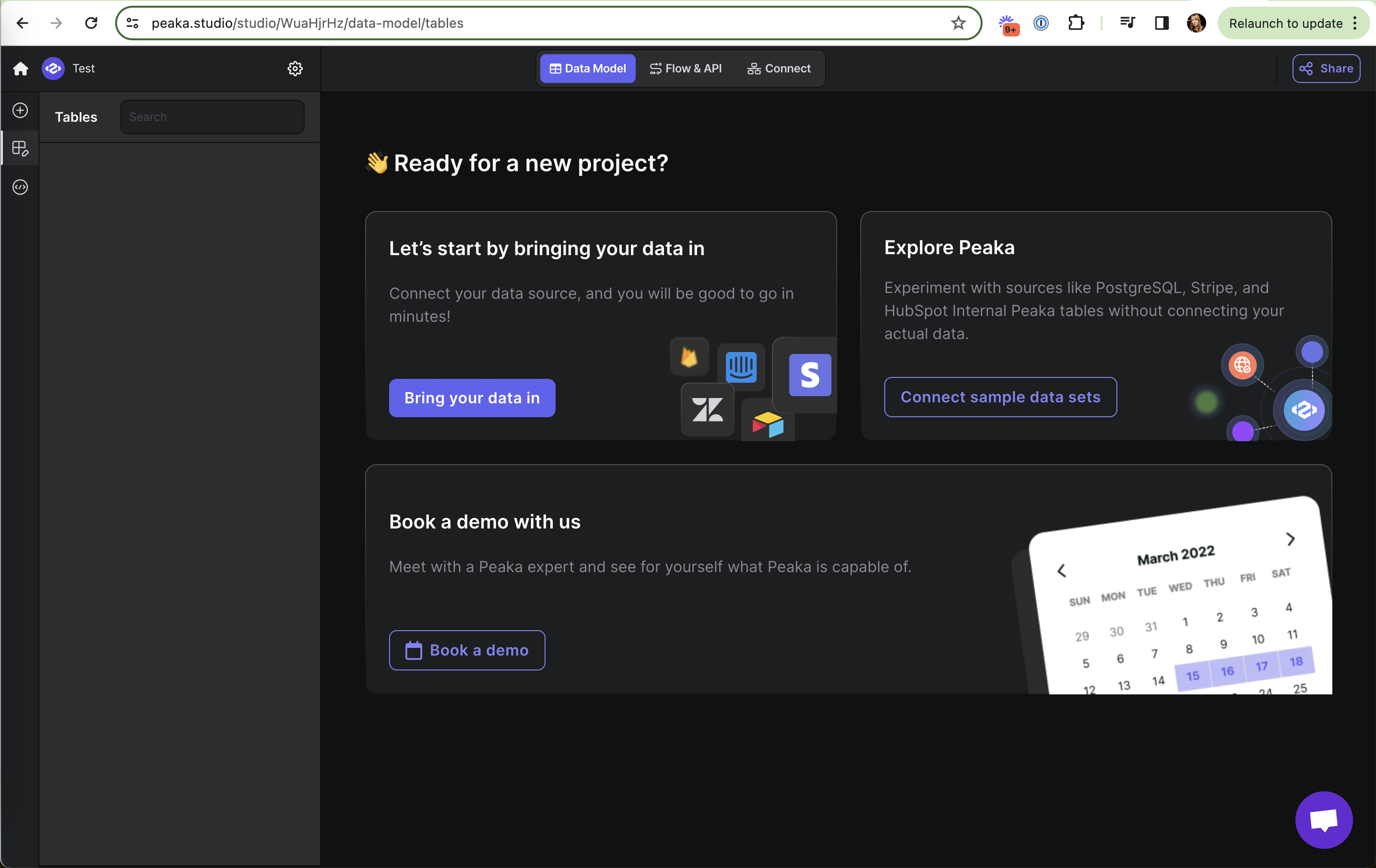
Nielsen's seventh usability heuristic says a design should serve both novices and experts: give a clear default path, plus shortcuts, alternatives and customization that speed up people who know what they want. On this site it also covers fallbacks (an invite link when email invites don't suit) and integrations that let users bring their own tools.
Nielsen Norman Group's article on the heuristic explains that accelerators like shortcuts and saved preferences should be unobtrusive, so they help experts without confusing beginners, and that offering several ways to complete a task lets people pick the one that fits their context.
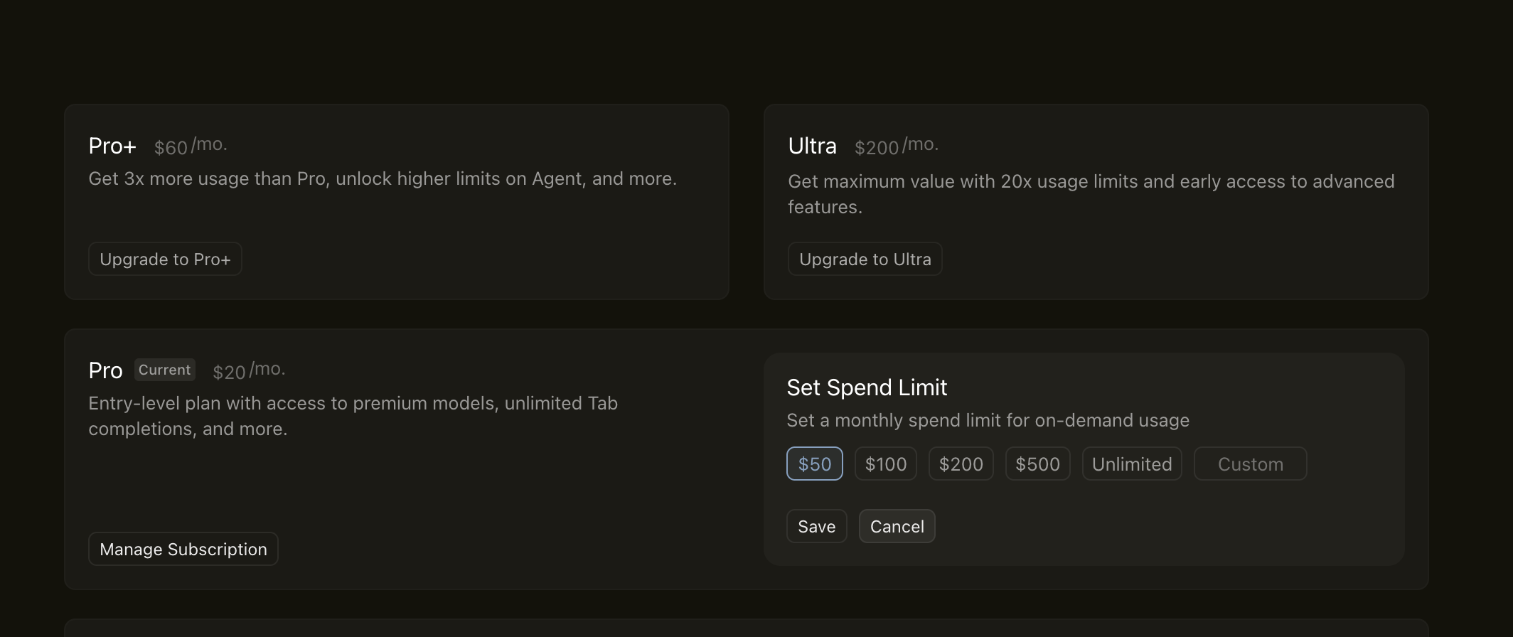
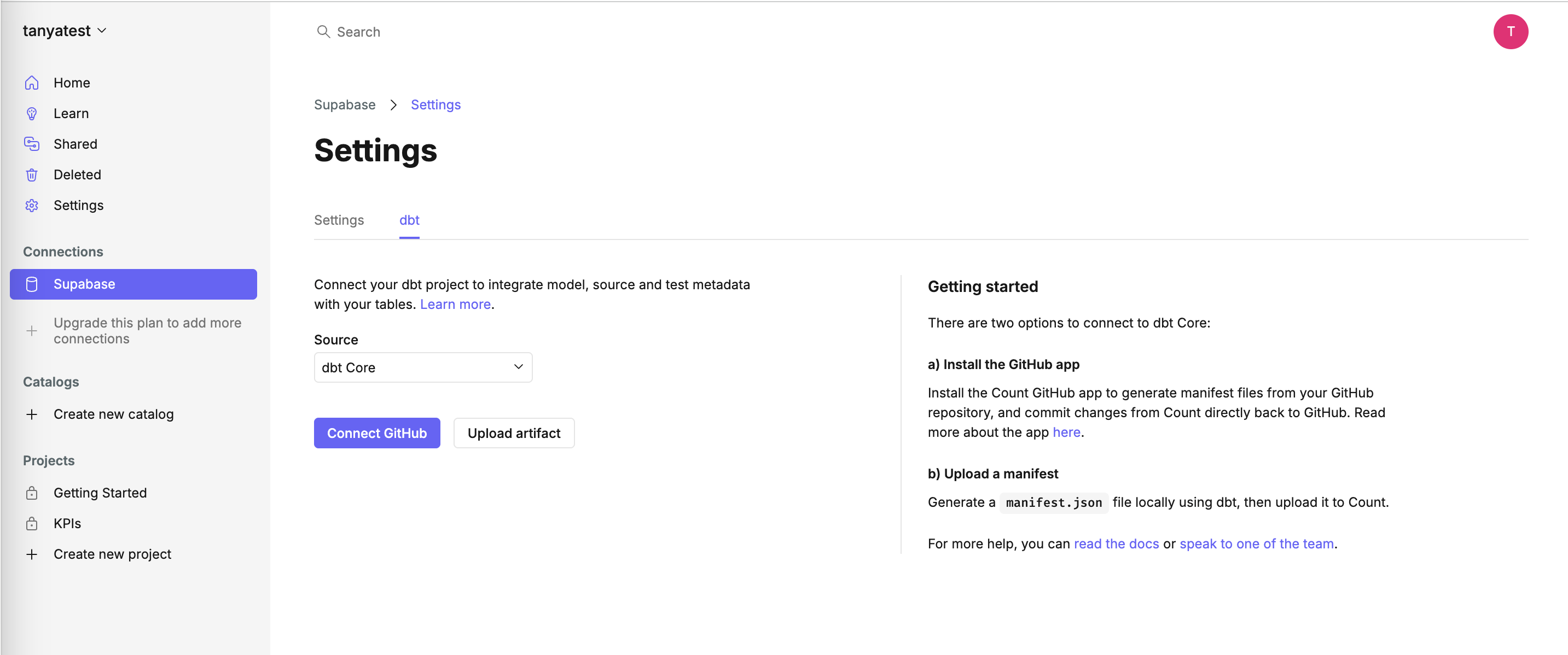
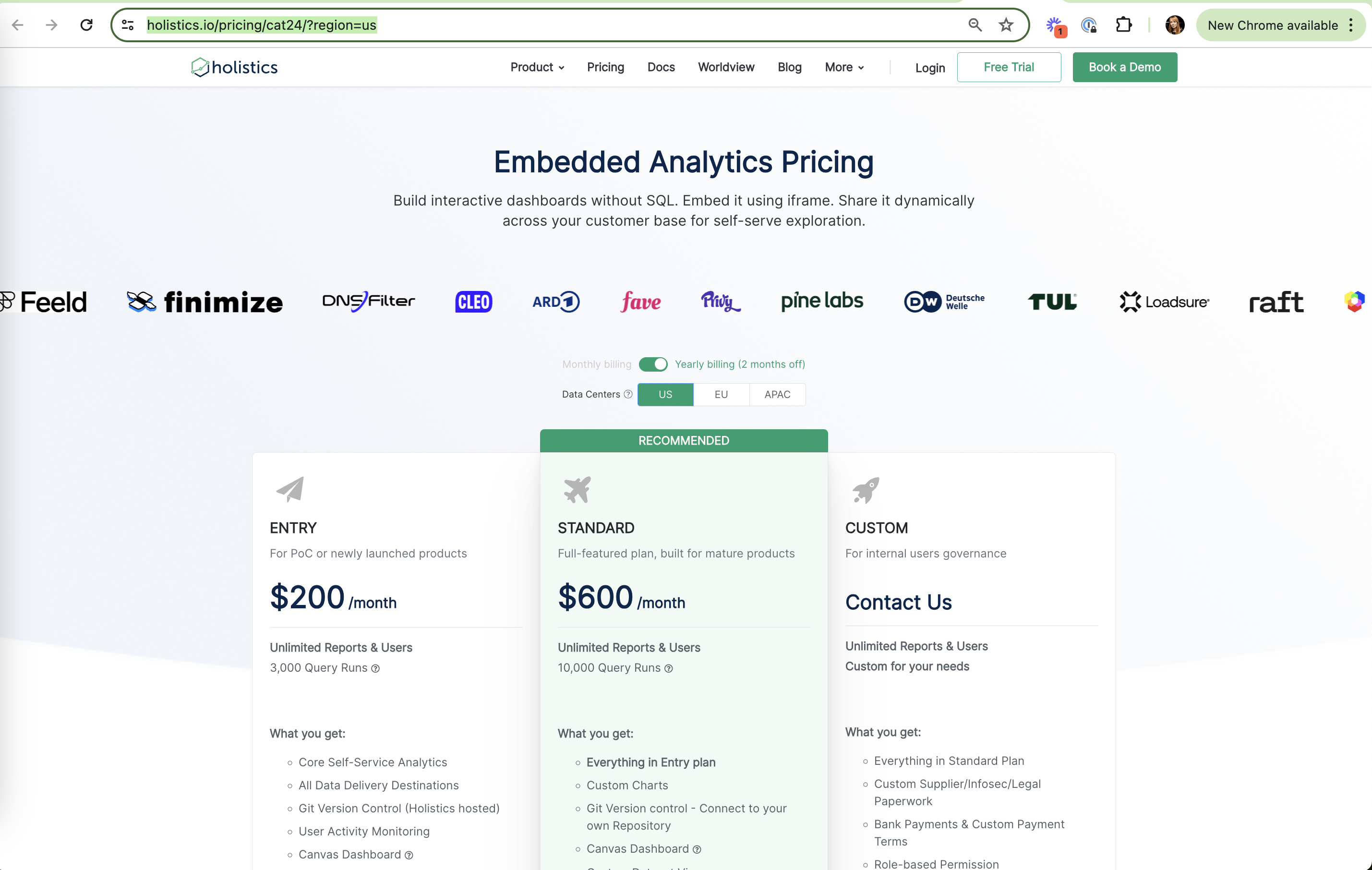
In onboarding, users arrive with different setups: some can install a GitHub app, some can't; some want to clone a template, some to run it straight away. Offering a primary path and a clearly secondary fallback keeps both groups moving. On pricing and billing, flexibility shows up as a custom amount next to presets or a choice of billing period.
How to use it
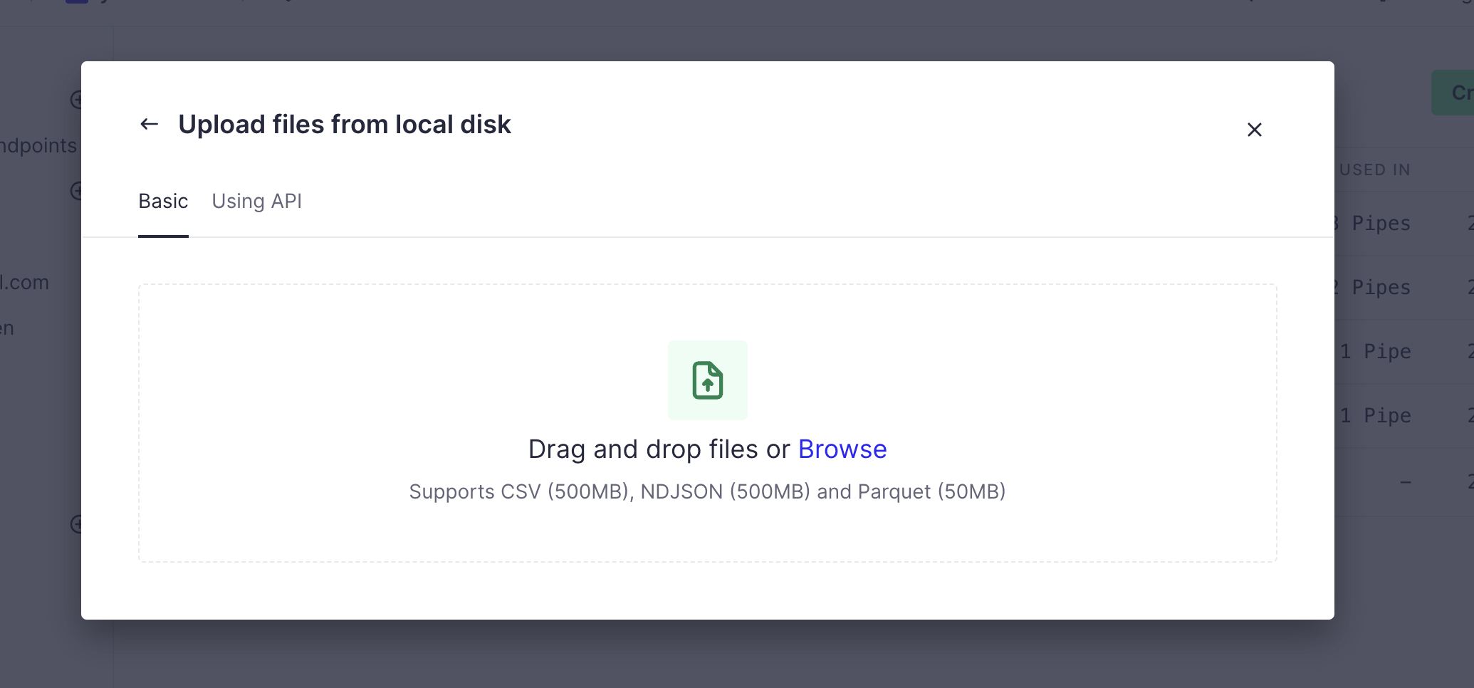
- Pair the main path with one clearly secondary alternative ("Upload a file instead", "Copy invite link").
- Next to preset amounts or plans, allow a custom value for users with their own constraints.
- Make optional fields truly optional, and let users skip steps that don't apply to their setup.
Watch out
- Too many equal-weight options on one screen turns flexibility into choice overload.
- Hiding the only workable path for some users (for example, no upload option when they can't connect an account).