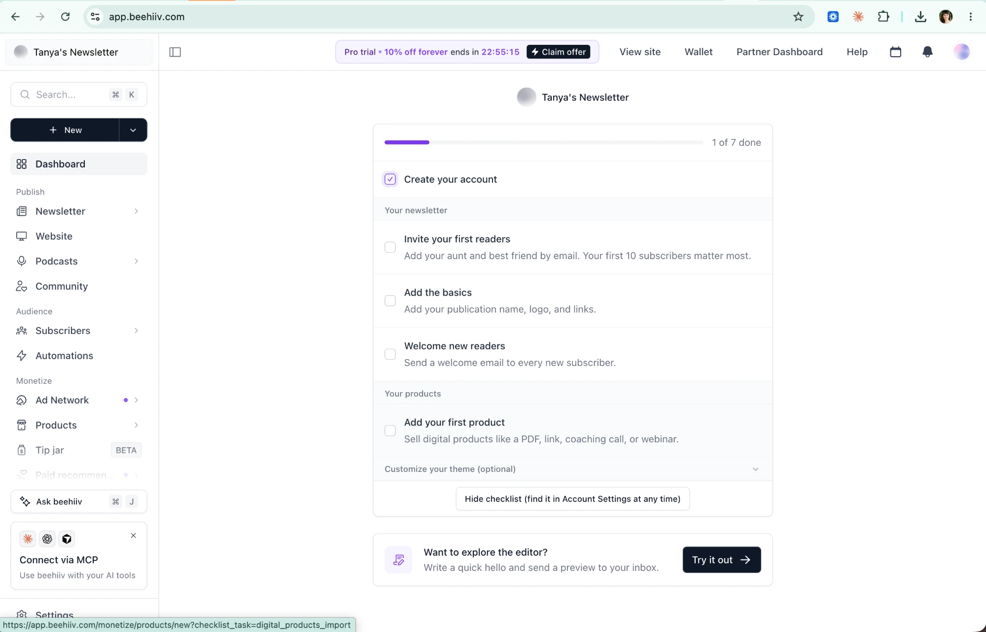
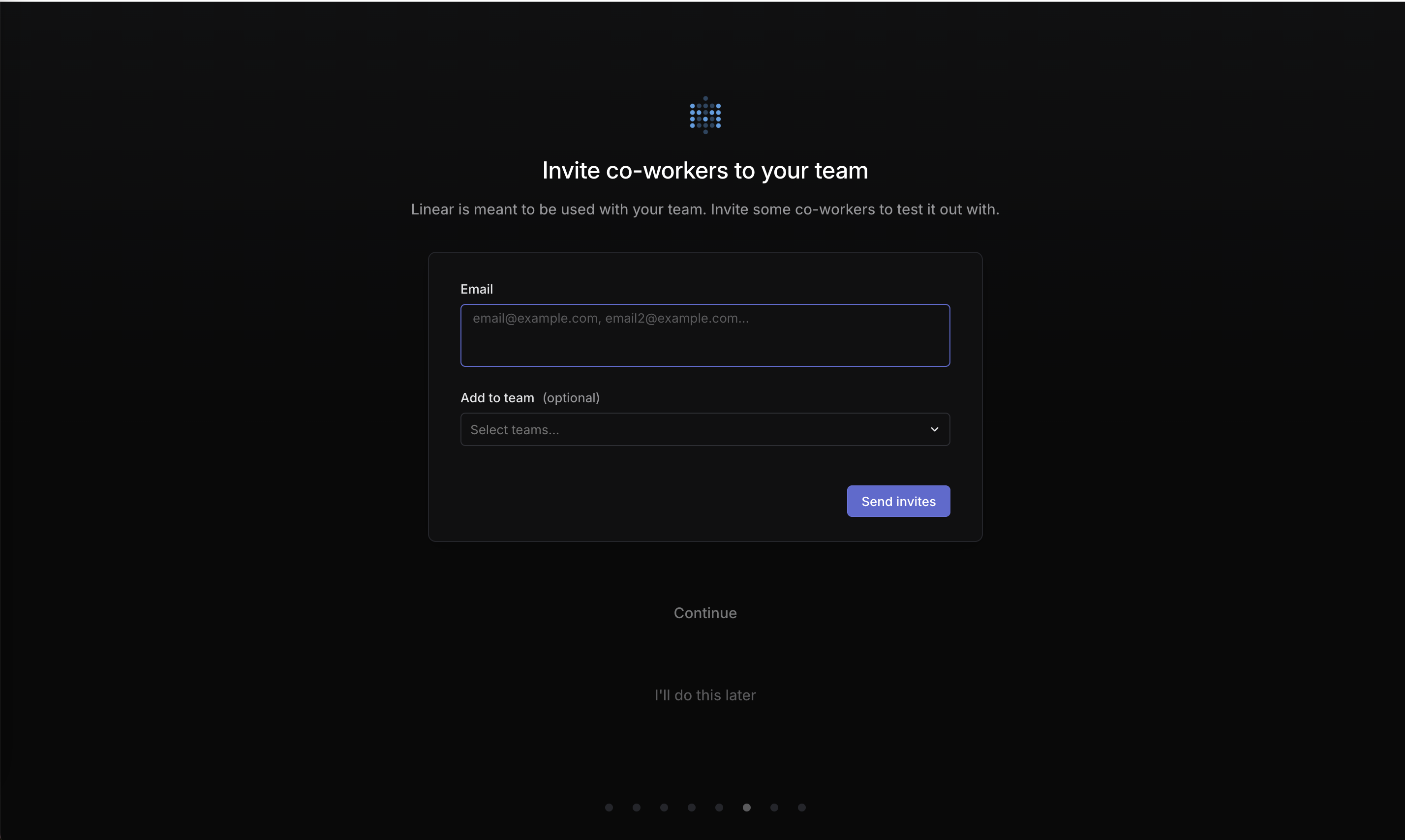
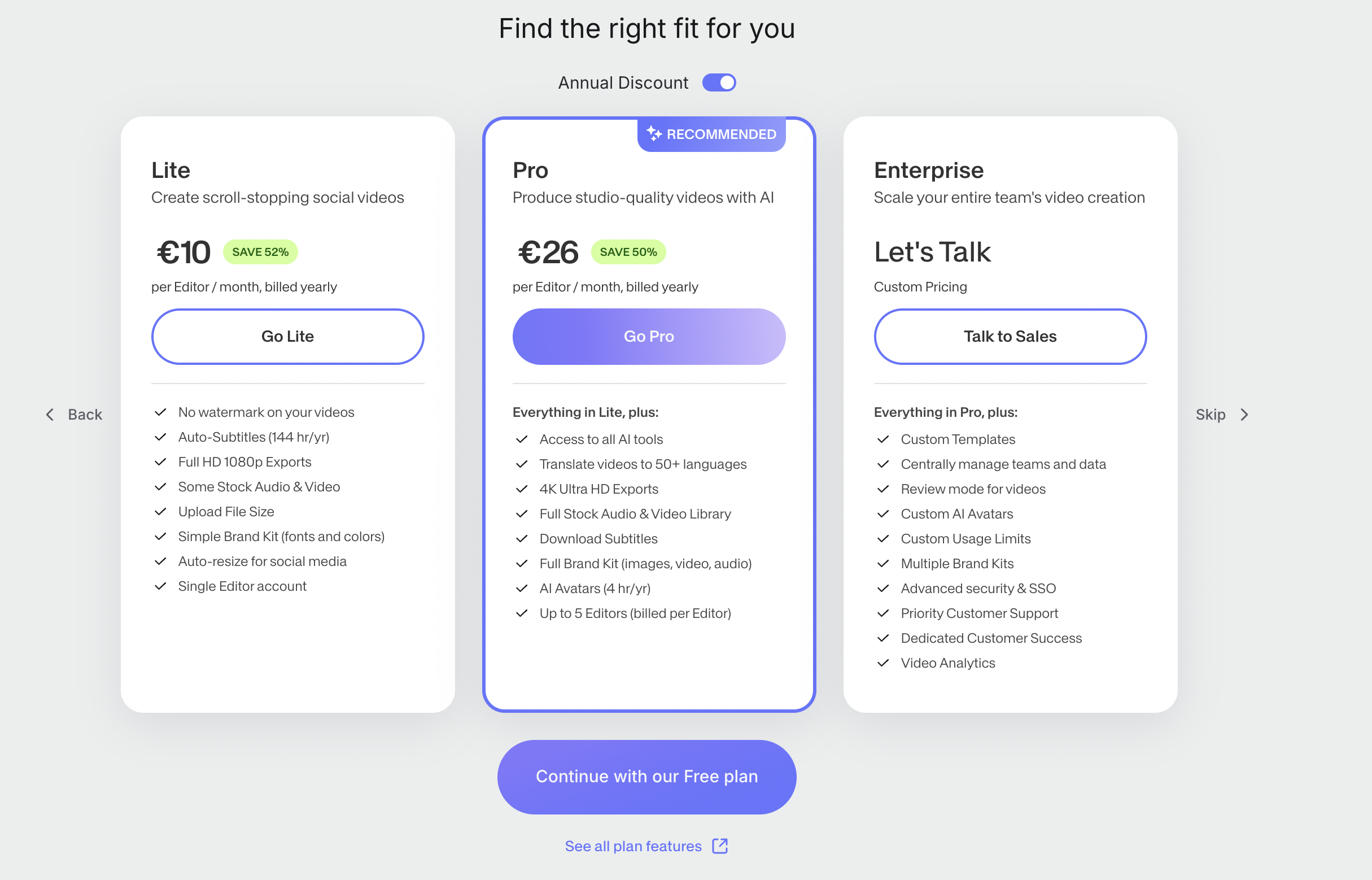
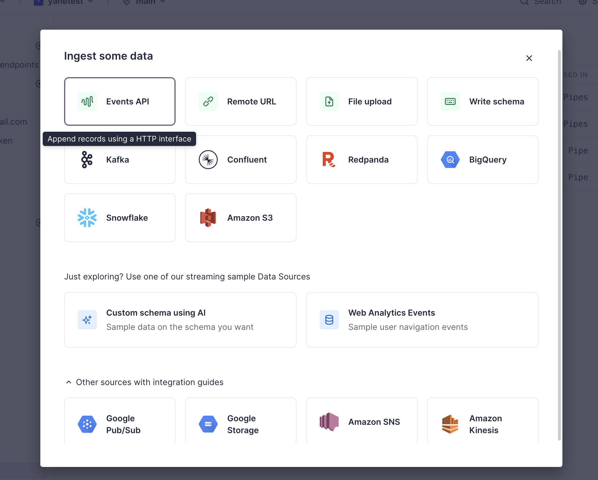
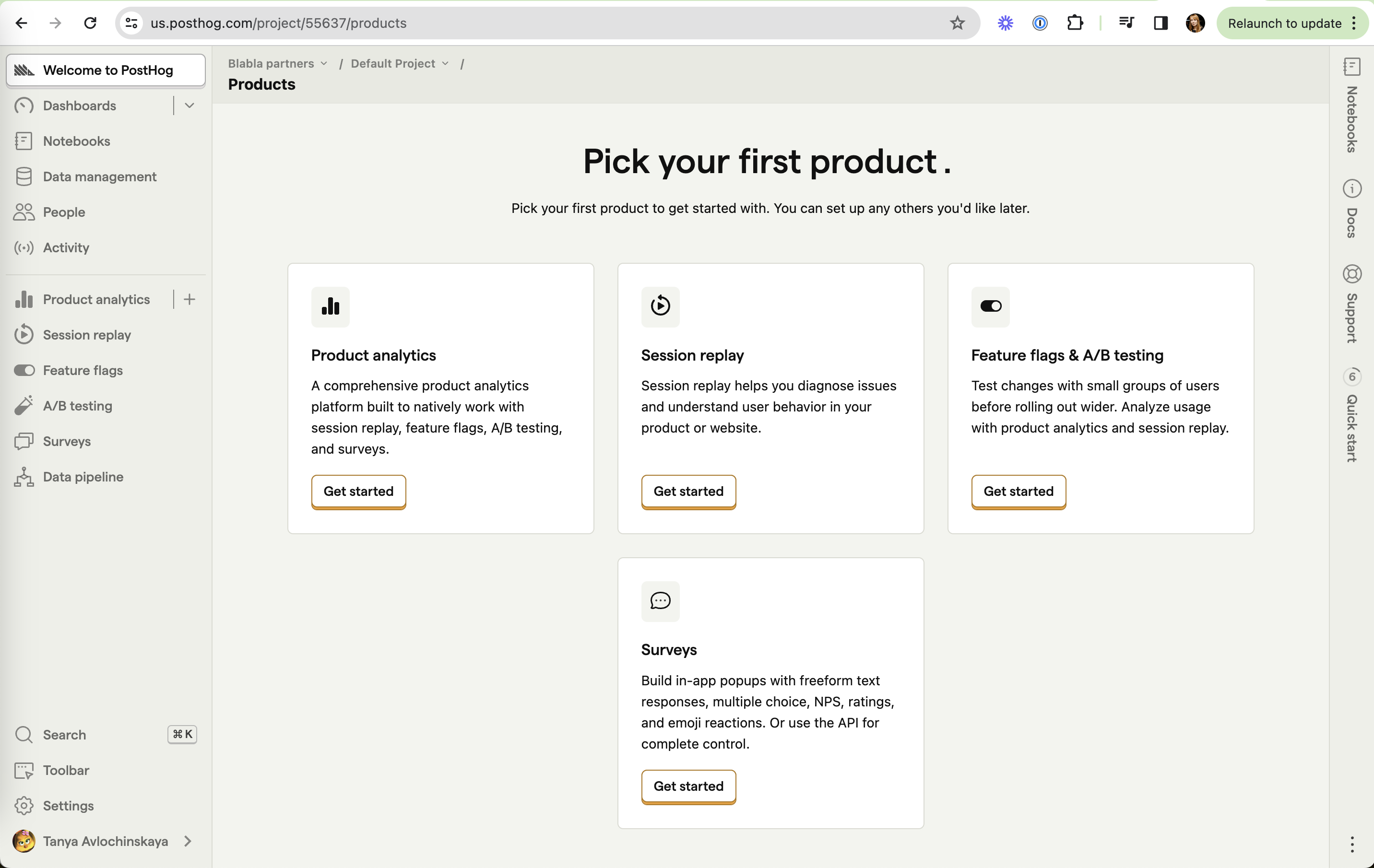
Choice overload is the idea that more options can reduce the chance that someone picks one. On this site it appears as a day-one sidebar full of features a new user can't use yet, two exit buttons with no clear difference, long unsearchable lists of sources, and rows of equal cards with identical "Get started" buttons and no recommended start.
Sheena Iyengar and Mark Lepper's jam study (2000) is the famous result: a tasting table with 24 jams drew more shoppers than one with 6, but only about 3% of them bought, against about 30% at the smaller table. The effect is not universal. A meta-analysis by Benjamin Scheibehenne and colleagues (2010) found an average effect close to zero across 50 experiments. Alexander Chernev and colleagues (2015) found that overload does appear reliably under specific conditions: complex options, hard decisions, unclear preferences, and a goal of picking just one.
Onboarding and plan pickers hit all four conditions. New users don't yet know what they want, options are unfamiliar, and they must pick one to continue. That is when narrowing the set or marking a recommended choice helps most.
How to use it
- Mark one recommended option or starting point, and say who it is for.
- Give each option a visibly different purpose; if two buttons do the same thing, remove one.
- Hide features and settings that don't apply yet, and add search or filters to any list longer than about seven items.
Watch out
- Cutting options the user actually needs to compare (for example hiding a cheaper plan) moves from simplification to manipulation.
- Citing the jam study as a universal law; the effect is inconsistent and depends on context, so test rather than assume.