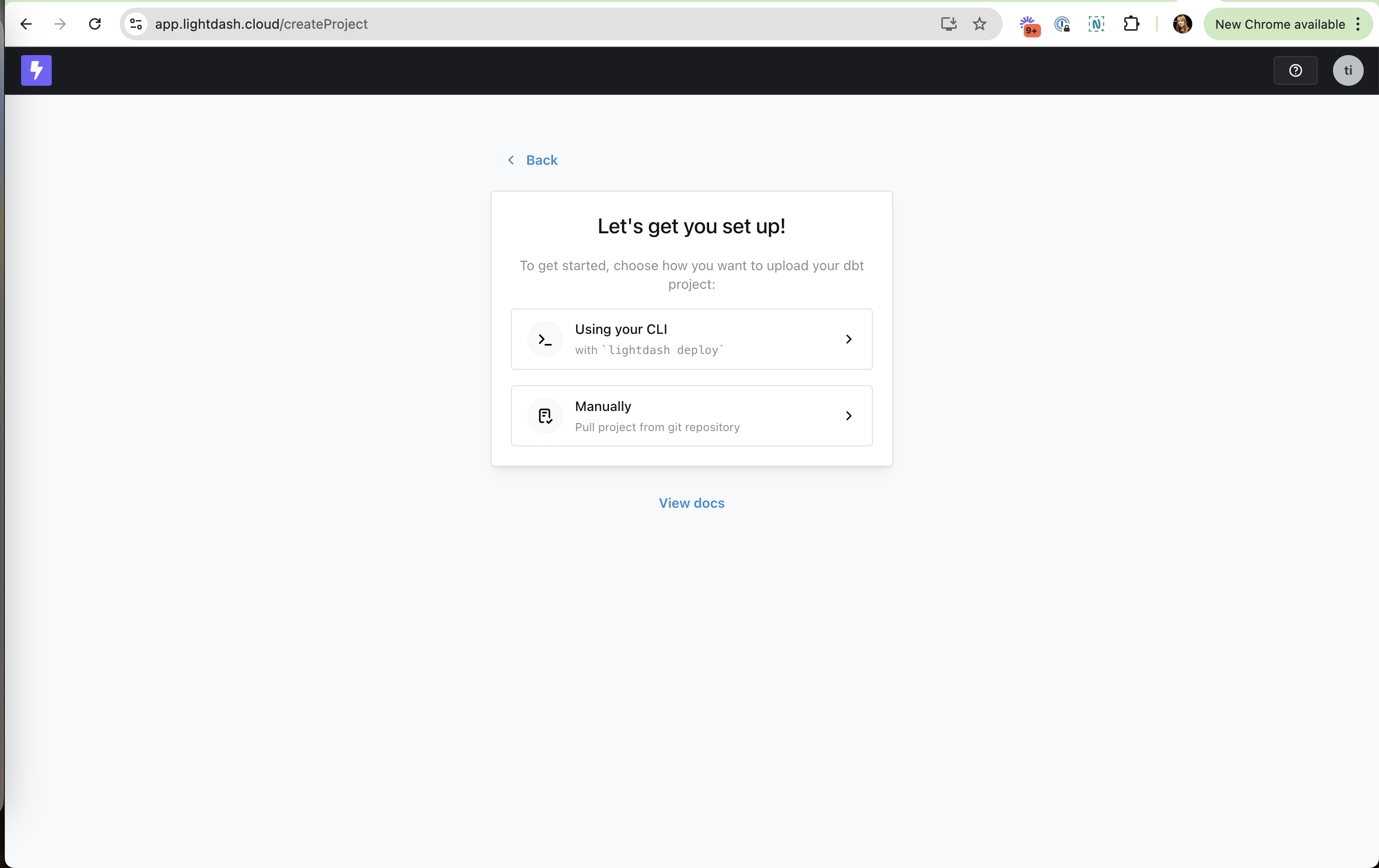
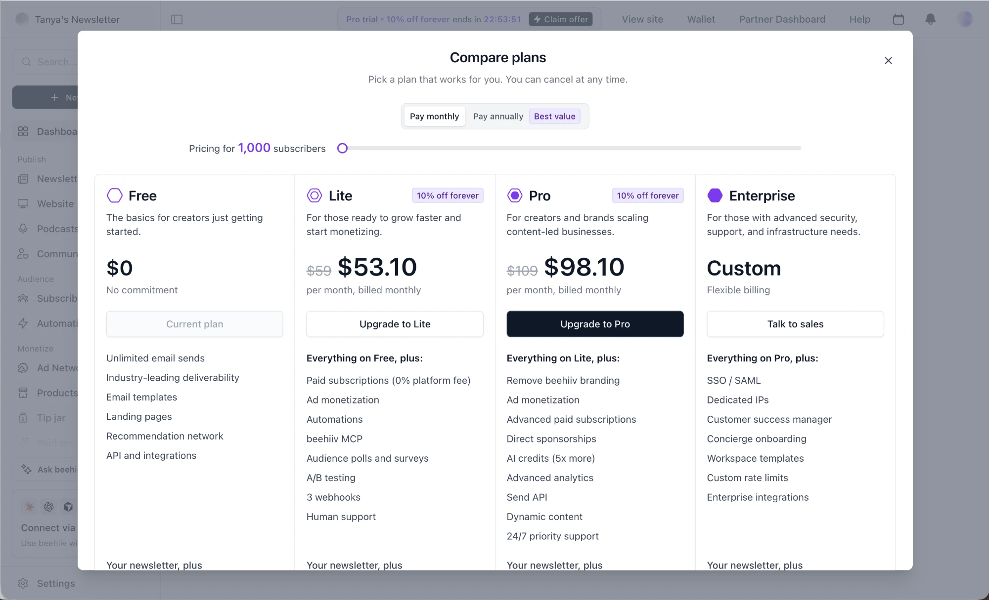
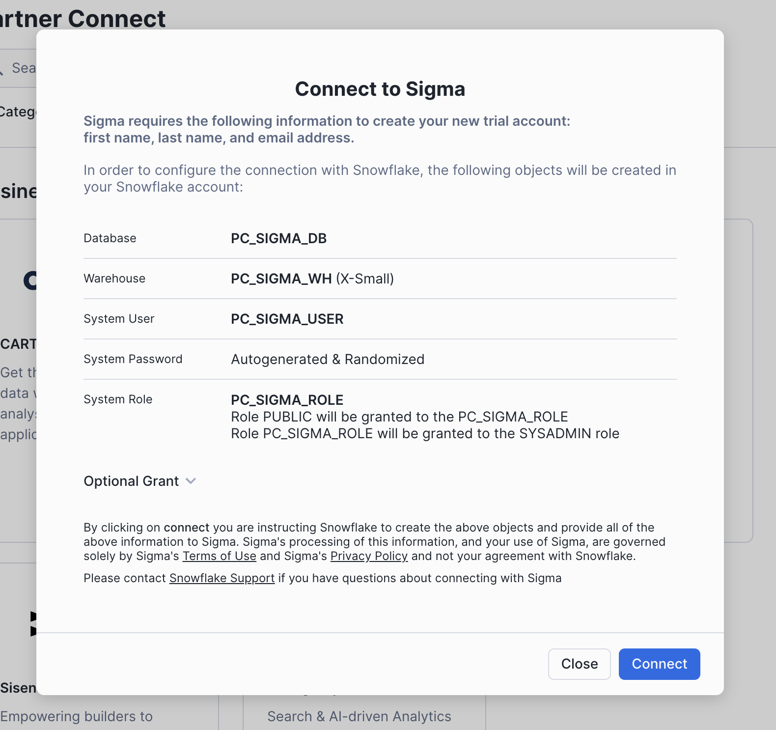
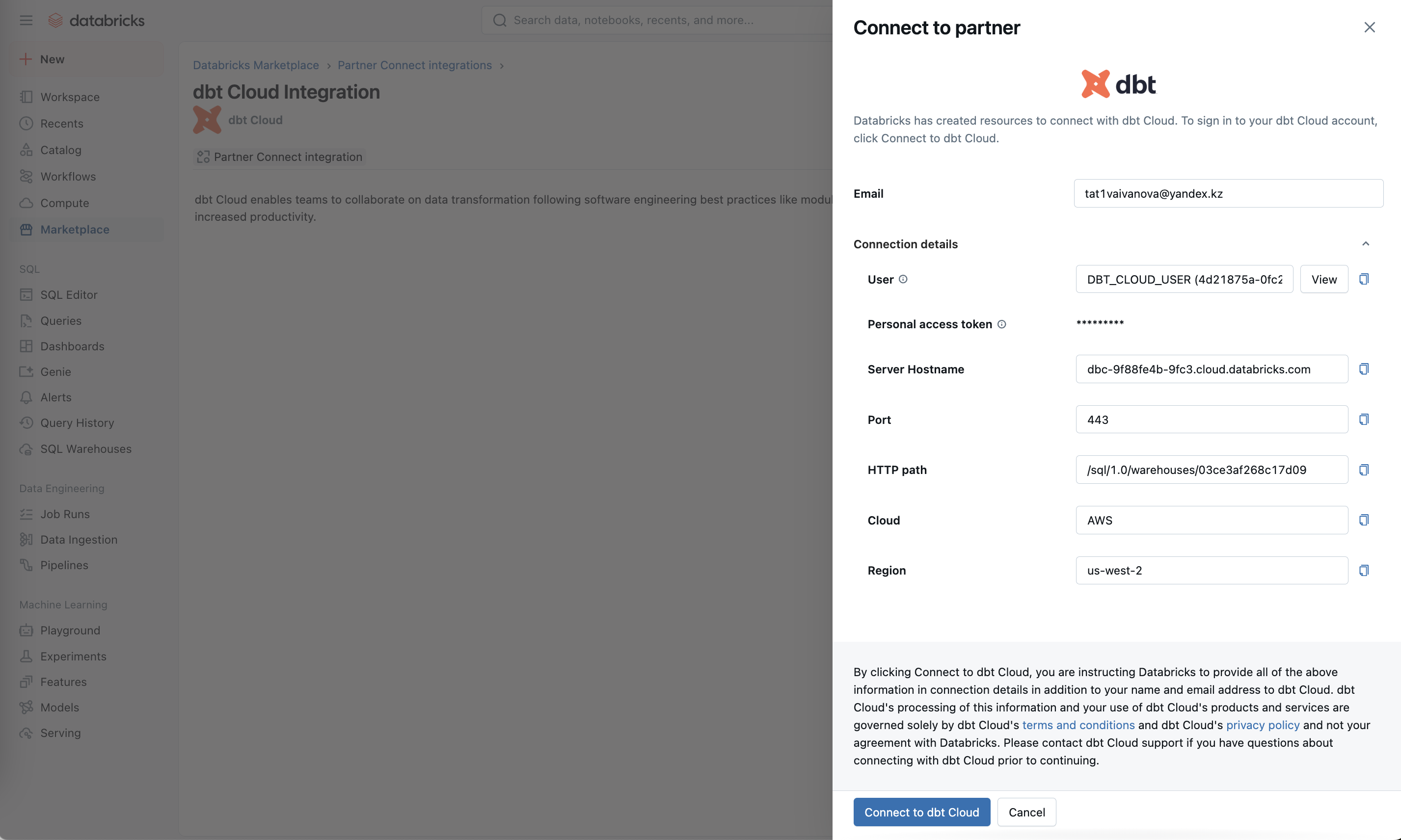
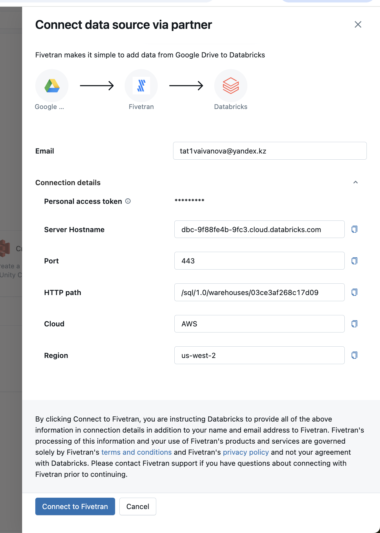
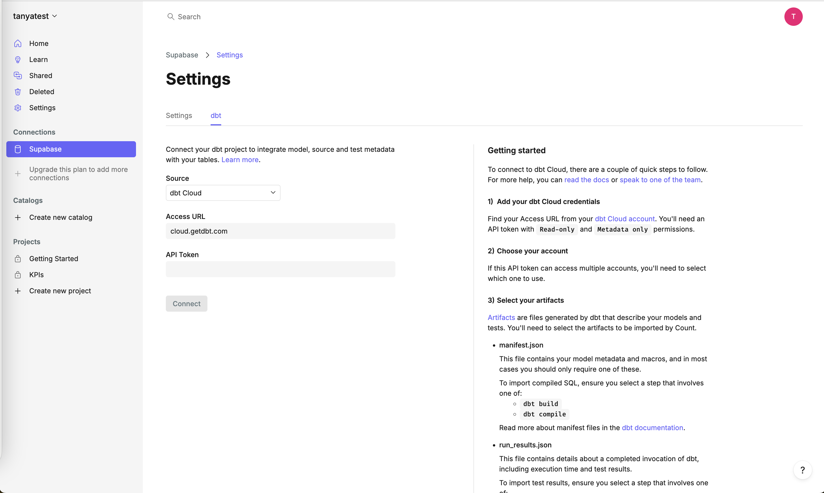
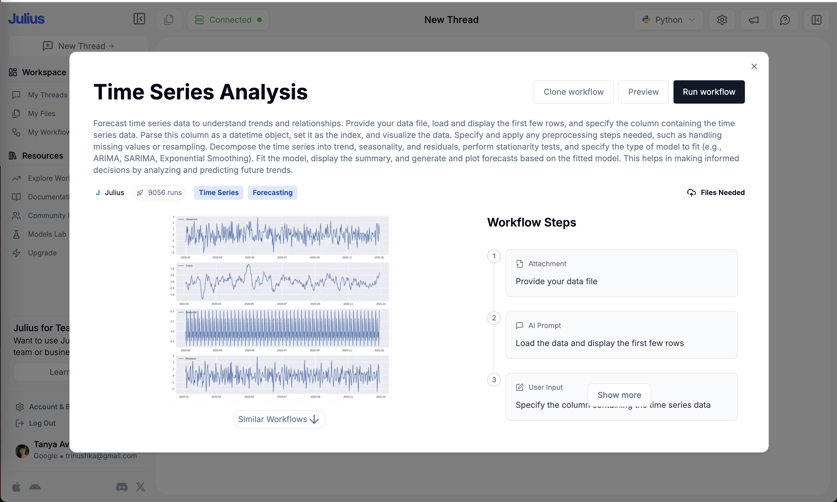
Cognitive load is the mental effort a screen demands. On the site it is mostly flagged where it goes wrong: legal walls right above a Connect button, jargon-heavy paragraphs, feature lists that run past the fold, and pricing with five separate meters and no calculator.
The idea comes from John Sweller's cognitive load theory. Sweller (1988) showed that the way people solve unfamiliar problems uses so much working memory that little is left for learning, which is why worked examples teach better than open problem solving. NN/g's Kathryn Whitenton (2013) applies this to interfaces: cut visual clutter, reuse familiar patterns, and offload tasks like remembering or calculating to the system.
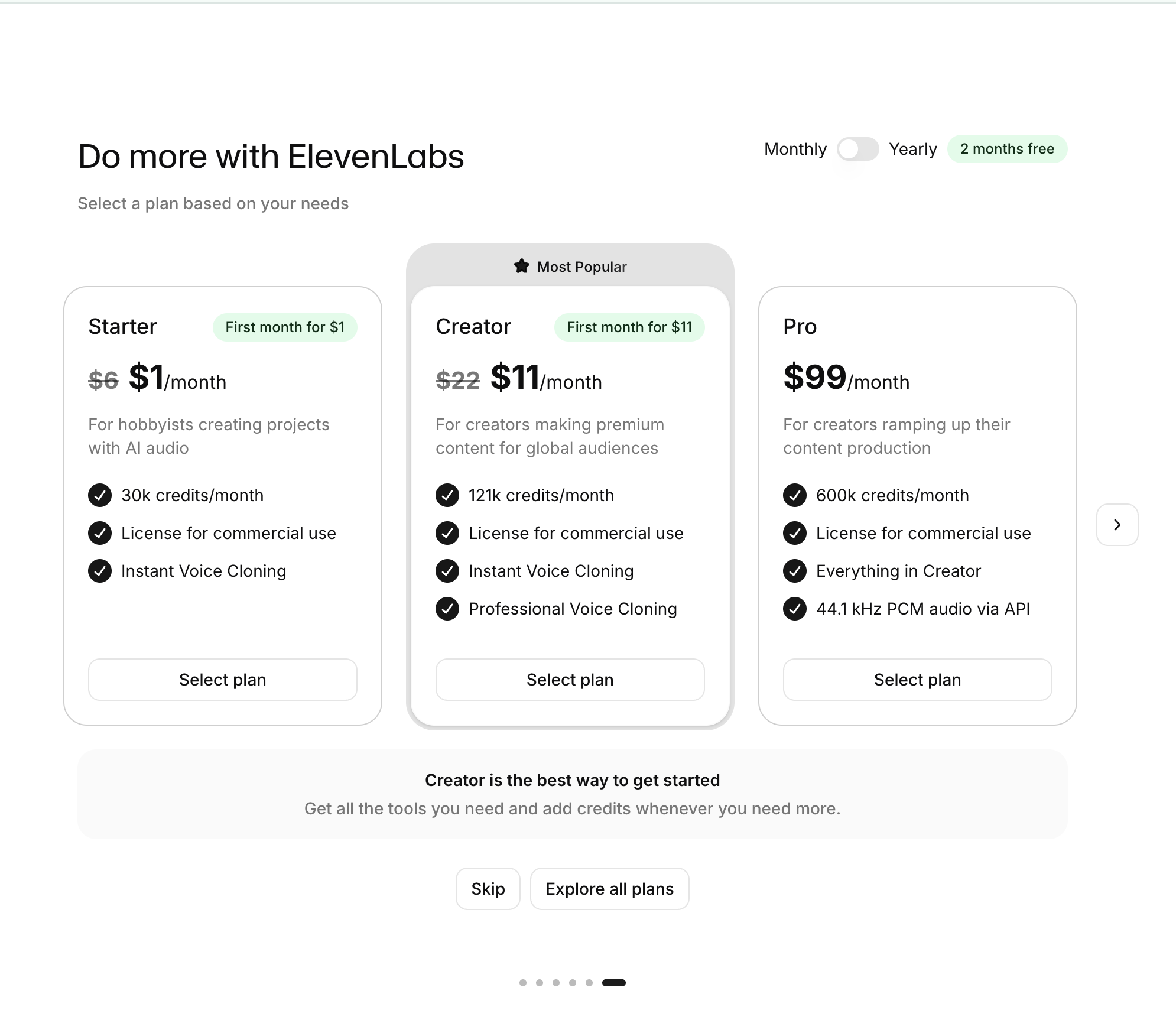
On a paywall, the user is doing a costly comparison. Each extra column, meter or term competes with the one question that matters: which plan is right for me?
How to use it
- Do the math for the user: show an estimated monthly total for their usage instead of listing each meter's unit price.
- Replace dense legal or technical paragraphs above a CTA with a one-line summary and a link to the full text.
- Limit plan comparisons to the differences that matter and use the same order and labels across plans.
Watch out
- Oversimplifying by hiding costs or terms reduces load now but creates surprise and churn later.
- Cutting explanation for experts can strand newcomers; match the depth to who is on the screen.