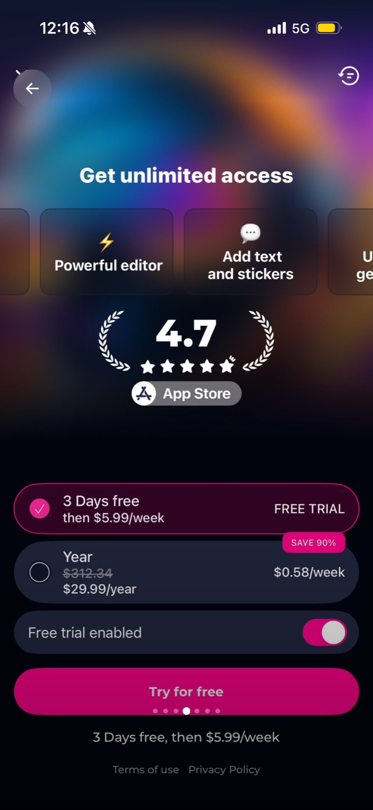
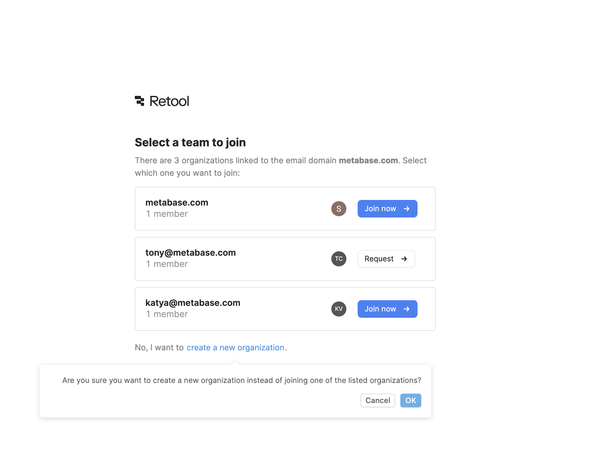
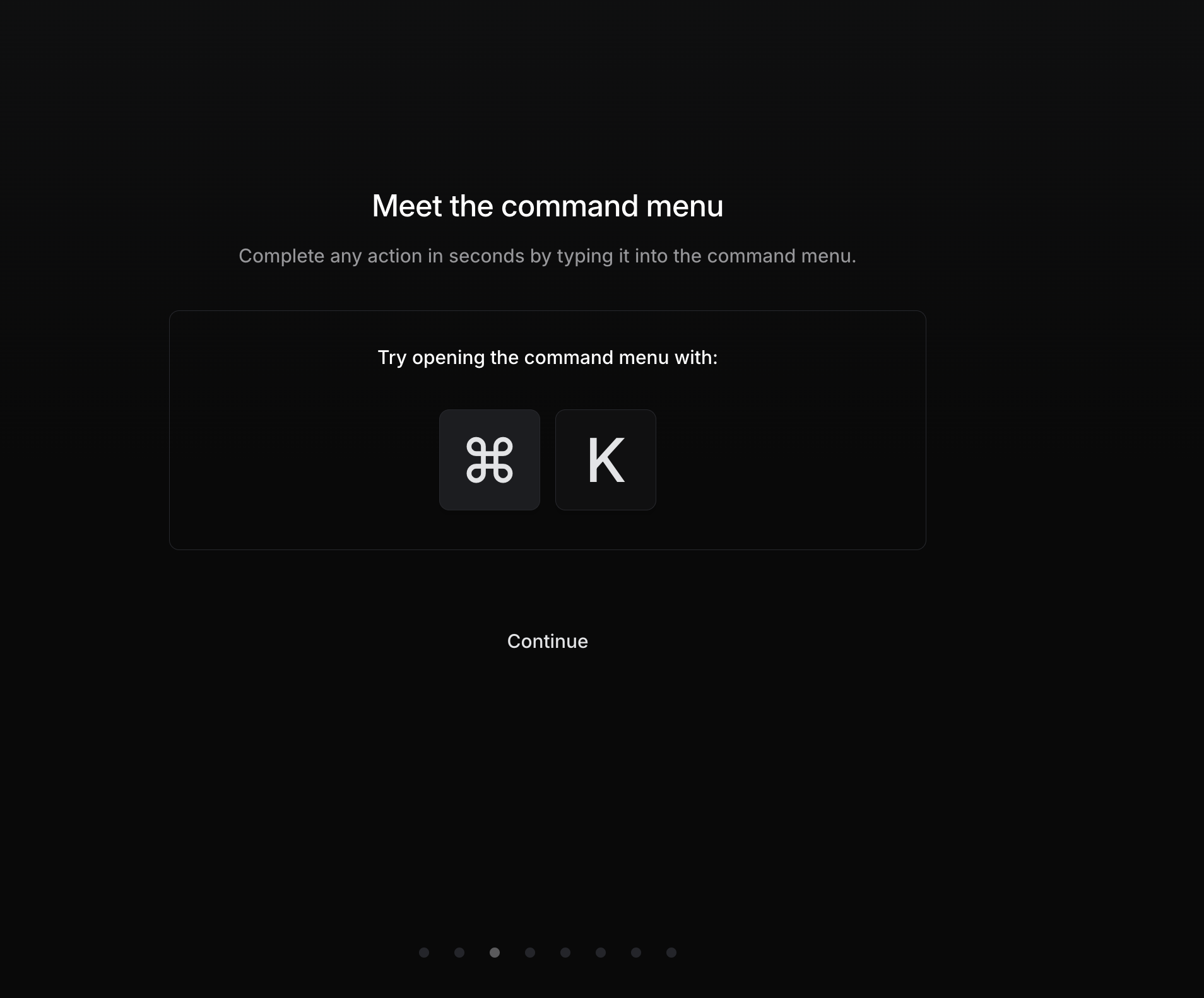
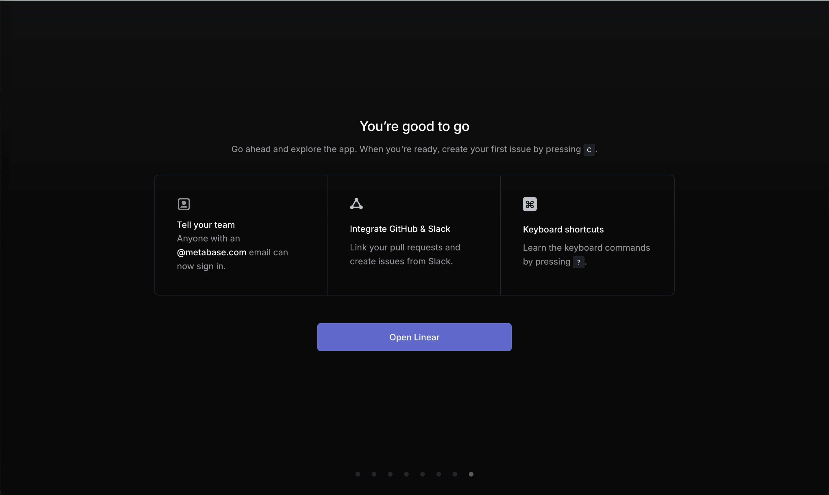
In design use, affordance means the visible cue that tells people an action is possible. On this site good examples include a carousel whose cards are cut off at the edges so you know to swipe, and buttons whose labels ("Join now" vs "Request") show the rule behind them. The failures are actions styled as plain text, such as a "Continue" link with no button styling, or an integration that reads as a tip rather than something you can click.
The psychologist James Gibson (1979) coined "affordance" for what an environment offers an animal. Don Norman brought it into design in The Design of Everyday Things and later clarified that designers care about perceived affordances and signifiers: the cues users can actually see. NN/g's Kate Moran tested this in an eyetracking study (2017) with 71 users: pages where clickable elements had weak cues (flat ghost buttons, links styled like text) took about 22% longer to use and drew about 25% more fixations than versions with strong cues.
Onboarding often has a single path forward. If that path doesn't look clickable, users stall or take the more obvious wrong option, such as skip.
How to use it
- Style the primary forward action as a real button with fill or border, and keep that style for actions only.
- Let partial content peek at the edge of carousels and scrollable rows so users know there is more.
- Turn suggestions that are really actions ("Integrate GitHub") into buttons or links with a clear verb.
Watch out
- Making decoration look clickable (cards, badges, icons with no action) sends users into dead ends.
- Disguising ads or upsells as content or system controls uses affordance to deceive.