Usability heuristic

Recognition over recall

Show options, labels and previous inputs on screen so users can pick what they need instead of remembering it.

Recognition over recall Two versions of a Connect a data source screen. One has a blank field where the user must type the exact source name and gets it wrong. The other shows labeled tiles to pick from, so nothing has to be remembered. Recall: type it from memory Connect a data source Source name postgress Connect No source named “postgress” Postgres? PostgreSQL? pg? Recognition: pick what you see Connect a data source PostgreSQL Google Sheets BigQuery Snowflake Recently used first Search 40 more Picking from a list beats remembering a name Shepard (1967): people recognized about 90% of words and 98% of pictures seen earlier
A blank field makes users type a source name from memory and get it wrong, while labeled tiles let them pick it. Shepard (1967) measured how strong recognition is.

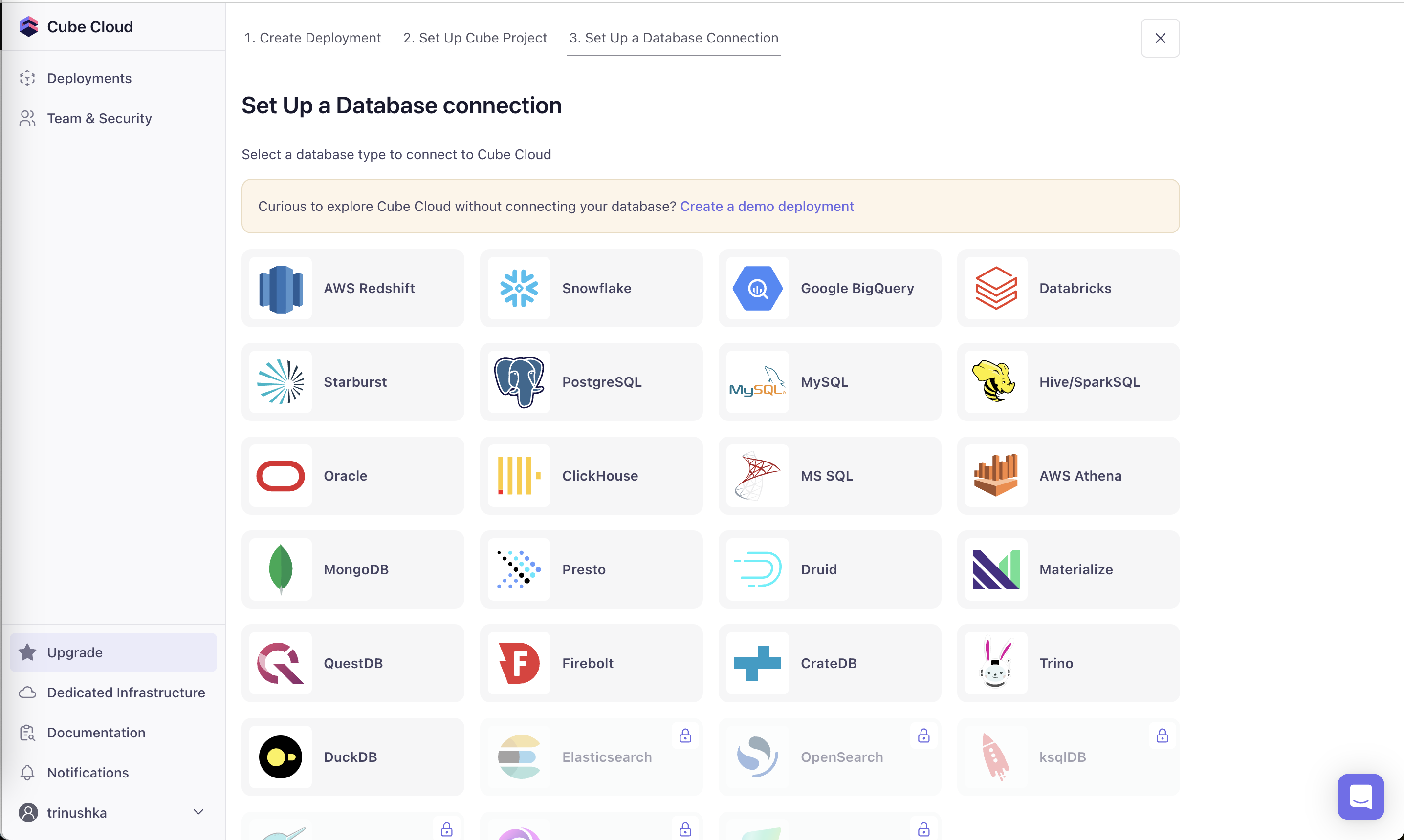
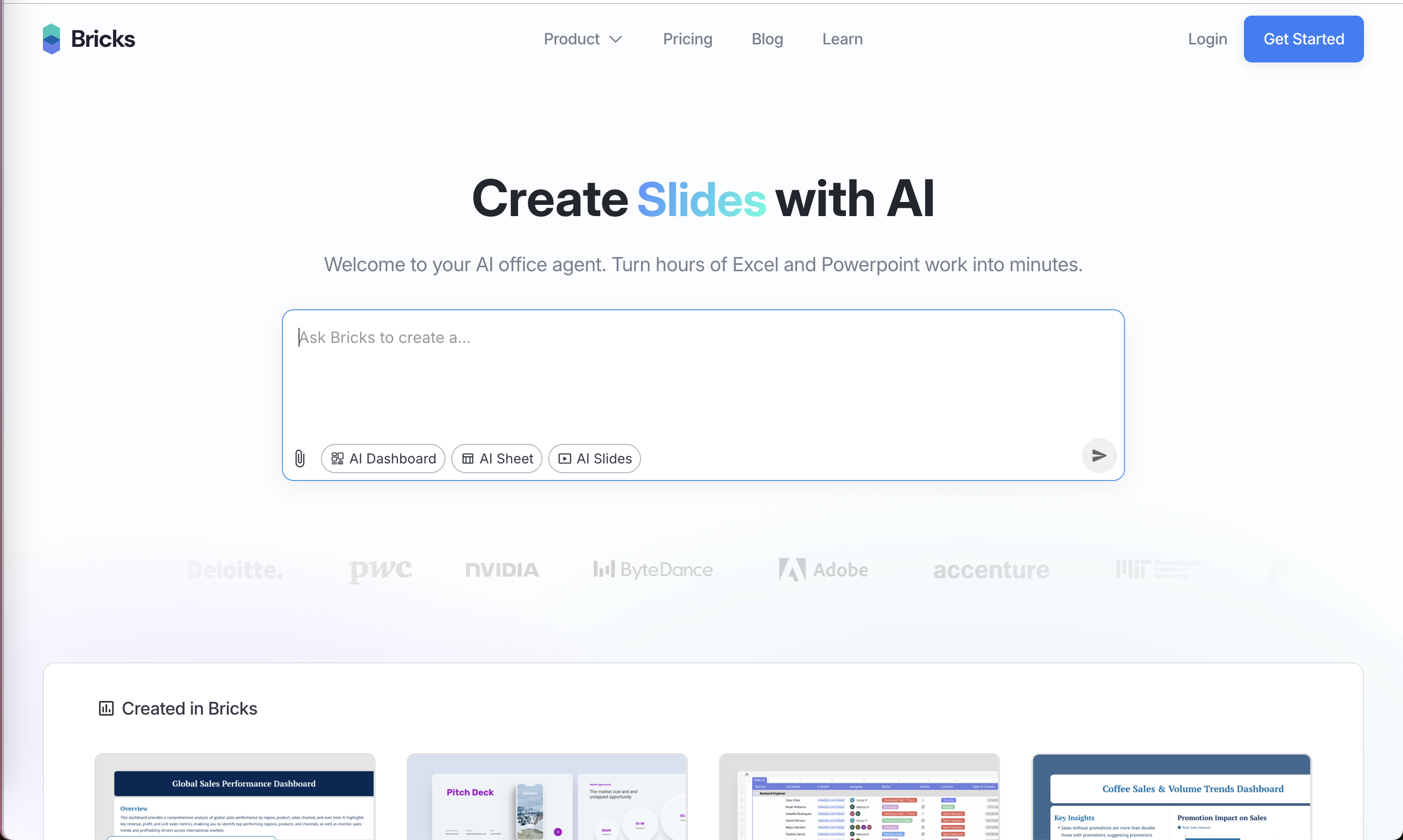
Recognizing an option from a list is much easier than producing it from memory. Interfaces that rely on recall (unlabeled icons, blank fields, codes you must remember) push work onto the user. On this site the good examples use logos, labeled chips, thumbnails and copyable details; the bad ones hide meaning behind icons or random strings.

Roger Shepard (1967) showed how strong recognition memory is: after looking through several hundred words, sentences or pictures, people picked the ones they had seen with roughly 90% accuracy for words and sentences and about 98% for pictures. Nielsen made the idea heuristic 6: minimize memory load by keeping elements, actions and options visible. Raluca Budiu at NN/g notes that long up-front tutorials are a weak substitute, because users forget them; cues on the current screen work better.

New users have nothing to recall yet. In onboarding and setup, every icon without a label, every empty field without an example and every value you expect them to remember later is a place they can stall.

How to use it

  • Label icons, at least during a user's first sessions, and use recognizable logos or thumbnails for choices like data sources or templates.
  • Prefill or suggest values from what you already know (company name, previous answers) instead of asking users to type them from memory.
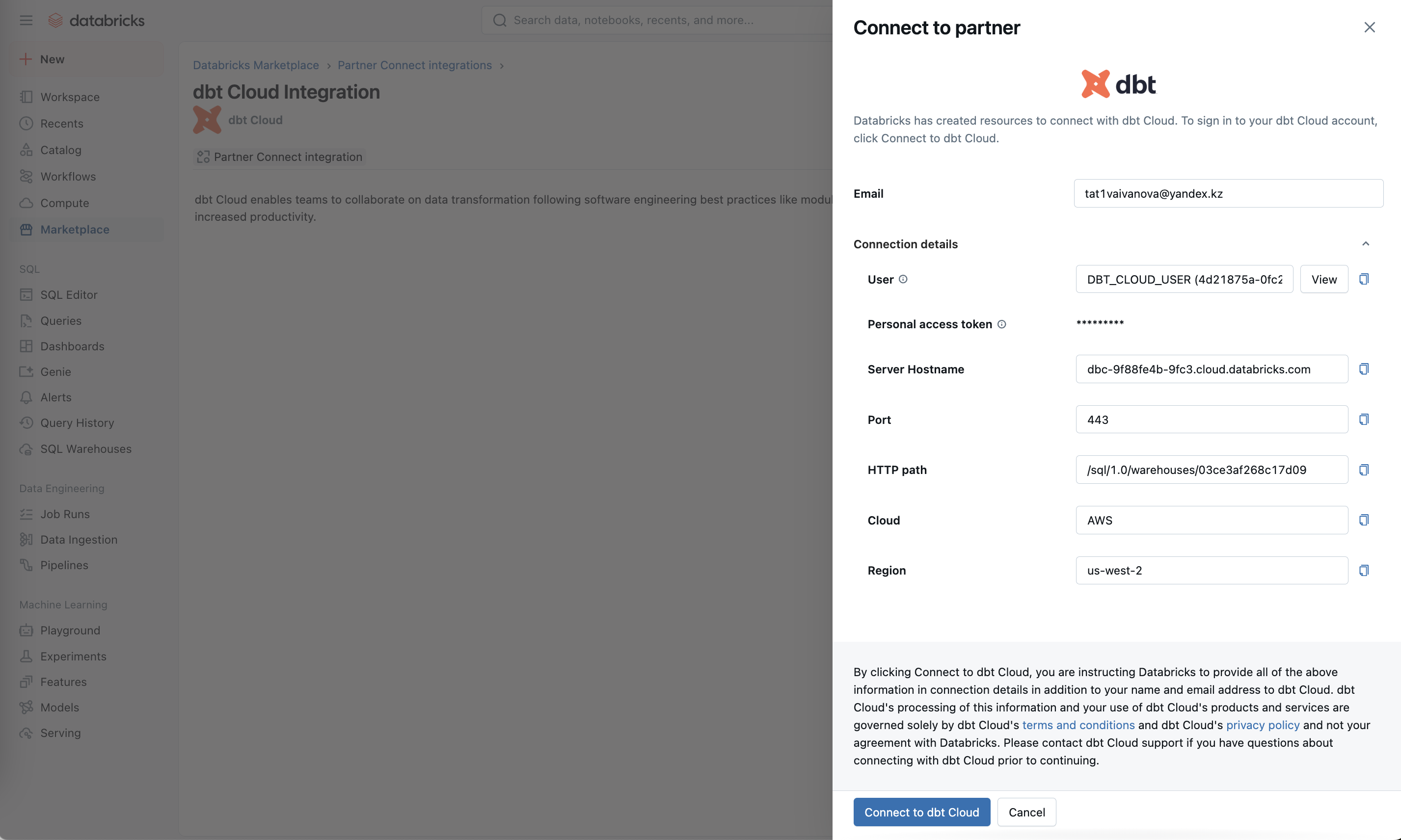
  • Keep reference details such as hostnames, keys and settings visible and copyable at the point where users will need them later.

Watch out

  • Showing every option to avoid recall can tip into clutter and choice overload; show the likely ones and make the rest searchable.
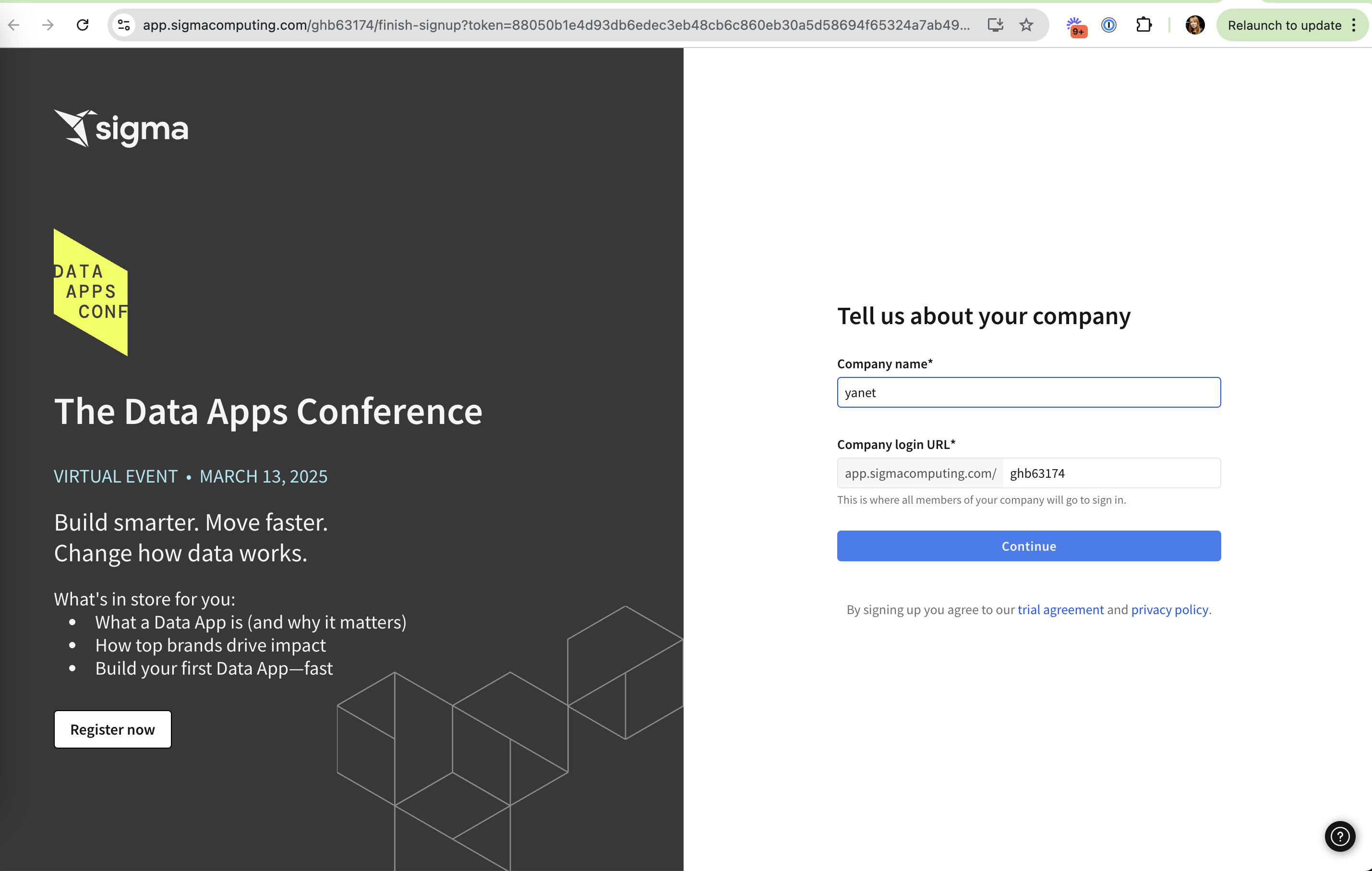
  • Generated defaults that users can't recognize (a random URL slug) are worse than an empty field, because they look intentional.
Related

Recognition over recall in real products 11 working · 3 not

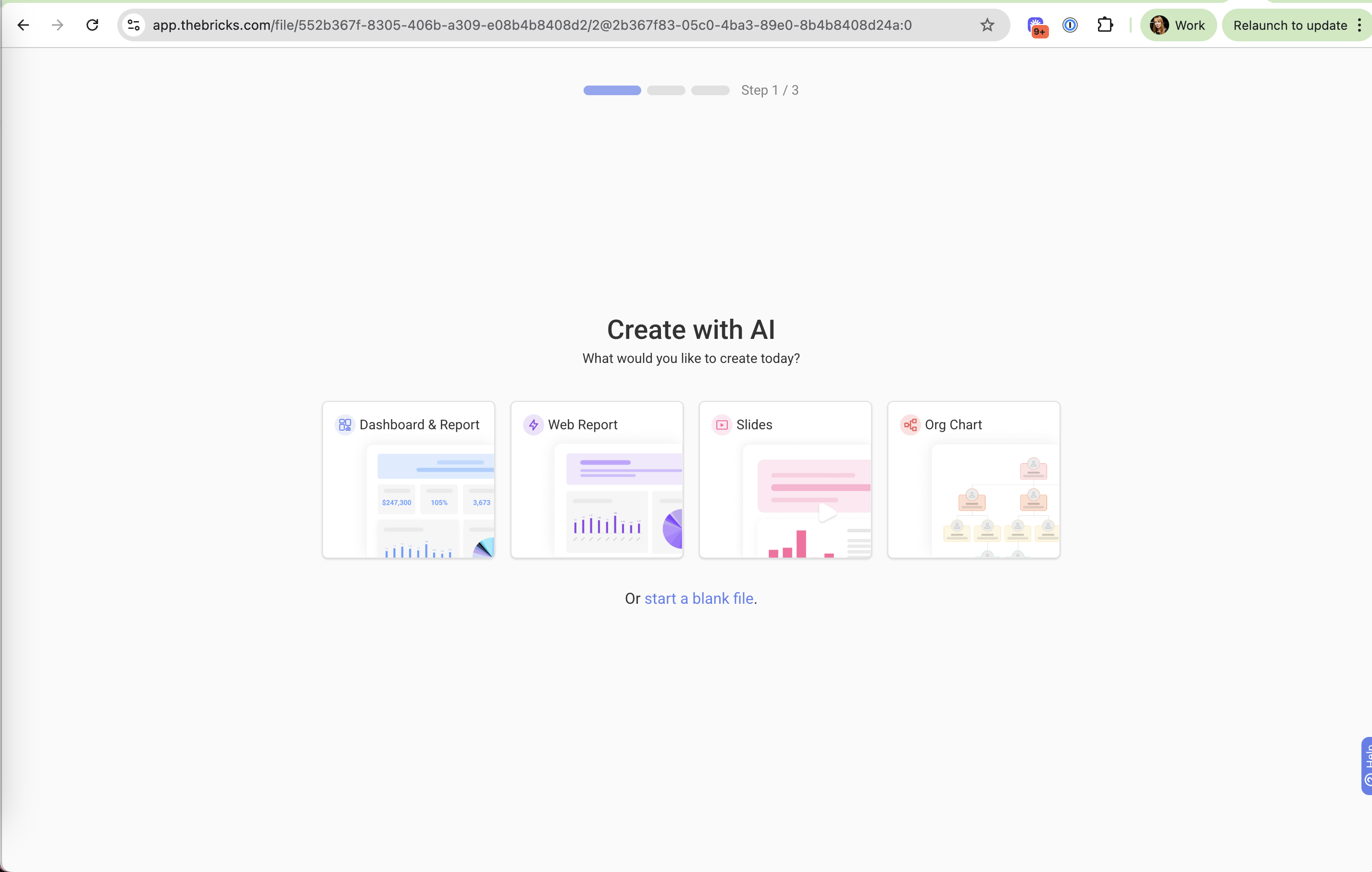
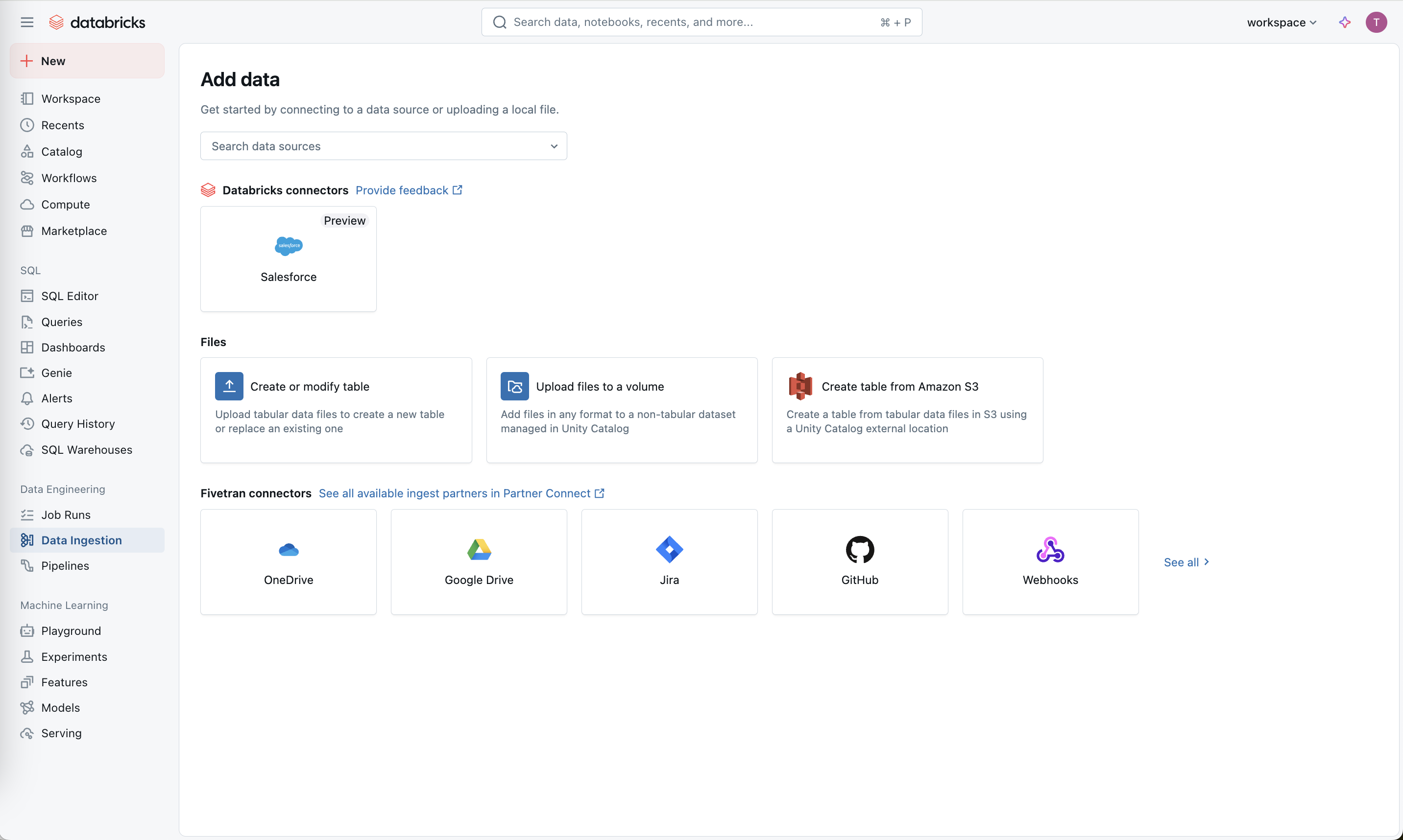
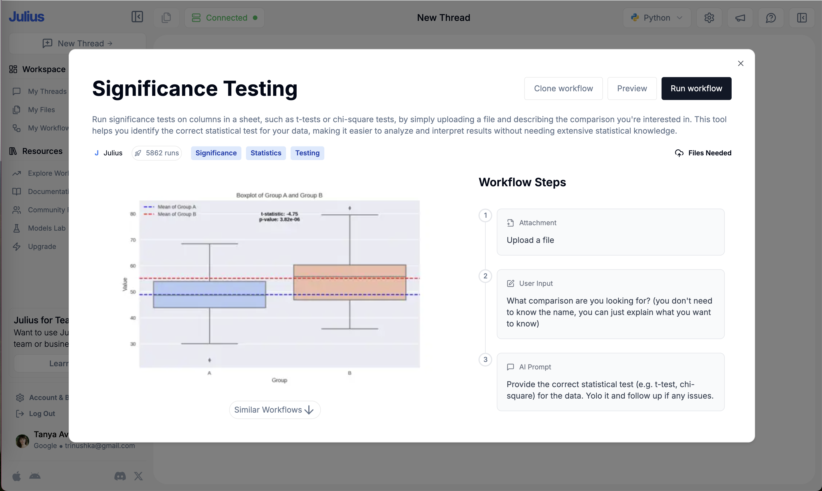
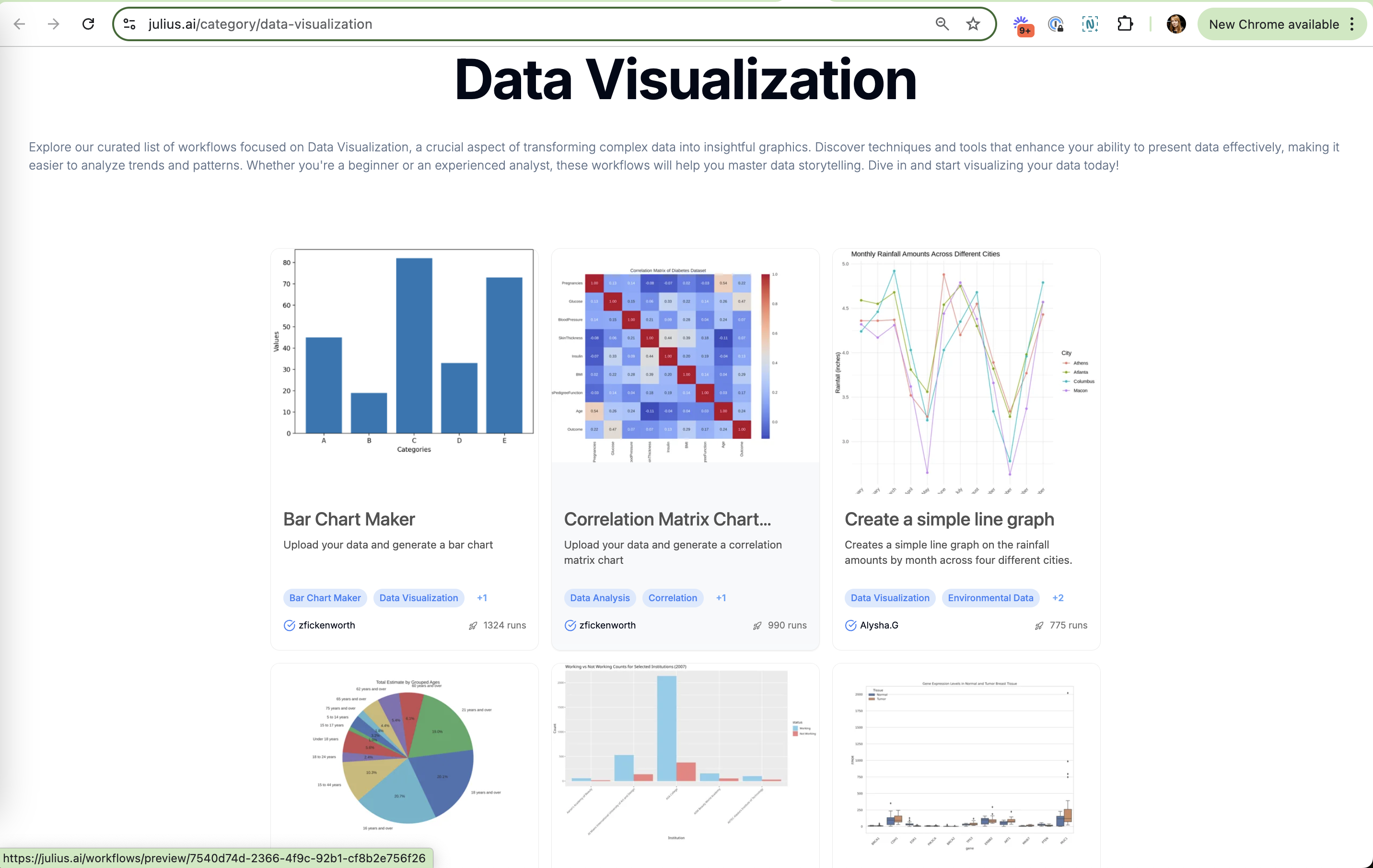
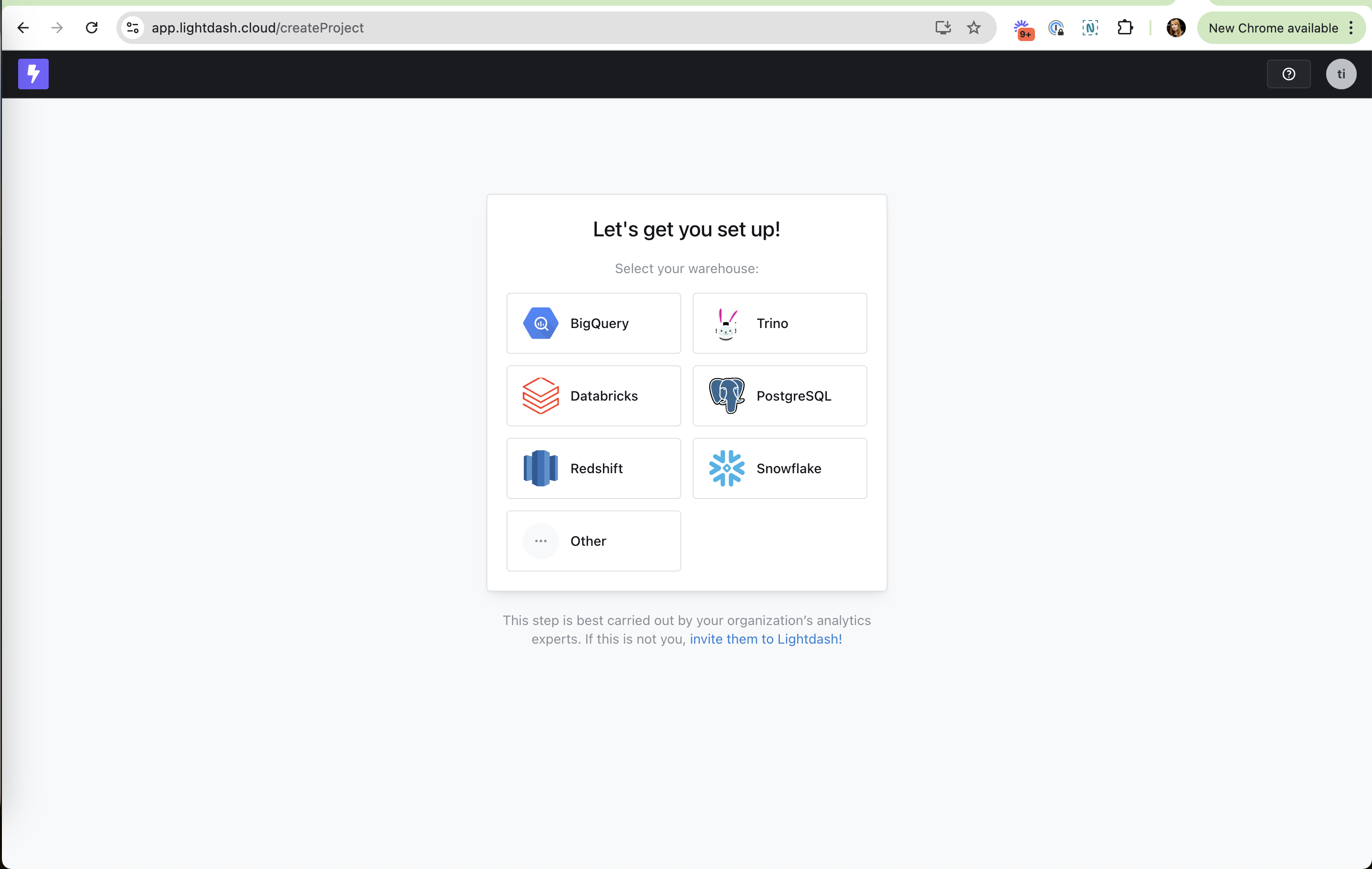
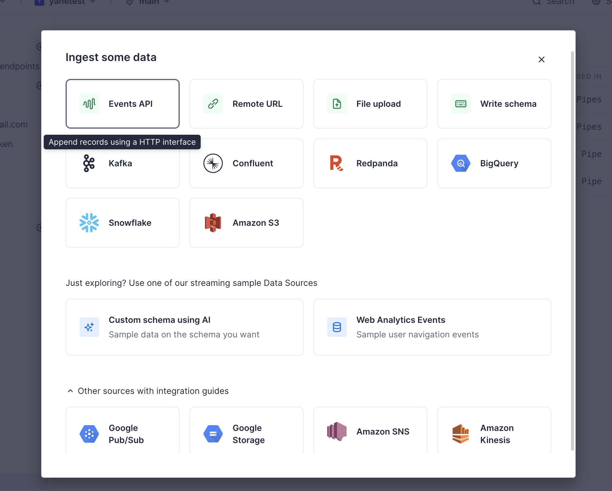
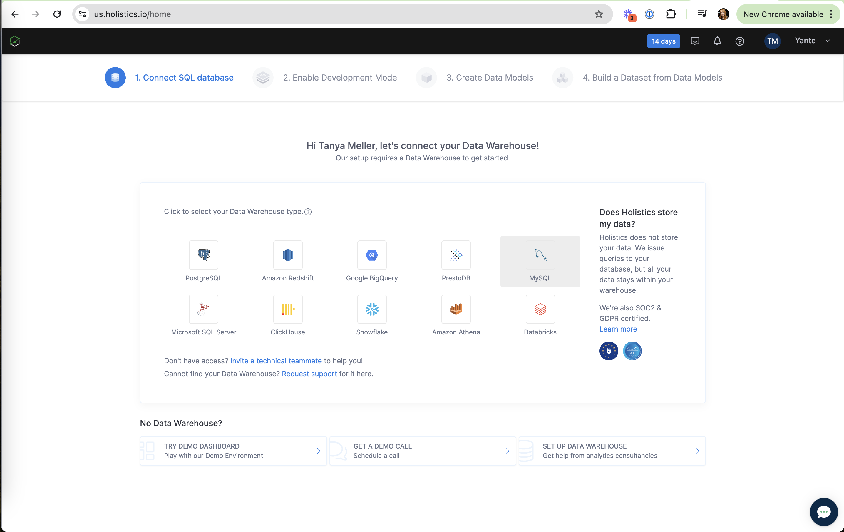
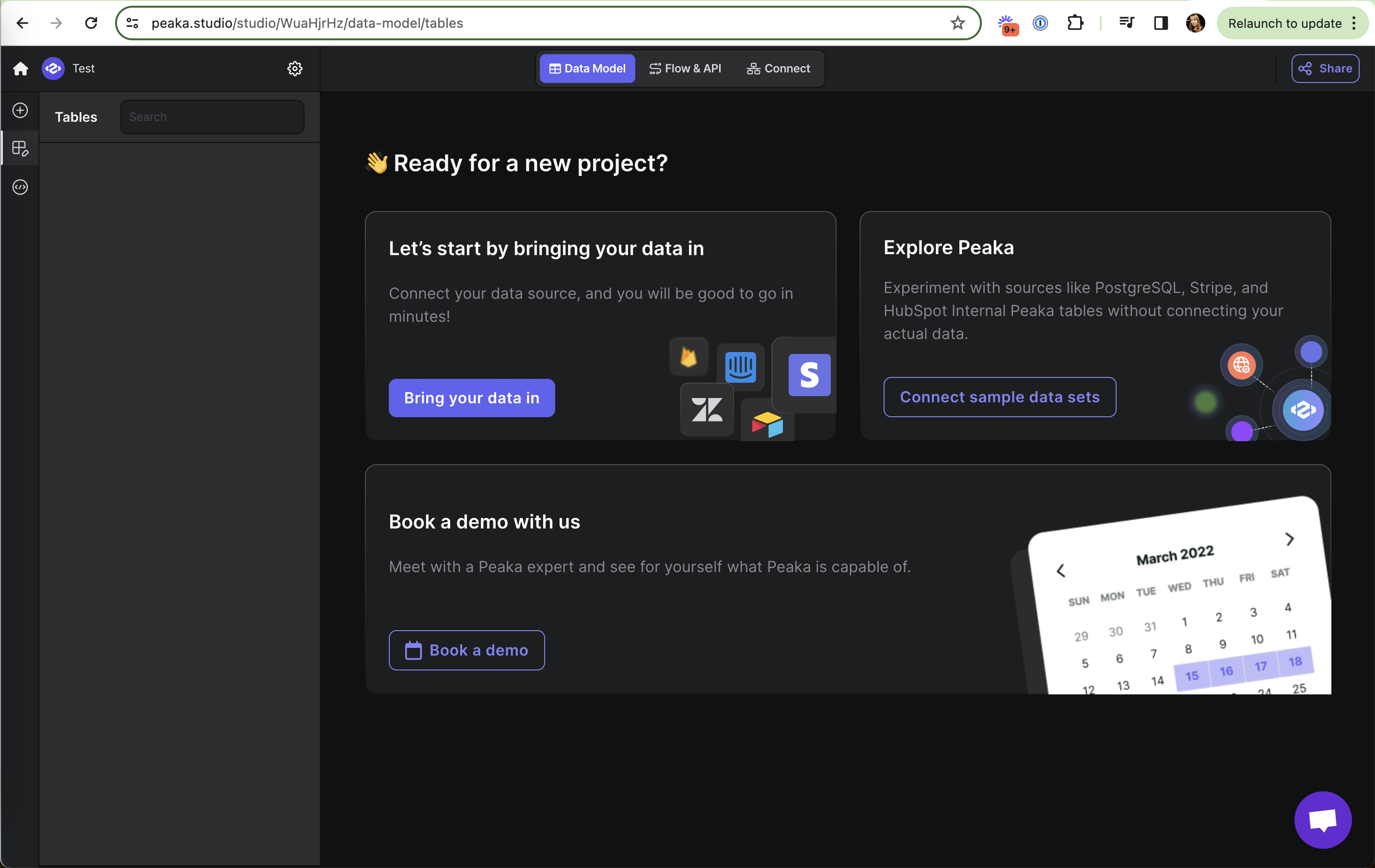
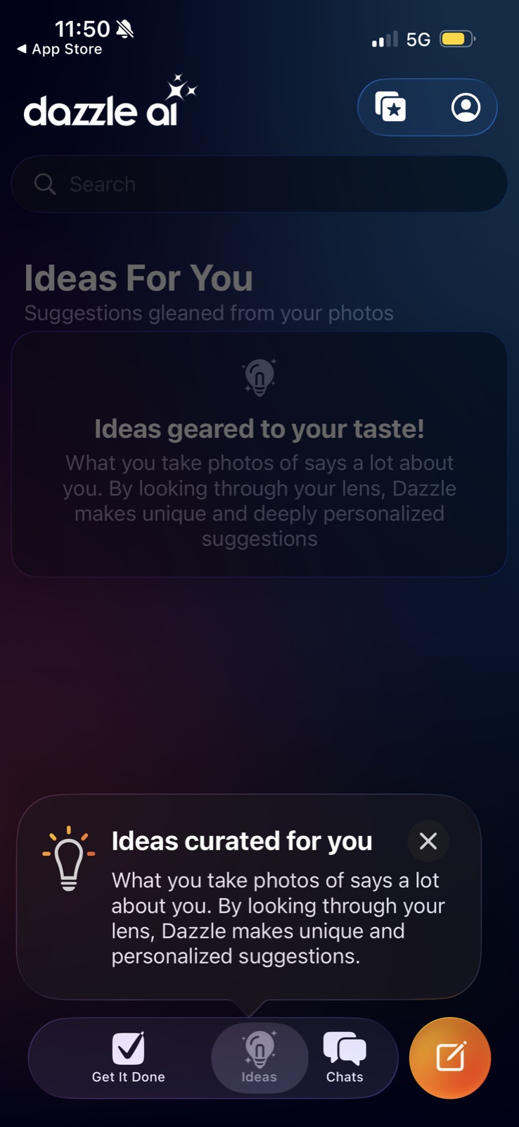
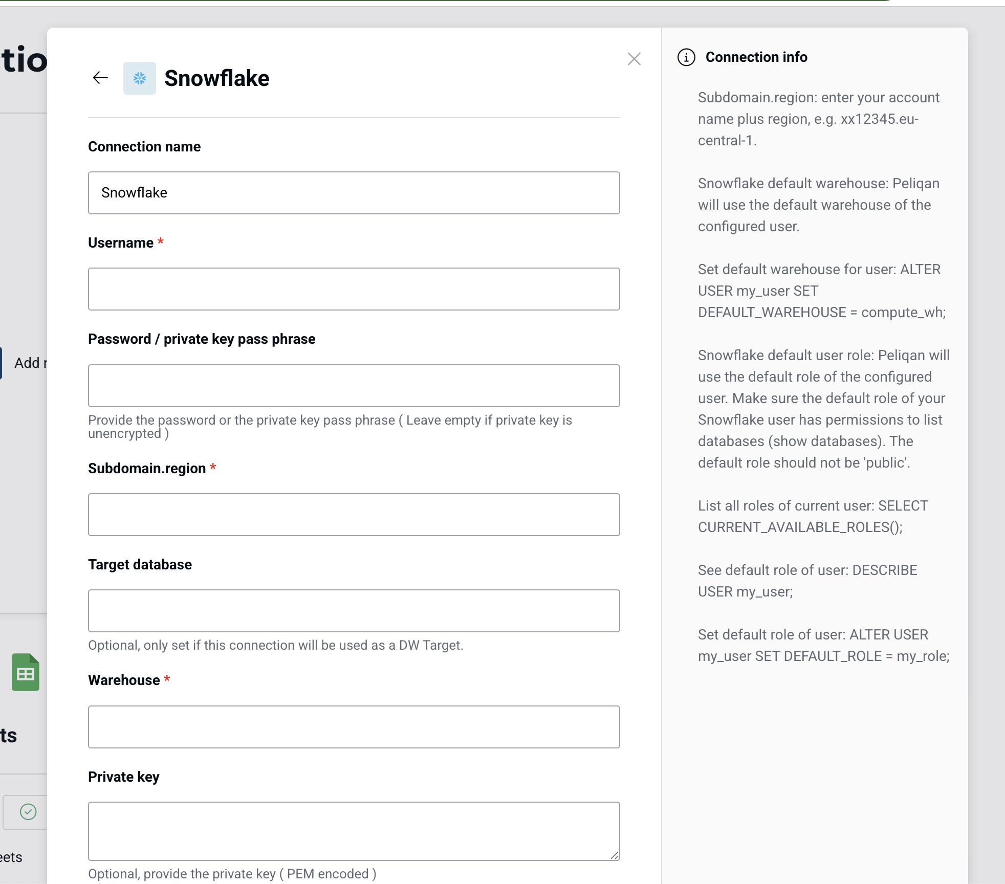
Cube Cloud: Logos for recognition Cube Cloud (working) Logos for recognition Each database is a big logo tile, quick to scan for your own stack. Bricks: Output types as chips Bricks (working) Output types as chips AI Dashboard, AI Sheet and AI Slides show the range without a menu. Bricks: Cards preview the output Bricks (working) Cards preview the output Each option shows a thumbnail of what it makes. Databricks: Details with copy buttons Databricks (working) Details with copy buttons Hostname, port, HTTP path, cloud and region are visible and copyable for anyone who needs to set it up by hand later. Databricks: Partner connectors by logo Databricks (working) Partner connectors by logo OneDrive, Google Drive, Jira, GitHub and Webhooks via Fivetran, with "See all" for the long tail. Julius: Plain-language input Julius (working) Plain-language input "You don't need to know the name, you can just explain what you want to know". Julius: Gallery of chart types Julius (working) Gallery of chart types Bar, correlation matrix, line, pie: you pick the picture you want and the workflow comes with it. Lightdash: Logos, not a form Lightdash (working) Logos, not a form Six warehouse tiles with familiar logos are quick to scan. Tinybird: Sources as tiles Tinybird (working) Sources as tiles APIs, files and connectors in one grid with logos. Holistics: Logo grid of warehouses Holistics (working) Logo grid of warehouses Ten recognisable logos make picking your stack one click. Peaka: Bring your own data Peaka (working) Bring your own data Primary CTA with familiar source logos (Stripe, Zendesk, Airtable). Dazzle AI: Unlabeled header icons Dazzle AI (not working) Unlabeled header icons Two icons with no labels; it is unclear what the starred-photos one does. Snowflake: Random URL slug Snowflake (not working) Random URL slug The login URL is prefilled with "ghb63174" instead of something based on the company name. Peliqan: SQL as grey prose Peliqan (not working) SQL as grey prose ALTER USER and SELECT commands are set in body text with no code style or copy button, so they're hard to grab.