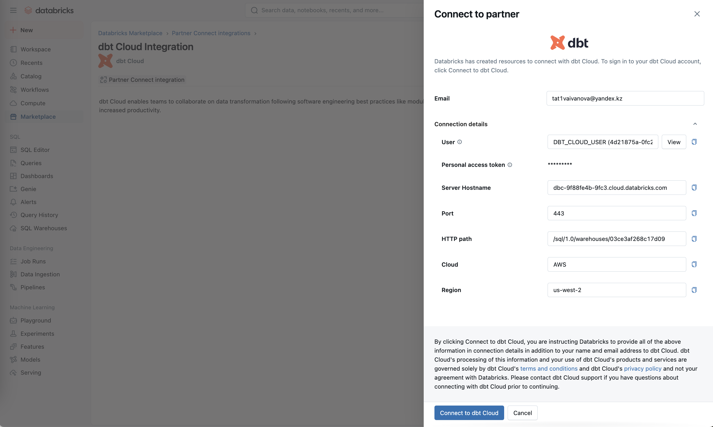
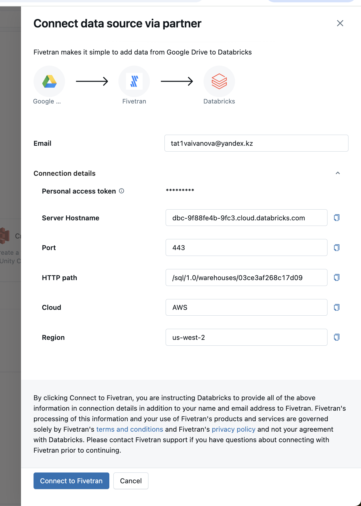
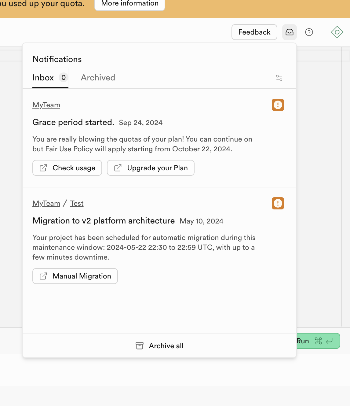
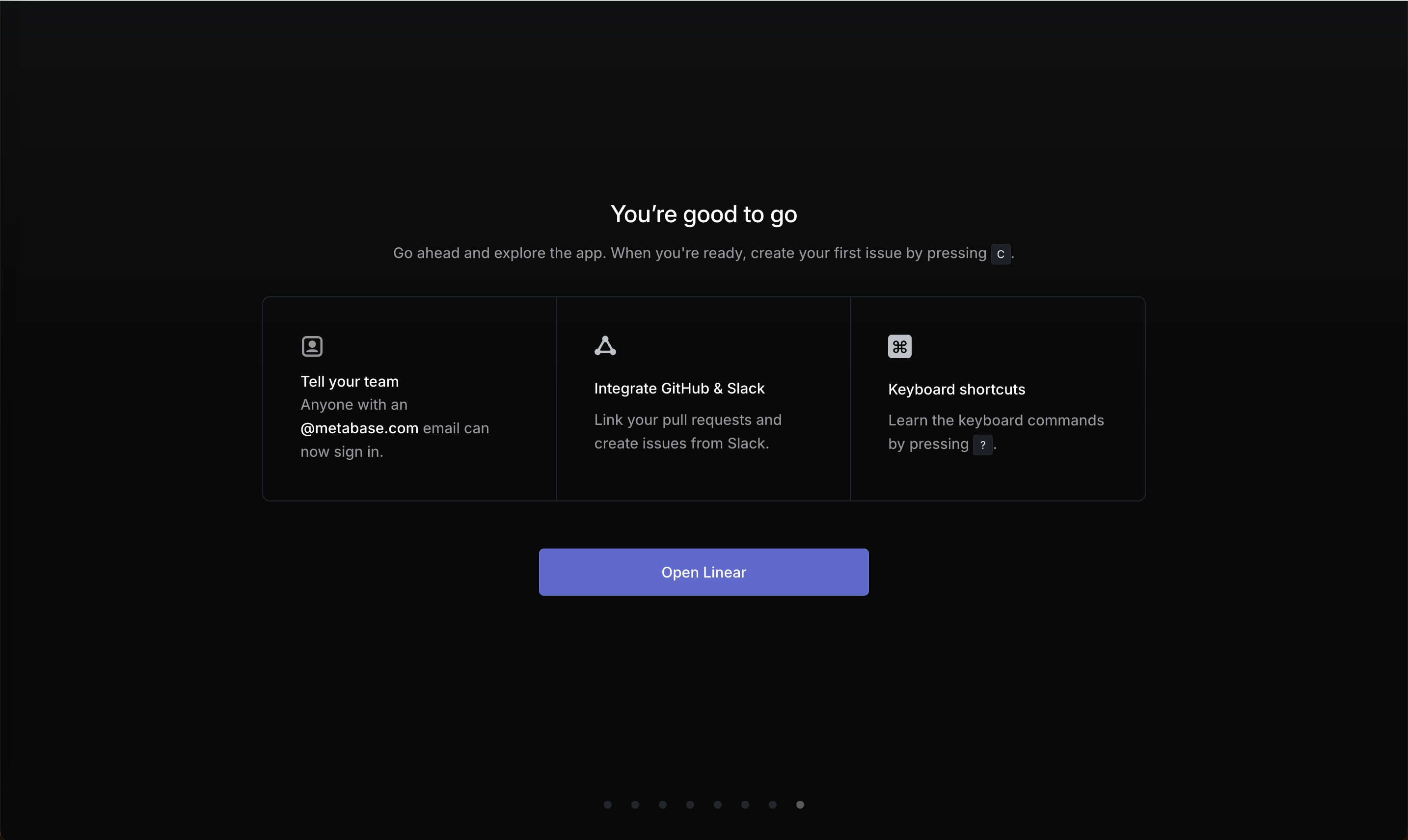
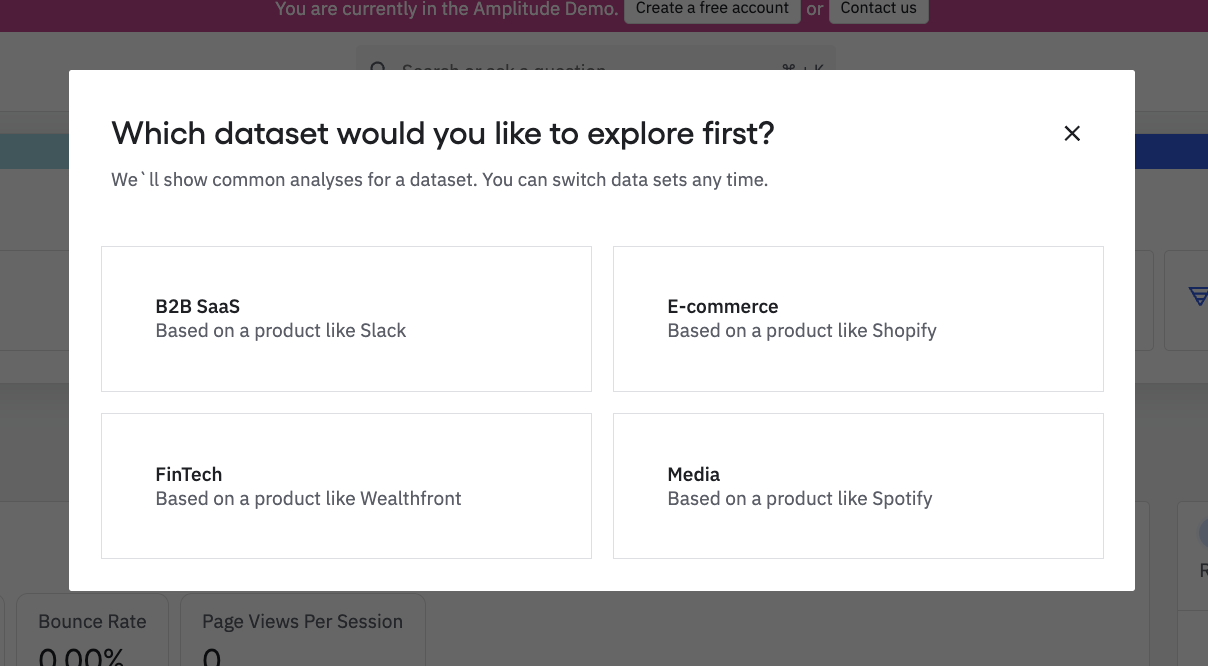
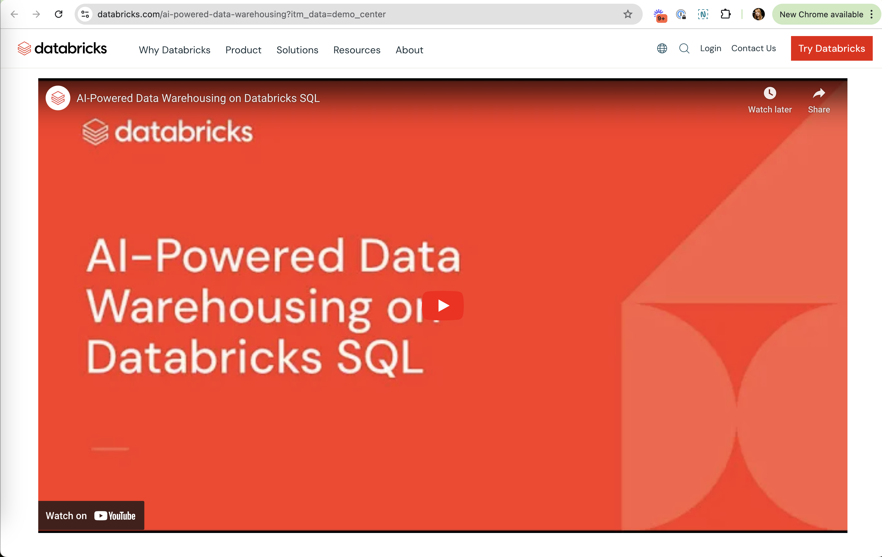
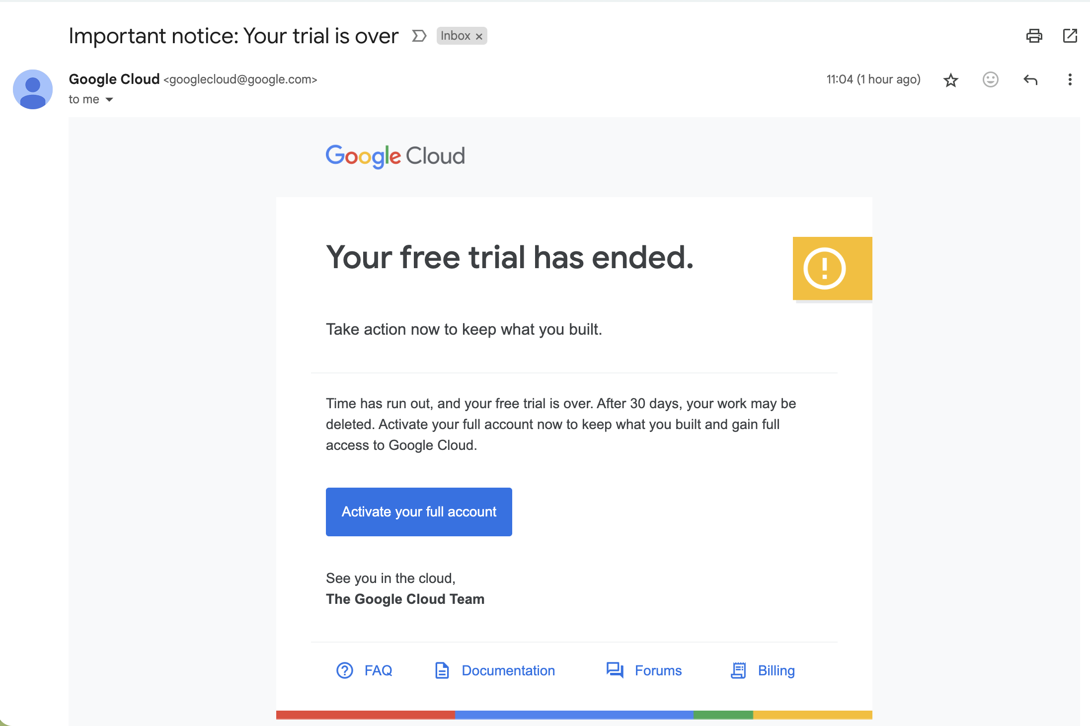
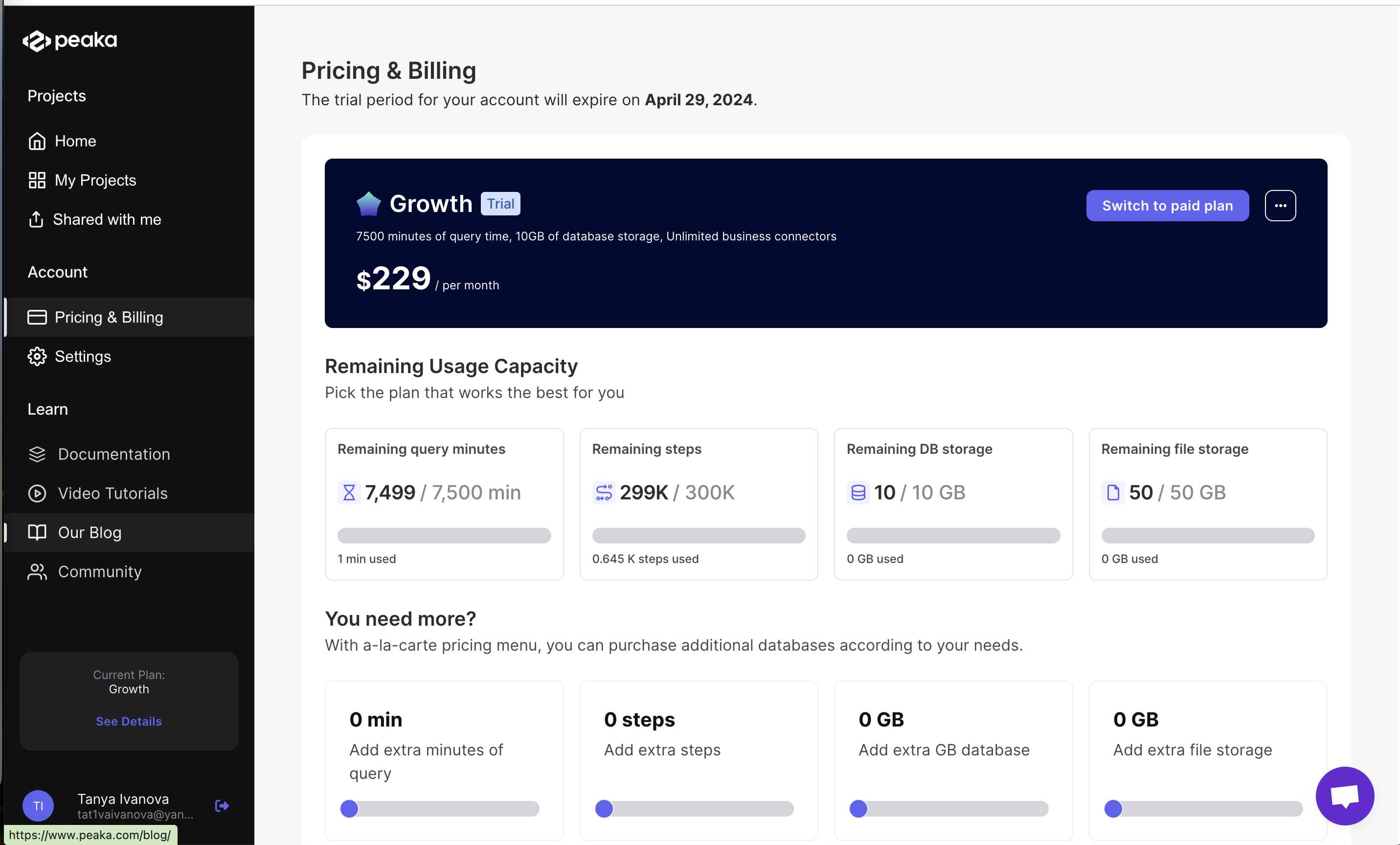
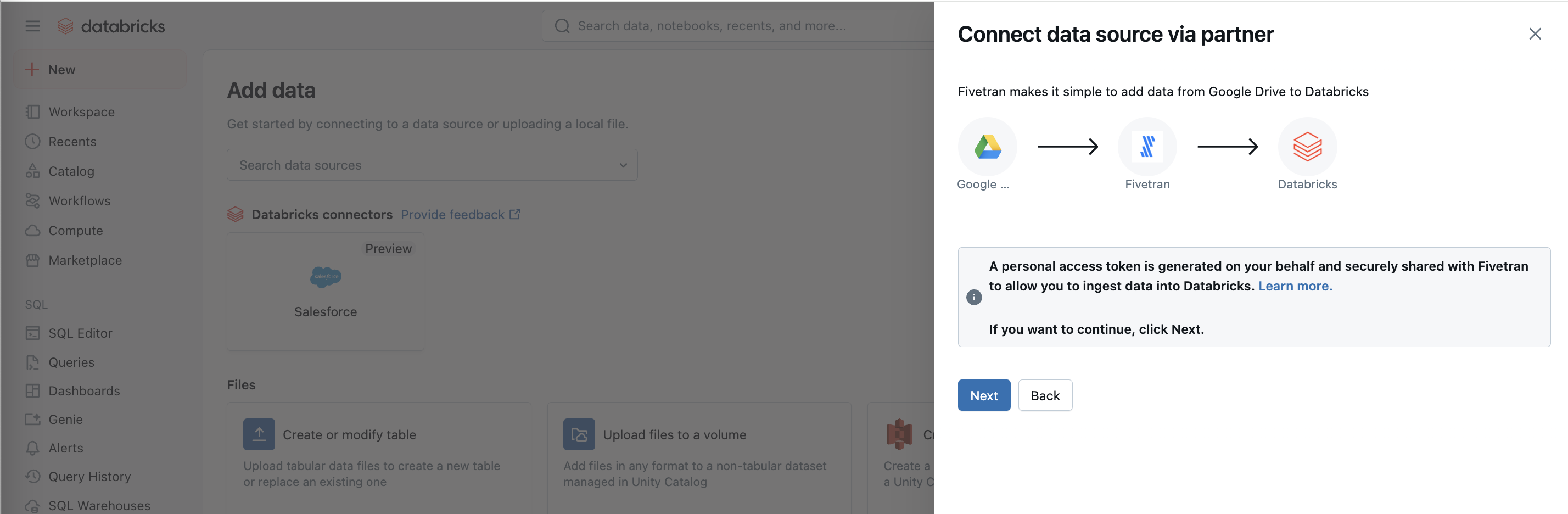
A clear call to action (CTA) is a single primary button whose label names the action or destination: "Connect to dbt Cloud", "Start my trial", "Switch to paid plan". On the site, vague labels like "Next" or "Learn more" on an upgrade banner count against this, as do screens with several competing primary buttons.
Research on behavior change backs the value of specific next steps. Leventhal, Singer and Jones (1965) found that students were far more likely to get a tetanus shot when the leaflet included specific instructions, such as a campus map and a prompt to plan when to go, regardless of how frightening the message was. Gollwitzer (1999) reviewed work showing that if-then plans tying a goal to a concrete action in a concrete situation help people follow through. NN/g's Katie Sherwin (2015) shows that generic "Learn more" labels leave users unsure where a link leads.
In an upsell, the CTA is where intent turns into action. If the button reads "Learn more" or opens an external page, the moment passes.
How to use it
- Make one button primary per screen and style the alternatives as secondary or text links.
- Label buttons with verb plus object ("Upgrade to Pro", "Connect Fivetran"), not "Next", "Continue" or "Learn more".
- Make the button lead to the action it names; an upgrade CTA should land on checkout or plan choice, not a docs page.
Watch out
- Making the paid option the only visible button and hiding the free or cancel path crosses into a dark pattern.
- Labels that overpromise ("Get started free" leading to a card form) break trust at the next screen.