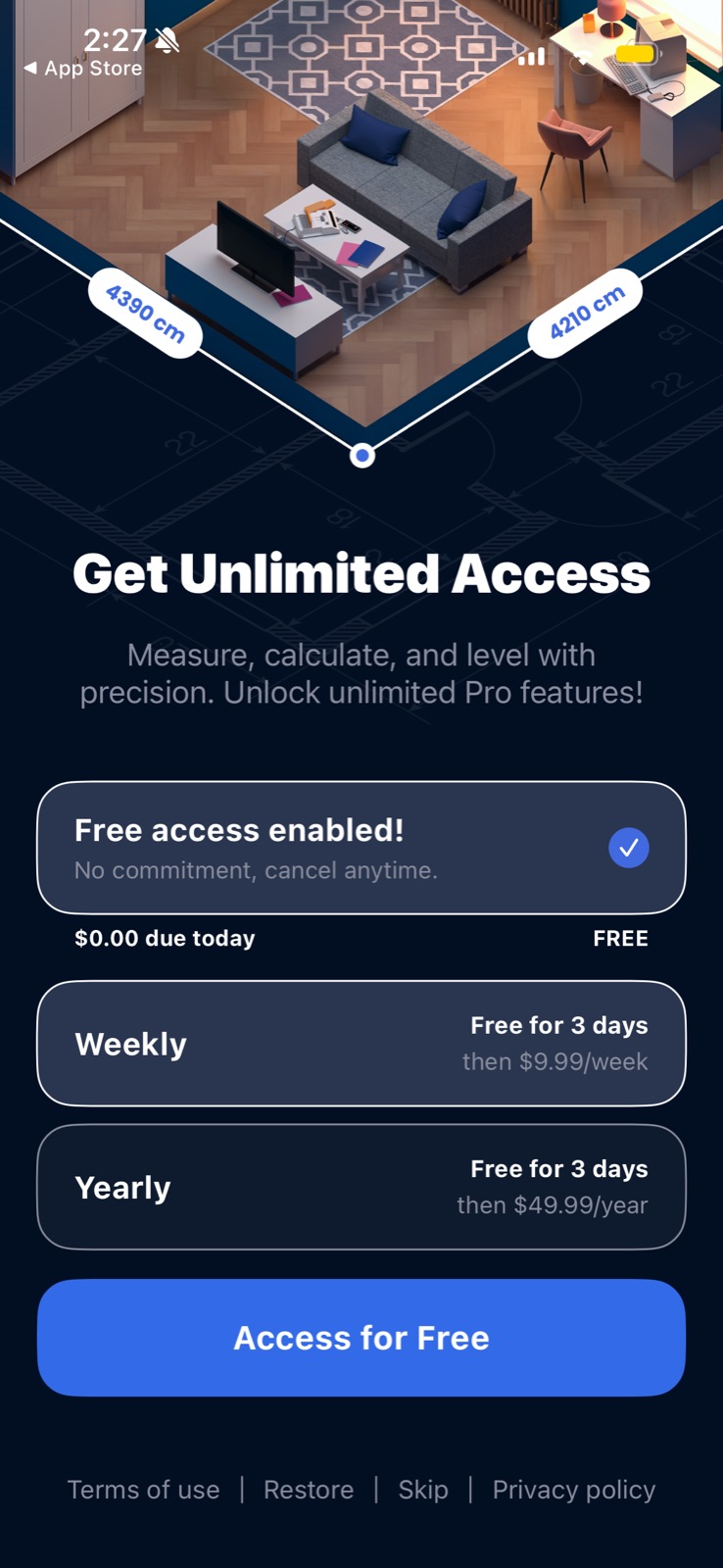
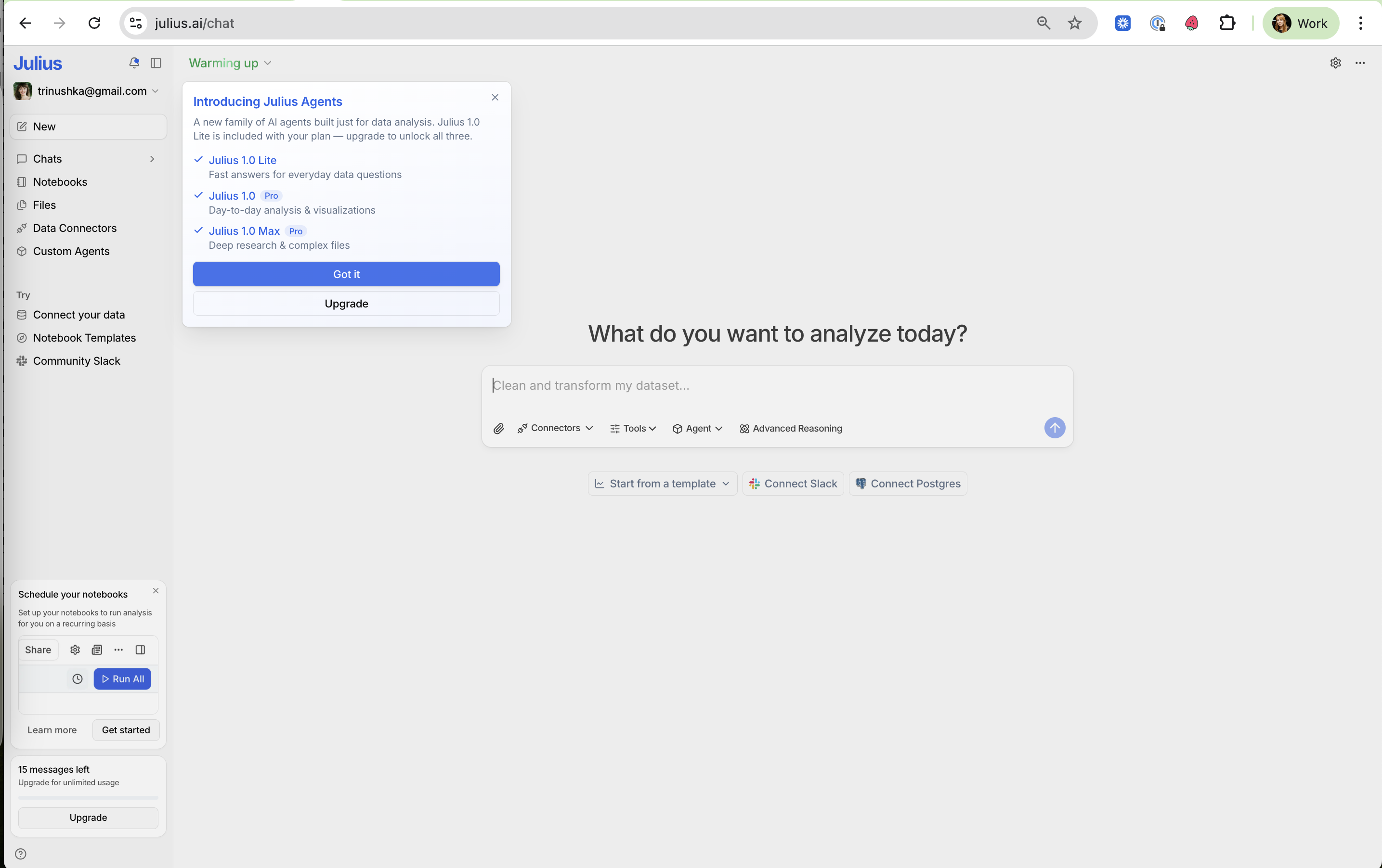
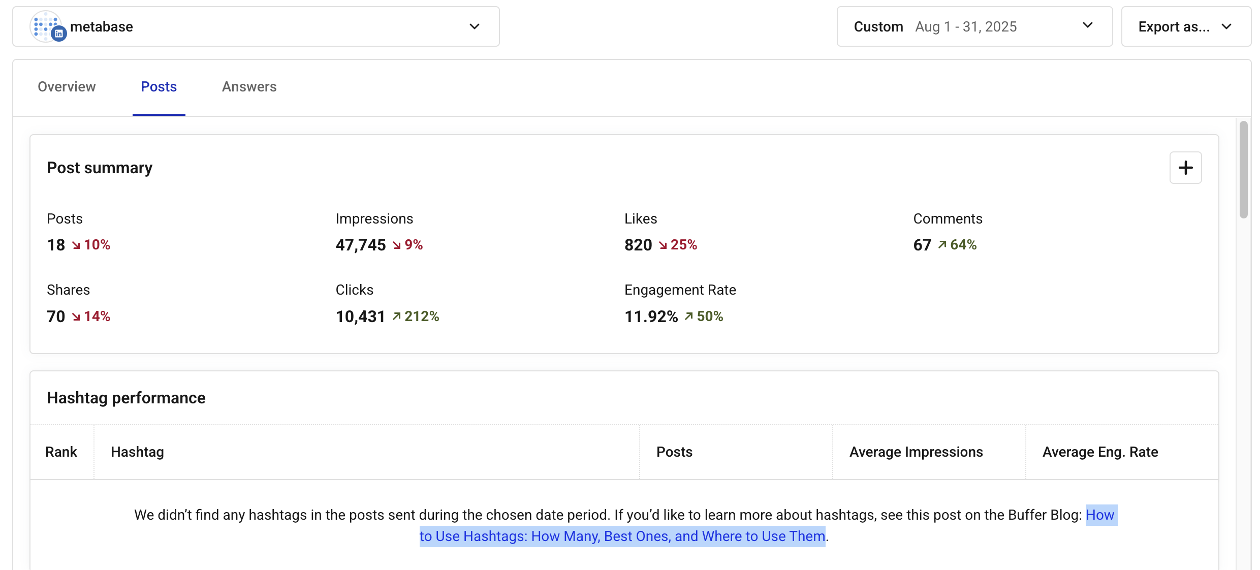
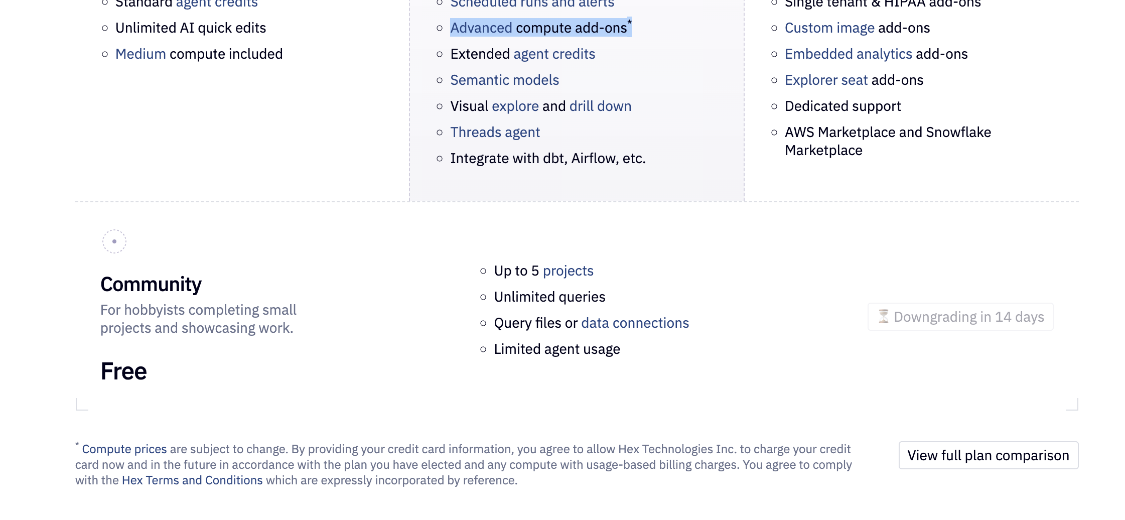
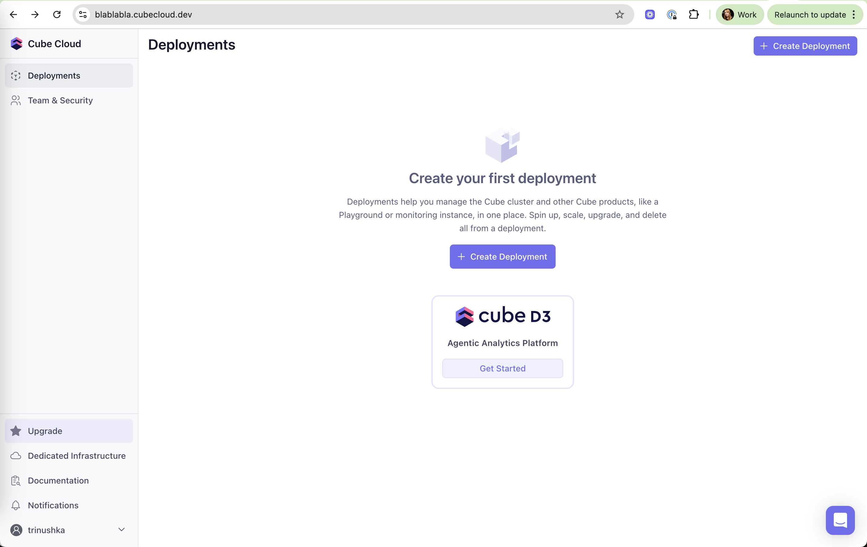
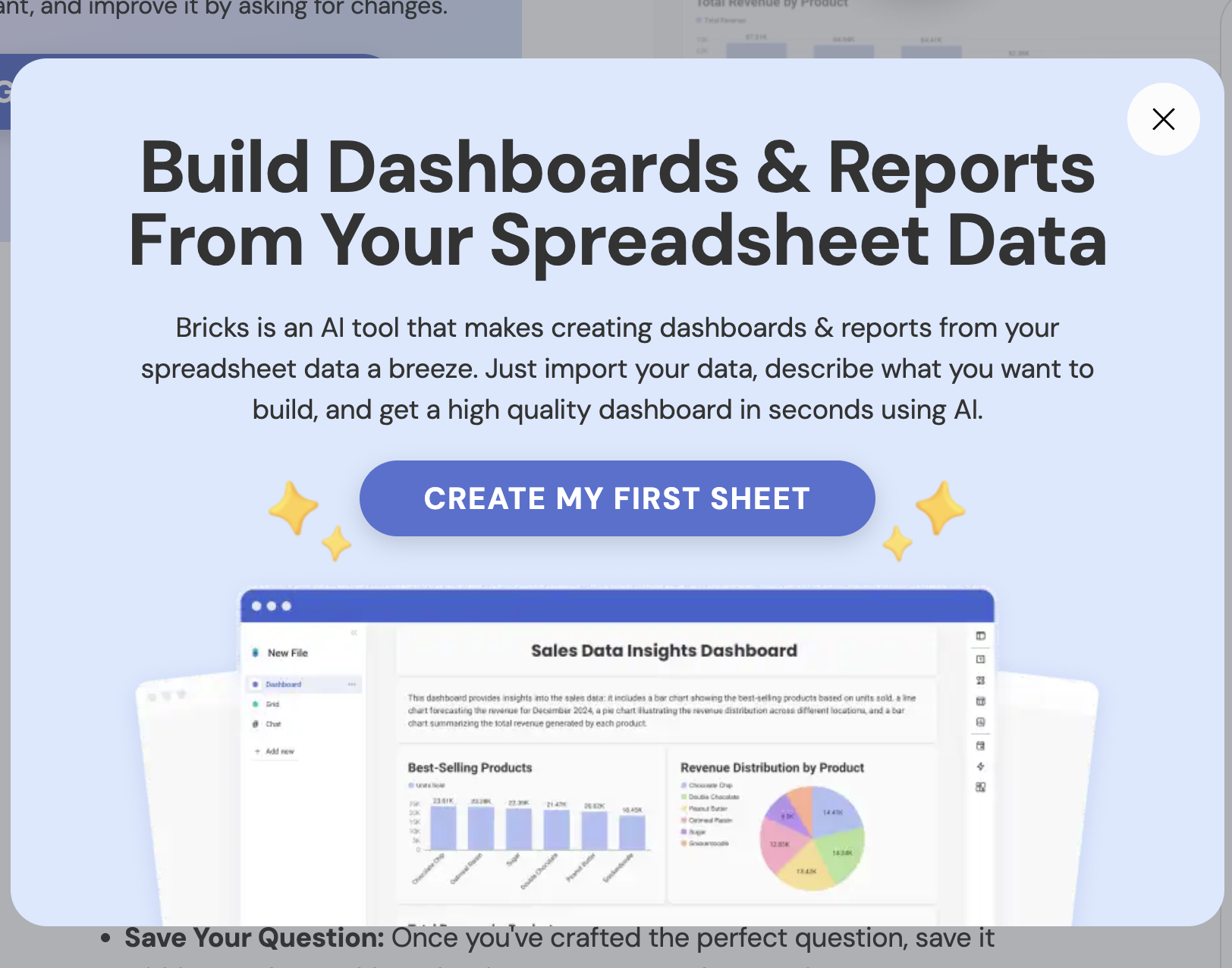
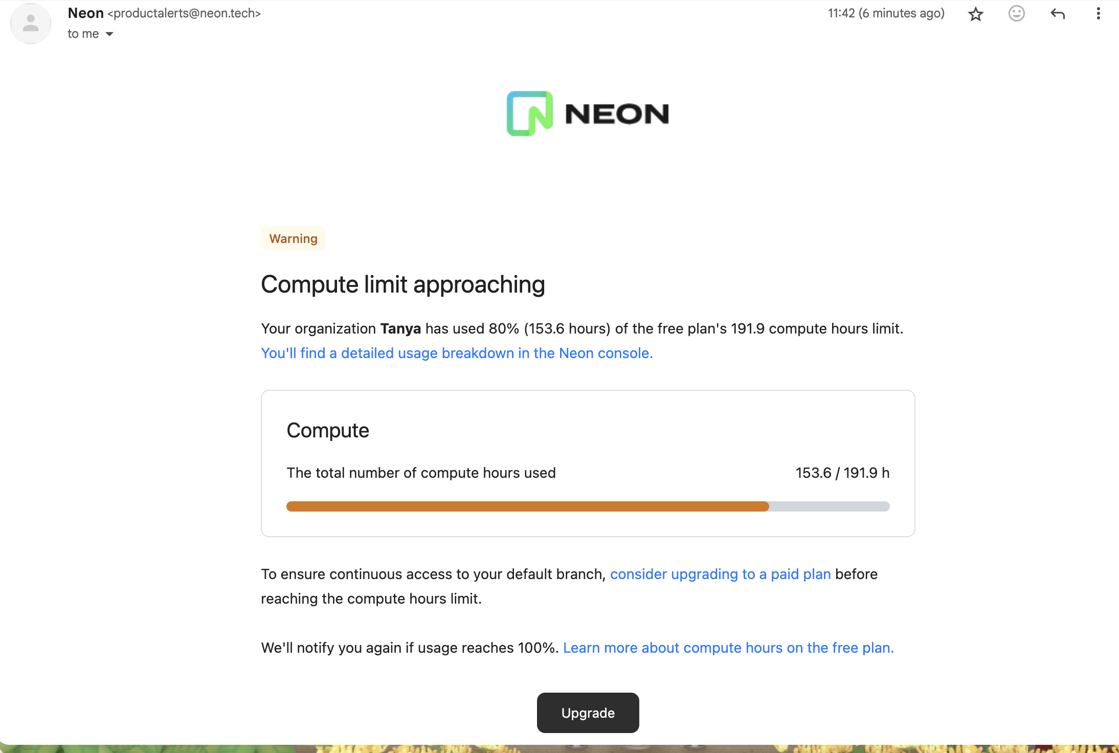
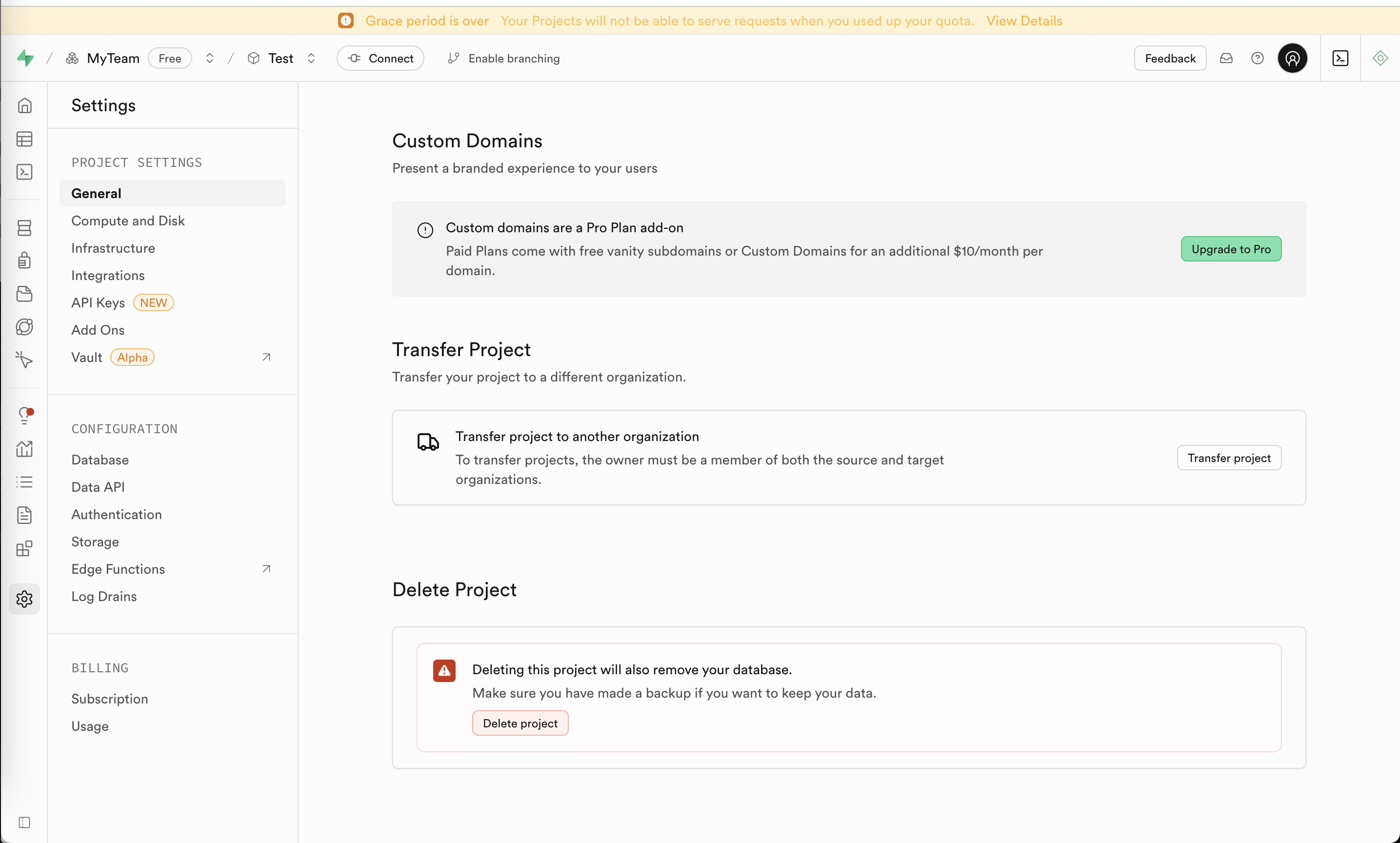
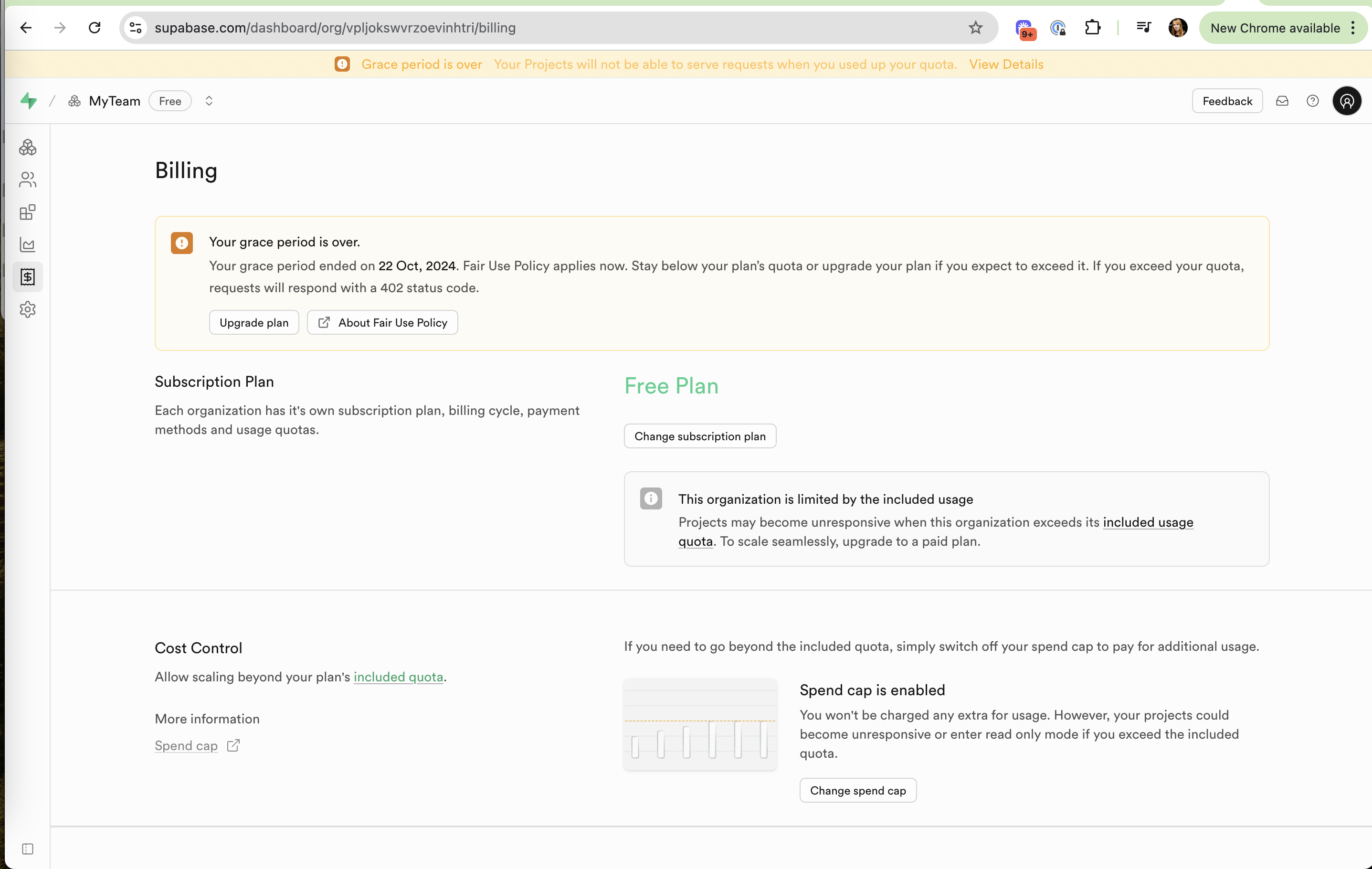
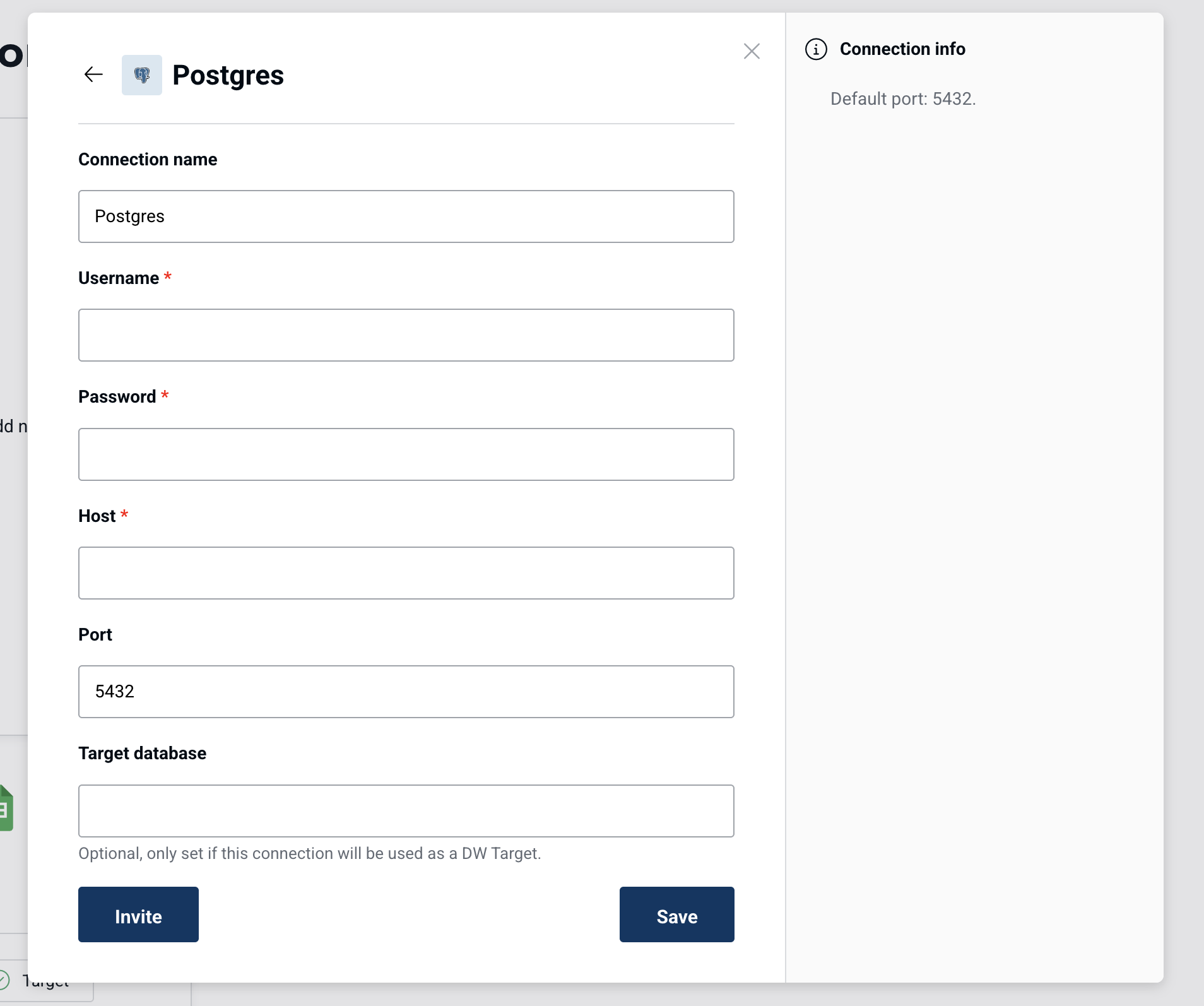
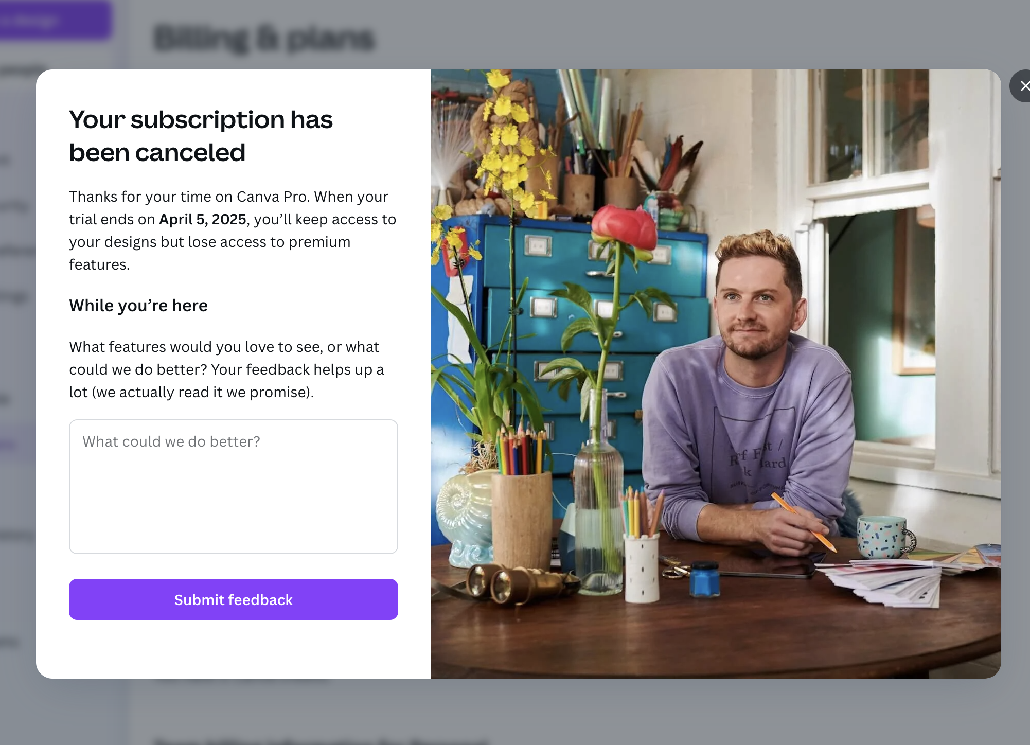
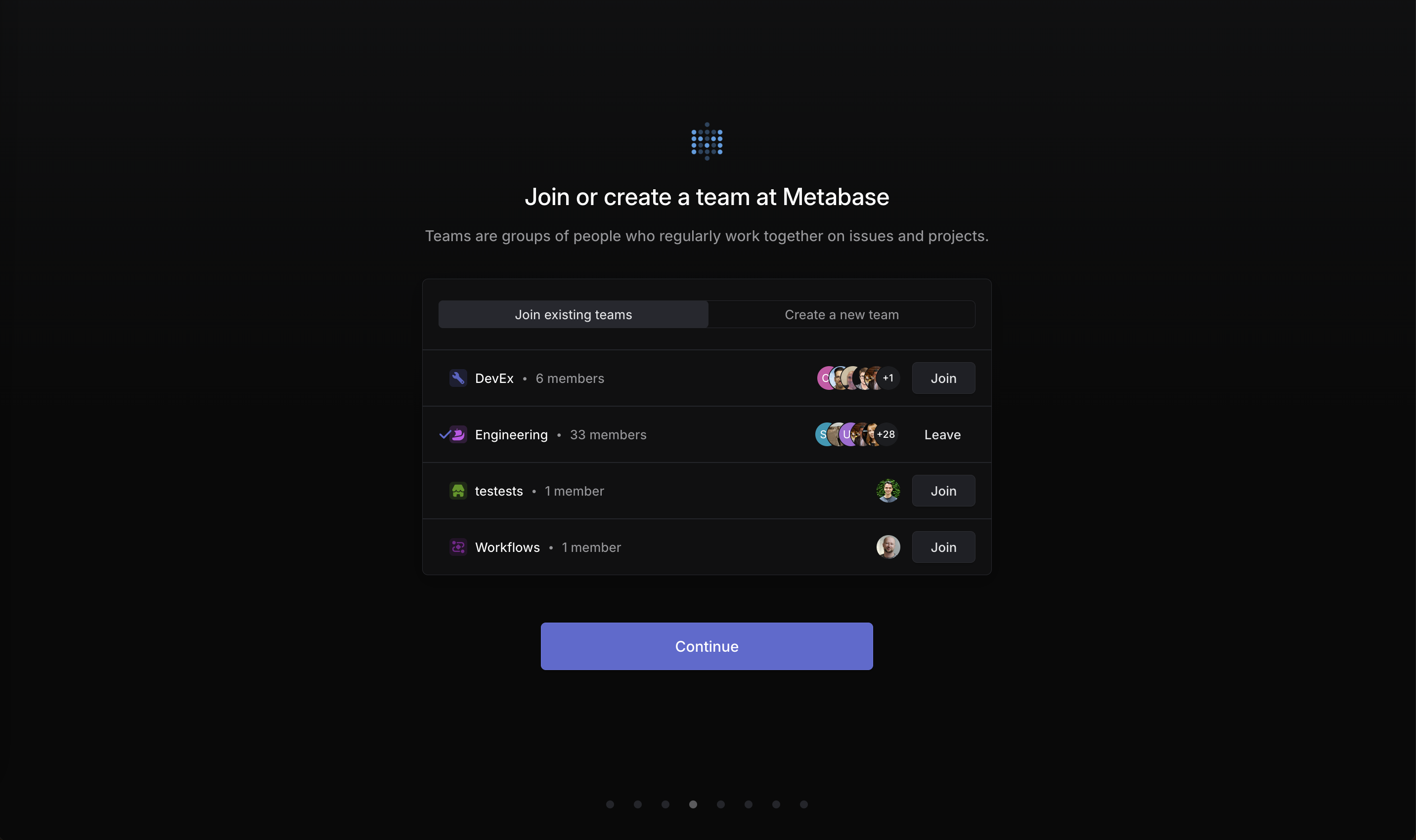
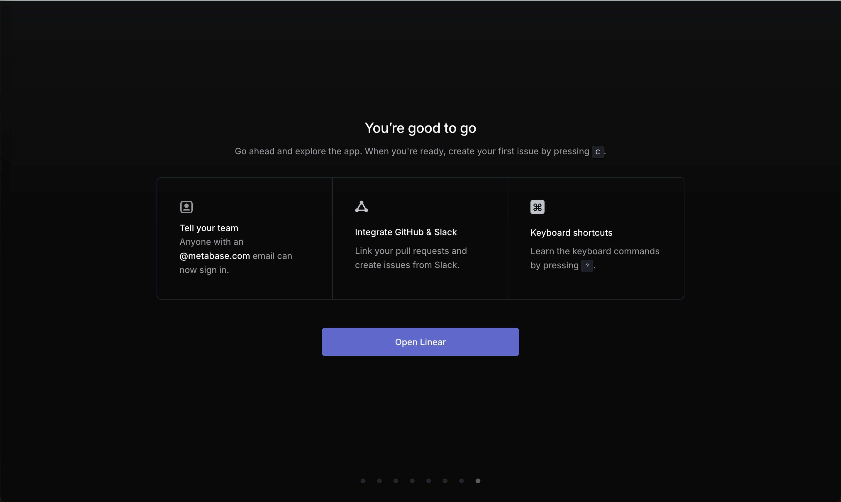
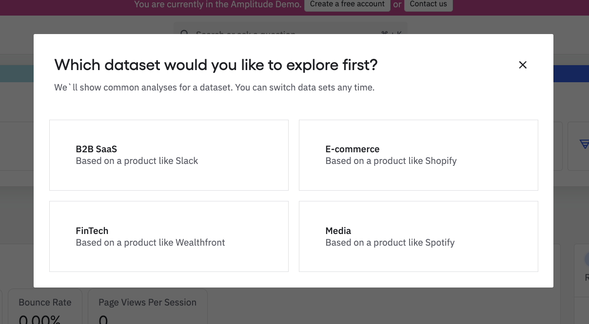
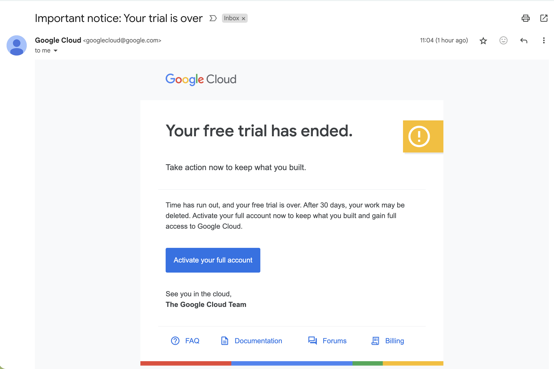
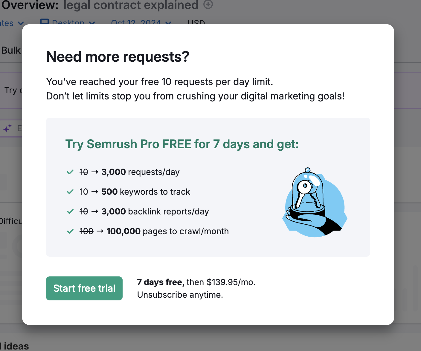
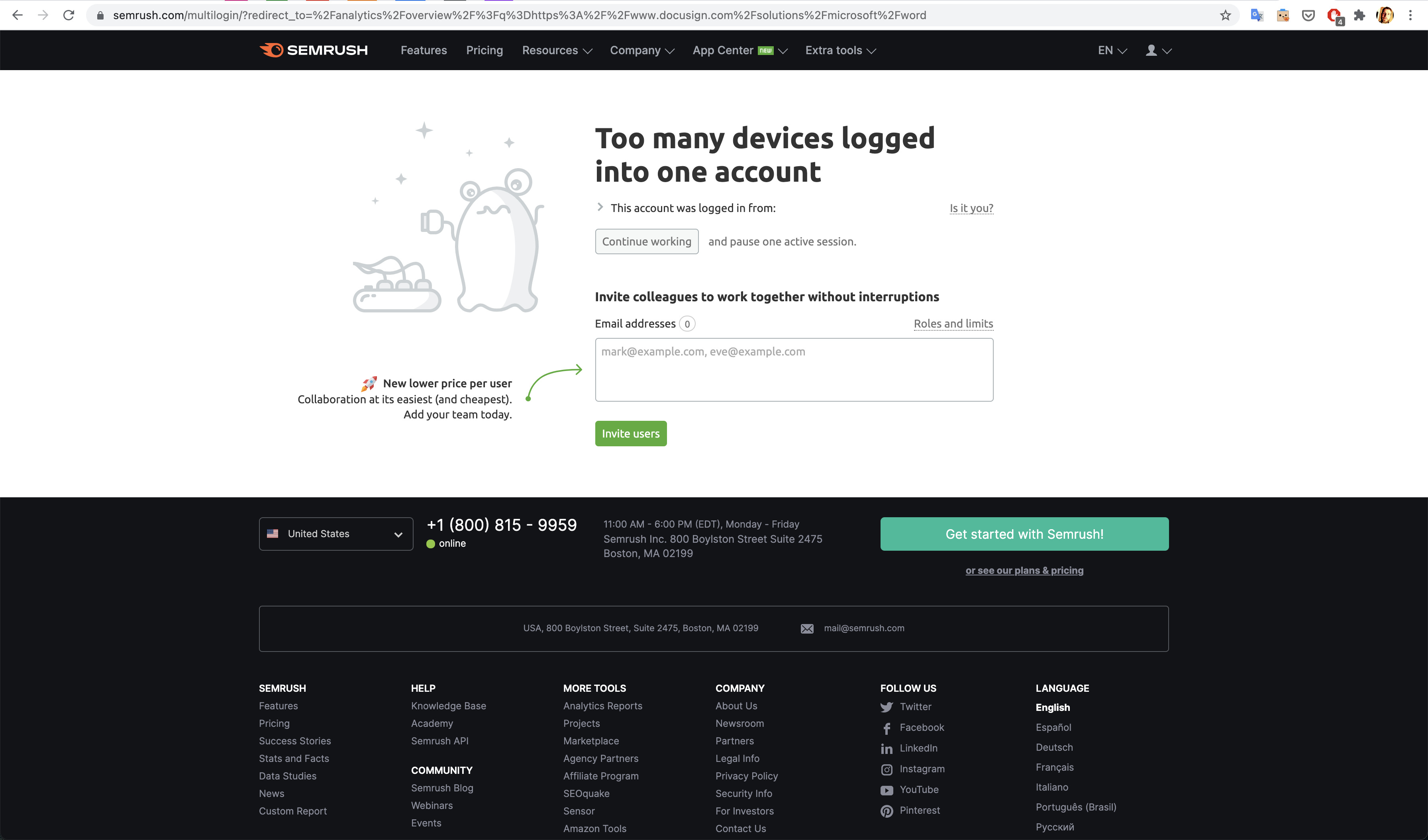
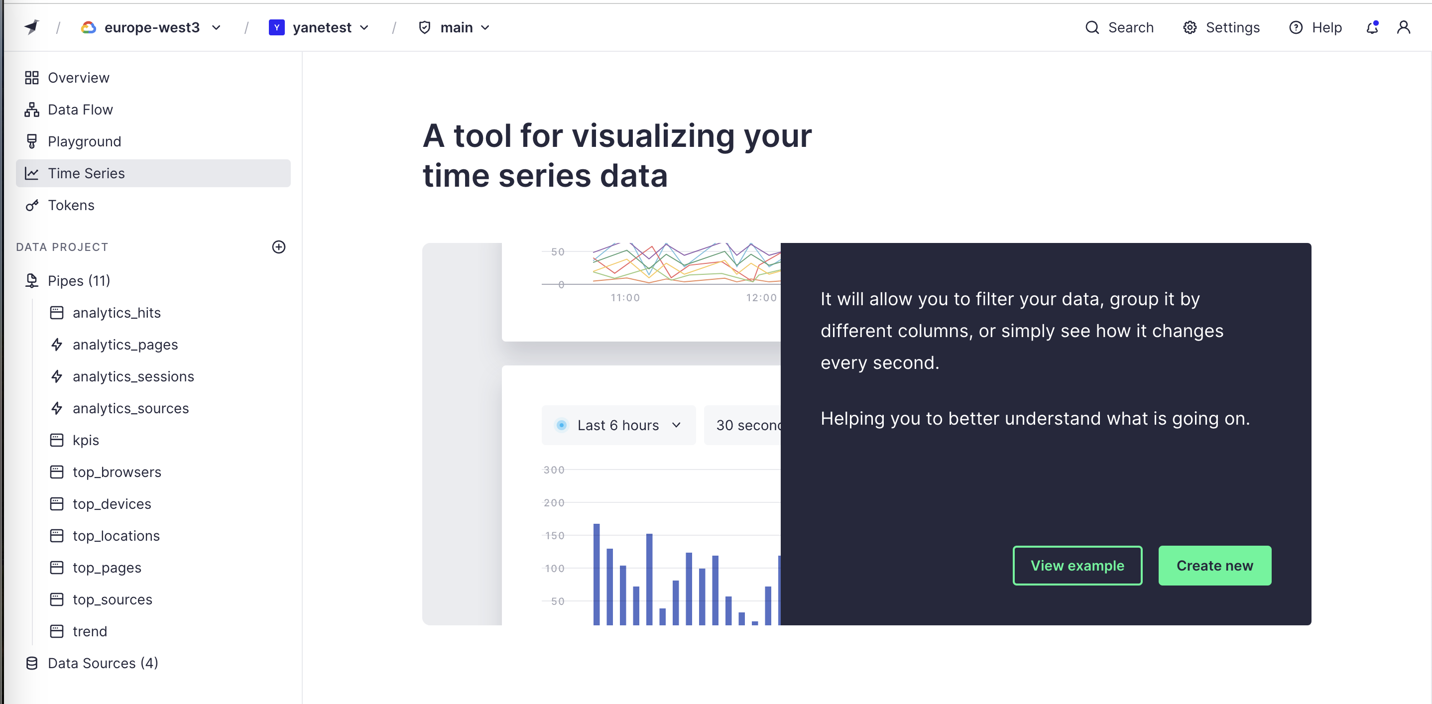
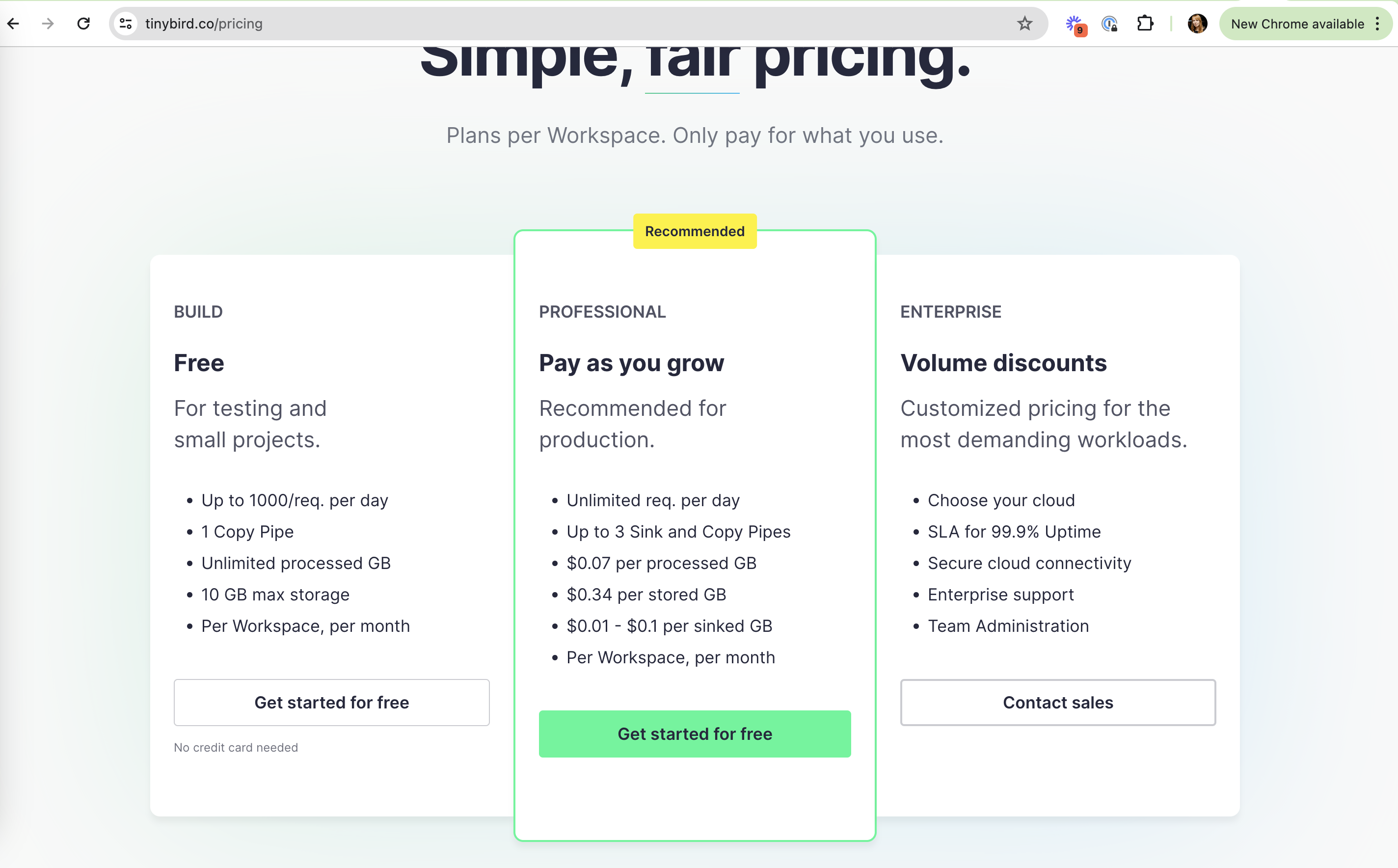
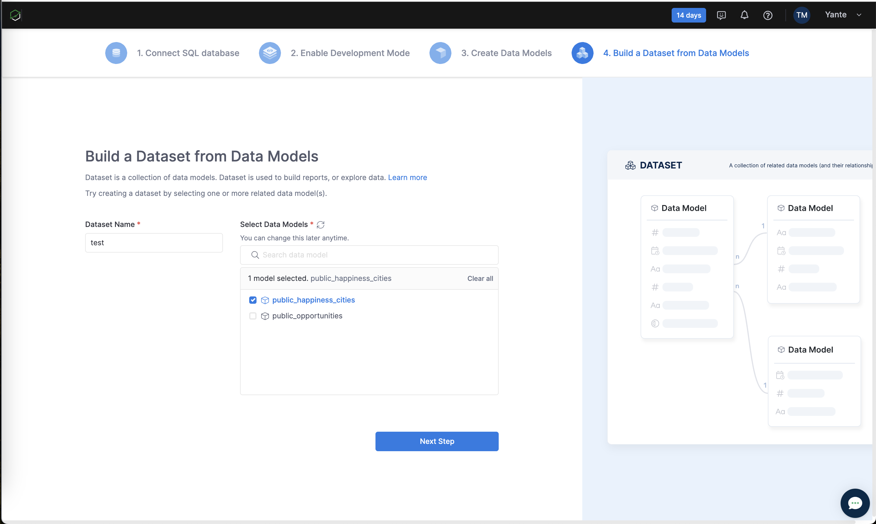
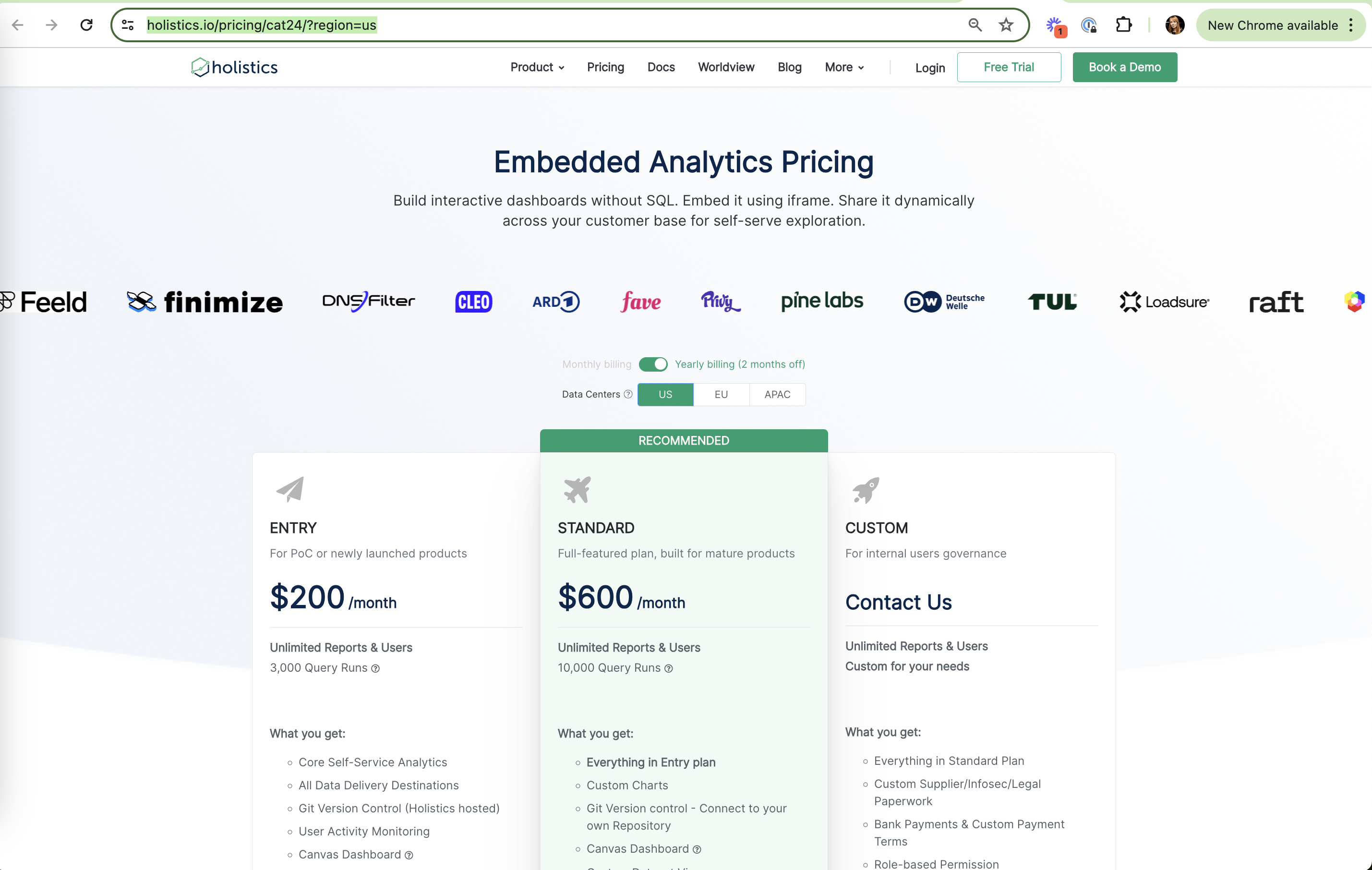
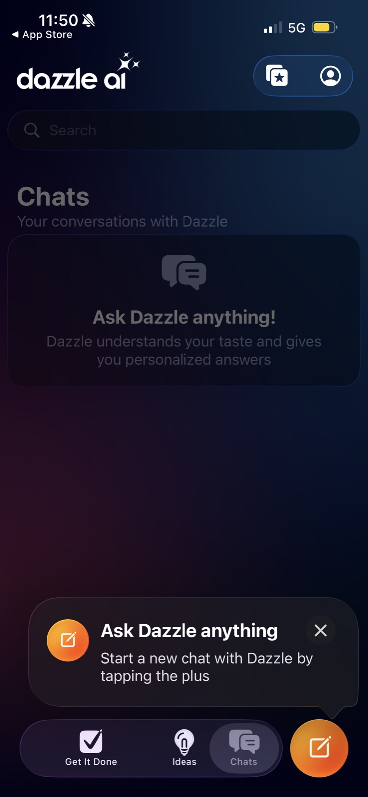
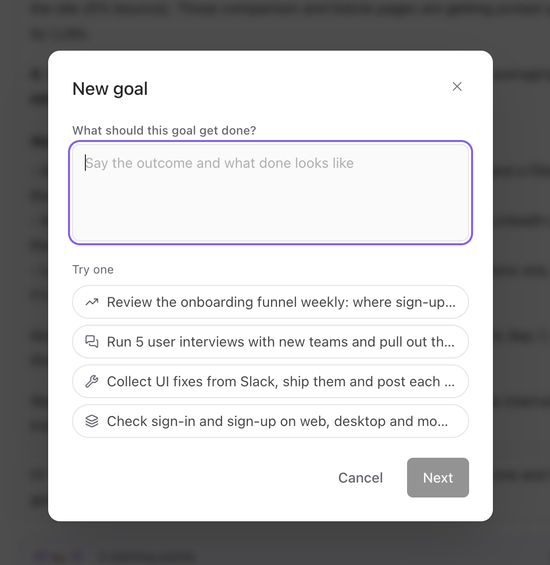
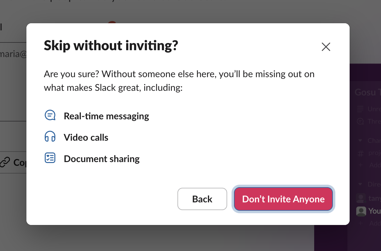
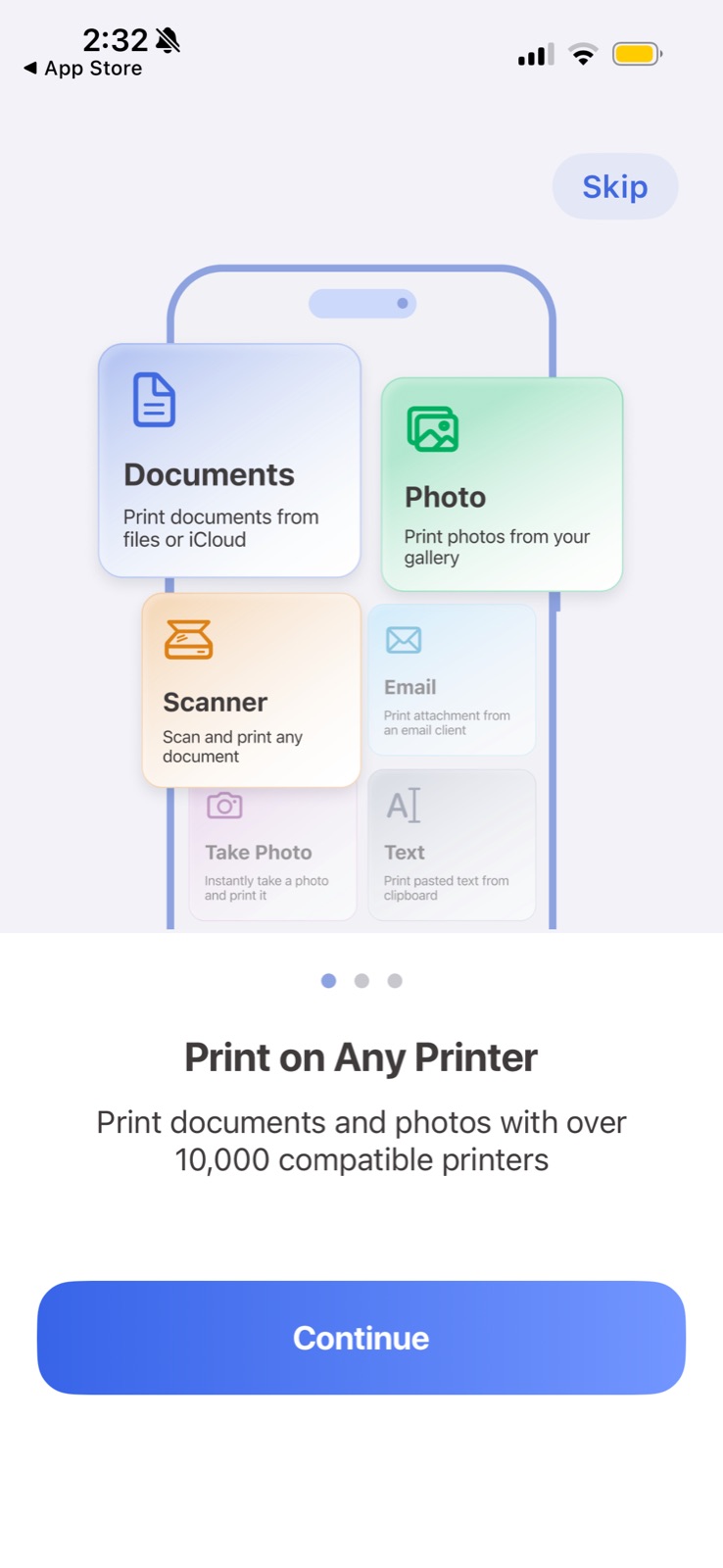
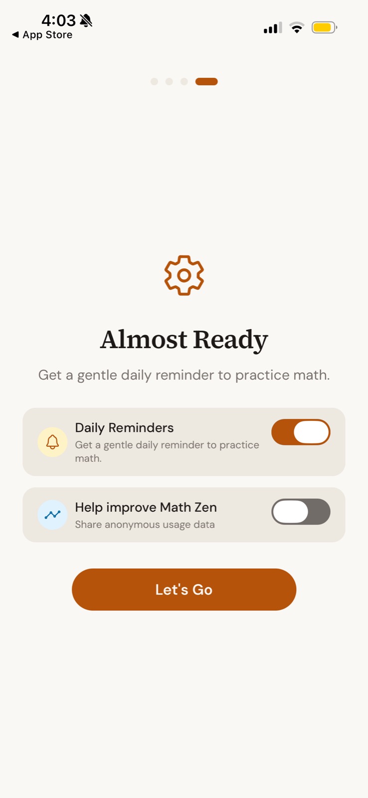
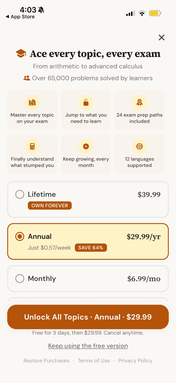
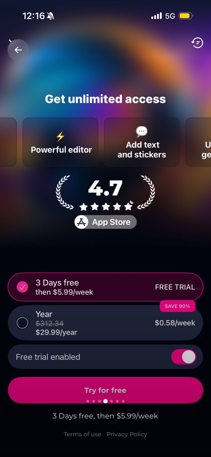
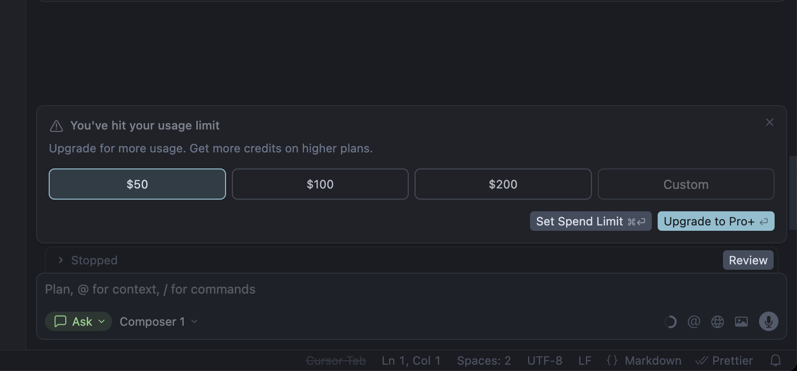
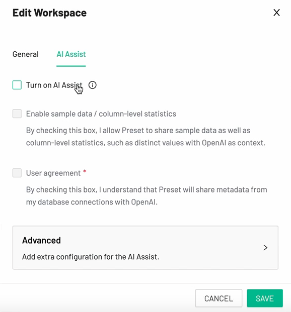
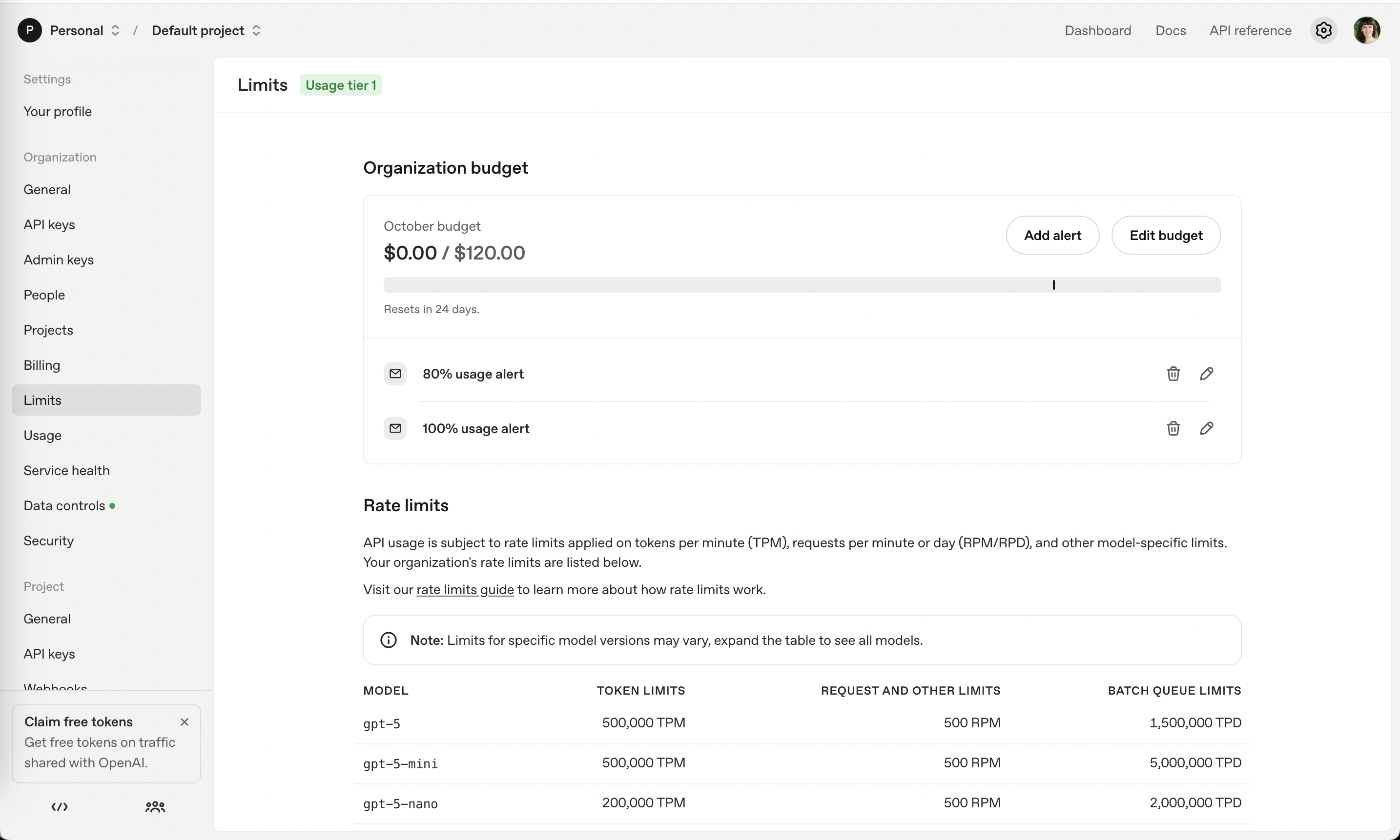
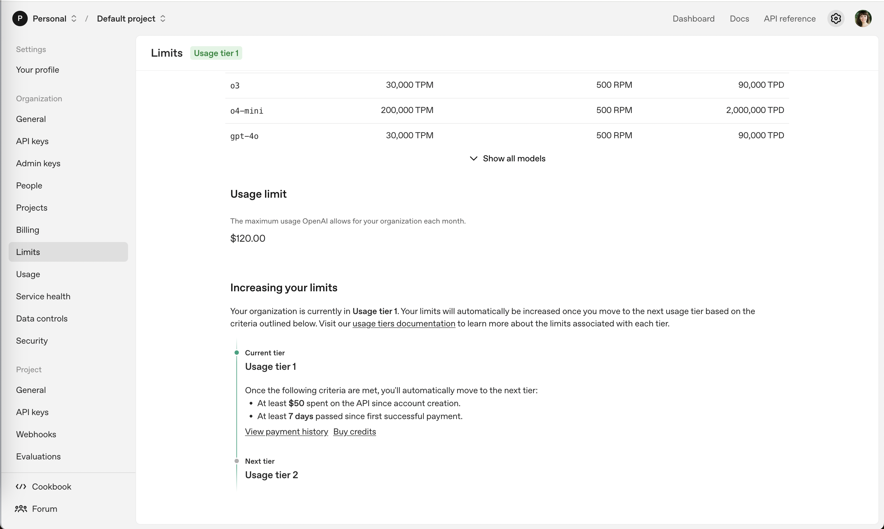
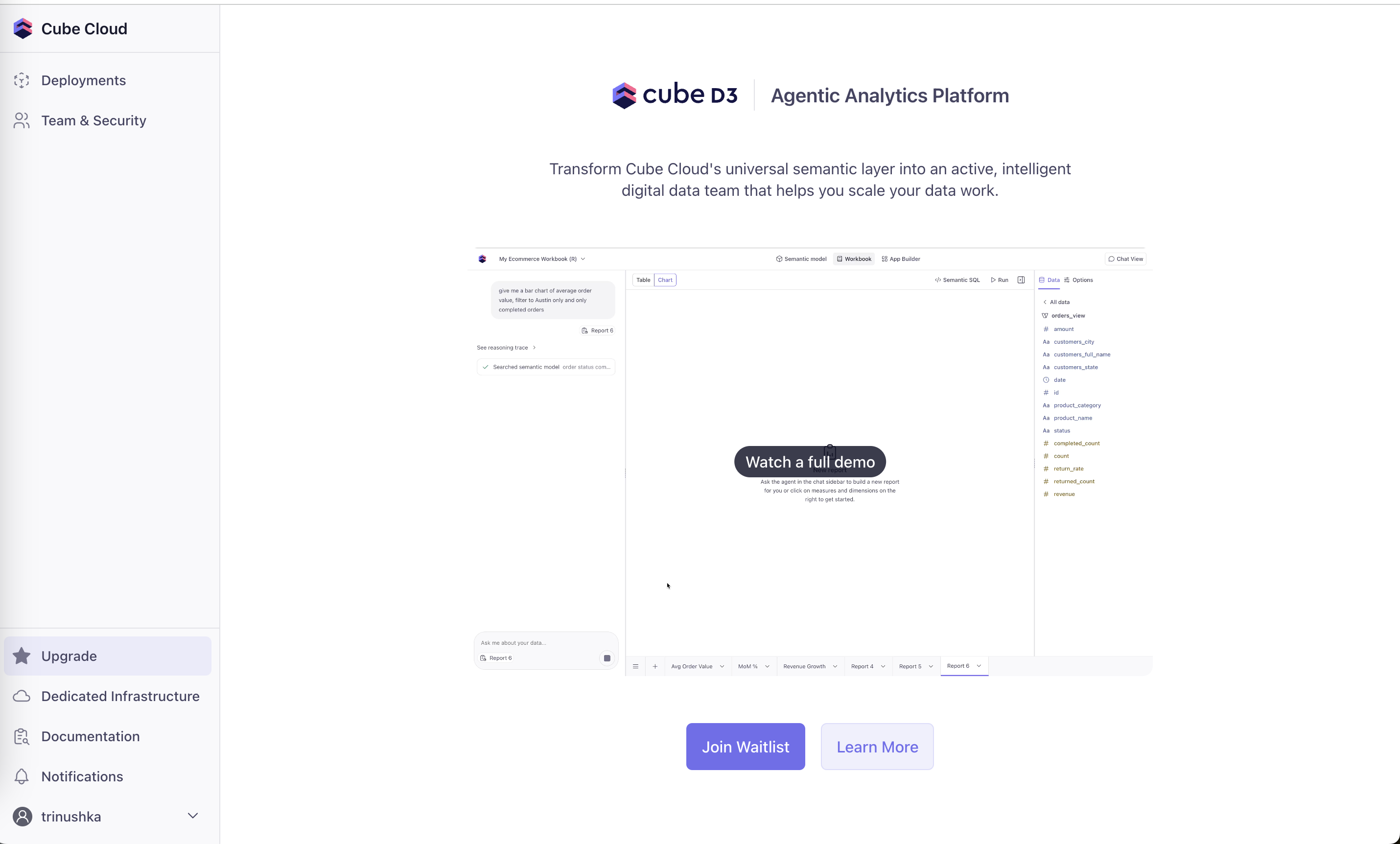
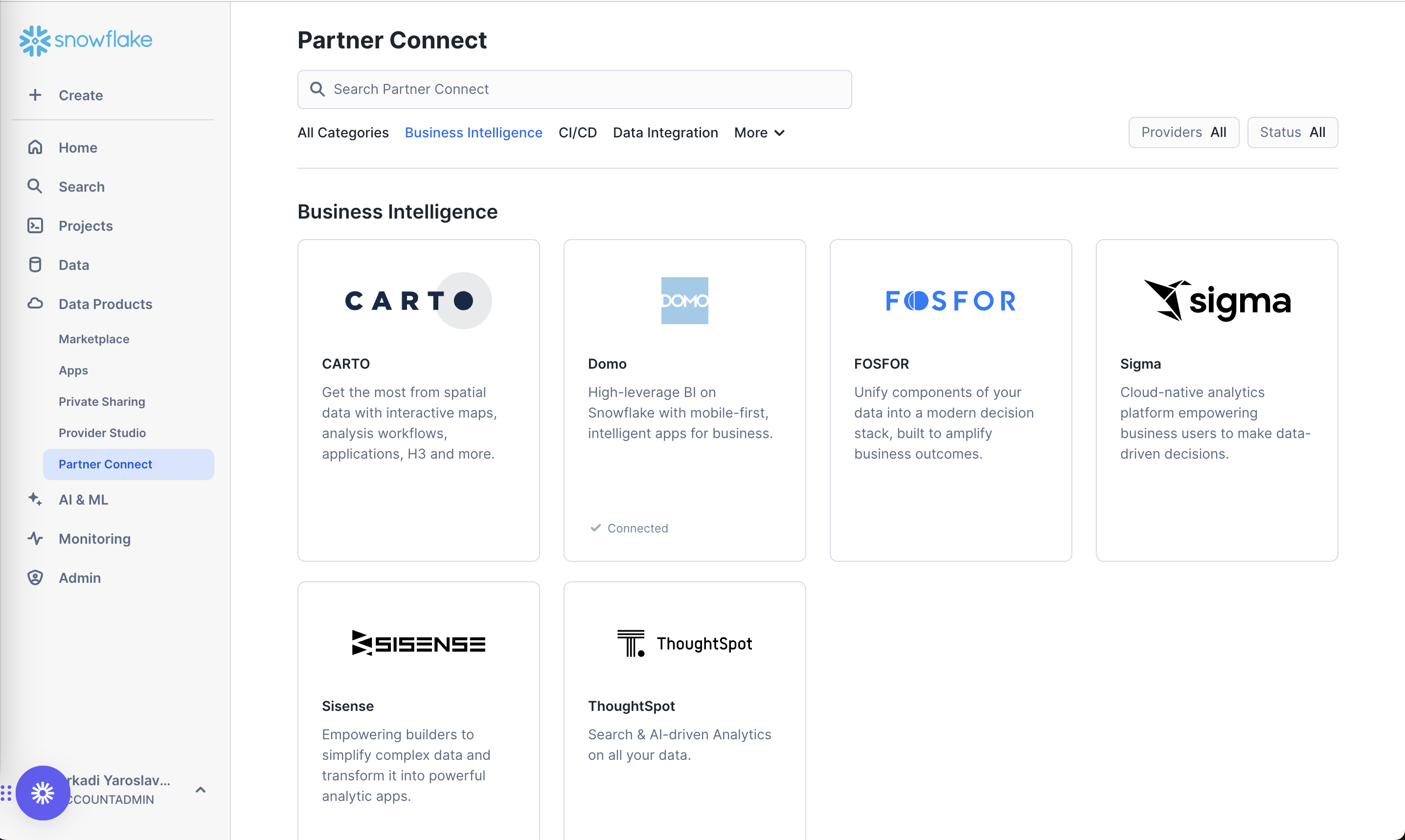
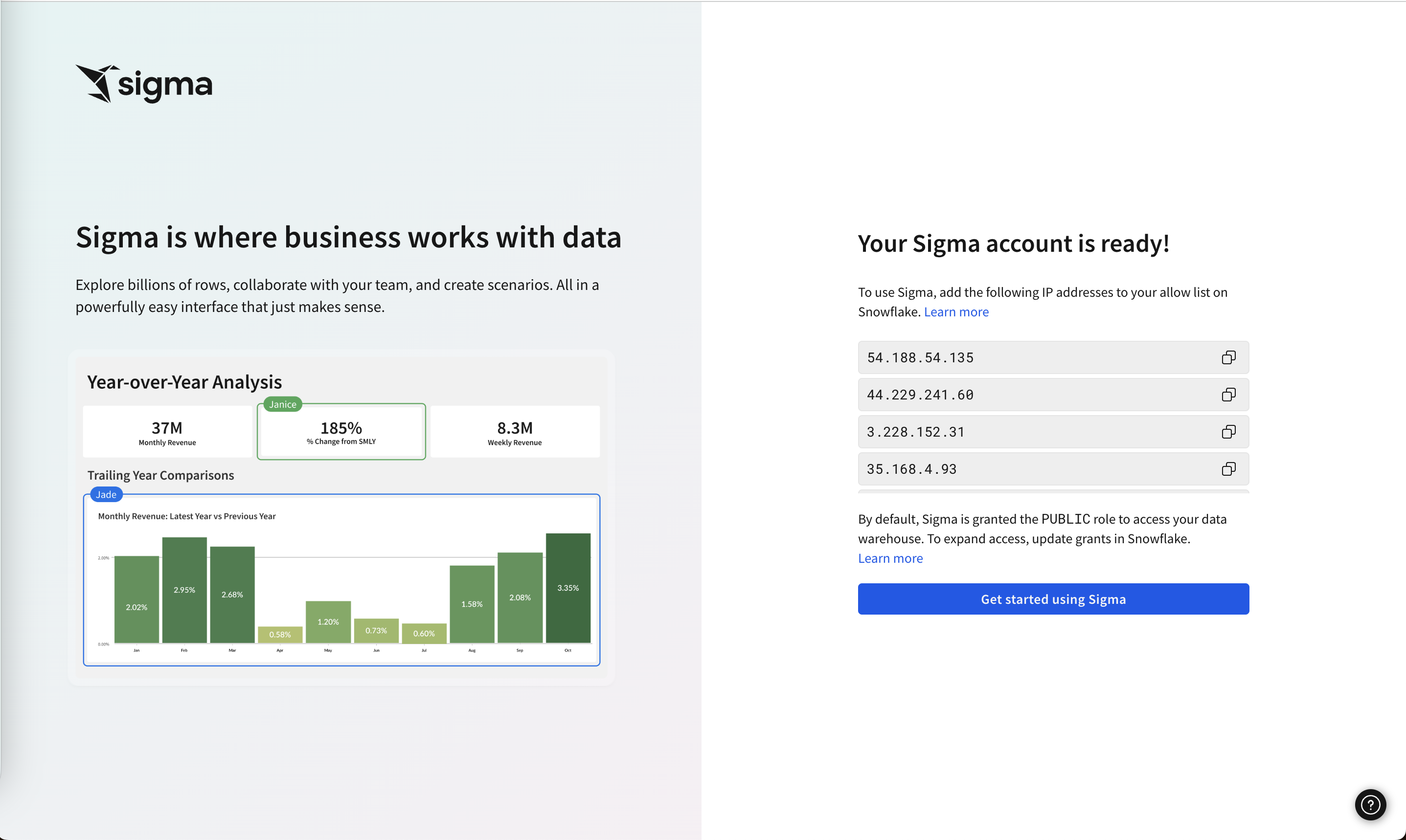
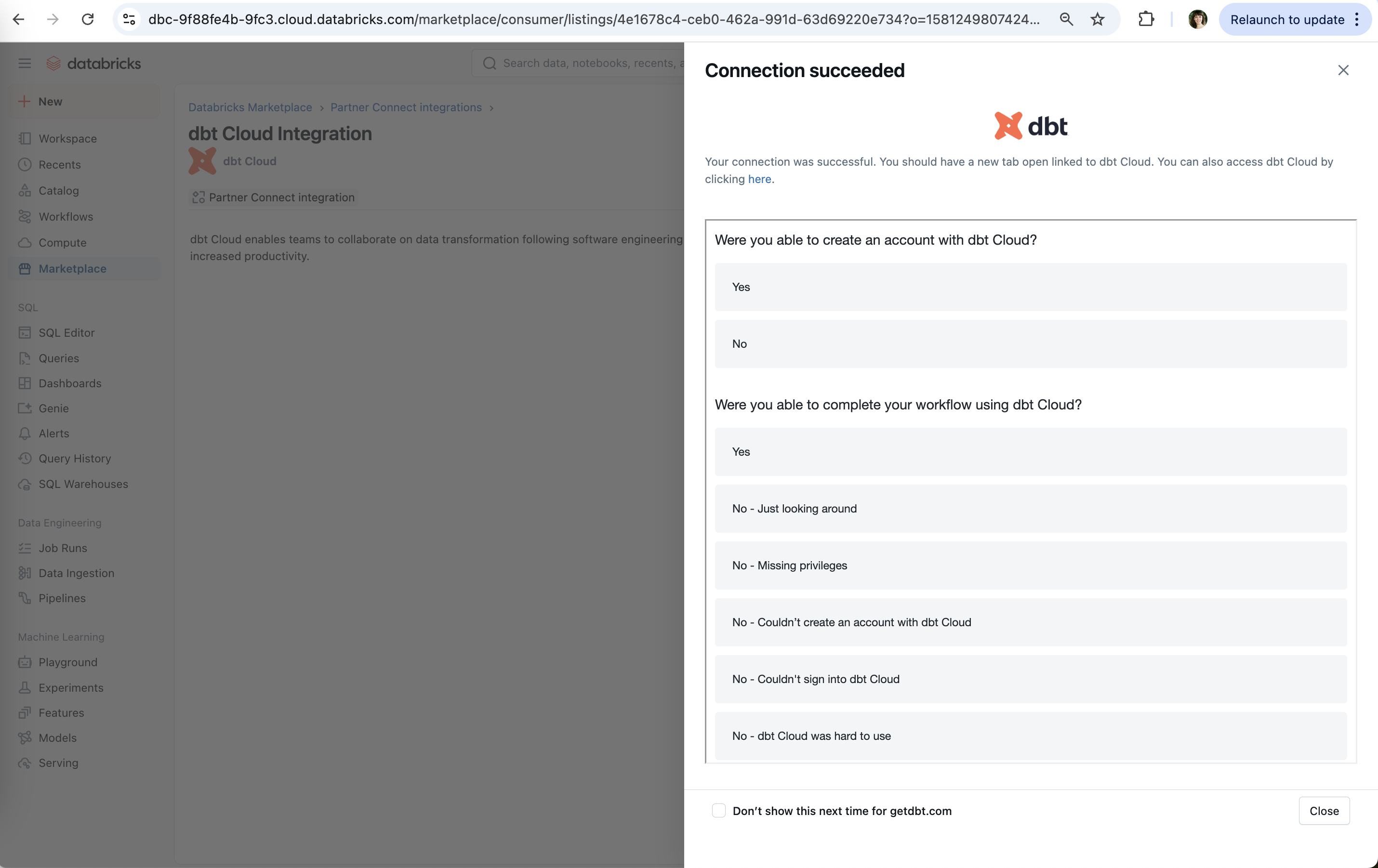
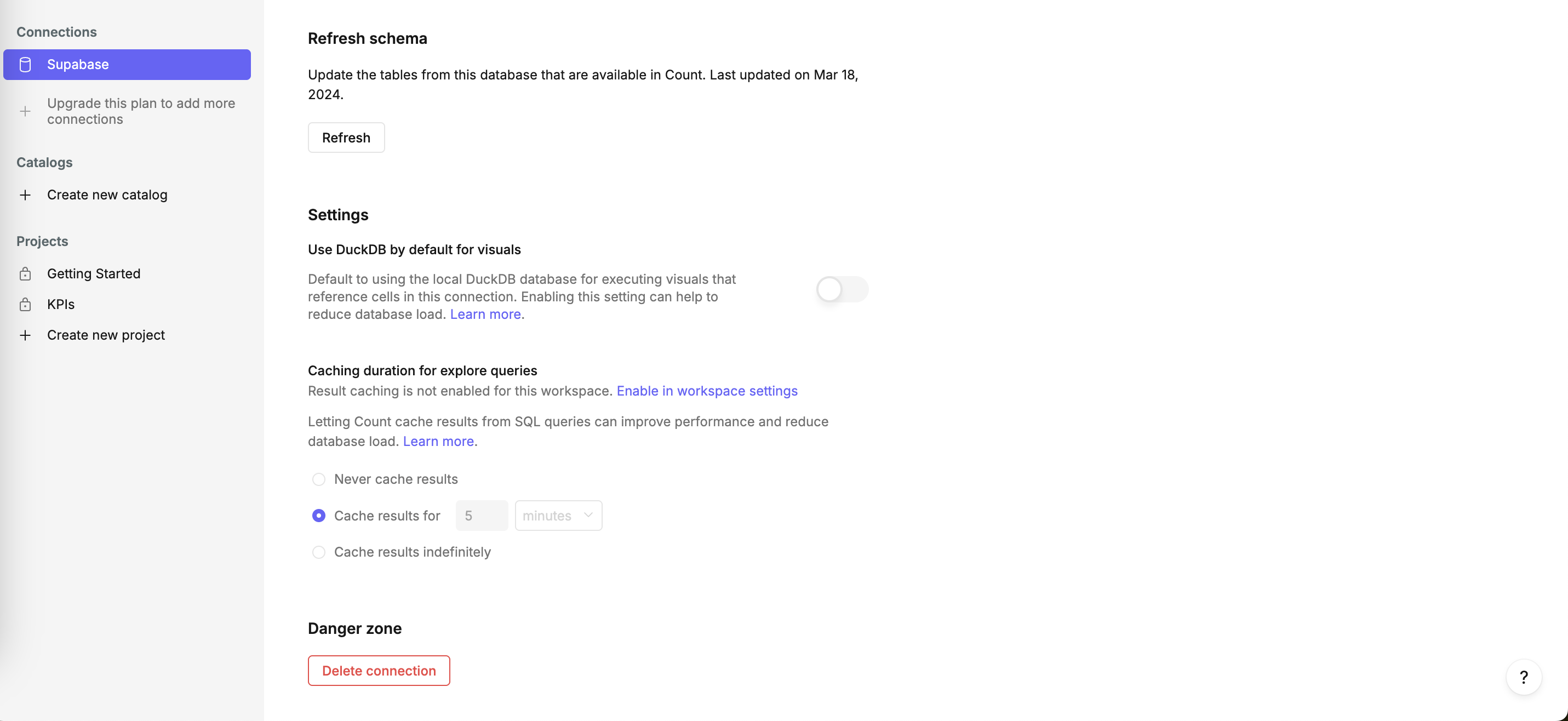
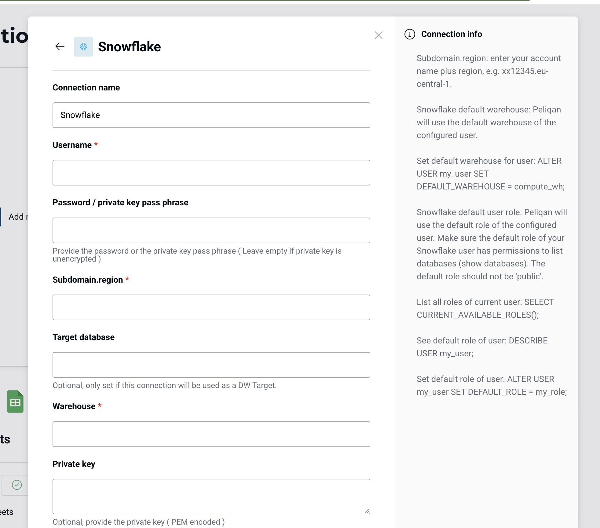
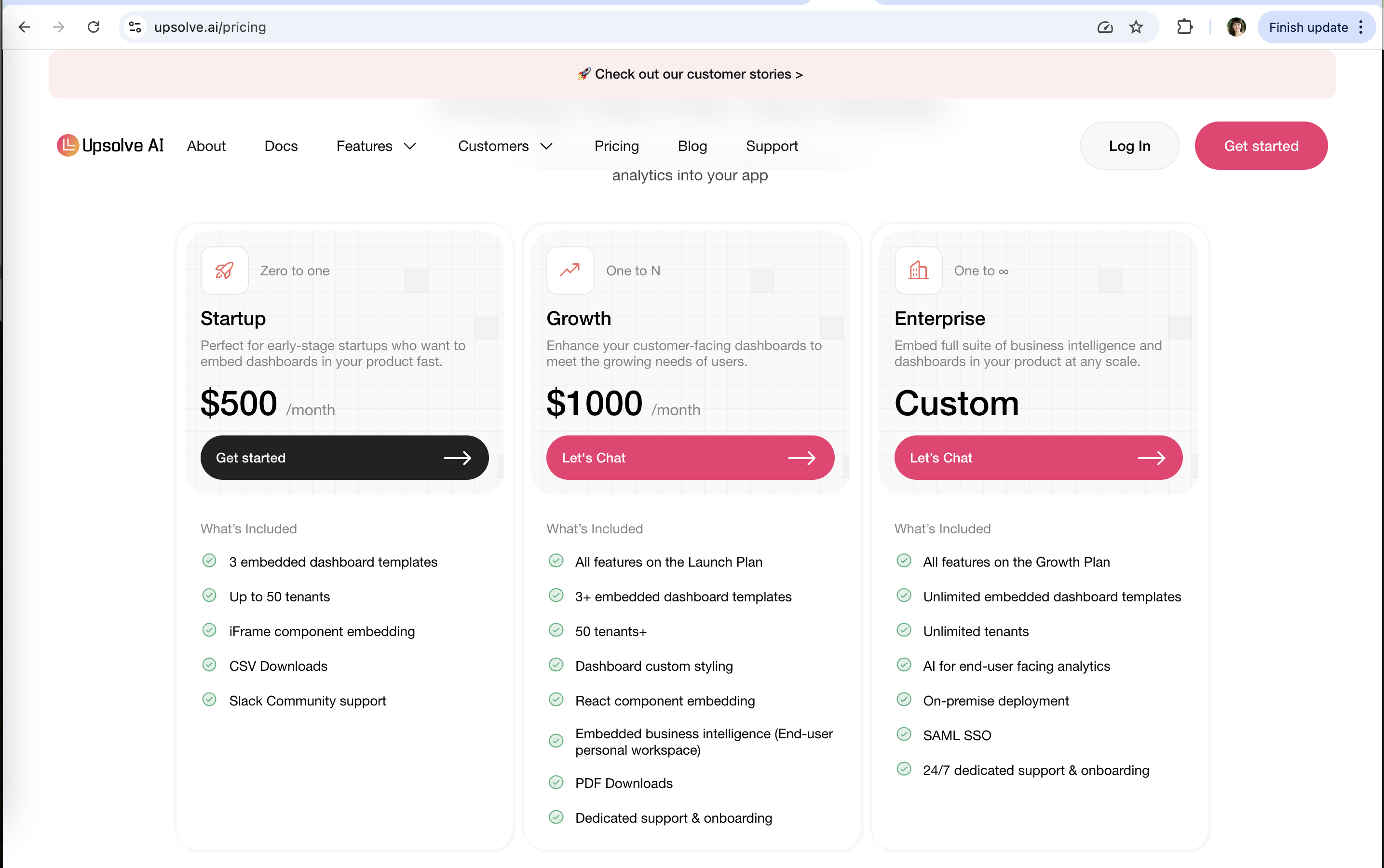
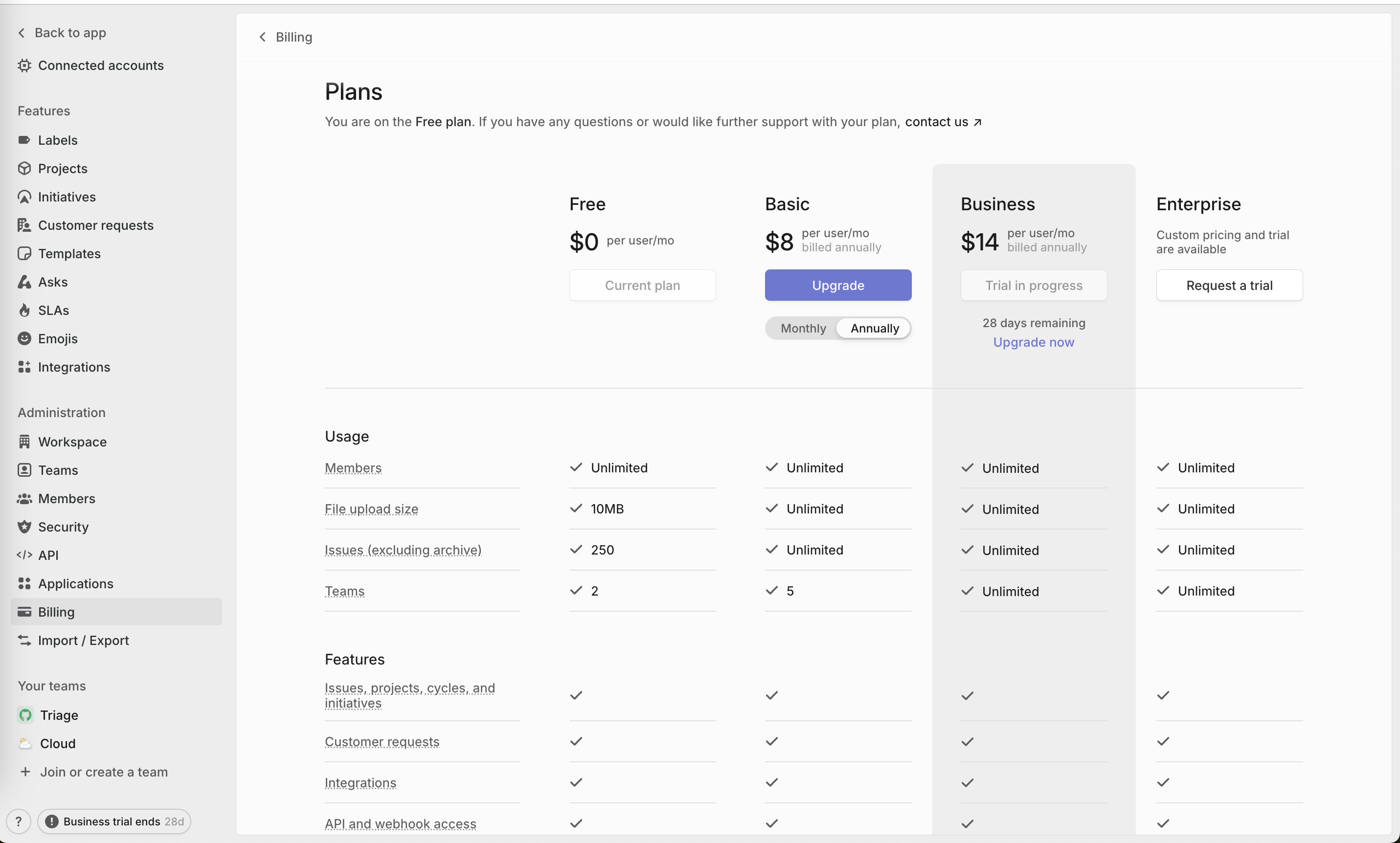
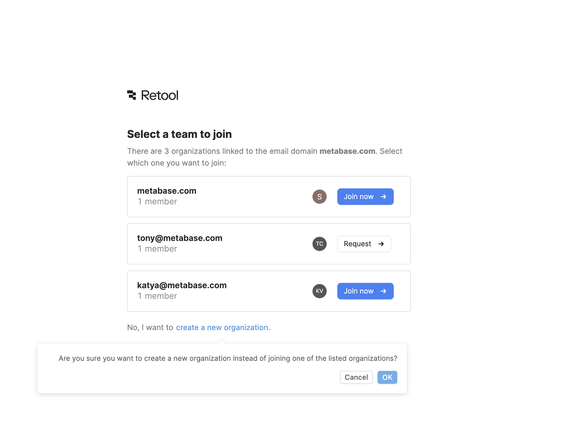
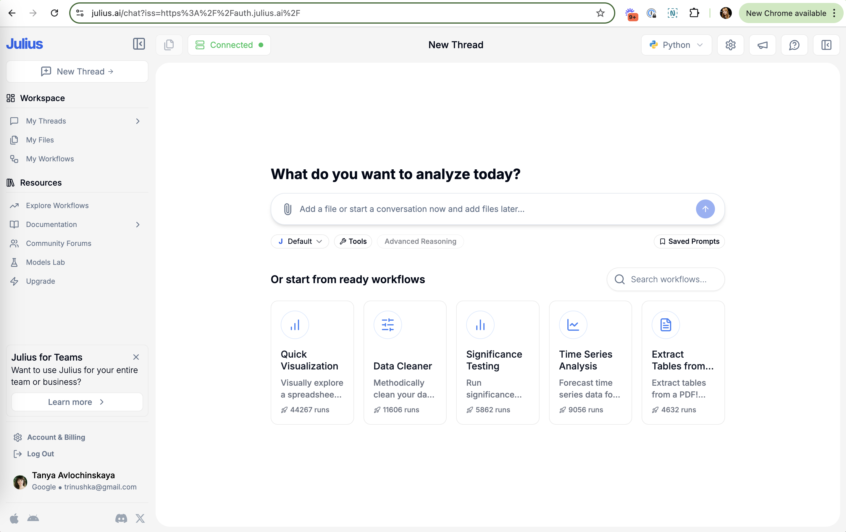
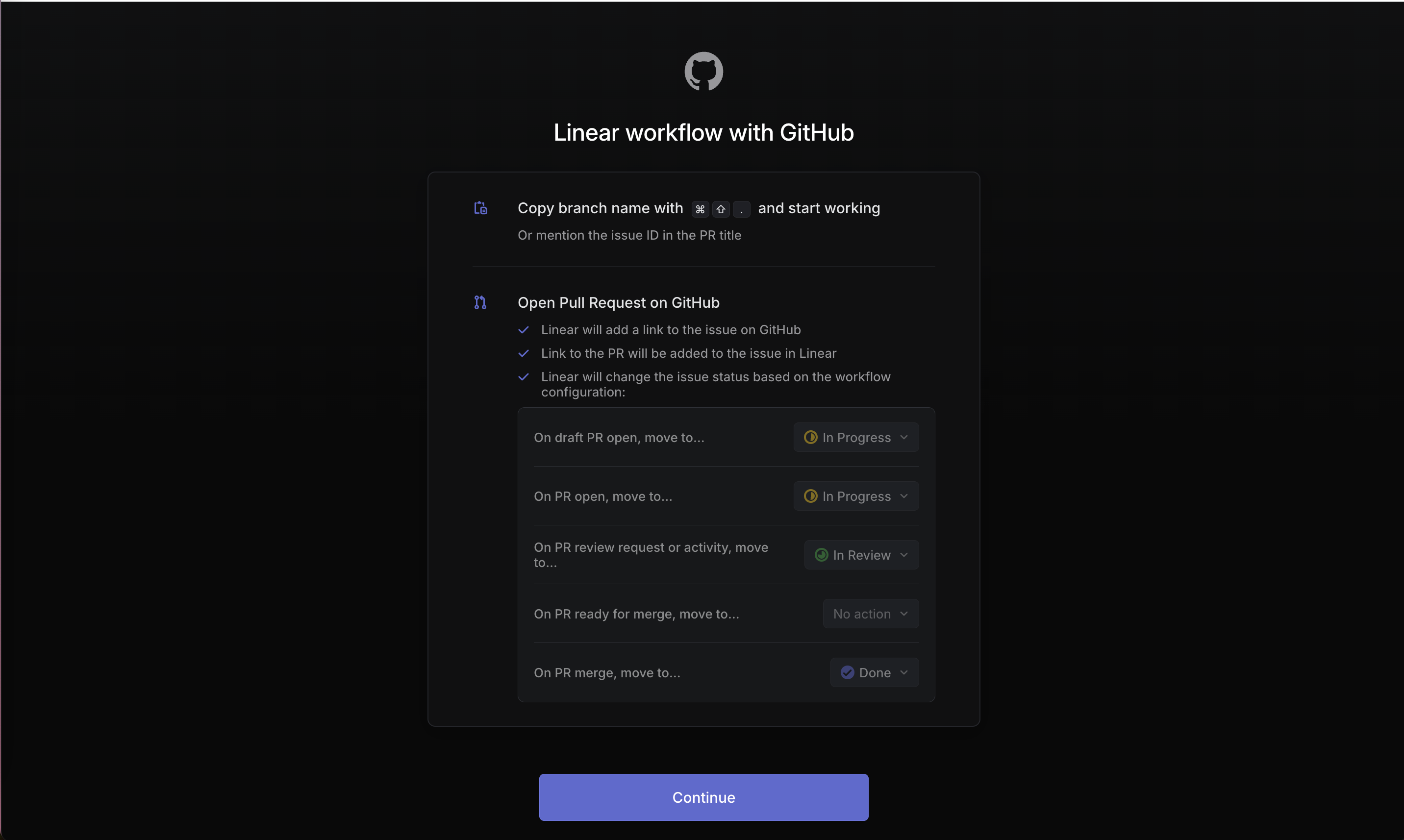
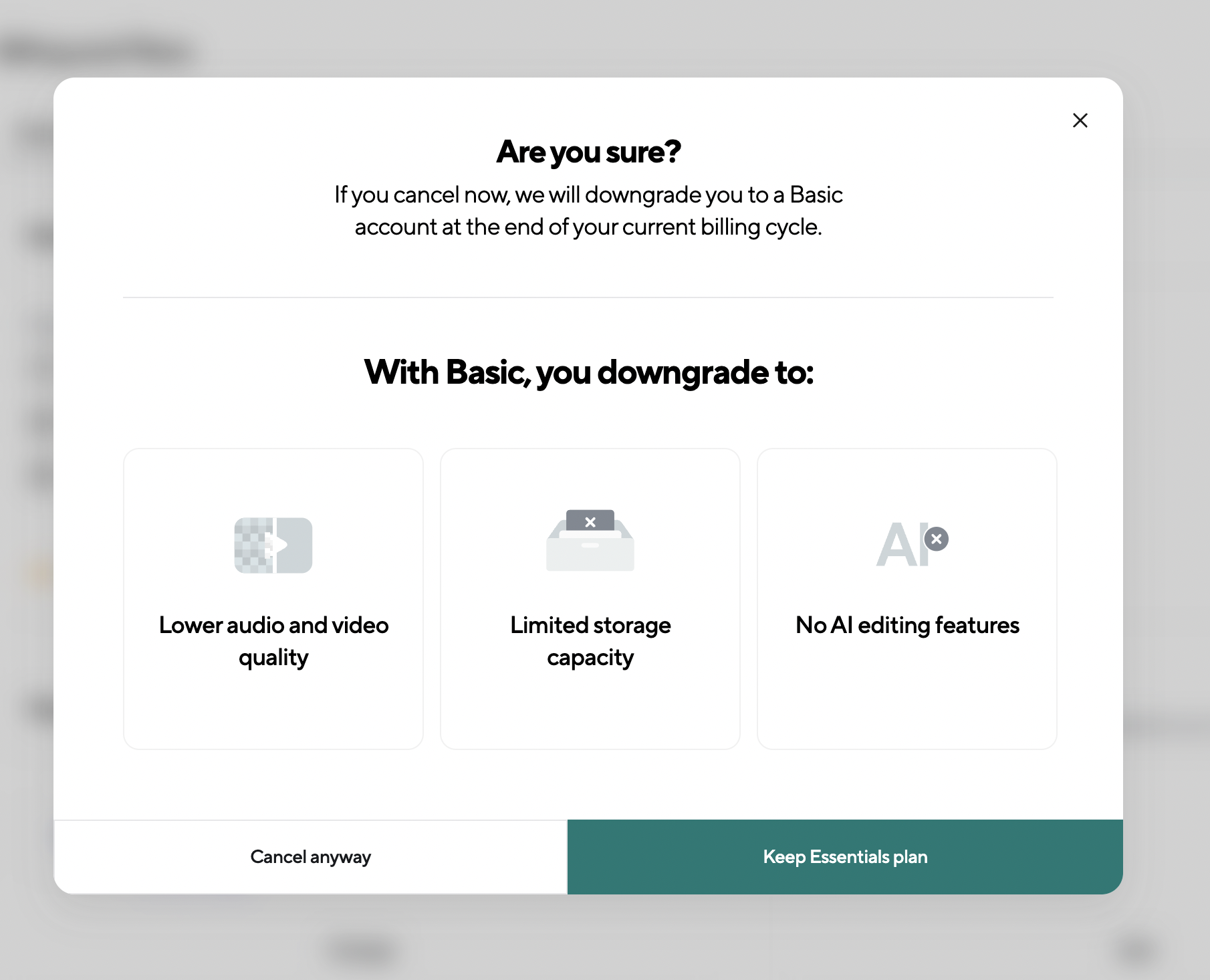
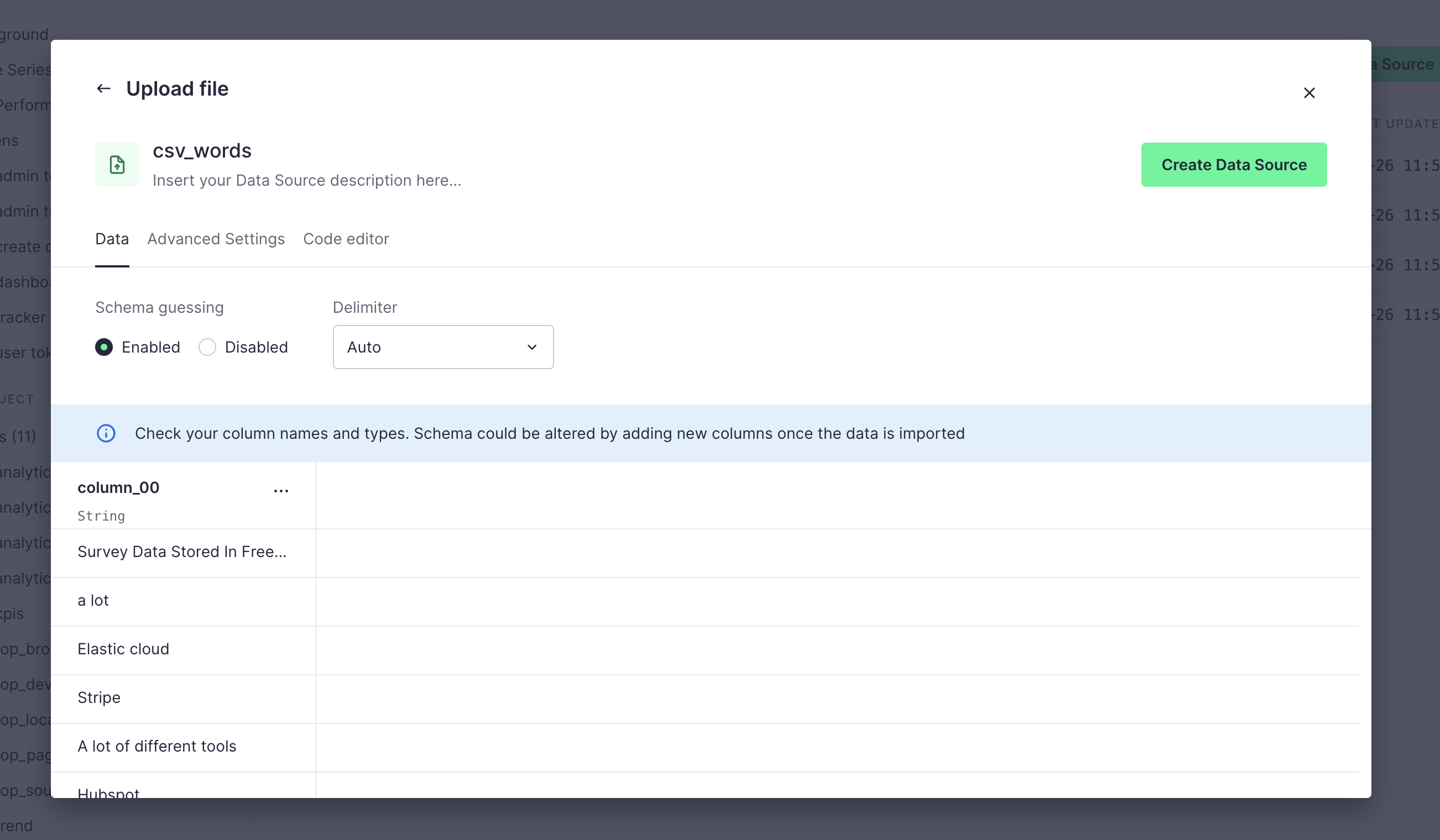
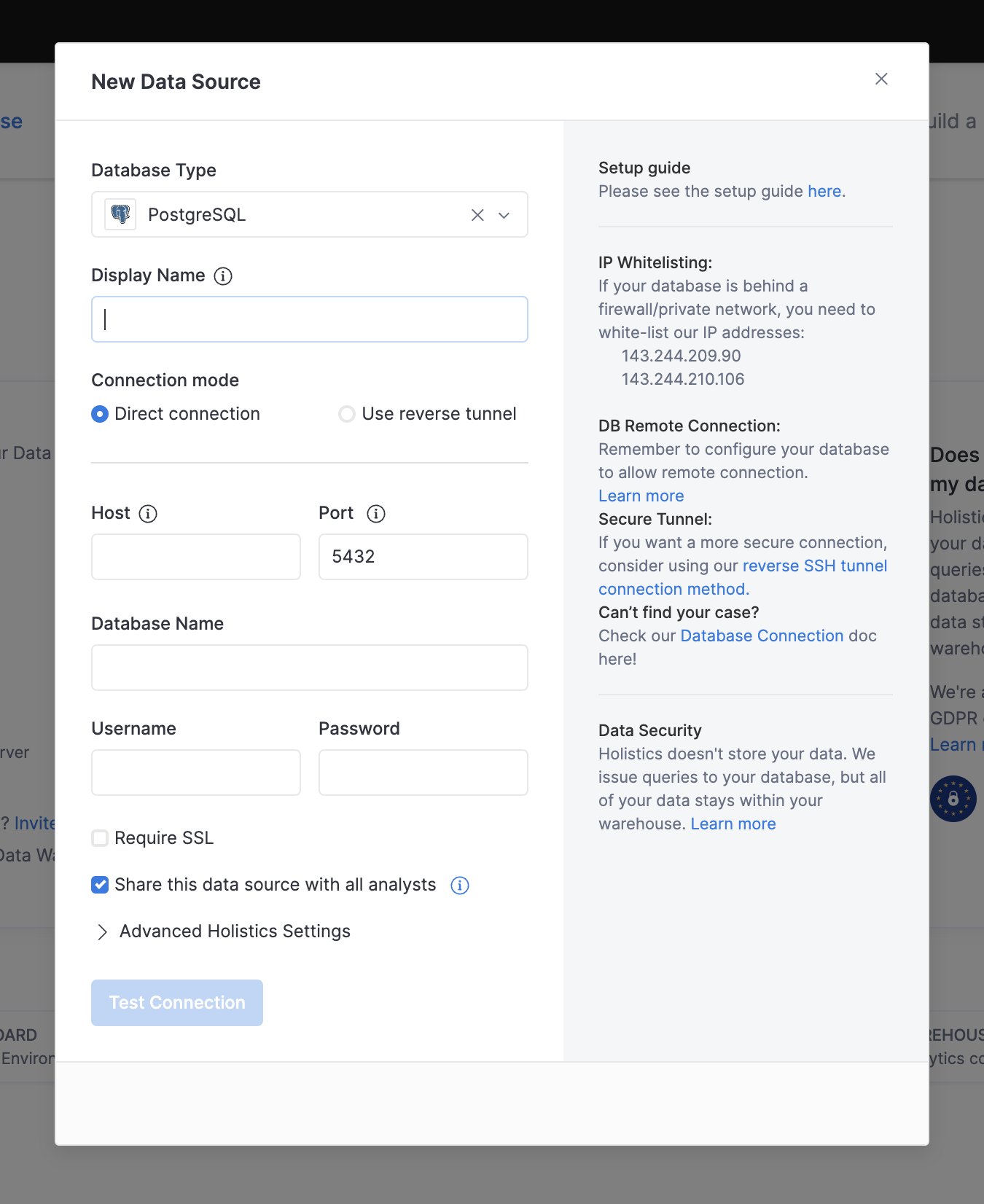
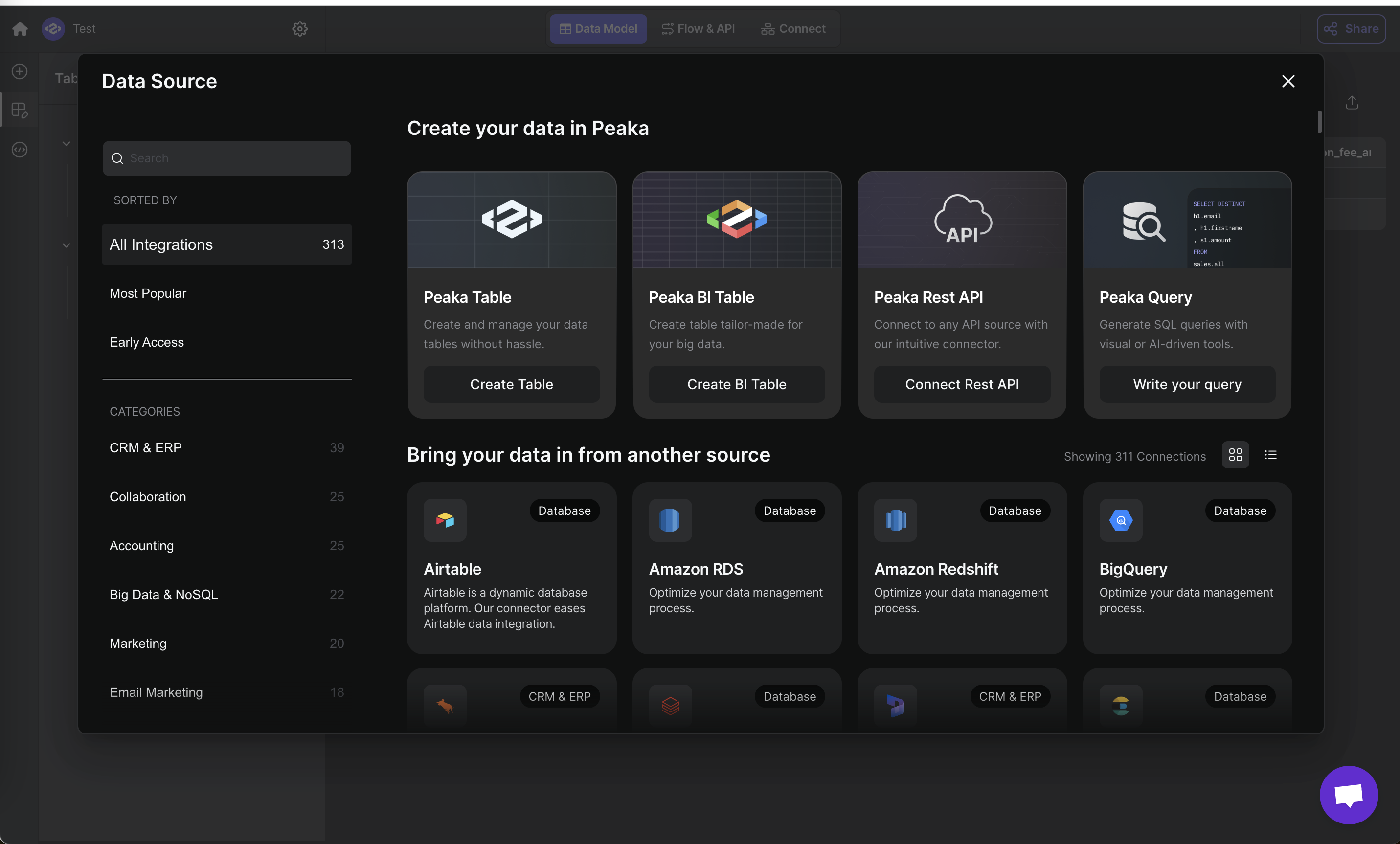
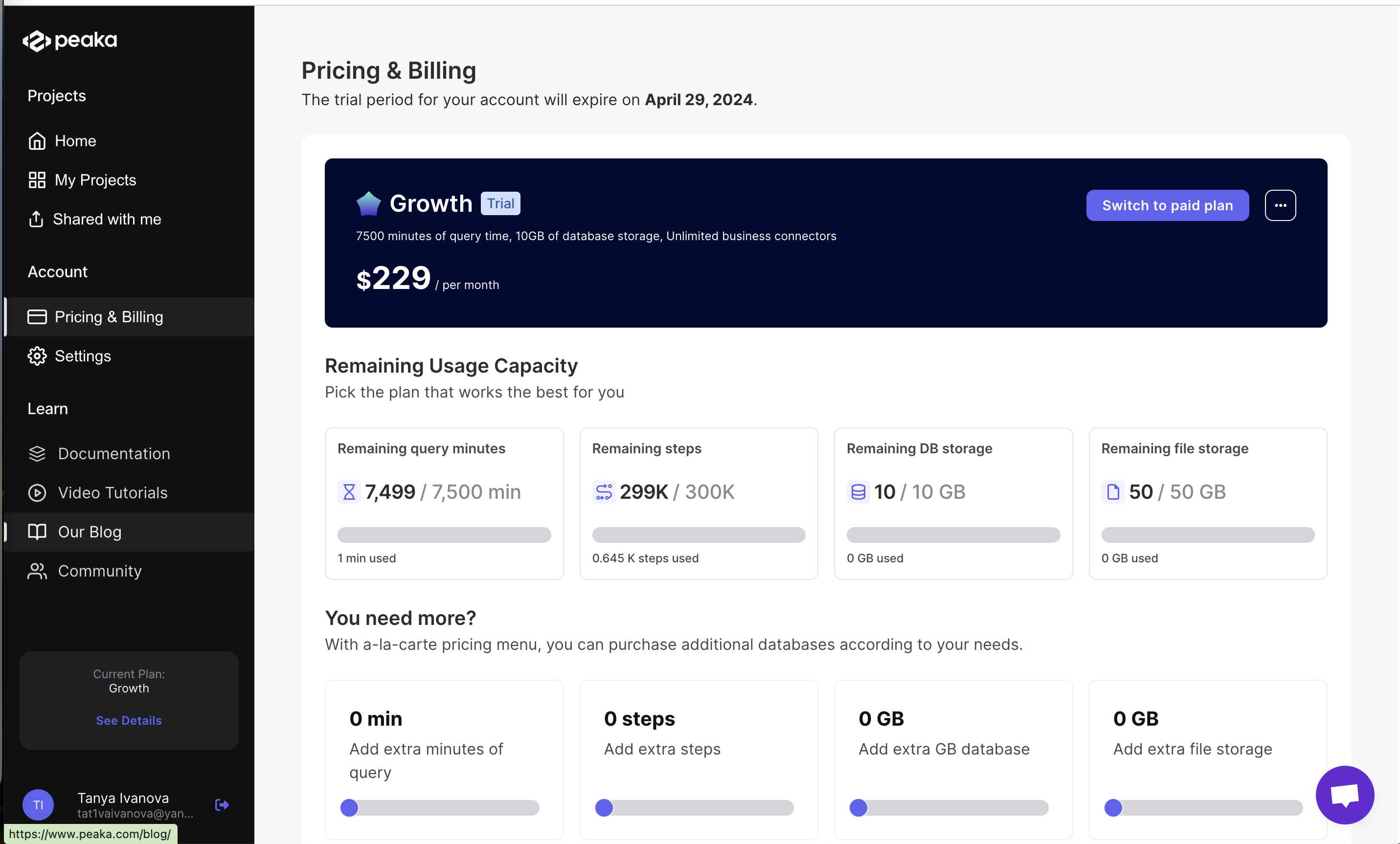
Clarity is the plain test of whether a user can read a screen, understand it, and correctly predict what each control will do. On this site it covers four failures: text that can't be read (tiny, faded or truncated), labels that contradict the visuals (a tip says "plus" but the button is a pencil), mixed signals (two plans styled the same, a skip button styled as the primary action), and expectation mismatch, where the result differs from what the screen promised.
There is no single paper behind it. Jakob Nielsen's usability heuristics ask designs to "speak the users' language" and keep words and actions consistent so users never have to wonder what they mean. Nielsen also splits text usability into three layers: legibility (can you see the characters), readability (how complex the words and sentences are) and comprehension (do you draw the right conclusion). WCAG 2.2 sets a measurable floor for legibility: a 4.5:1 contrast ratio for normal text and 3:1 for large text.
Onboarding and paywall screens get seconds of attention. If the yearly plan doesn't look selected, if the price line is pale grey, or if a chip is cut off with an ellipsis, people either guess or leave. A clear screen costs nothing extra and removes the most common reason for a wrong tap.
How to use it
- Read every instruction against the screenshot it describes: icon names, button labels and counts must match exactly.
- Give the selected state of plans, chips and toggles a visible difference beyond color, such as a border, check mark or filled background.
- Check secondary text (prices, plan descriptions, captions) against the WCAG 4.5:1 contrast ratio and never truncate an option the user has to choose between.
Watch out
- Styling the option you want users to avoid as the strongest button, or making the one you want look like plain text, sends a mixed signal that users will follow.
- Deliberate vagueness around price or renewal terms is not a clarity slip but a dark pattern.