Usability heuristic

Visual hierarchy

Use size, contrast, color and position so the most important element on a screen is the one people see and act on first.

Visual hierarchy The same paywall twice. In the first, the title, the price and three buttons all have the same size and weight, so there is no obvious place to look. In the second, a large title leads to one big filled Start free trial button, with Not now and Restore purchase kept quiet. Everything looks the same Go Premium 7 days free, then $59.99 a year Restore purchase Start free trial Not now ? ? ? Weak cues: 22% longer to use 25% more eye fixations. NN/g eyetracking, 71 people A clear order: 1, 2, 3 Go Premium 7 days free, then $59.99 a year Start free trial Not now Restore purchase 1 2 3 The eye goes straight to one action
The same paywall with equal-weight elements and with one dominant button; in NN/g's eyetracking study of 71 people, weak visual cues took 22% longer and 25% more fixations.

Visual hierarchy is the order in which people notice things on a screen. Designers control it with scale, color and contrast, weight, spacing and grouping. On this site it covers salience and focus: whether the primary action is the one that stands out, whether the recommended plan looks recommended, and whether the committing button is distinct from Cancel.

NN/g defines visual hierarchy as arranging elements so people take them in by order of importance. Their 2017 eyetracking study (Kate Moran, 71 participants) found that pages with weak visual cues for clickable elements took 22% longer to use and drew 25% more eye fixations than the same pages with strong cues, a sign that people had to hunt. WCAG sets a floor for legibility: at least 4.5:1 contrast for normal text and 3:1 for large text.

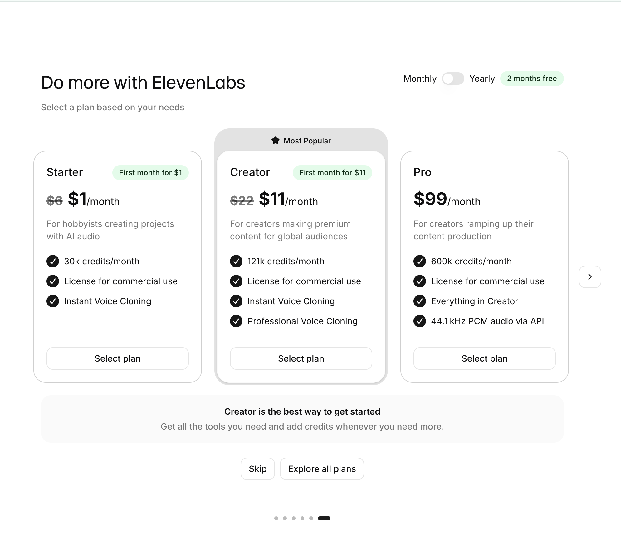
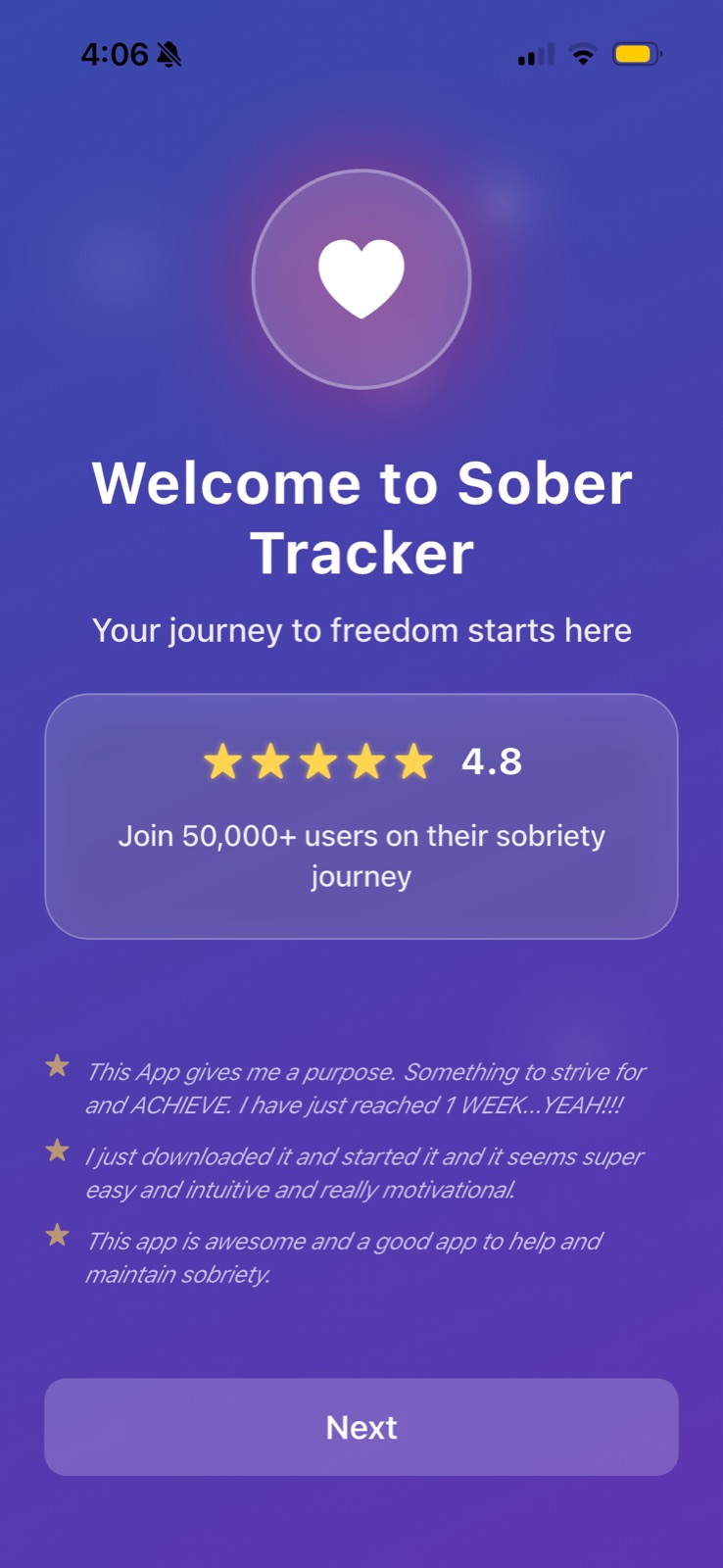
On paywalls and plan pickers, hierarchy decides what people choose. If every plan's button looks the same, the recommended one has no pull; if the Next button is muted purple on purple, it becomes the weakest thing on the screen. One clearly dominant action per screen is usually the right target.

How to use it

  • Give each screen one filled, high-contrast primary button; make secondary actions outlined or text links.
  • Make the plan you recommend visibly different (badge, border, filled button), and keep the others plain.
  • Check that buttons and key terms meet WCAG contrast (4.5:1 for normal text) and are not the faintest element on the screen.

Watch out

  • Making the paid option bright and the decline option a barely visible grey link manipulates the choice; hierarchy should match what is best for the user, not just the business.
  • Emphasizing too many things (badges, colors, animations everywhere) flattens the hierarchy so nothing stands out.
Related

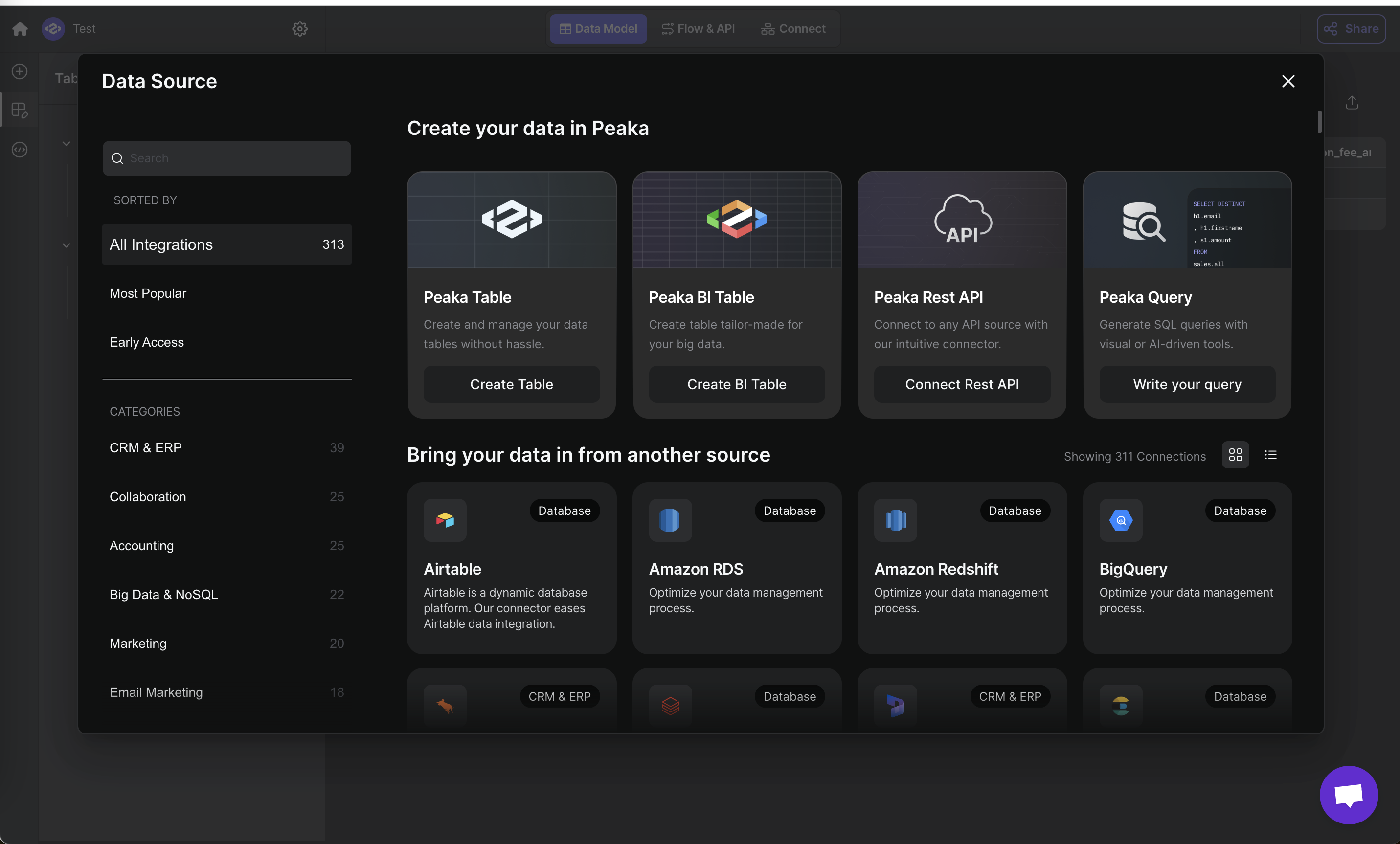
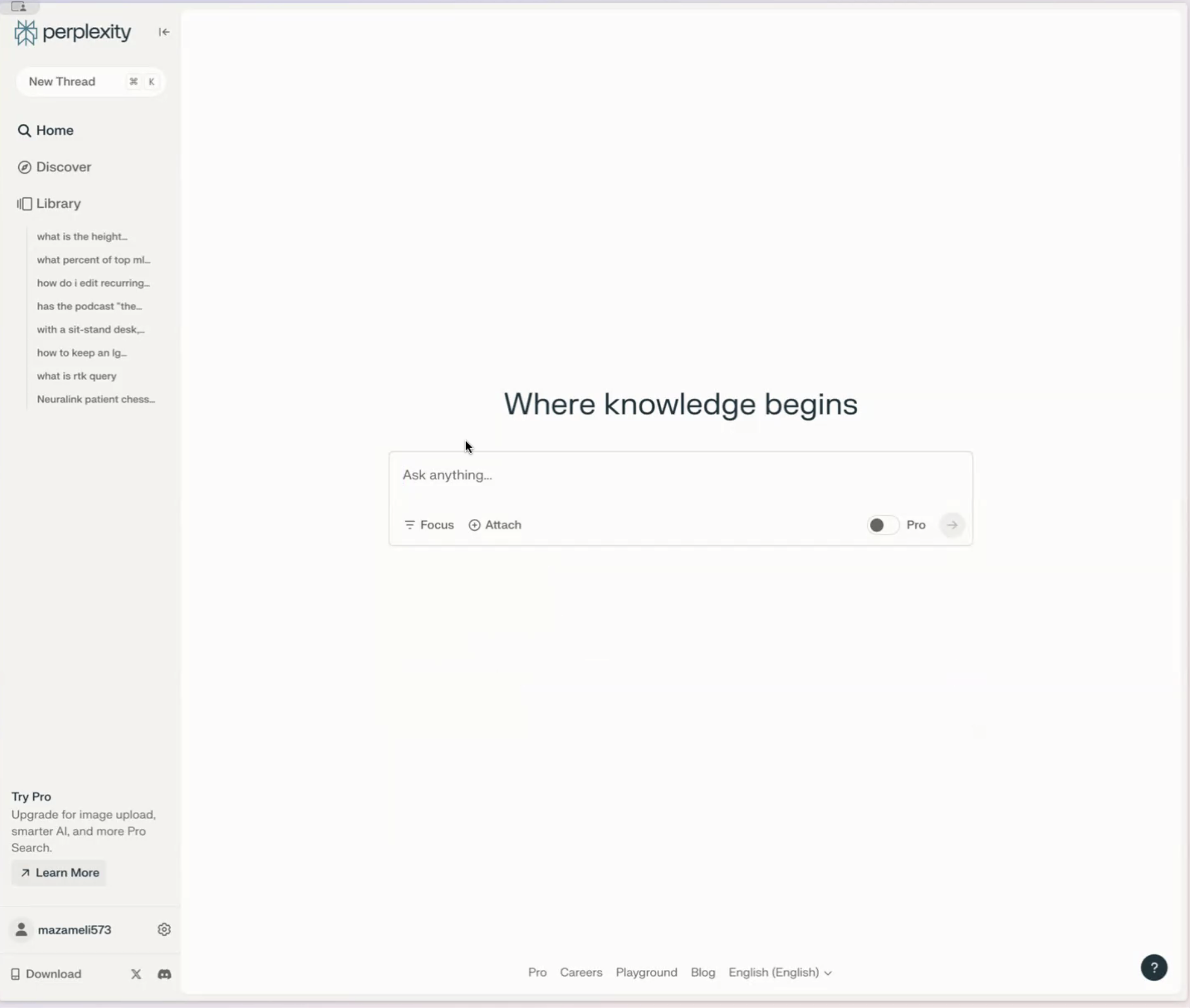
Visual hierarchy in real products 15 working · 9 not

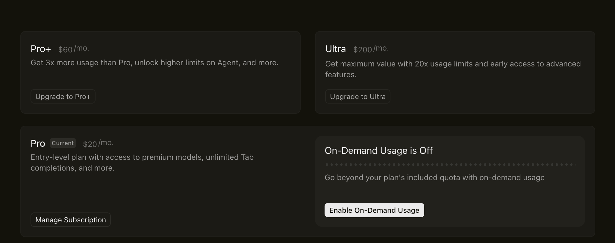
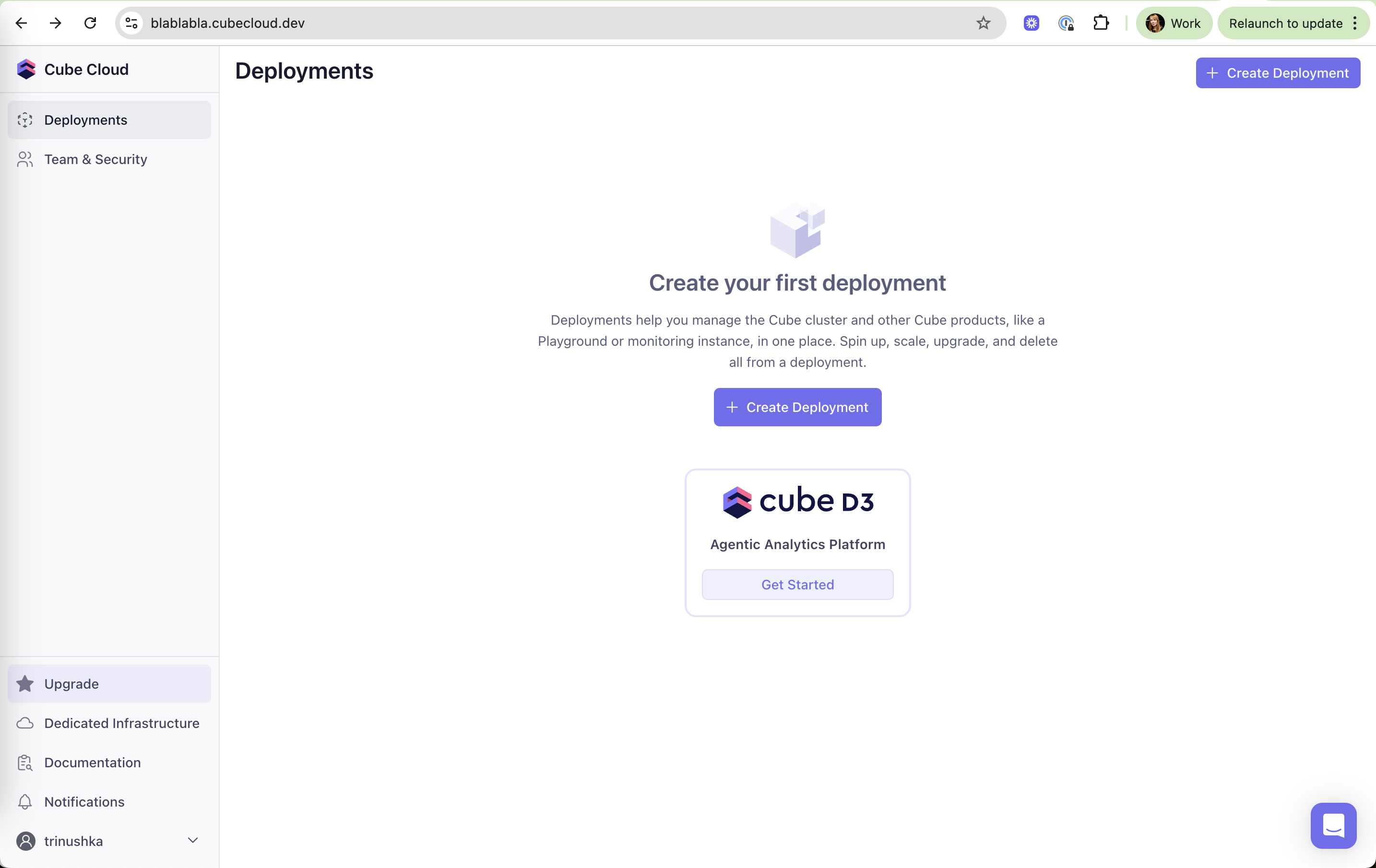
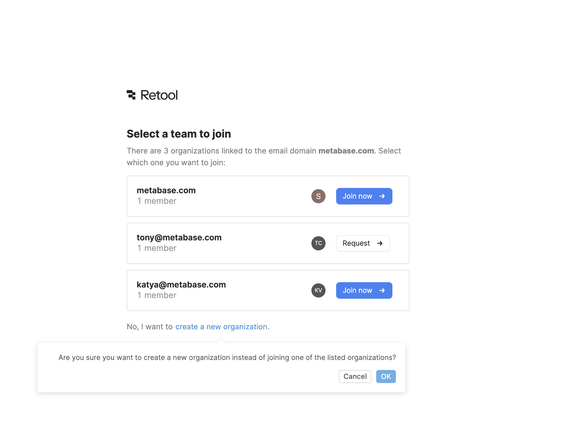
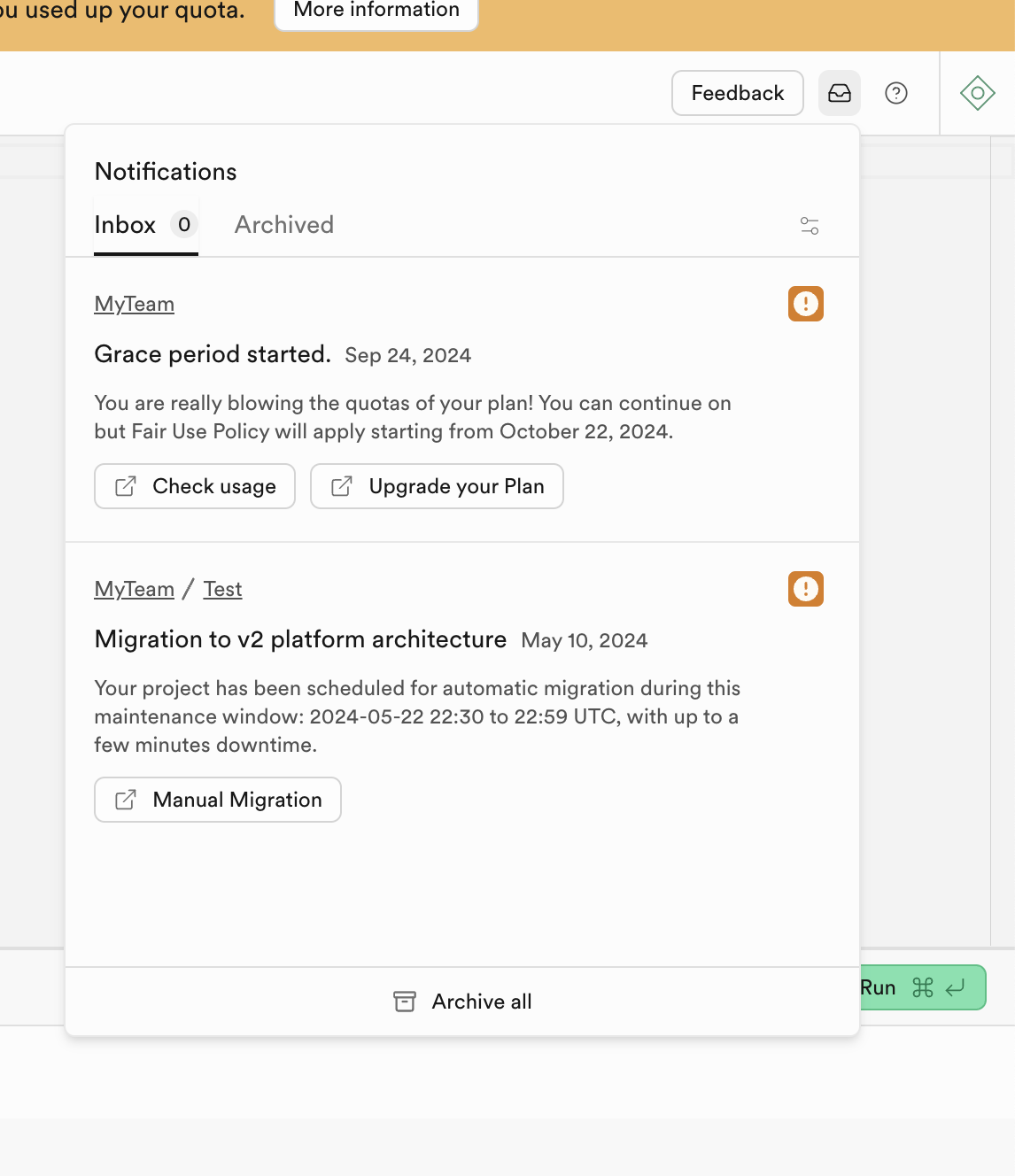
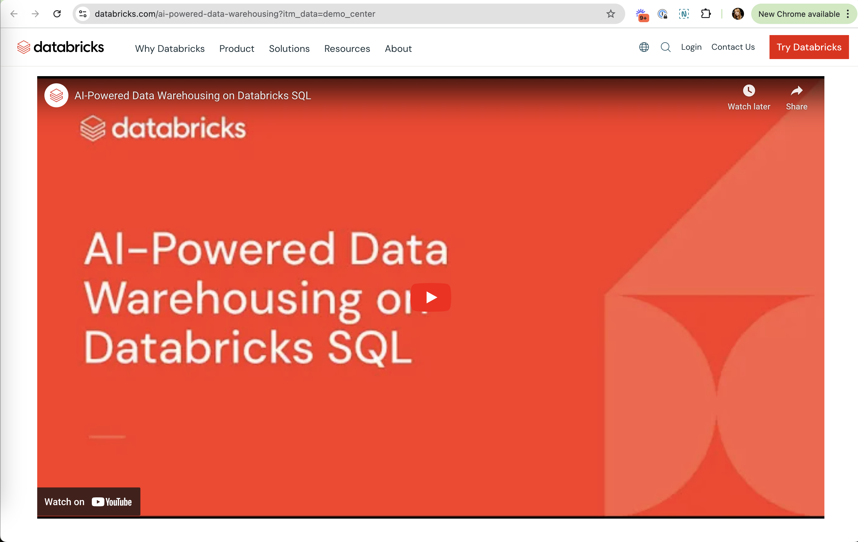
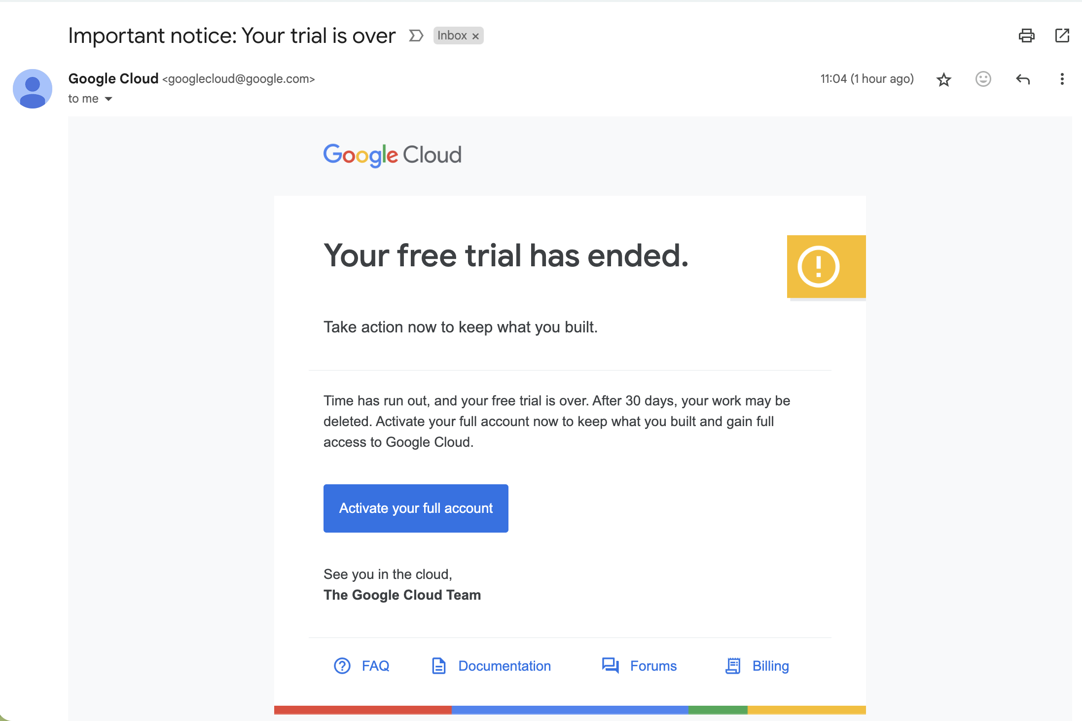
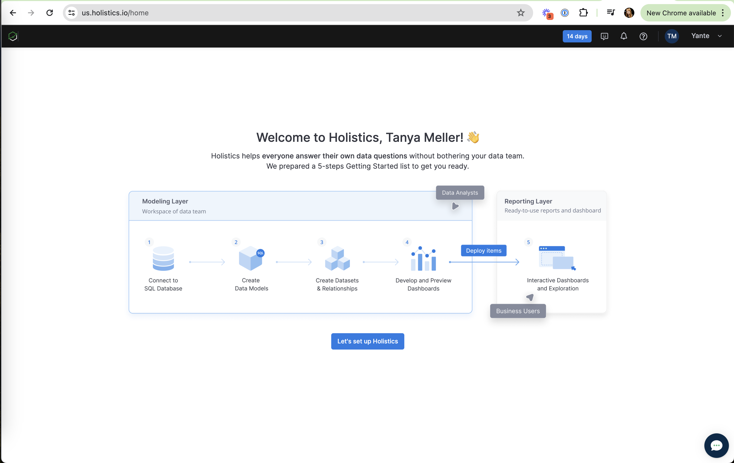
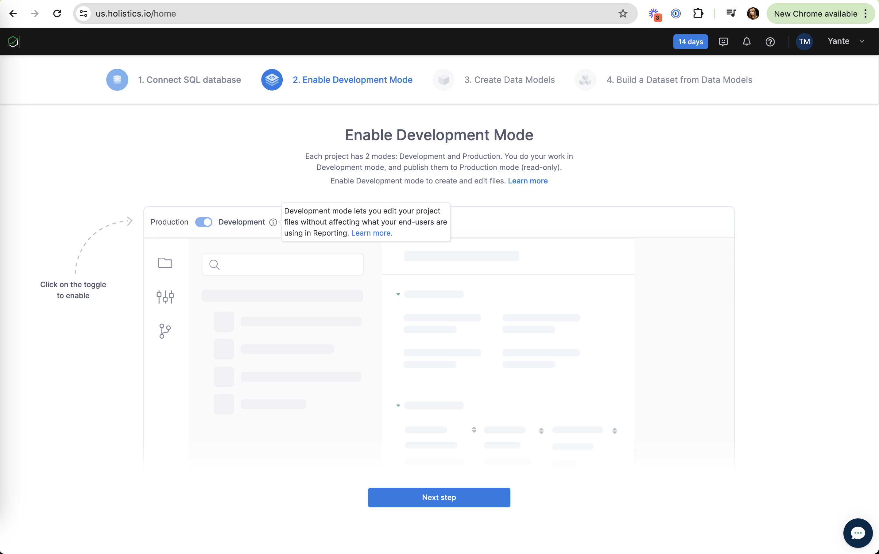
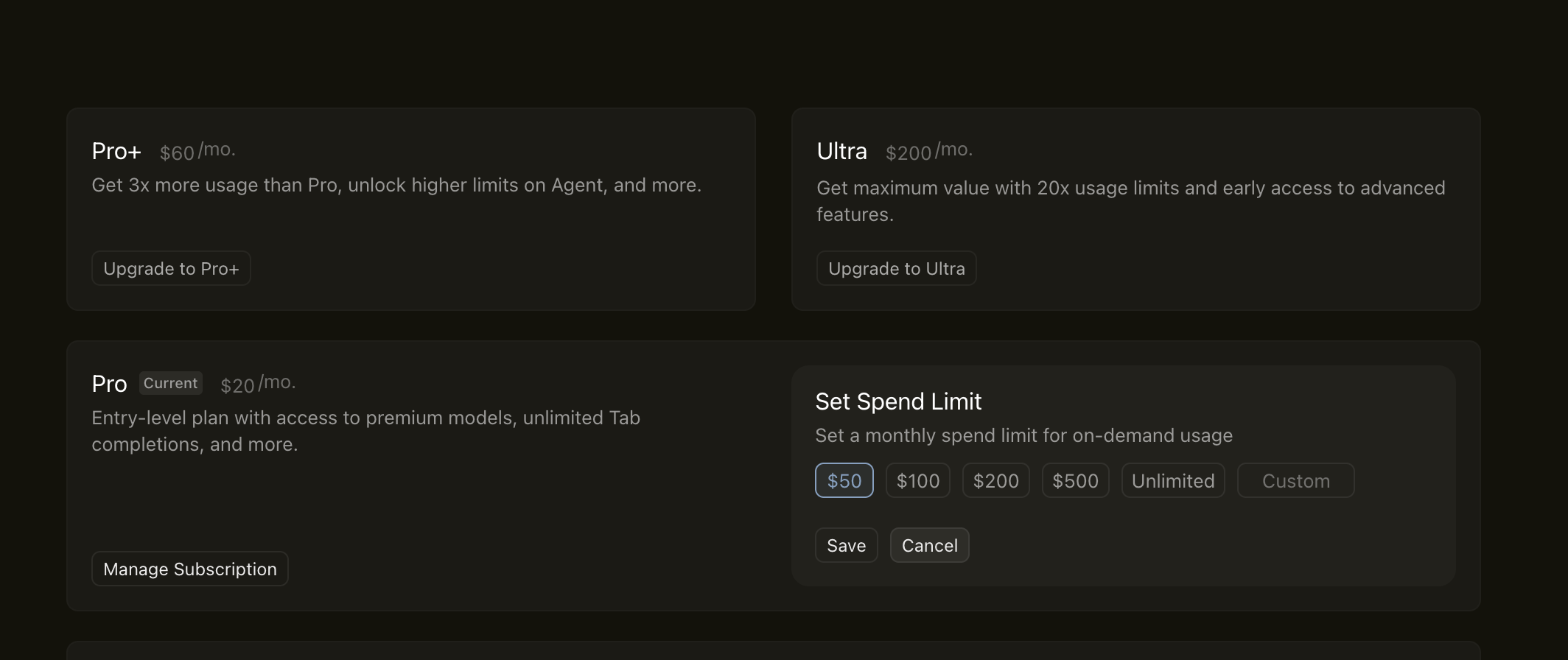
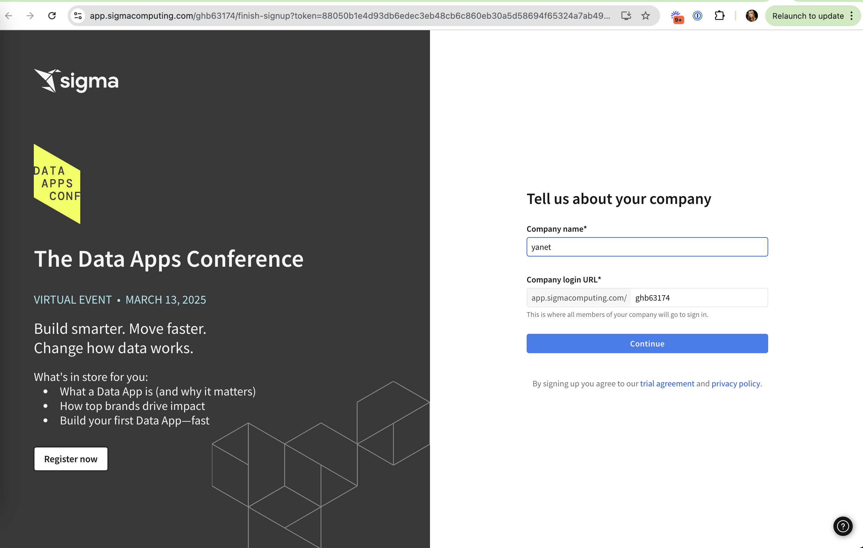
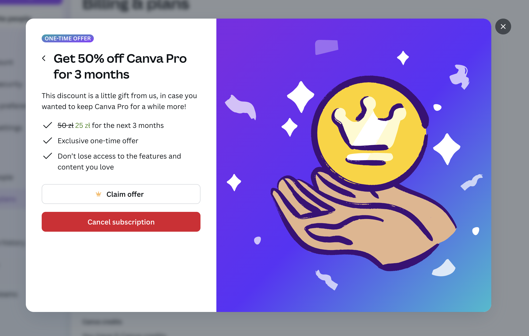
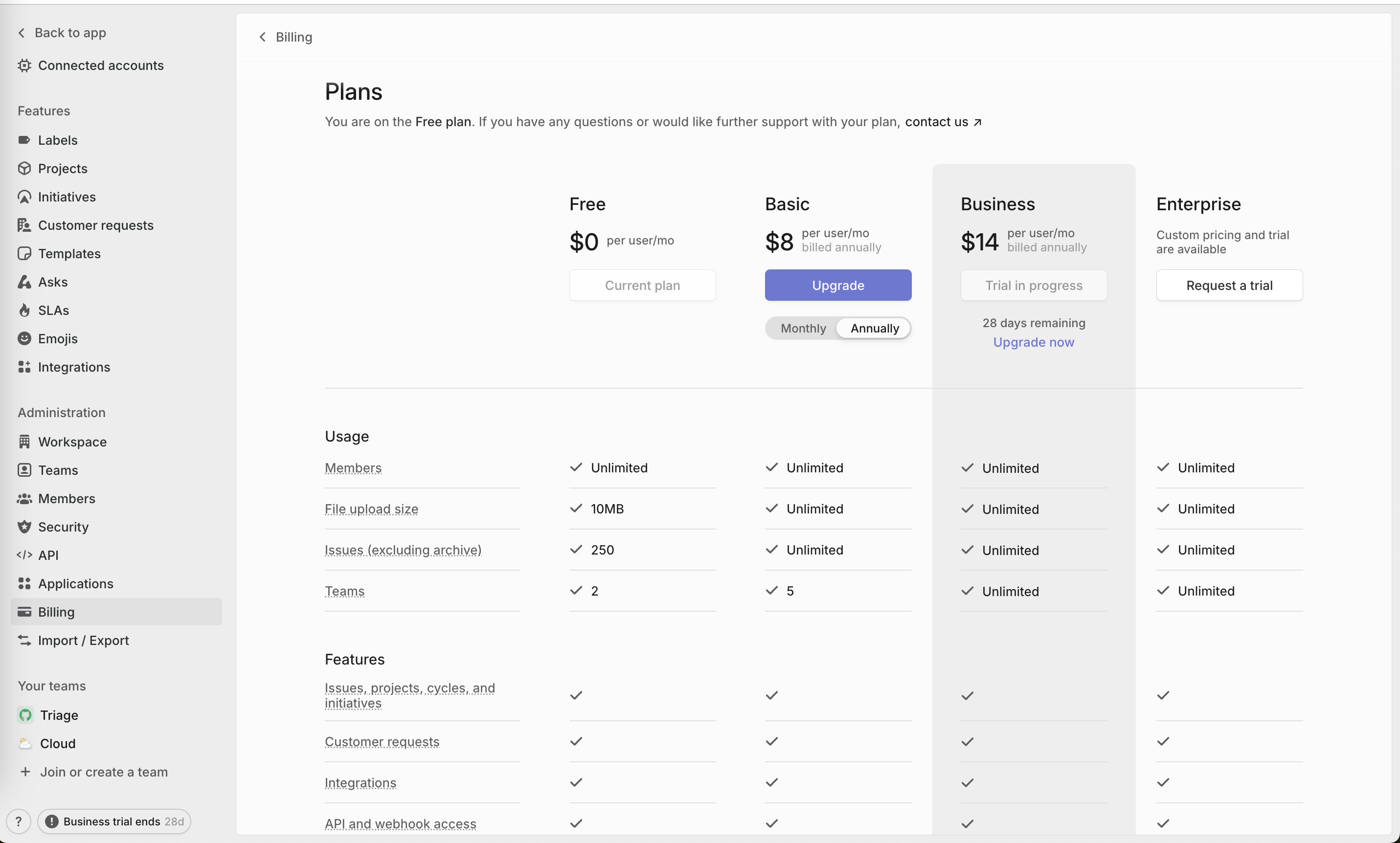
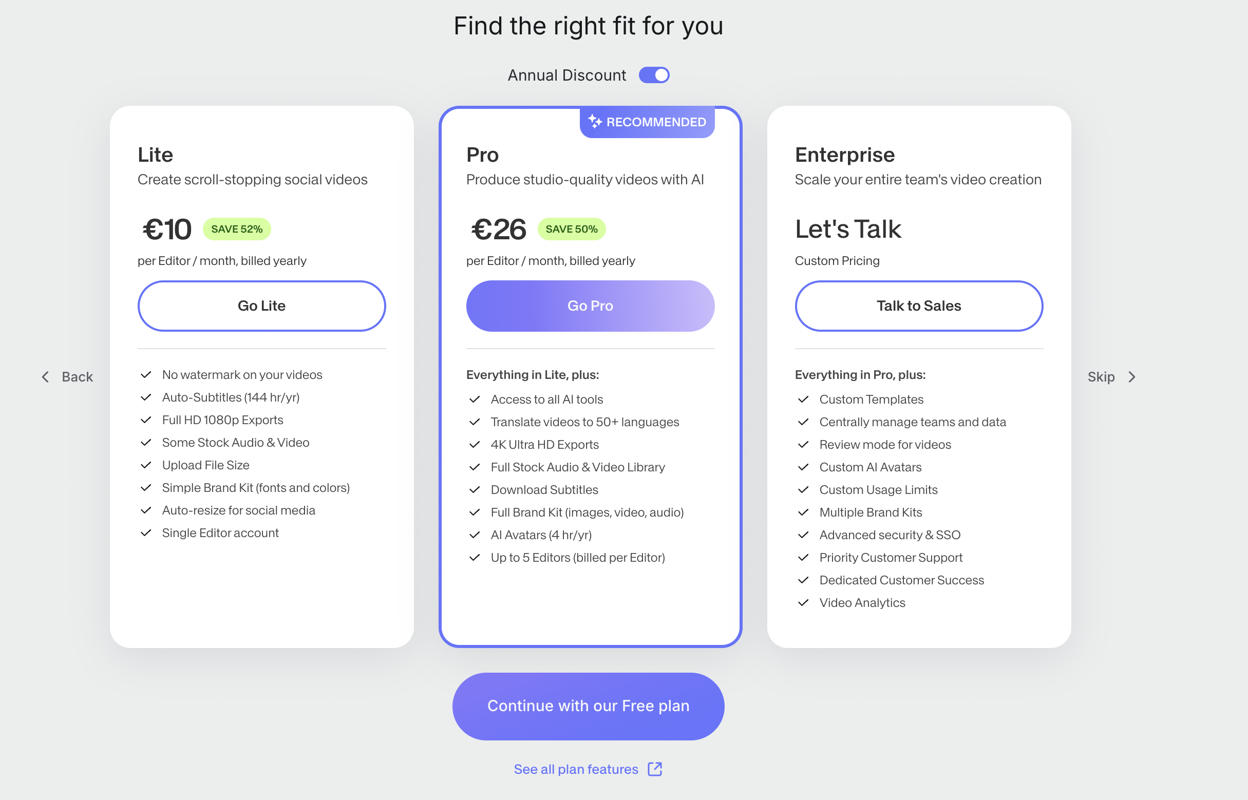
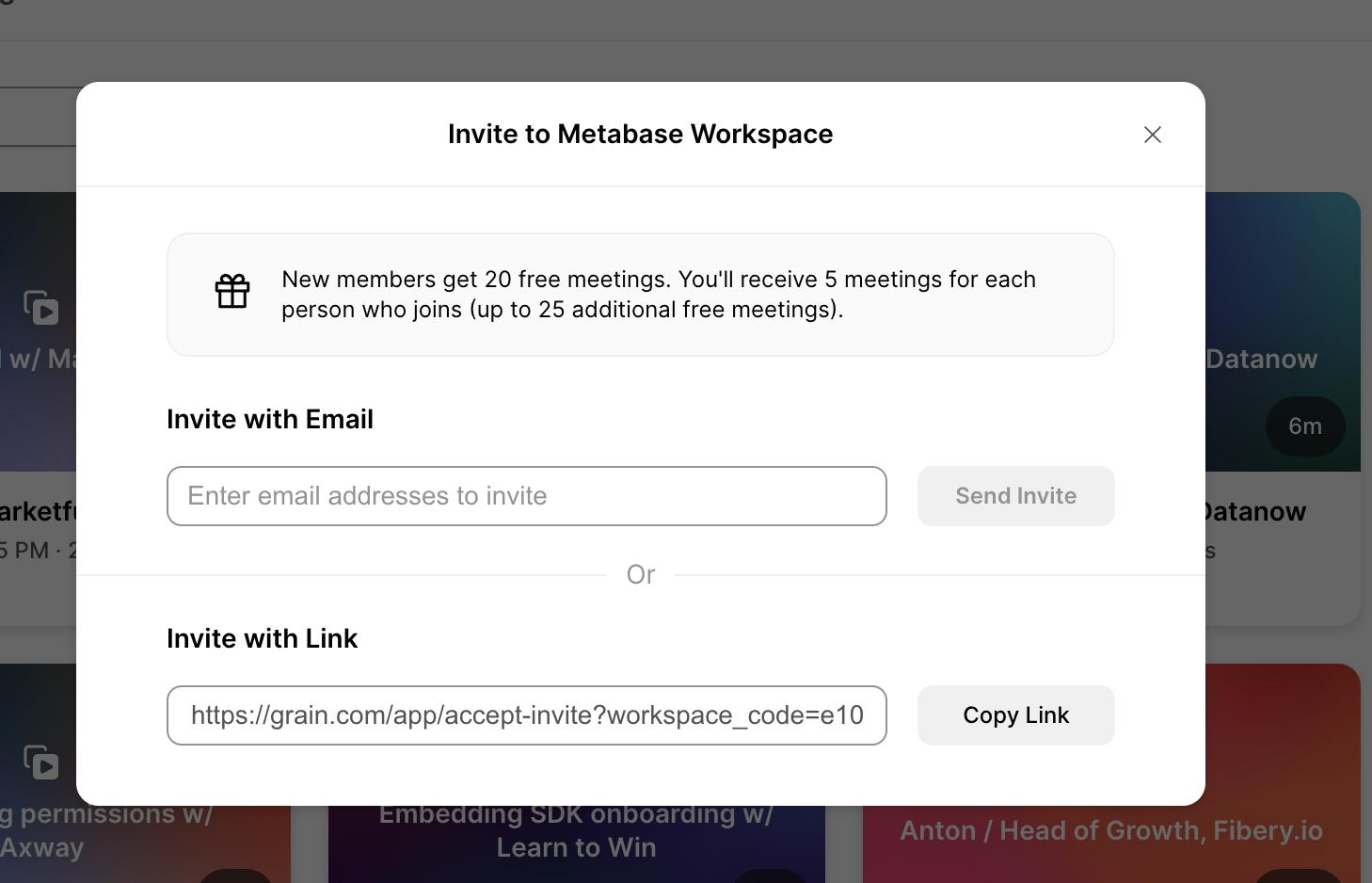
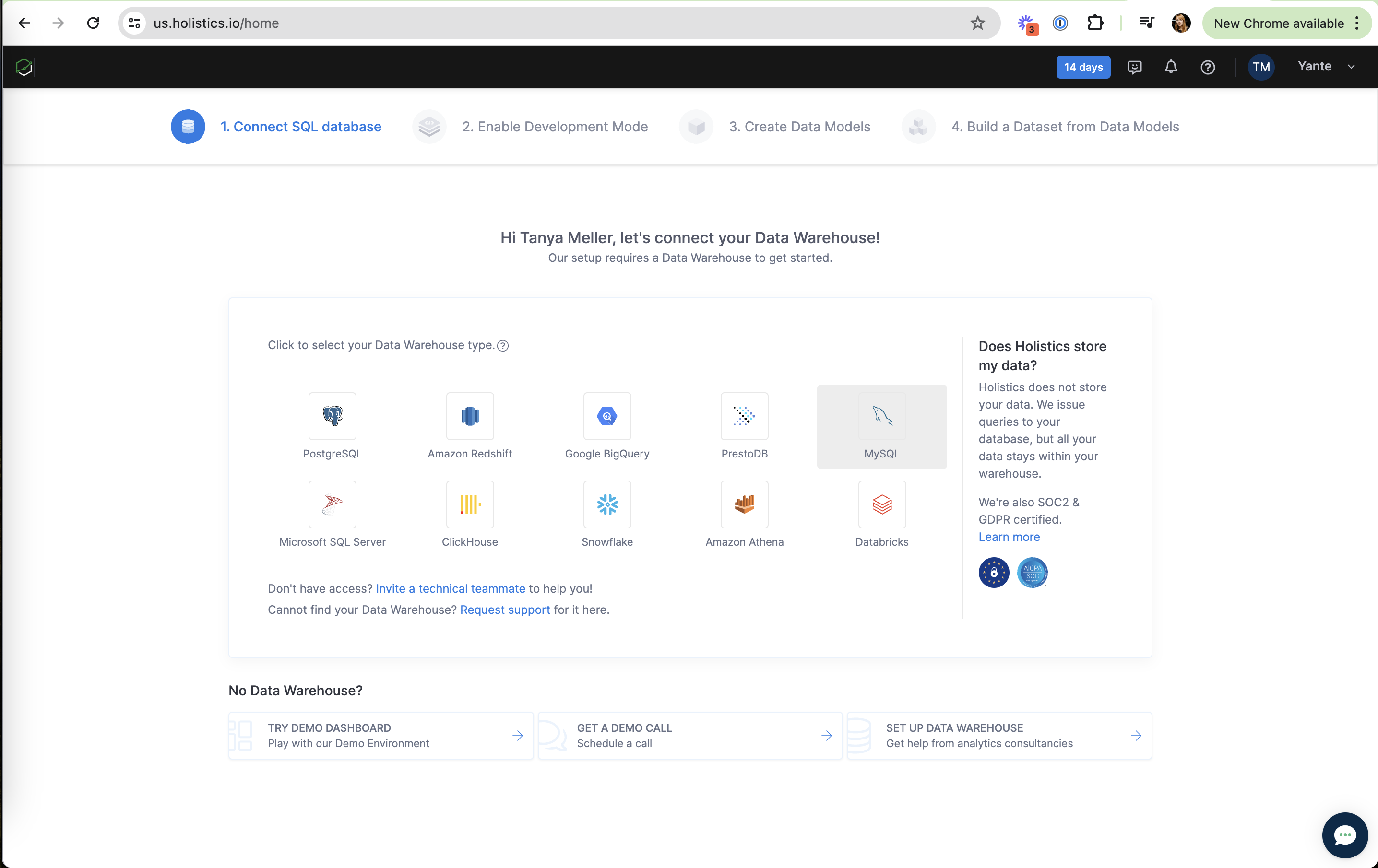
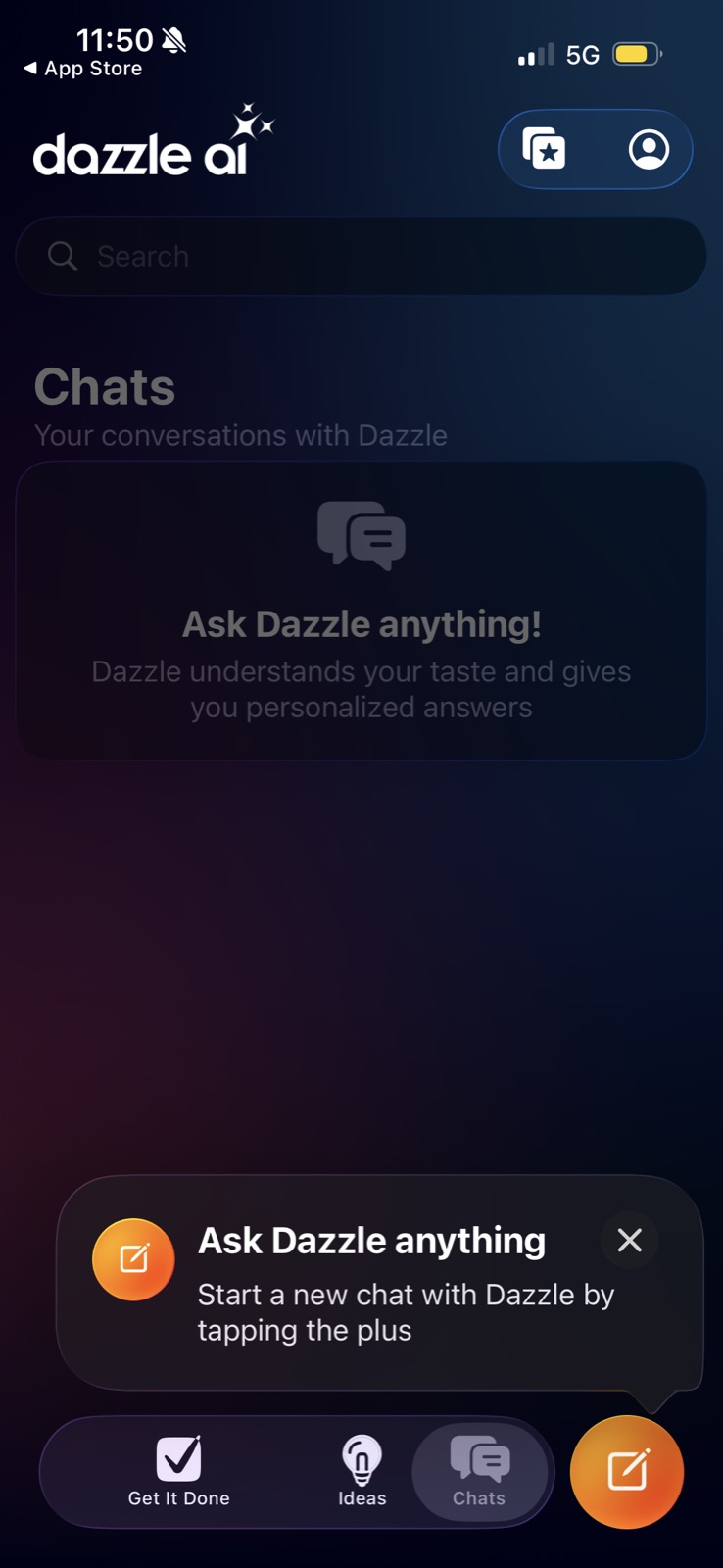
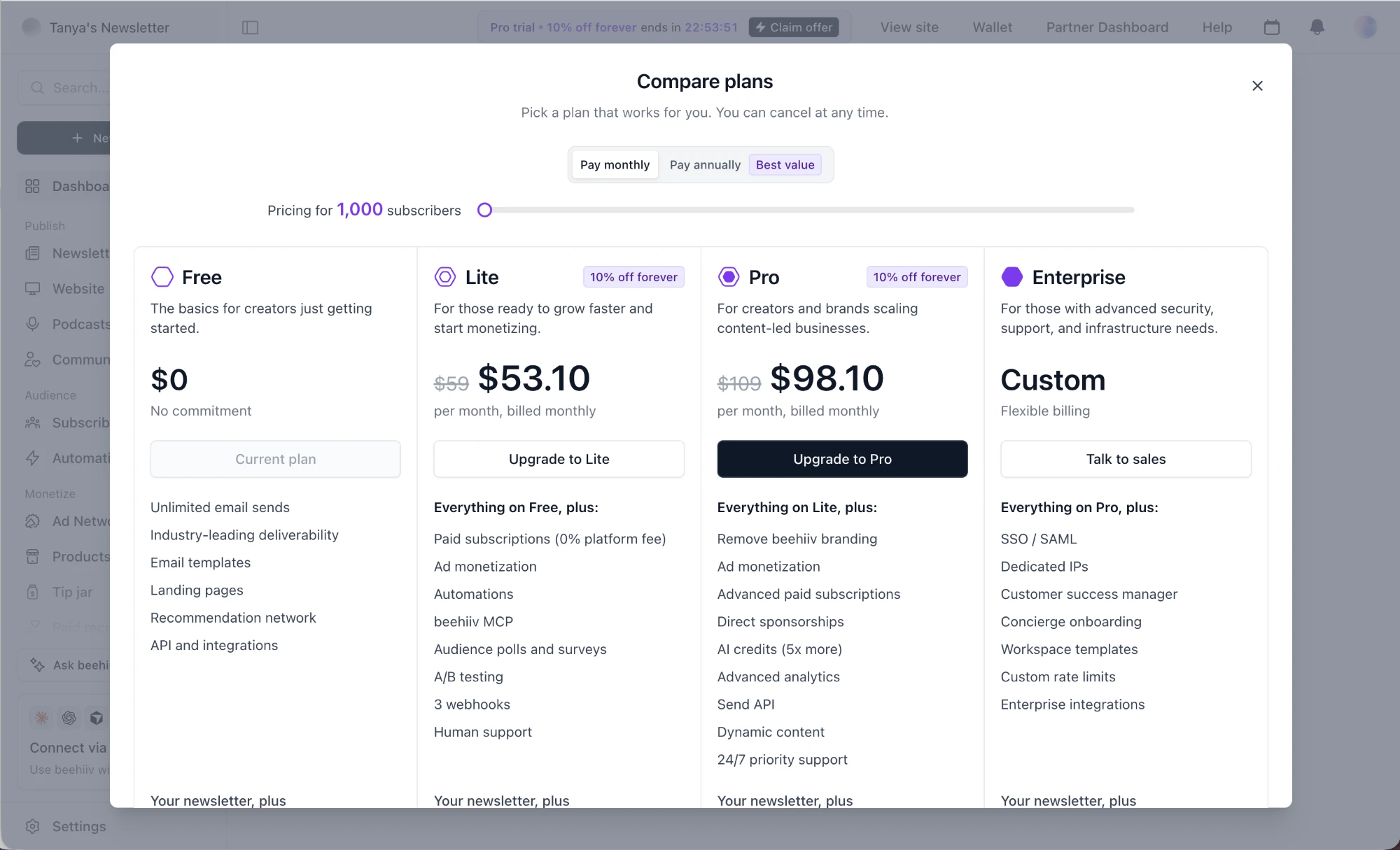
Dazzle AI: One persistent primary action Dazzle AI (working) One persistent primary action The orange floating button stays in the same spot across tabs, so the main action is always one tap away. beehiiv: Only Pro gets the dark CTA beehiiv (working) Only Pro gets the dark CTA One button stands out, so the target plan is unmistakable. Cursor: Brightest button is pay-as-you-go Cursor (working) Brightest button is pay-as-you-go The only filled button is "Enable On-Demand Usage", not a plan upgrade. Cube Cloud: One clear first step Cube Cloud (working) One clear first step "Create Deployment" is the only filled button in the content area. Retool: New org is a quiet link Retool (working) New org is a quiet link "create a new organization" is plain text below, not a competing button. Supabase: Persistent quota banner Supabase (working) Persistent quota banner The top bar keeps "you used up your quota" visible on every page, with "More information". Databricks: Video fills the page Databricks (working) Video fills the page No hero copy or form in the way: the demo is the first and only thing you see. Google Cloud: Headline plus alert Google Cloud (working) Headline plus alert A big headline and a yellow warning block make the status clear before reading. MotherDuck: Countdown, always visible MotherDuck (working) Countdown, always visible "30 days left in trial" sits next to Help in a calm light-blue pill, seen without being in the way. Holistics: One clear CTA Holistics (working) One clear CTA "Let's set up Holistics" is the only action on the page. Holistics: Trial days in the nav Holistics (working) Trial days in the nav "14 days" pill stays visible throughout setup. Holistics: Hand-drawn hint Holistics (working) Hand-drawn hint "Click on the toggle to enable" with a dashed arrow points straight at the control. Holistics: Trial pill stays in the nav Holistics (working) Trial pill stays in the nav "14 days" is always visible in the dark header. Peaka: Native options first Peaka (working) Native options first Peaka Table, BI Table, Rest API and Query come before integrations. Perplexity: Search stays the hero Perplexity (working) Search stays the hero Nothing blocks "Ask anything"; the upsell never interrupts the core task. ElevenLabs: All CTAs look identical ElevenLabs (not working) All CTAs look identical The recommended plan's Select button is no stronger than the others. Sober Tracker: Washed-out Next button Sober Tracker (not working) Washed-out Next button The CTA is a muted purple on purple, the weakest element on the screen. Cursor: Save and Cancel look the same Cursor (not working) Save and Cancel look the same Both buttons share one style, so the committing action has no emphasis. Snowflake: Event ad mid-signup Snowflake (not working) Event ad mid-signup A "Register now" pitch for The Data Apps Conference competes with finishing setup. Canva: The offer is the weaker button Canva (not working) The offer is the weaker button "Claim offer" is a white outline button while "Cancel subscription" is bold red, so the eye goes to cancelling. Linear: Strongest CTA on the cheaper plan Linear (not working) Strongest CTA on the cheaper plan The only filled button is "Upgrade" on Basic, not on Business, the plan being trialed. Synthesia: Free plan is the loudest button Synthesia (not working) Free plan is the loudest button The largest filled button on screen is the free option, which pulls attention away from "Go Pro". Grain: Primary looks disabled Grain (not working) Primary looks disabled "Send Invite" is the same grey as "Copy Link", so nothing reads as the main action. Holistics: Fallbacks are washed out Holistics (not working) Fallbacks are washed out "No Data Warehouse?" options (demo, call, consultants) are pale and below the fold.