Usability heuristic

Progressive disclosure

Show the few options most people need first, and move advanced or rarely used details to a second step.

Progressive disclosure Two pricing tables for the same three plans. One lists all ten feature rows at once, so the rows that differ are buried. The other shows the three rows that decide the choice, with a Compare all 10 features link that opens the rest. All 10 rows at once Free Pro Team Projects Team seats Storage Guest access Version history Integrations API access Single sign-on Audit log Priority support What differs is buried The 3 rows that decide, first Free Pro Team Projects Team seats Priority support Compare all 10 features 7 more rows open on click Decide fast, detail one click away
The same pricing table twice: all ten feature rows at once, or the three rows that decide the choice with the full comparison one click away.

Progressive disclosure splits information into layers: the core choice up front, the rest one click away behind "Show all", "Advanced" or "View full comparison". The site uses the term for collapsing secondary content, sequencing setup into steps, and asking for profile data over time instead of all at once.

Jakob Nielsen (2006) describes it as deferring advanced features to a secondary screen so the interface is easier to learn and less error-prone. An early demonstration is Carroll and Carrithers' "training wheels" study (1984): a word processor that blocked advanced functions for beginners helped new users learn faster and make fewer errors than the full system.

On a pricing page, a short summary table with a link to the full comparison lets most visitors decide quickly, while the detail is still there for the buyer who needs it.

How to use it

  • Show the three or four plan differences that drive the decision; put the full feature matrix behind "Compare all features".
  • Collapse advanced configuration in setup flows behind a clearly labeled row, with sensible defaults already set.
  • Ask for profile details when they become useful (team size when inviting, billing address at checkout) rather than all at signup.

Watch out

  • Hiding something users need often (or the price, or the cancel option) behind a disclosure makes it look like you are concealing it.
  • Too many layers turn into a scavenger hunt; keep it to two levels and make the trigger label say what is inside.
Related

Progressive disclosure in real products 16 working · 4 not

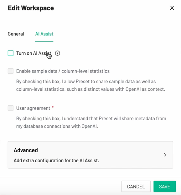
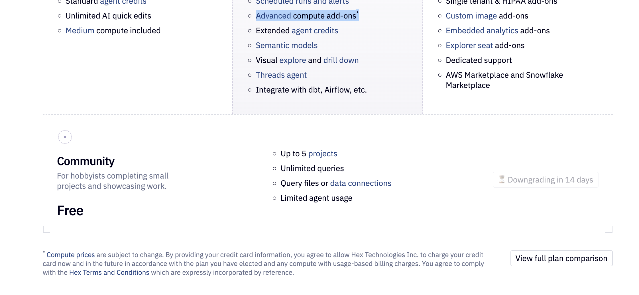
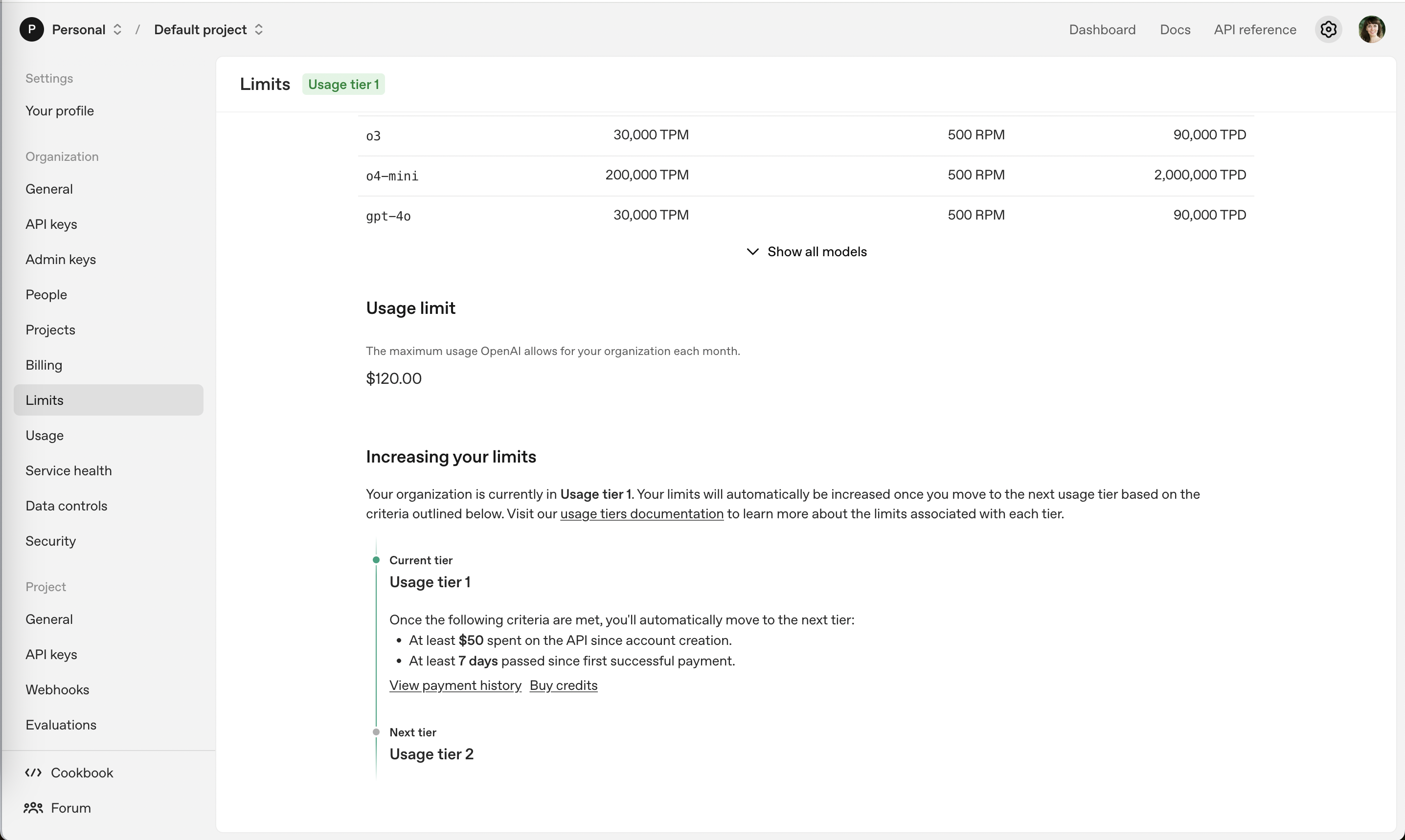
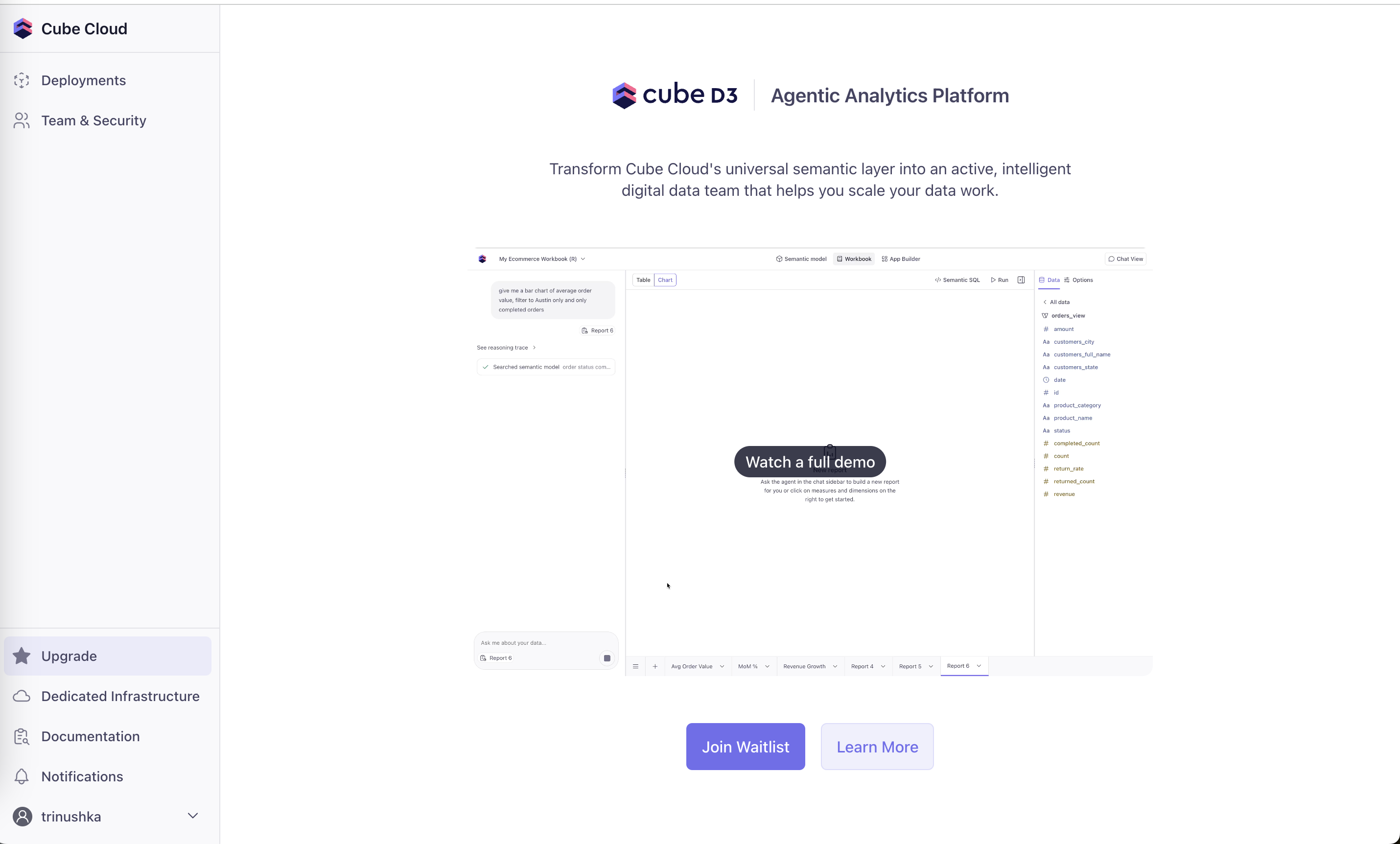
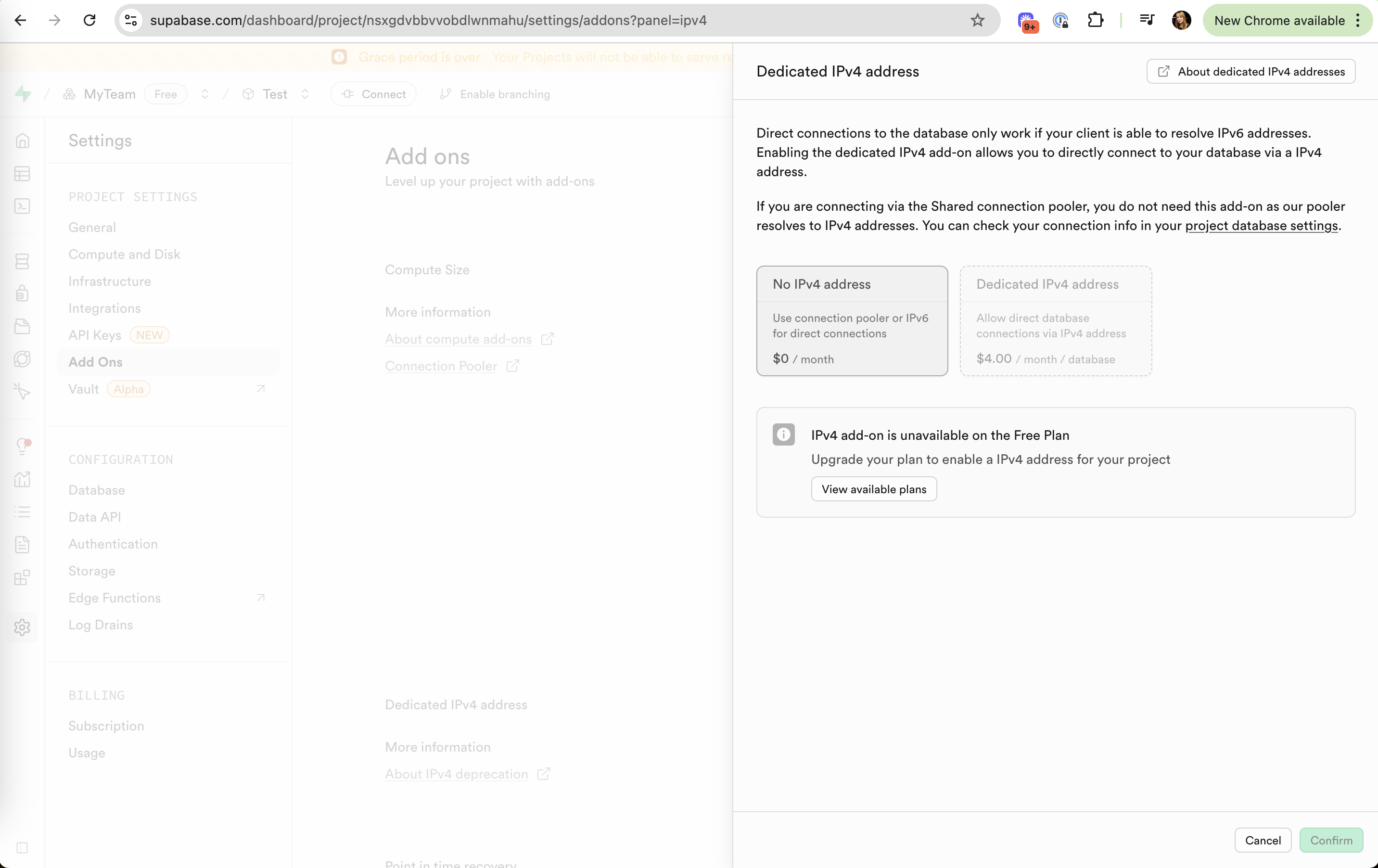
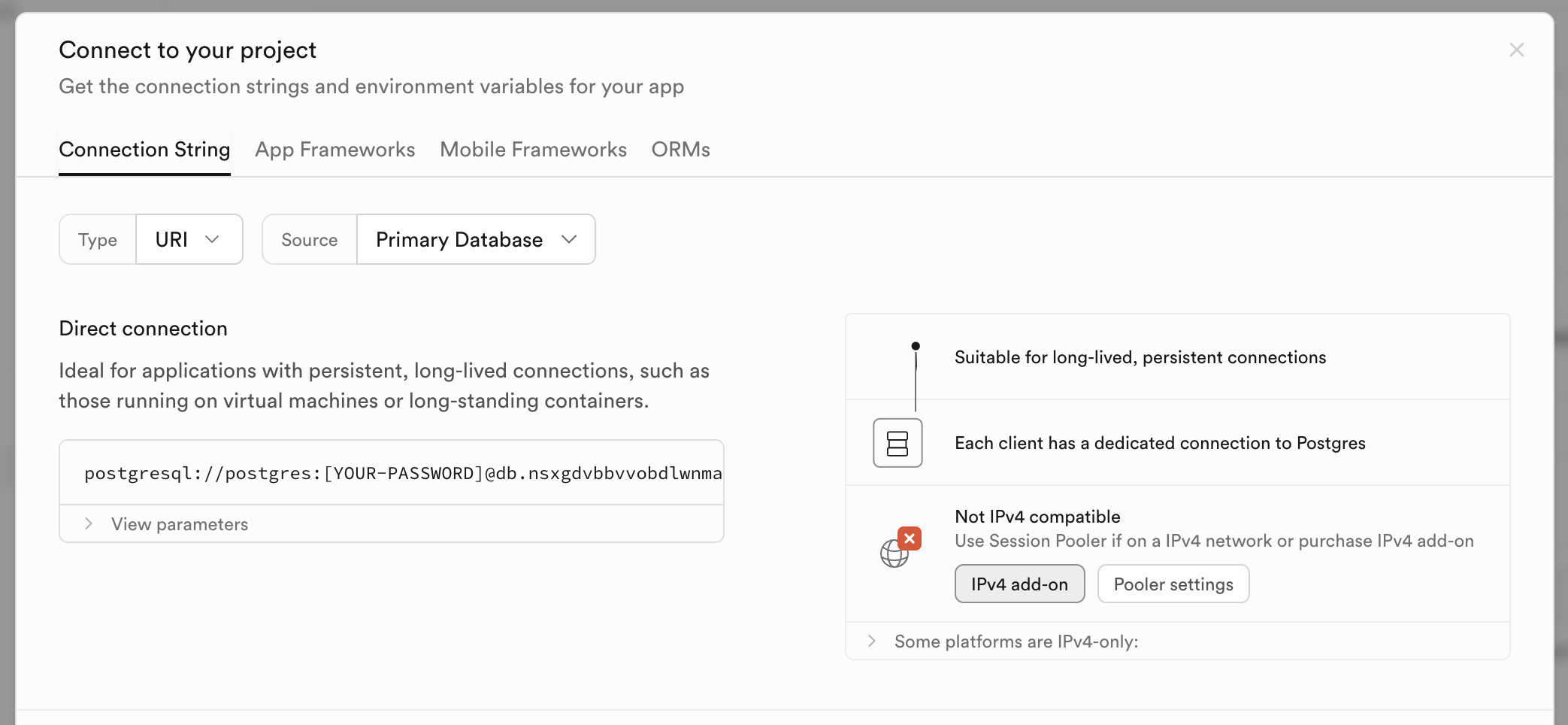
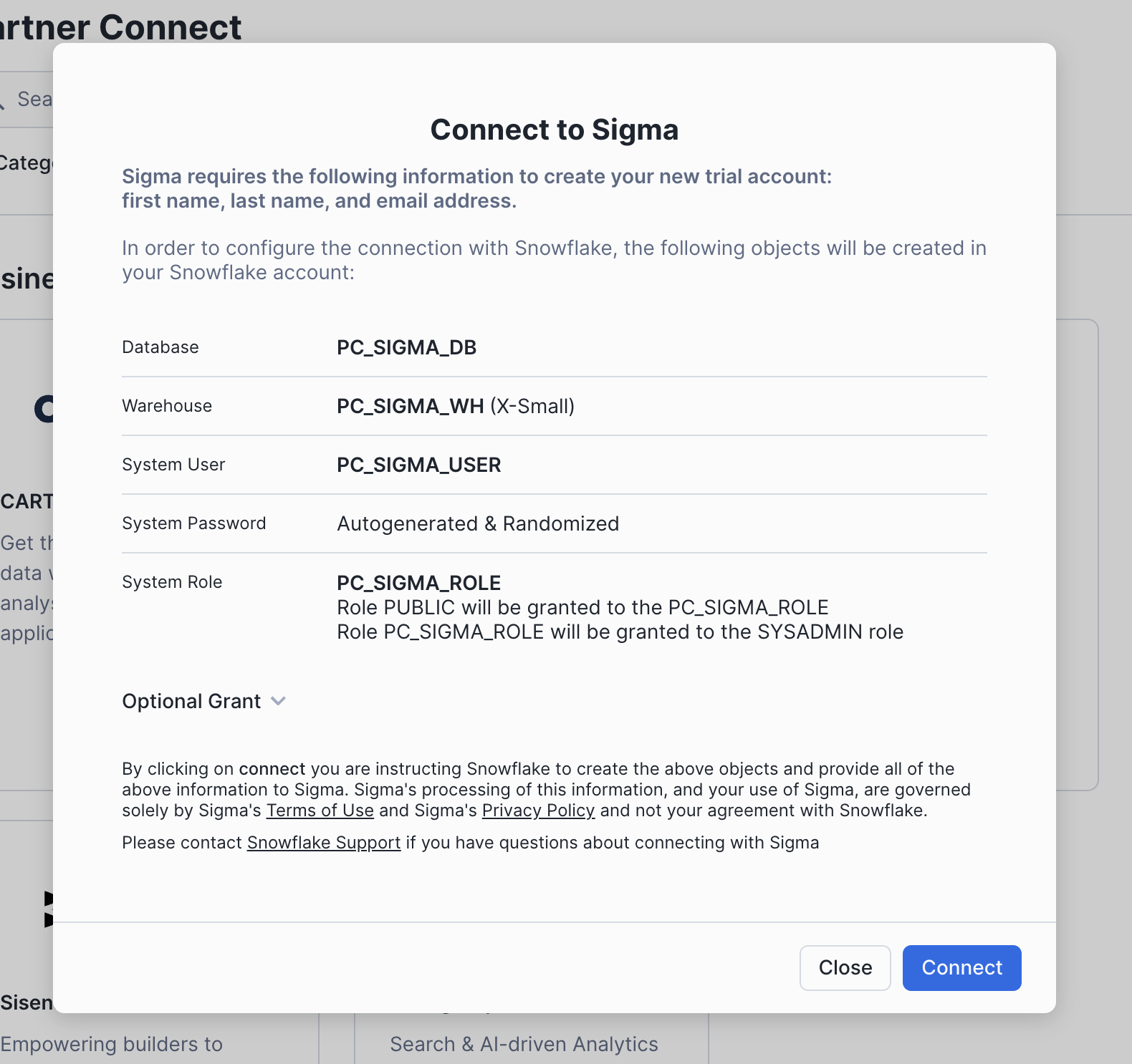
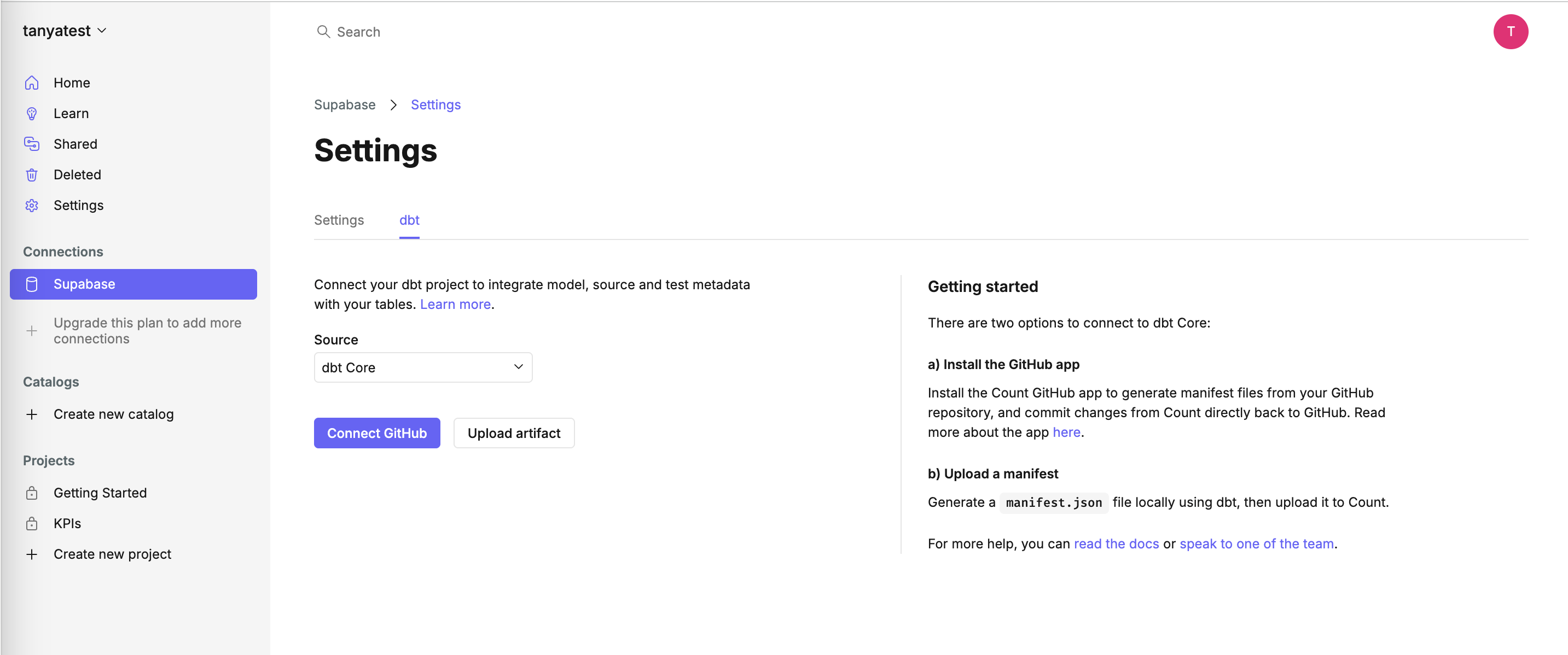
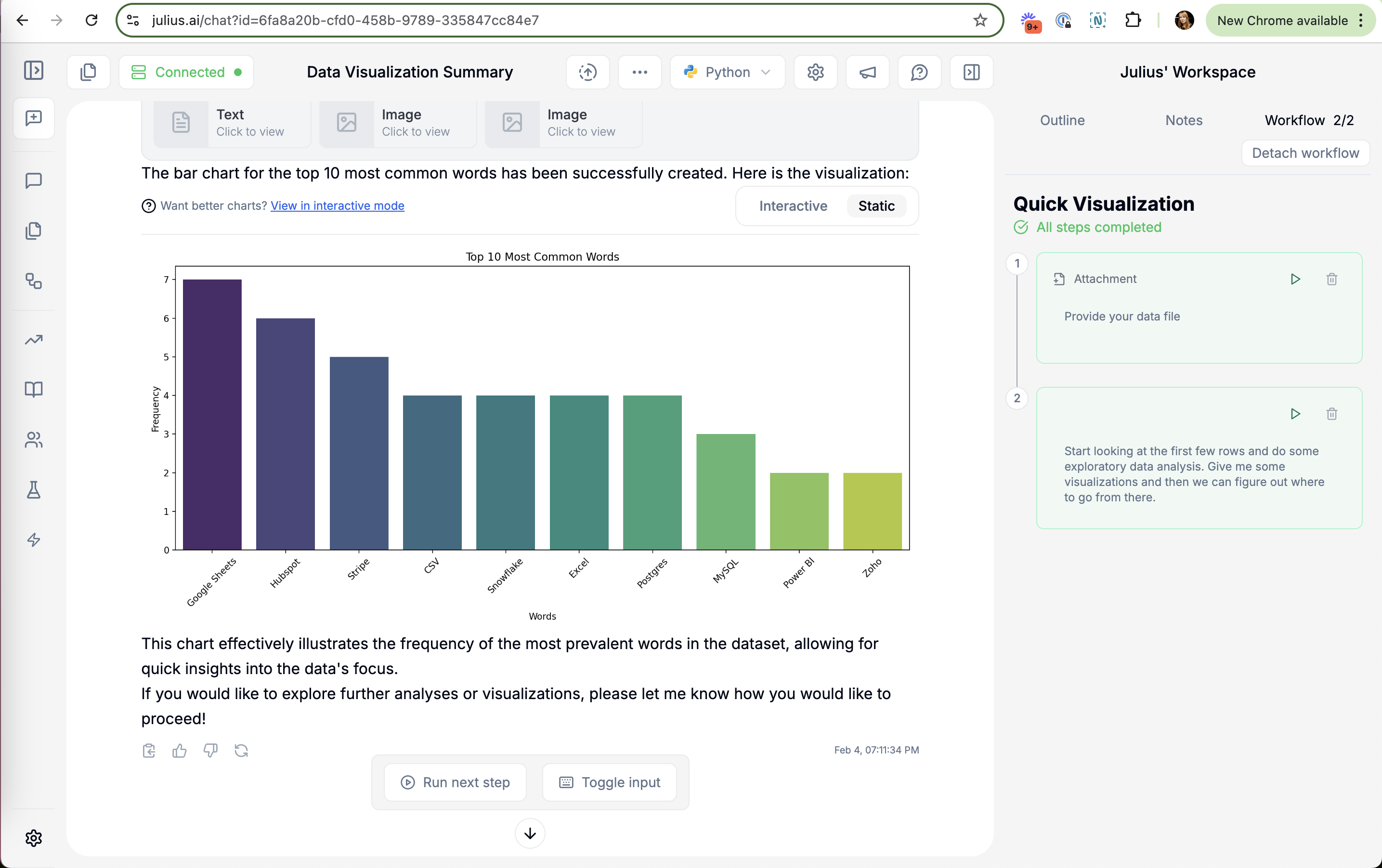
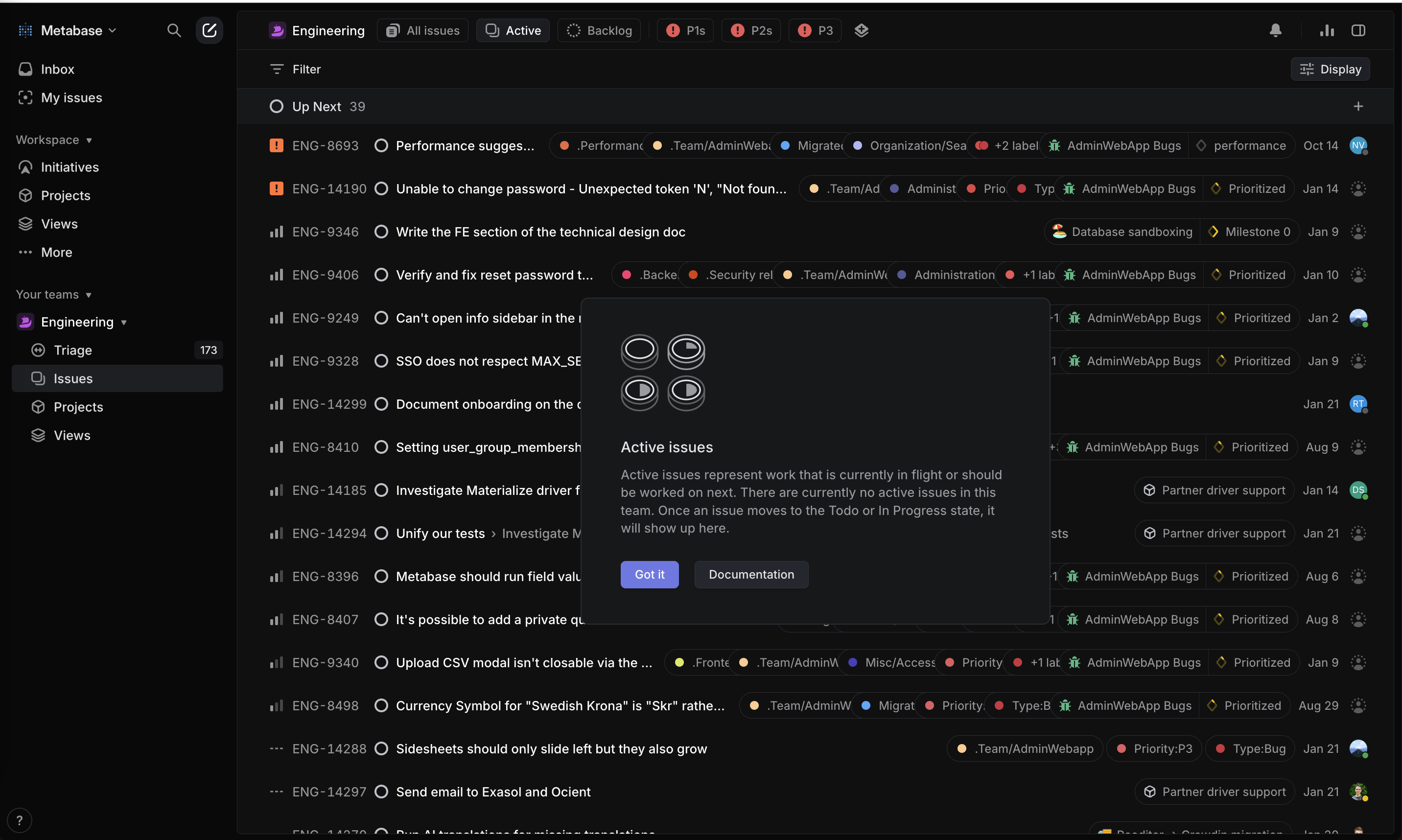
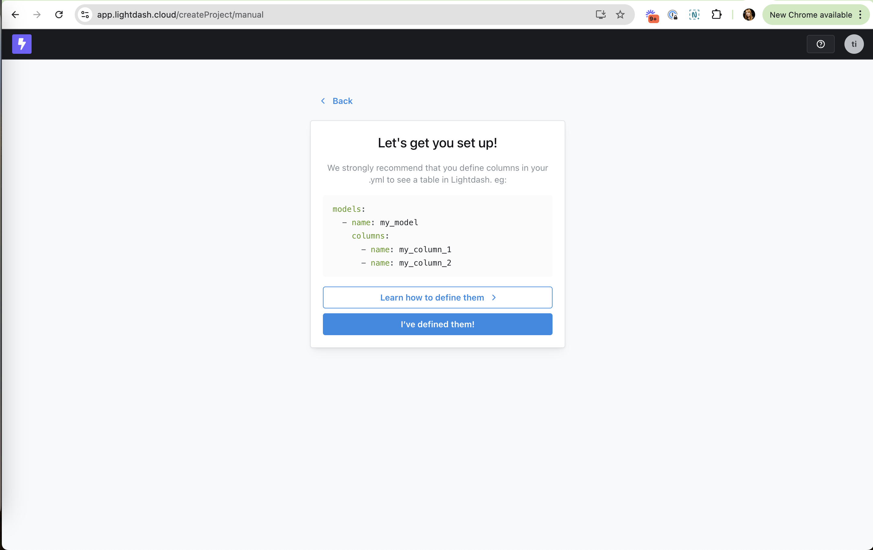
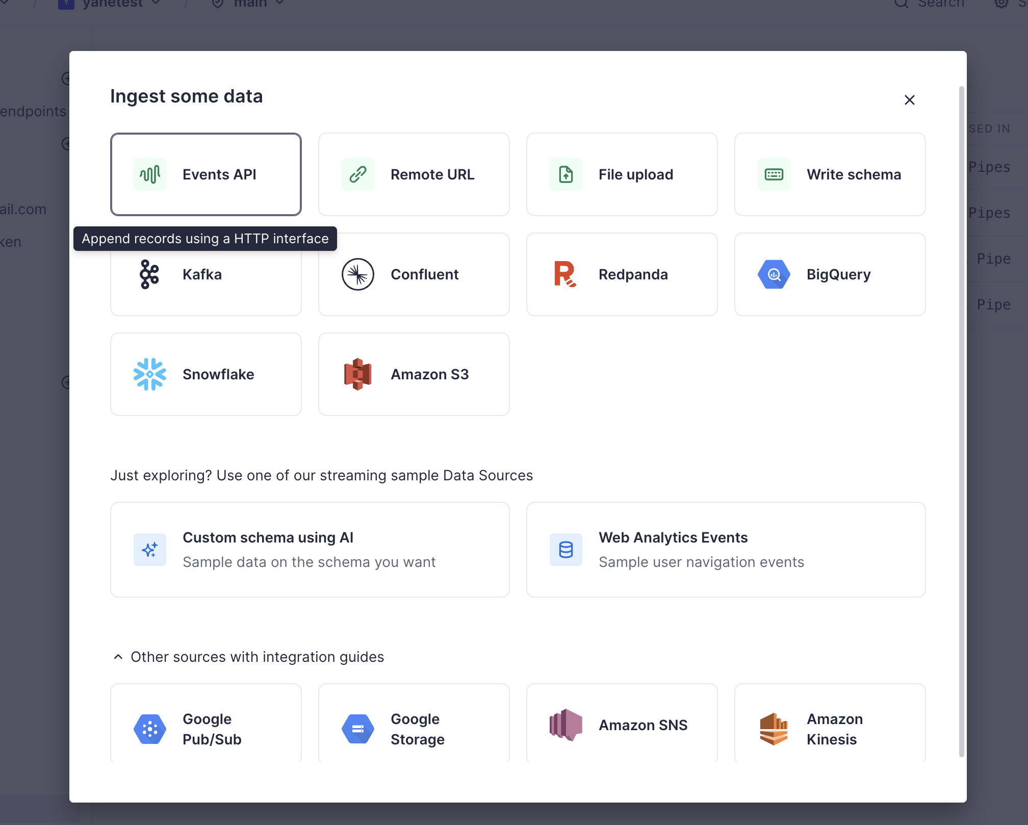
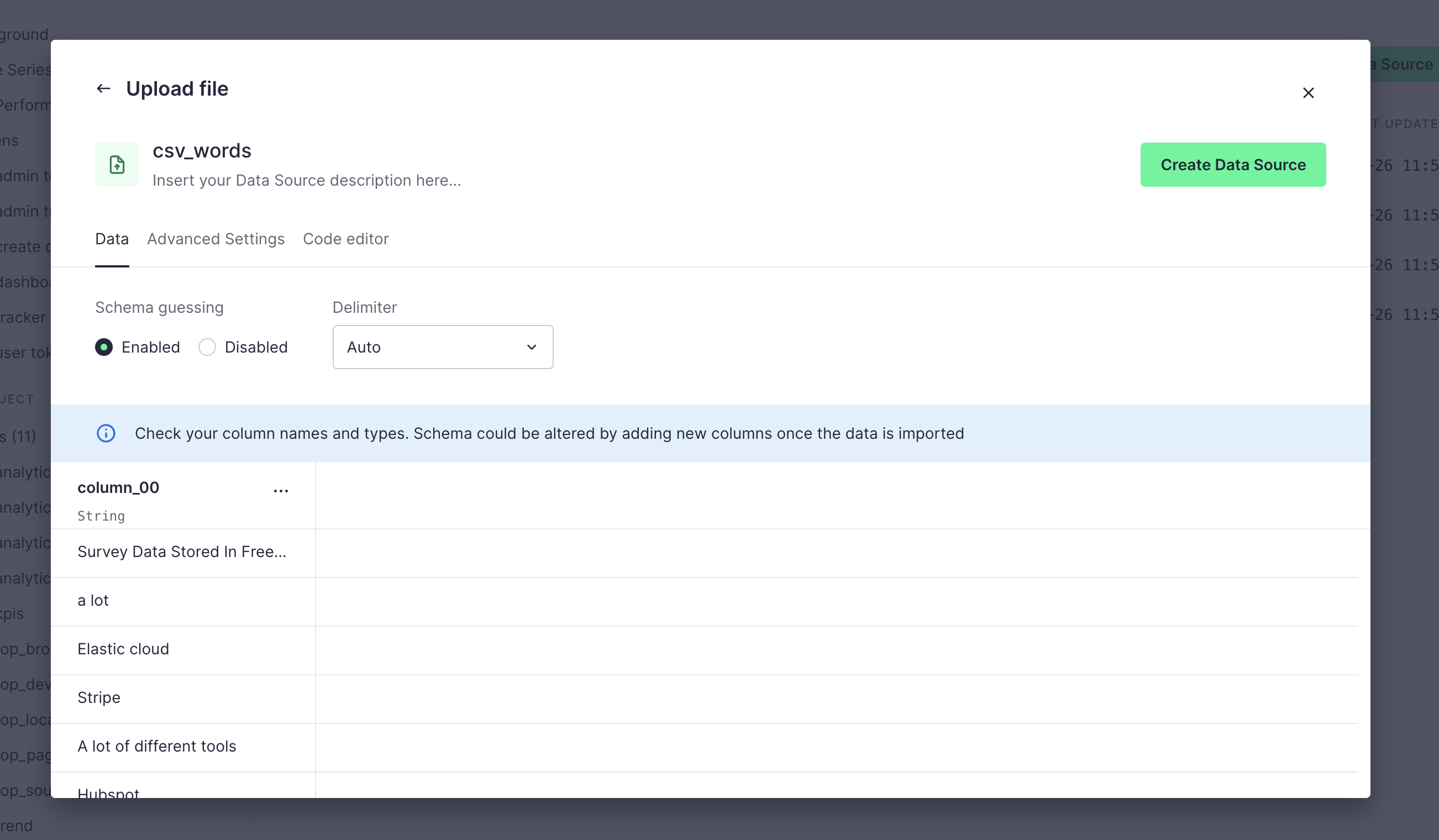
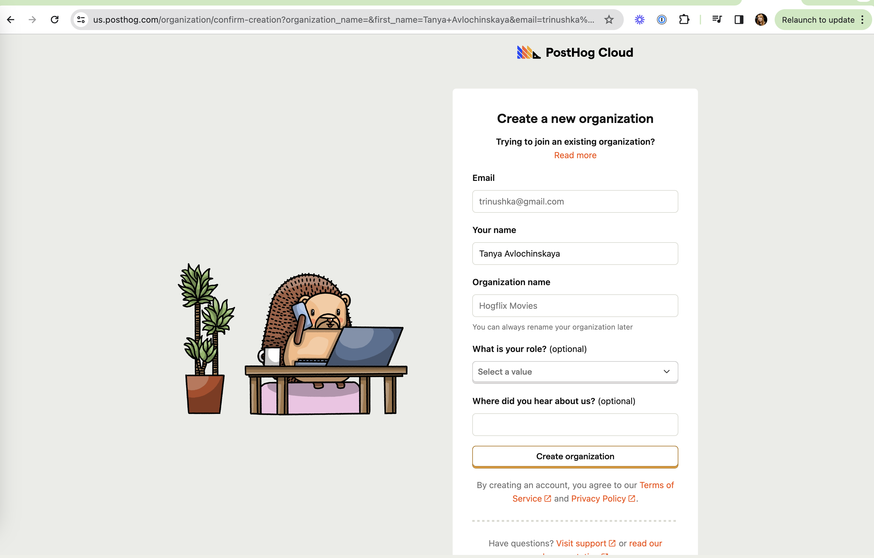
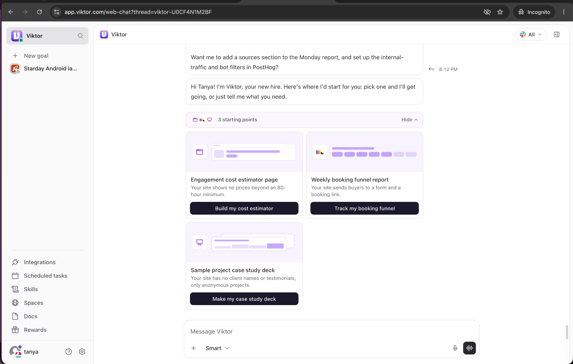
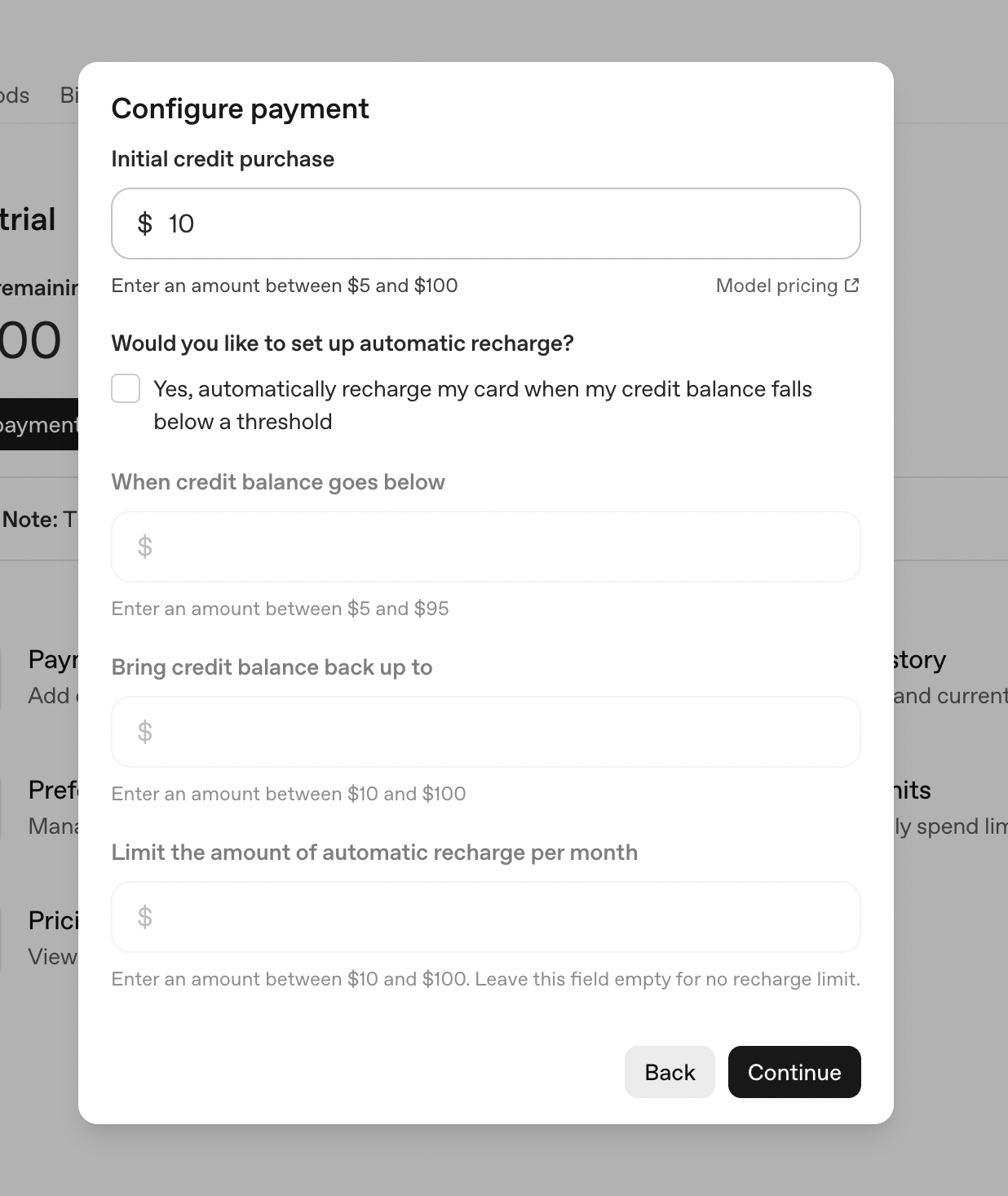
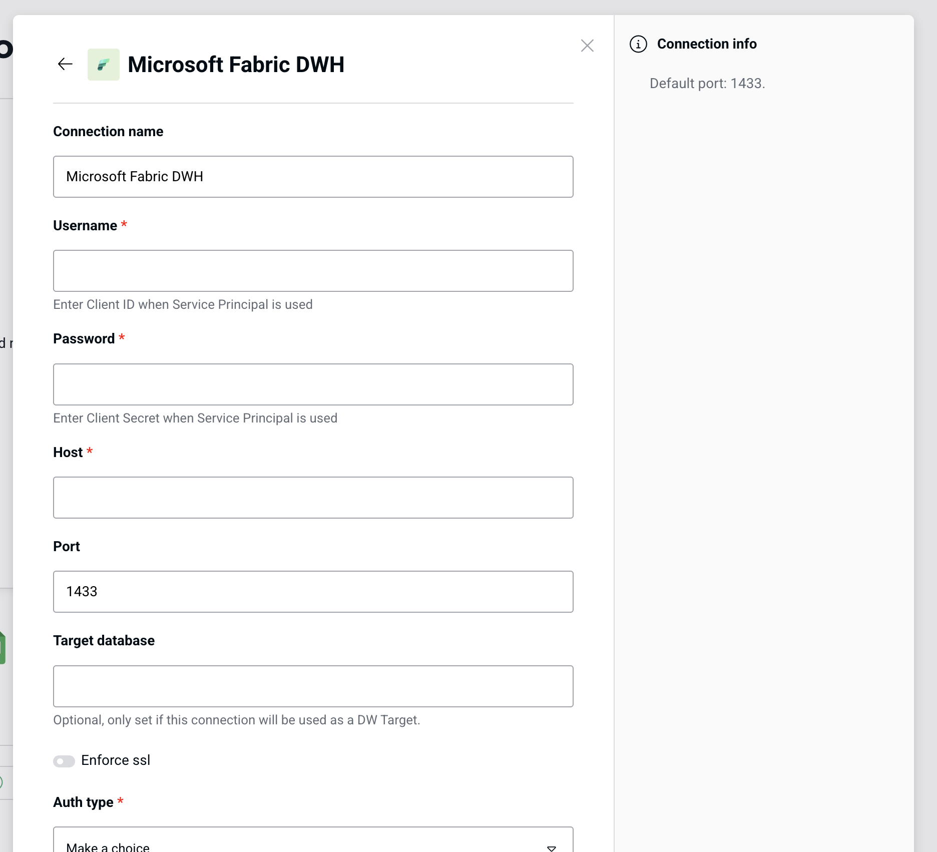
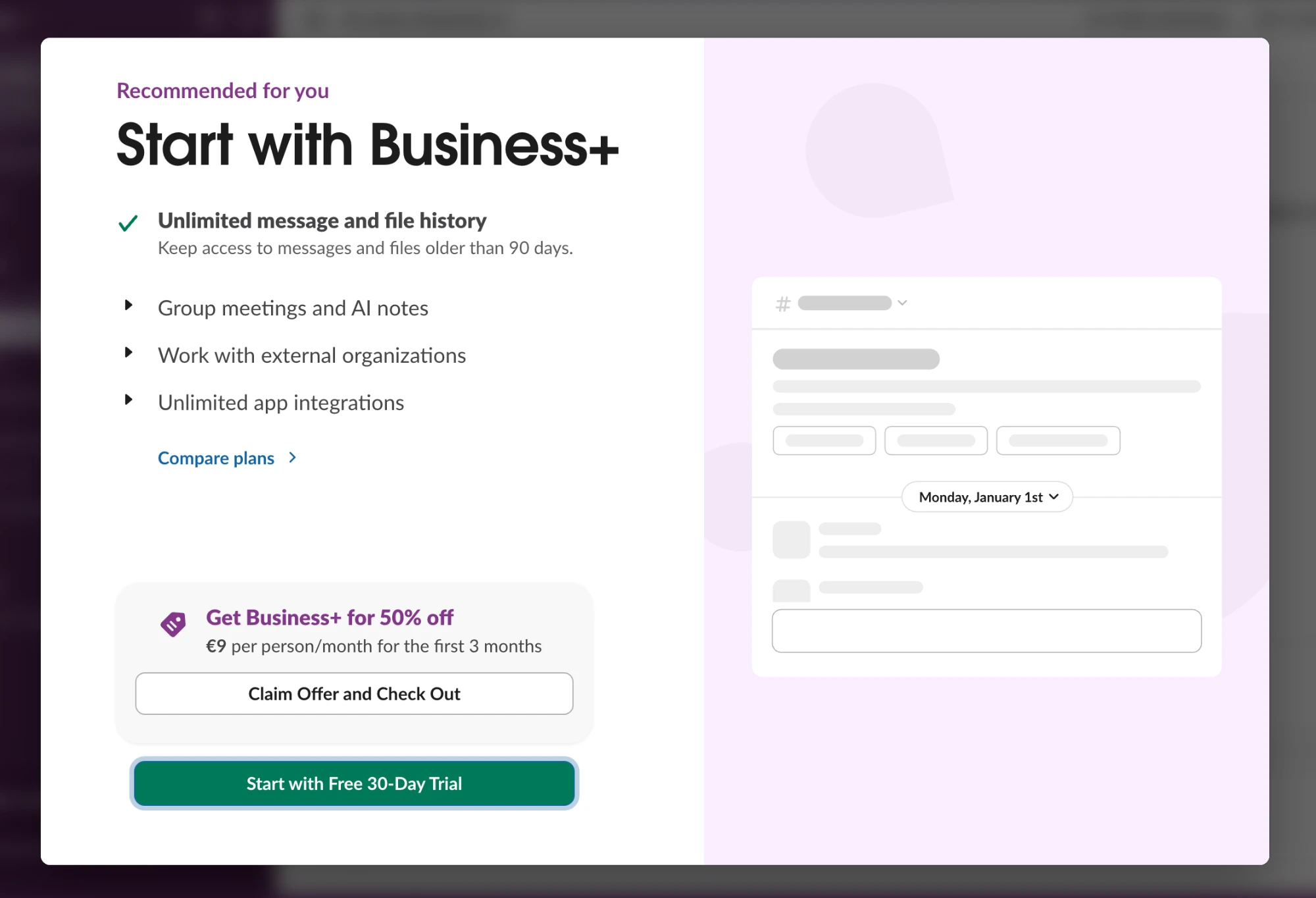
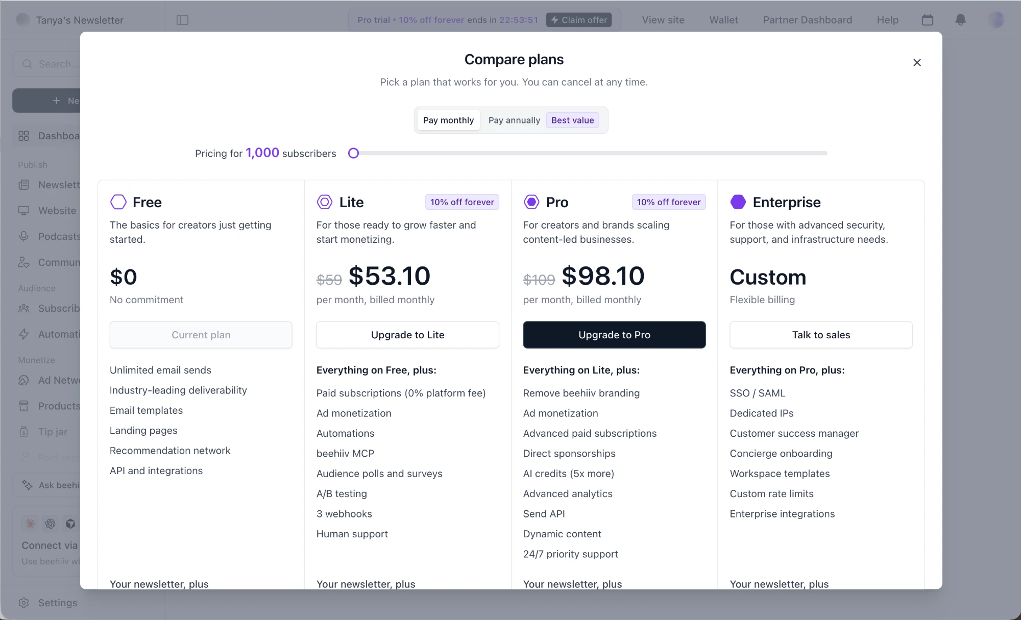
Slack: The rest collapsed Slack (working) The rest collapsed Secondary features stay folded so the hero point stands out. beehiiv: "Everything on Lite, plus:" beehiiv (working) "Everything on Lite, plus:" Each tier lists only what's new, so comparing is easy. Preset: Advanced tucked away Preset (working) Advanced tucked away Extra configuration sits behind a collapsed row. Hex: Full comparison on demand Hex (working) Full comparison on demand "View full plan comparison" keeps the summary short. OpenAI API: Long list collapsed OpenAI API (working) Long list collapsed "Show all models" keeps the rate-limit table short. Cube Cloud: Demo video on the image Cube Cloud (working) Demo video on the image "Watch a full demo" sits on the preview for those who want more. Supabase: Docs one click away Supabase (working) Docs one click away "About dedicated IPv4 addresses" links out for people who need more detail. Supabase: Detail folded away Supabase (working) Detail folded away "Some platforms are IPv4-only" stays collapsed until someone needs it. Snowflake: Optional grant folded Snowflake (working) Optional grant folded Extra permissions stay collapsed until someone needs them. Count: Core or Cloud in one dropdown Count (working) Core or Cloud in one dropdown One Source picker switches the whole form between dbt Core and dbt Cloud. Julius: Nudge to a better chart Julius (working) Nudge to a better chart "Want better charts? View in interactive mode" points to a richer output right under the result. Linear: Dismiss or go deeper Linear (working) Dismiss or go deeper "Got it" and "Documentation" let you close the tip or read more. Lightdash: Learn link as secondary Lightdash (working) Learn link as secondary "Learn how to define them" for those who need more. Tinybird: Hover explains Tinybird (working) Hover explains "Append records using a HTTP interface" explains Events API without leaving the modal. Tinybird: Advanced settings tucked away Tinybird (working) Advanced settings tucked away Advanced Settings and Code editor sit in tabs behind the simple Data view. PostHog: Qualifying questions are optional PostHog (working) Qualifying questions are optional Role and "Where did you hear about us?" are clearly marked (optional). Viktor: Welcome isn't first Viktor (not working) Welcome isn't first The intro sits below an earlier follow-up question, which muddles the thread's start. OpenAI API: Greyed fields make it long OpenAI API (not working) Greyed fields make it long Three disabled inputs show before you opt in, so a one-field purchase looks like a long form. Peliqan: Hints depend on a later choice Peliqan (not working) Hints depend on a later choice "Enter Client ID when Service Principal is used" refers to Auth type, which you only pick at the bottom. Peliqan: "Make a choice" last Peliqan (not working) "Make a choice" last Auth type is required but sits at the end with a placeholder that doesn't hint at the options.