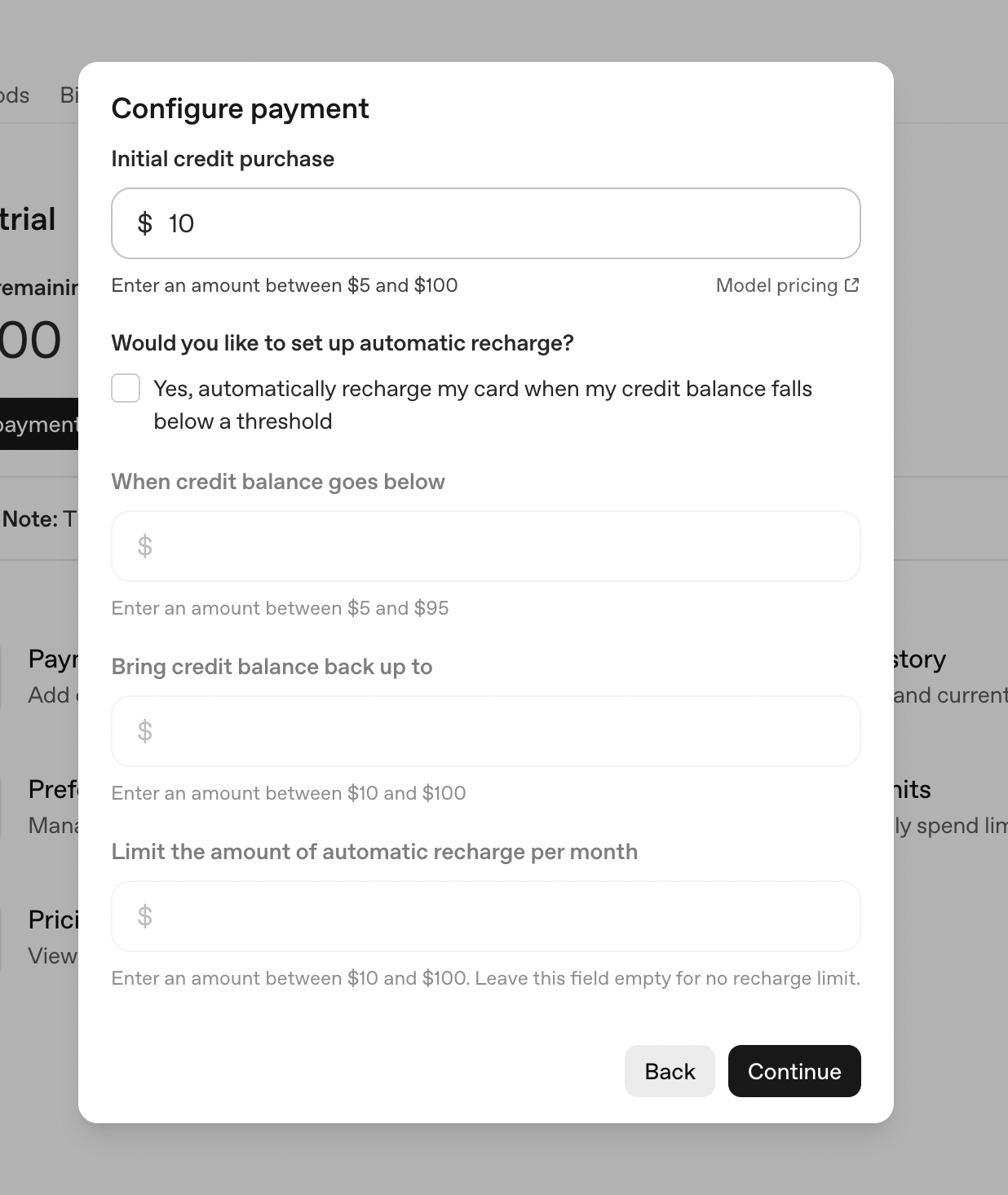
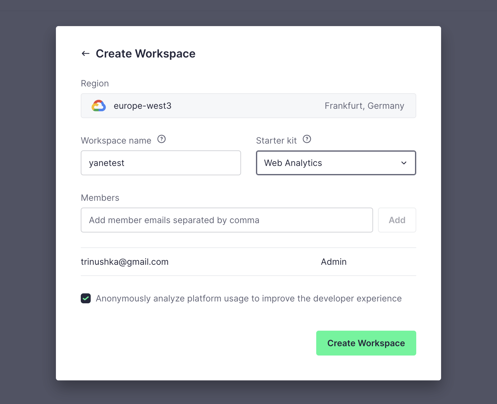
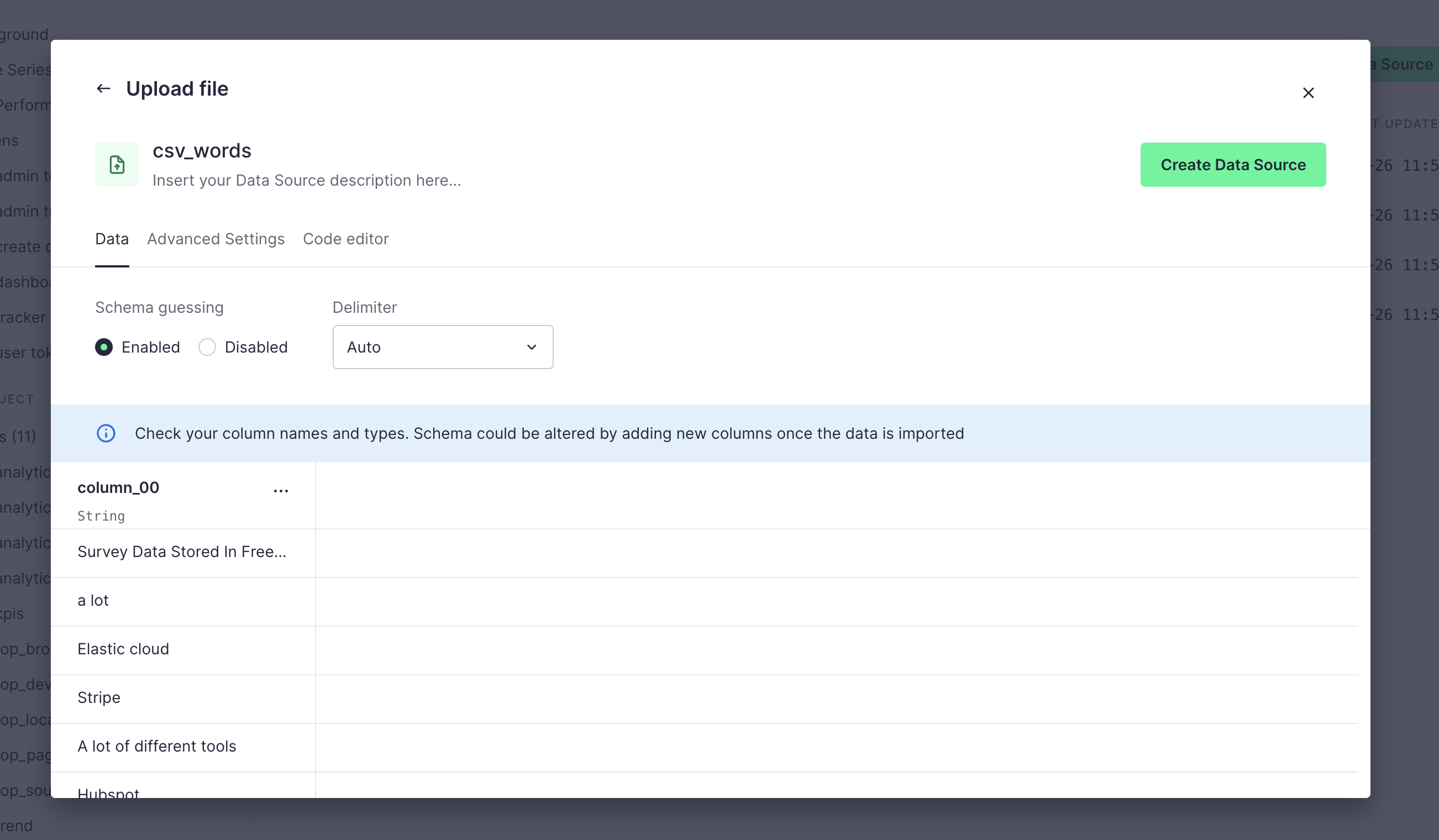
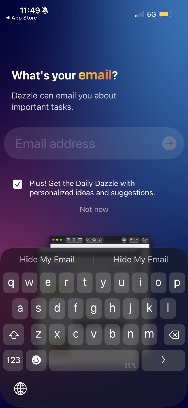
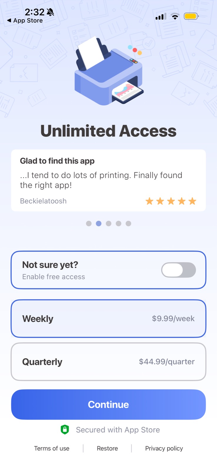
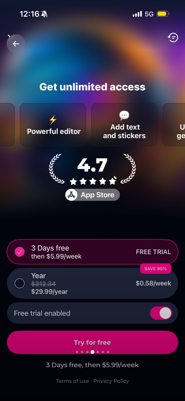
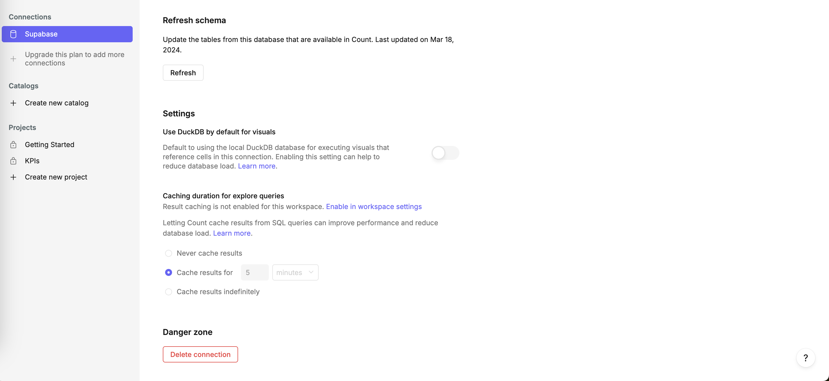
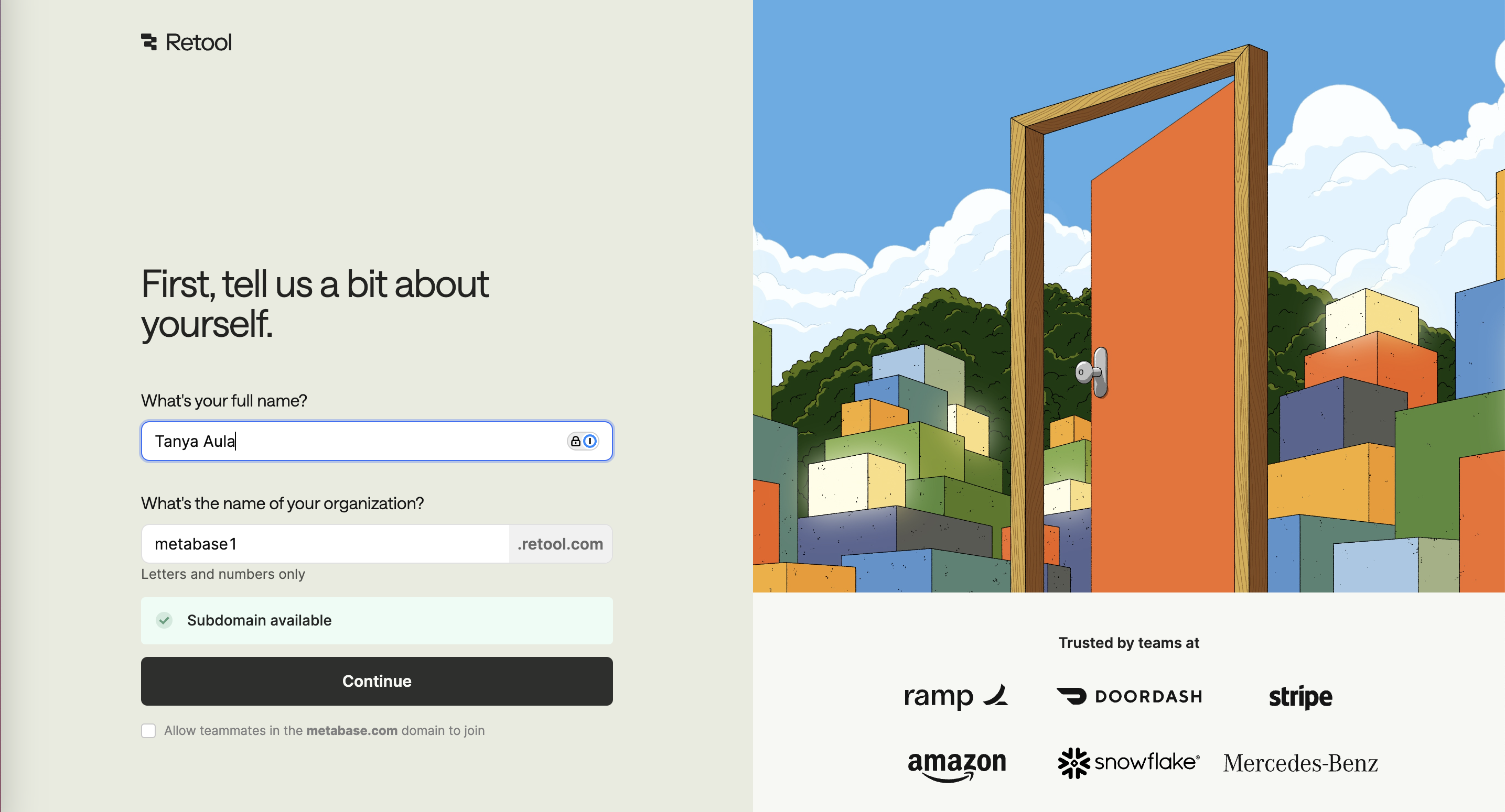
A default is the option that takes effect if the user does nothing: a pre-ticked box, a preselected plan, a toggle that starts on. Because changing it takes a decision, a little effort and sometimes a feeling of going against advice, most people leave it as it is.
Johnson and Goldstein asked 161 people online whether they would be organ donors; 42% agreed when they had to opt in and 82% when being a donor was the default, about twice as many. Madrian and Shea found that 401(k) participation at a US firm jumped after automatic enrollment, and employees also stuck with the default contribution rate and fund. A 2019 meta-analysis of 58 datasets (Jachimowicz and colleagues) confirmed a reliable average effect but with very large variation between studies; defaults worked best when they read as a recommendation or felt like something people already had.
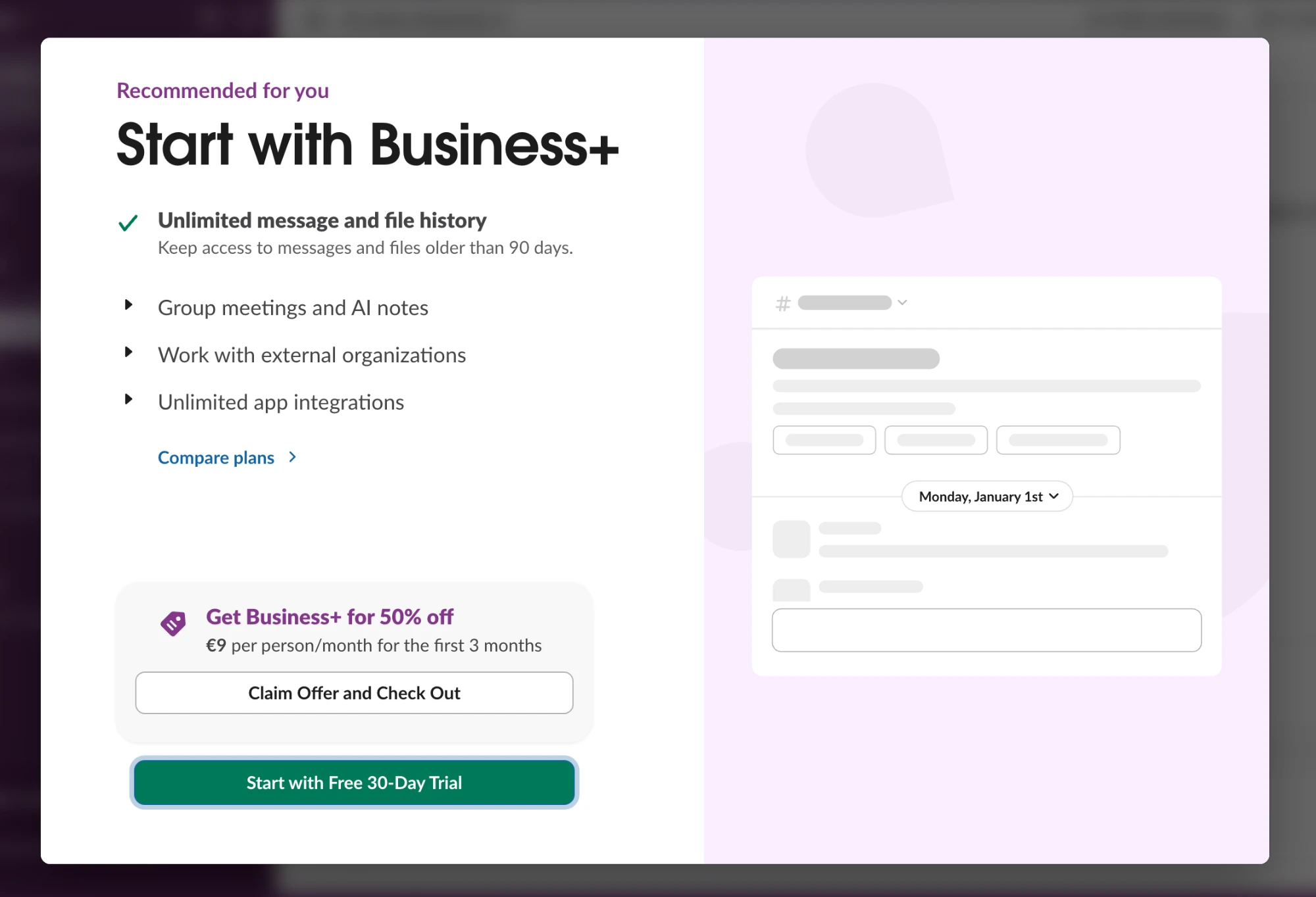
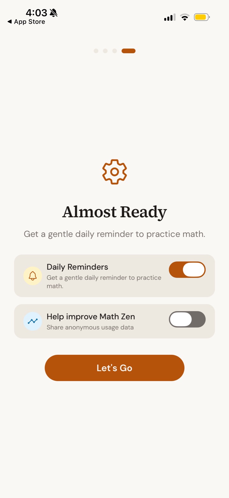
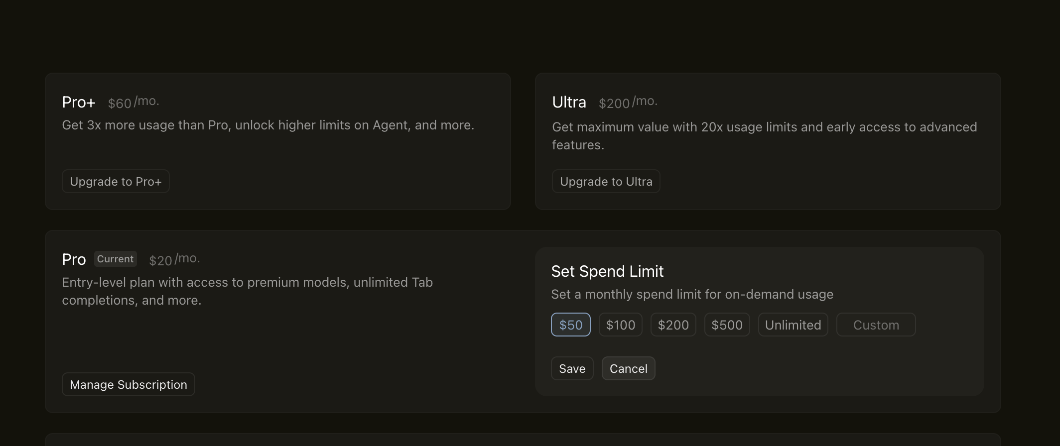
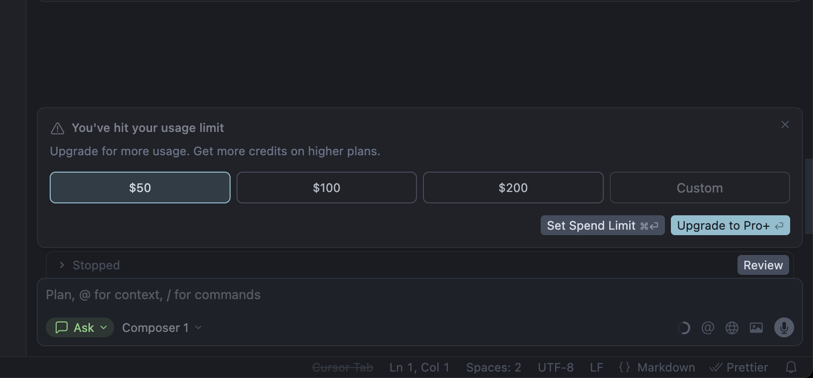
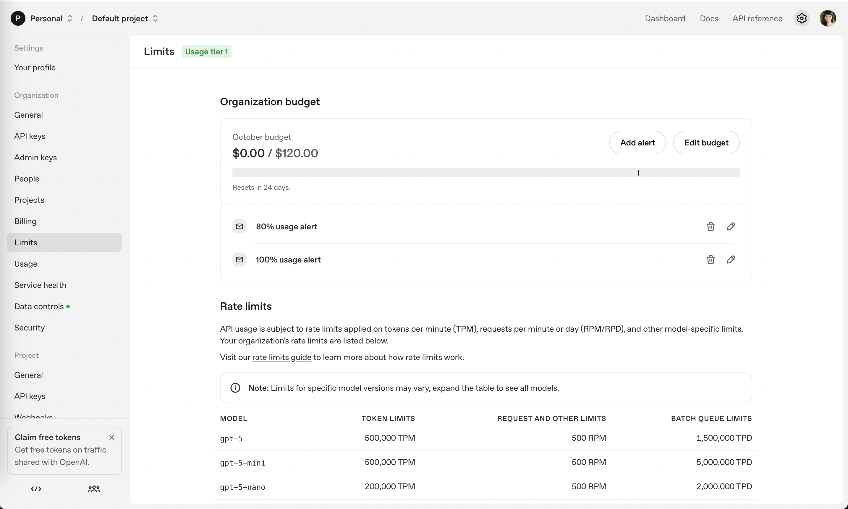
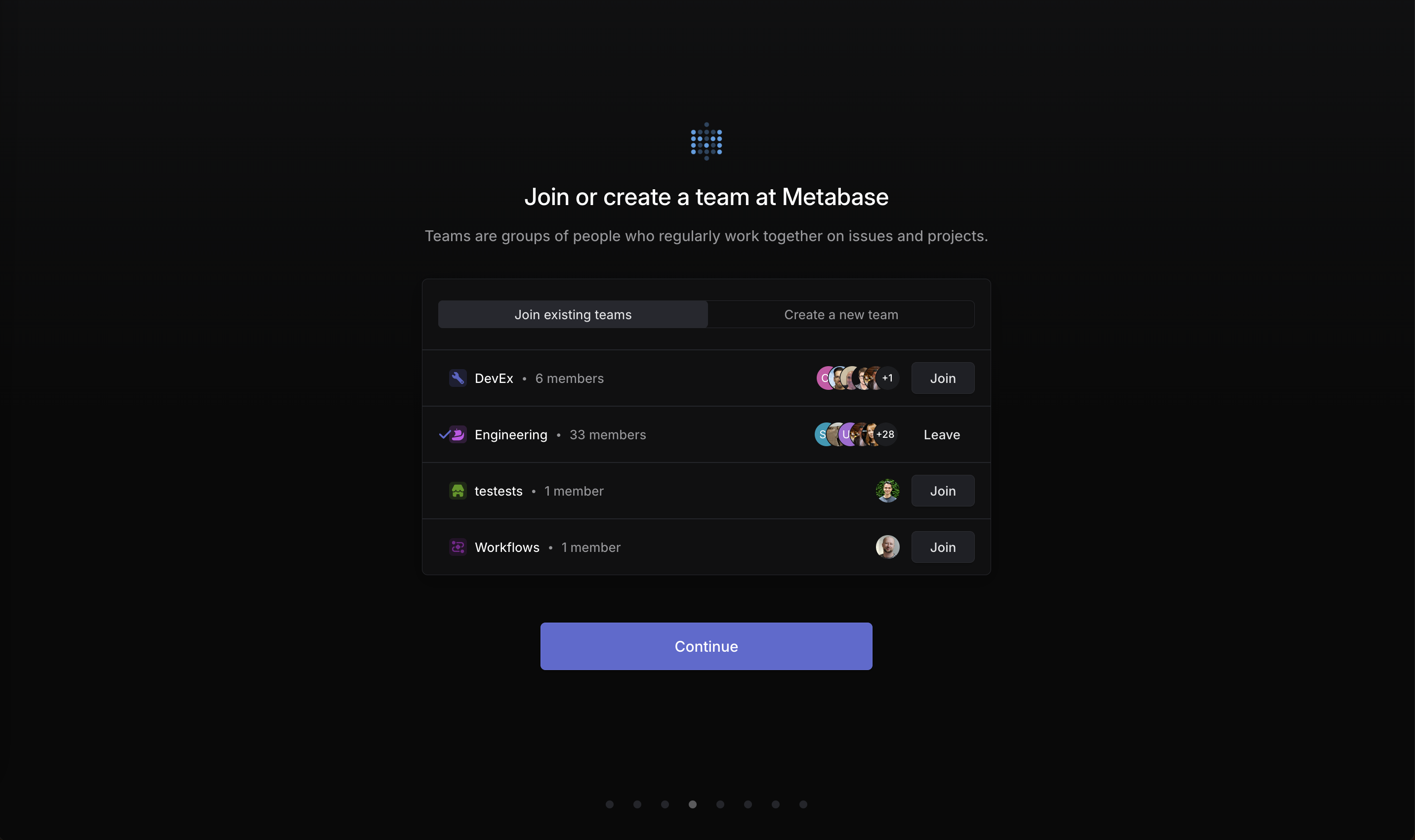
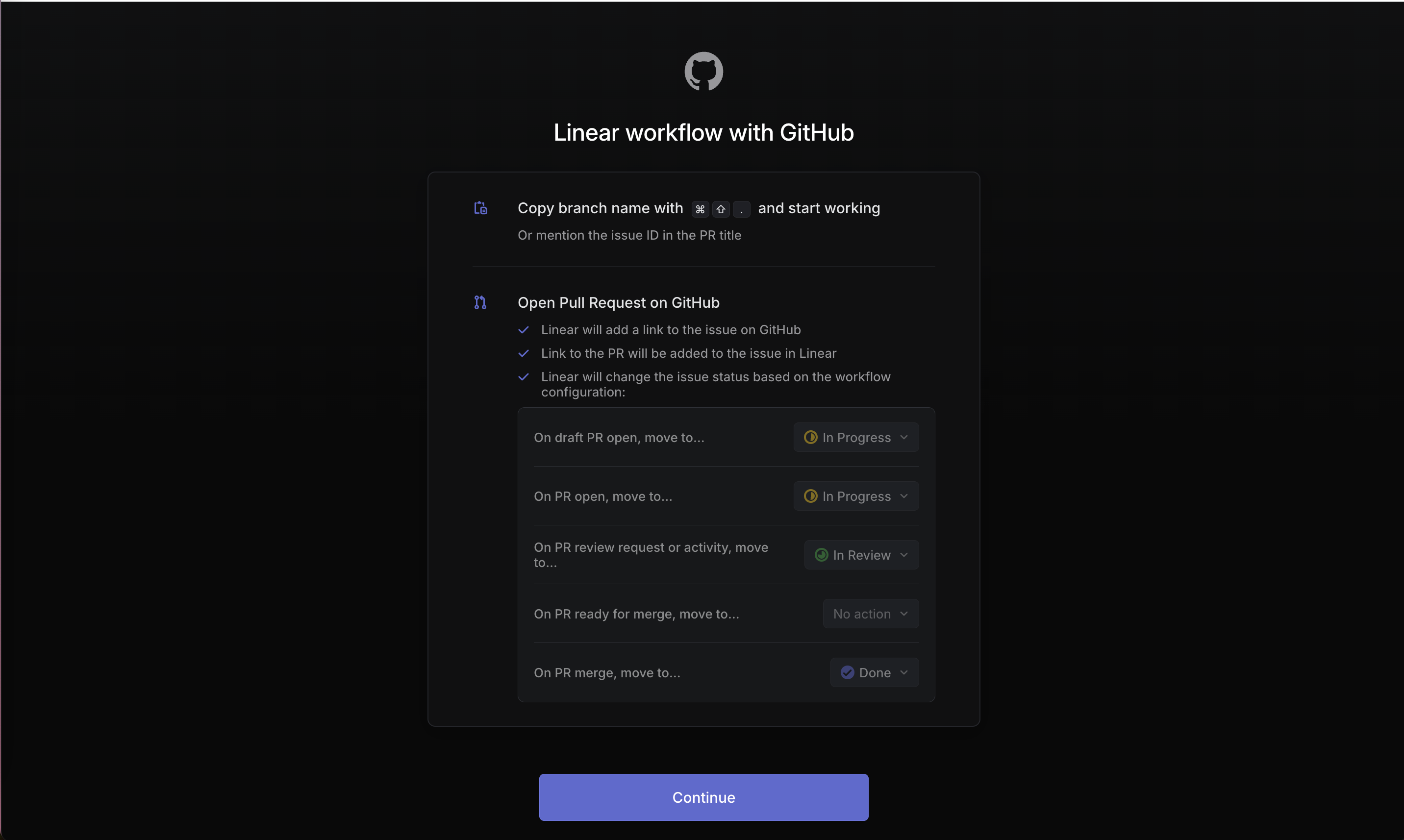
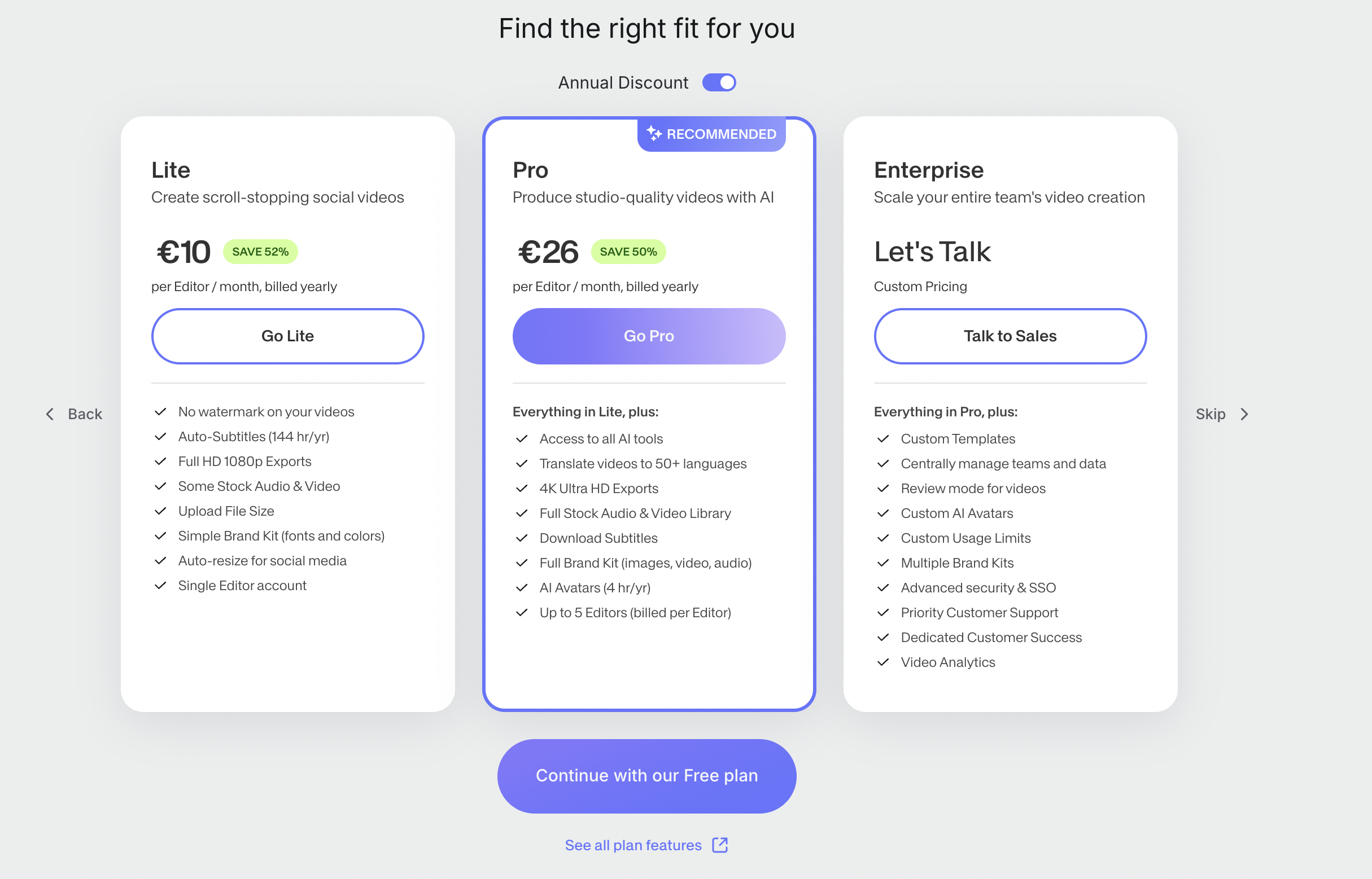
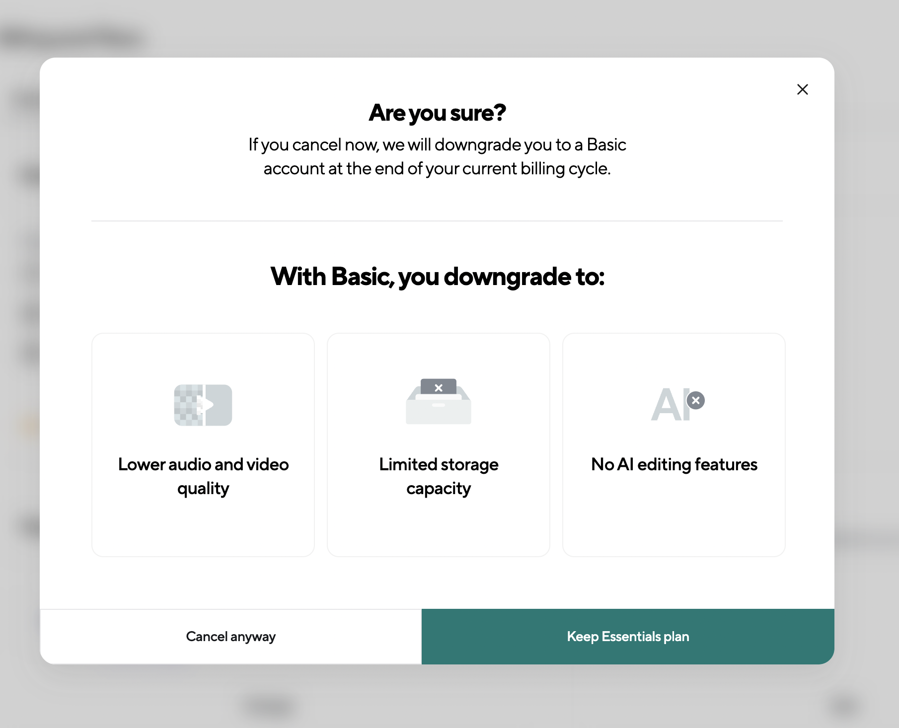
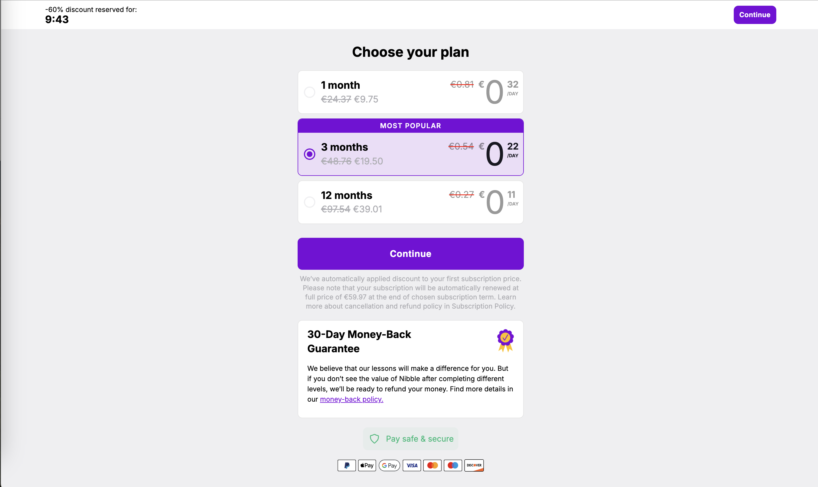
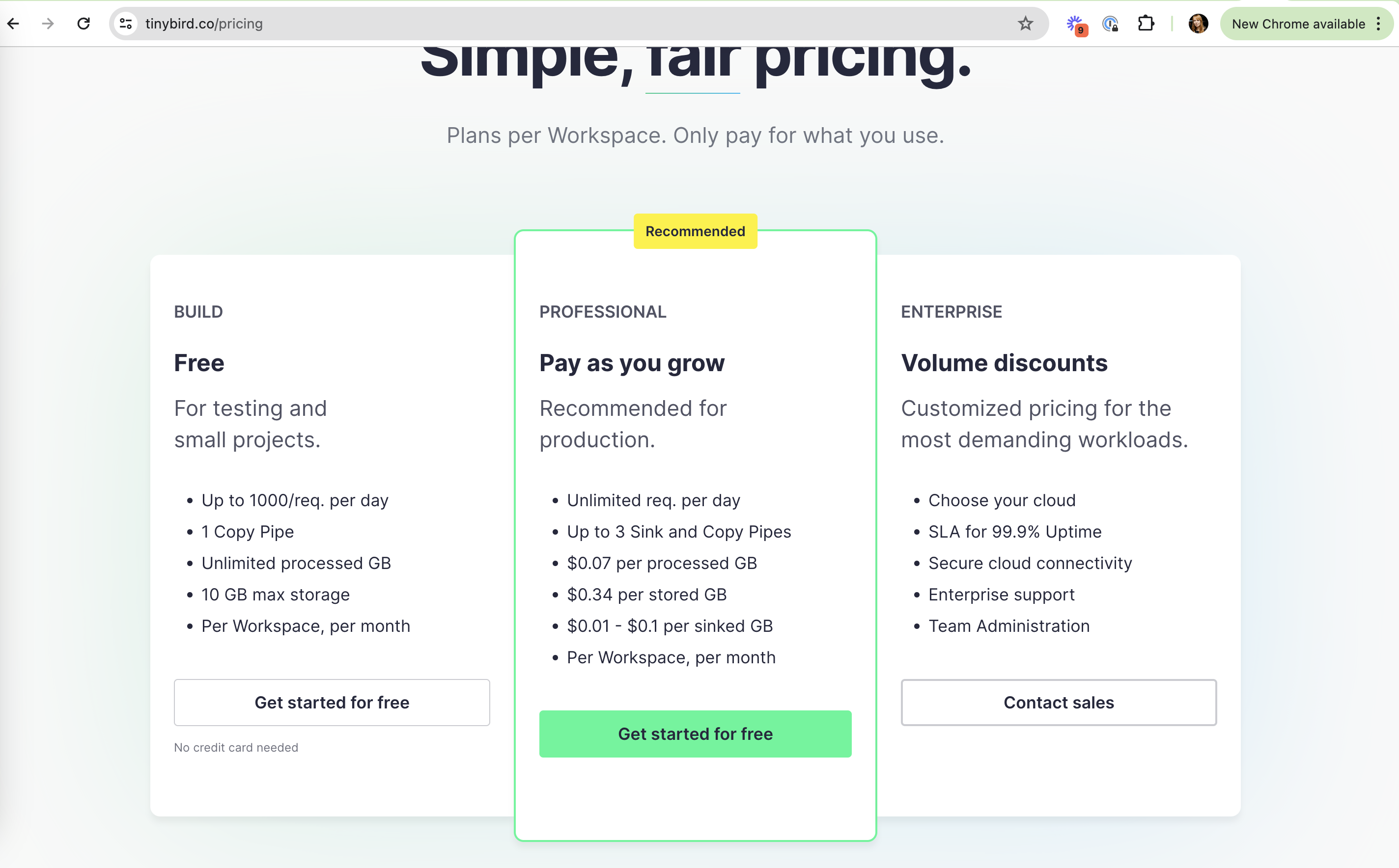
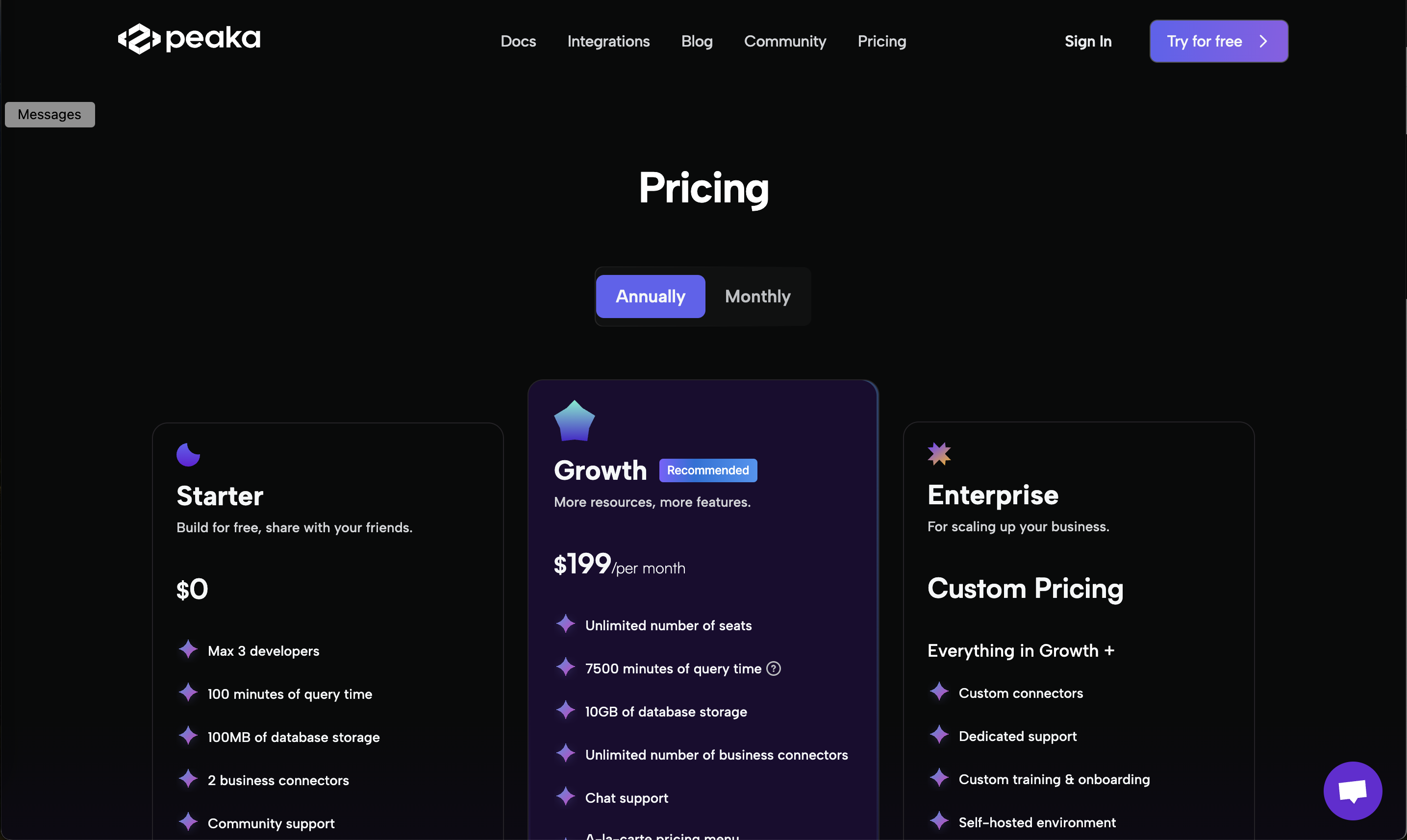
On onboarding screens and paywalls the preselected option is the one most people will end up with: the selected plan, the trial length, the notification setting, the newsletter box. That makes the default a product decision, not a layout detail. A default that serves the user (reminders on for a habit app, the lowest spend cap) reduces effort; one that serves only the business (a pre-ticked newsletter, the priciest weekly plan) gets accepted now and resented later.
How to use it
- Preselect the option you would recommend to a typical new user, and be able to say why in one line.
- Pair a preselected plan with its comparison (price per week or month, savings) so the default is not the only option that is easy to read.
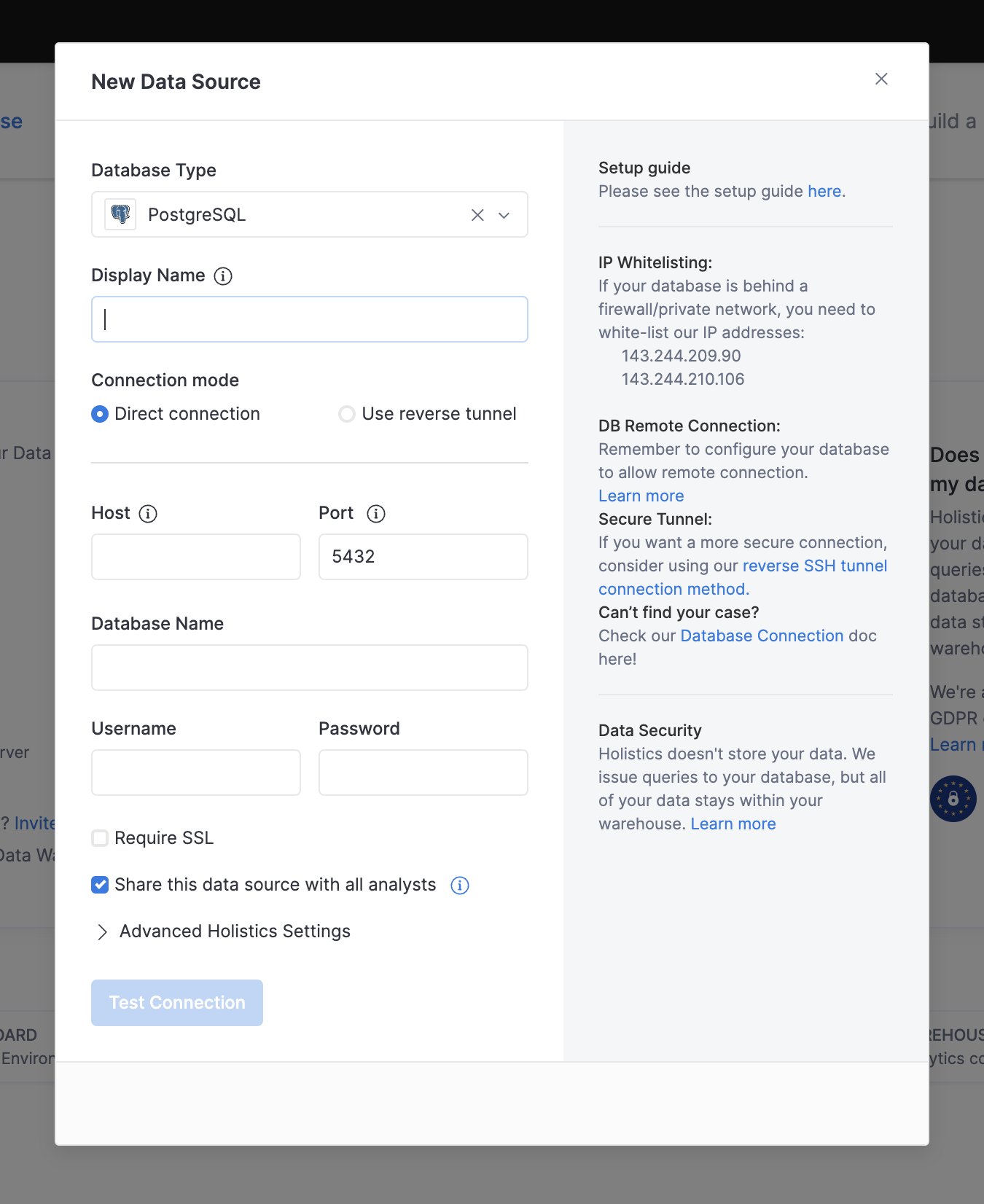
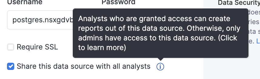
- Keep defaults for anything that costs money, shares data or sends marketing in the off position until the user turns them on.
Watch out
- Preselecting the most expensive plan or a pre-ticked marketing box: it converts, but users feel tricked and churn or complain.
- Assuming a default is neutral. If you have to pick one, own it as a recommendation and test it like one.