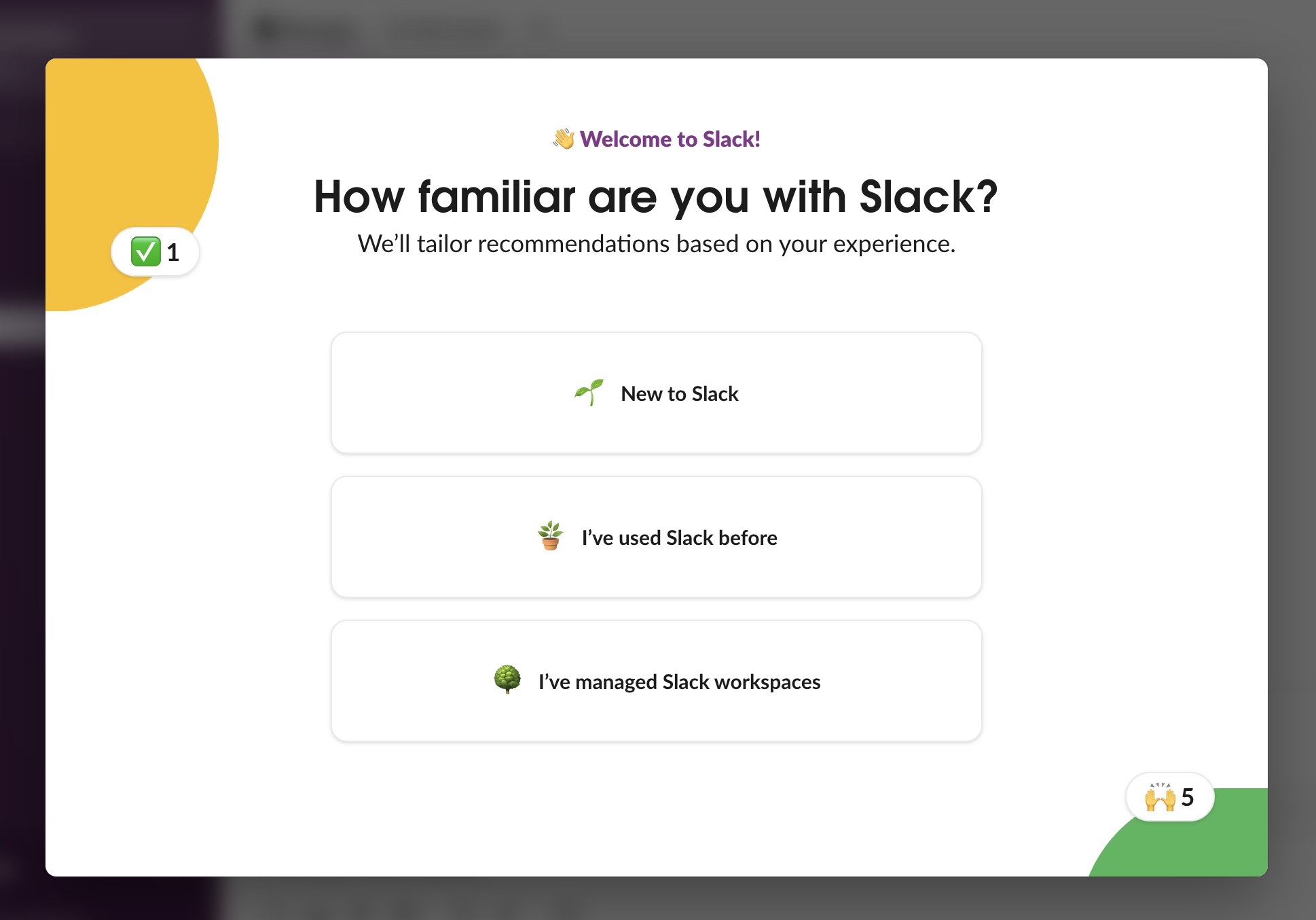
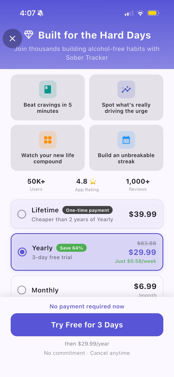
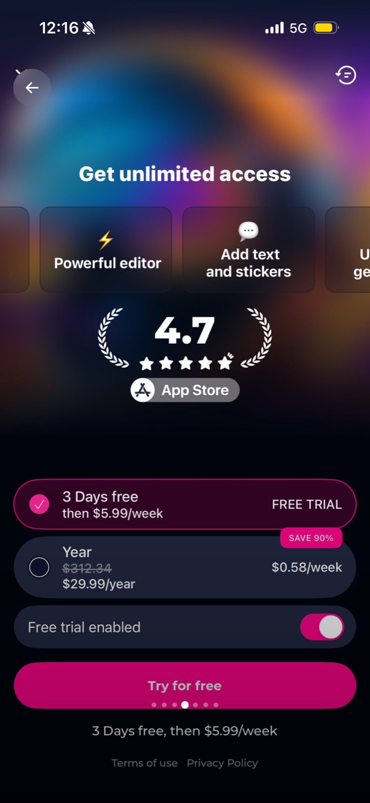
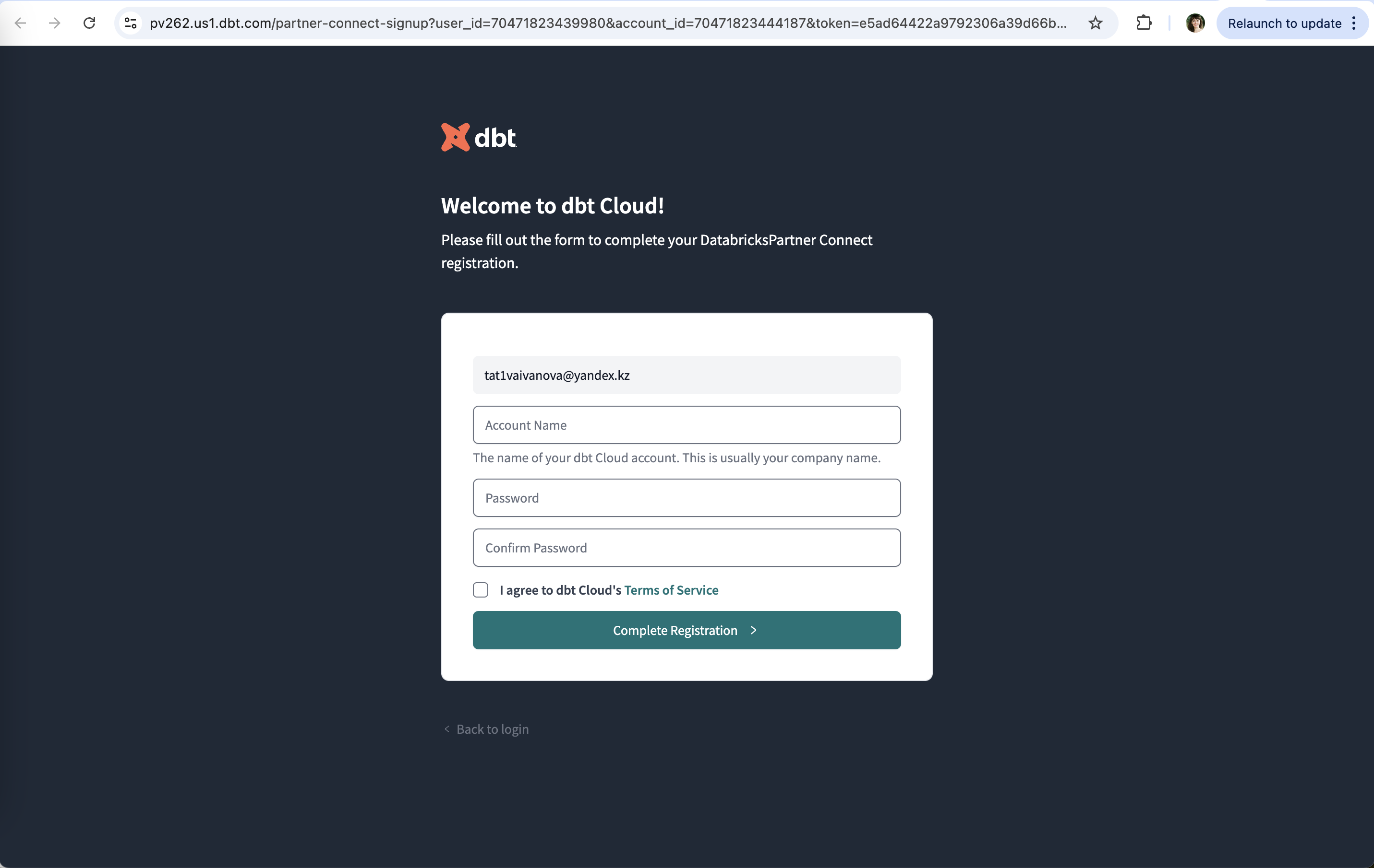
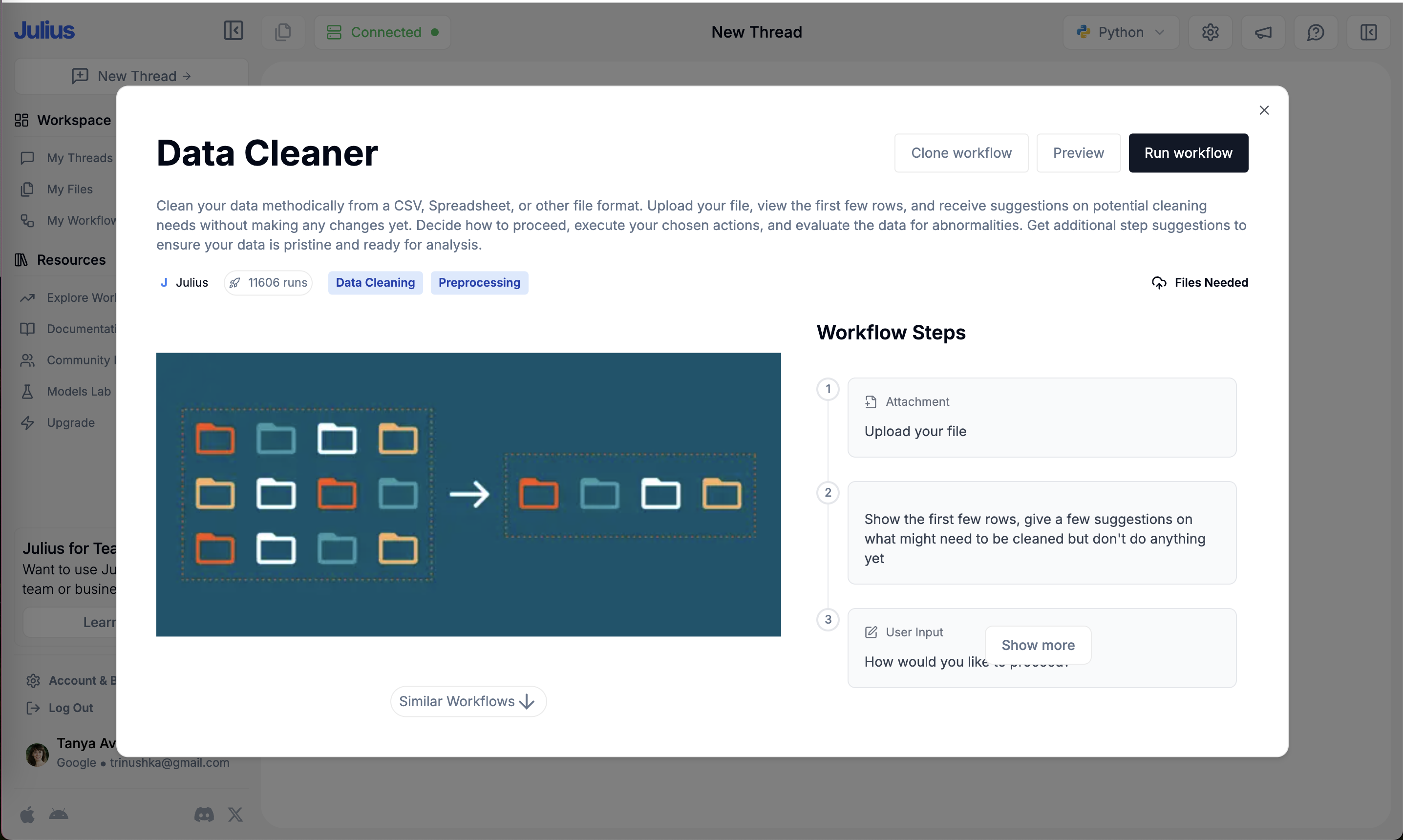
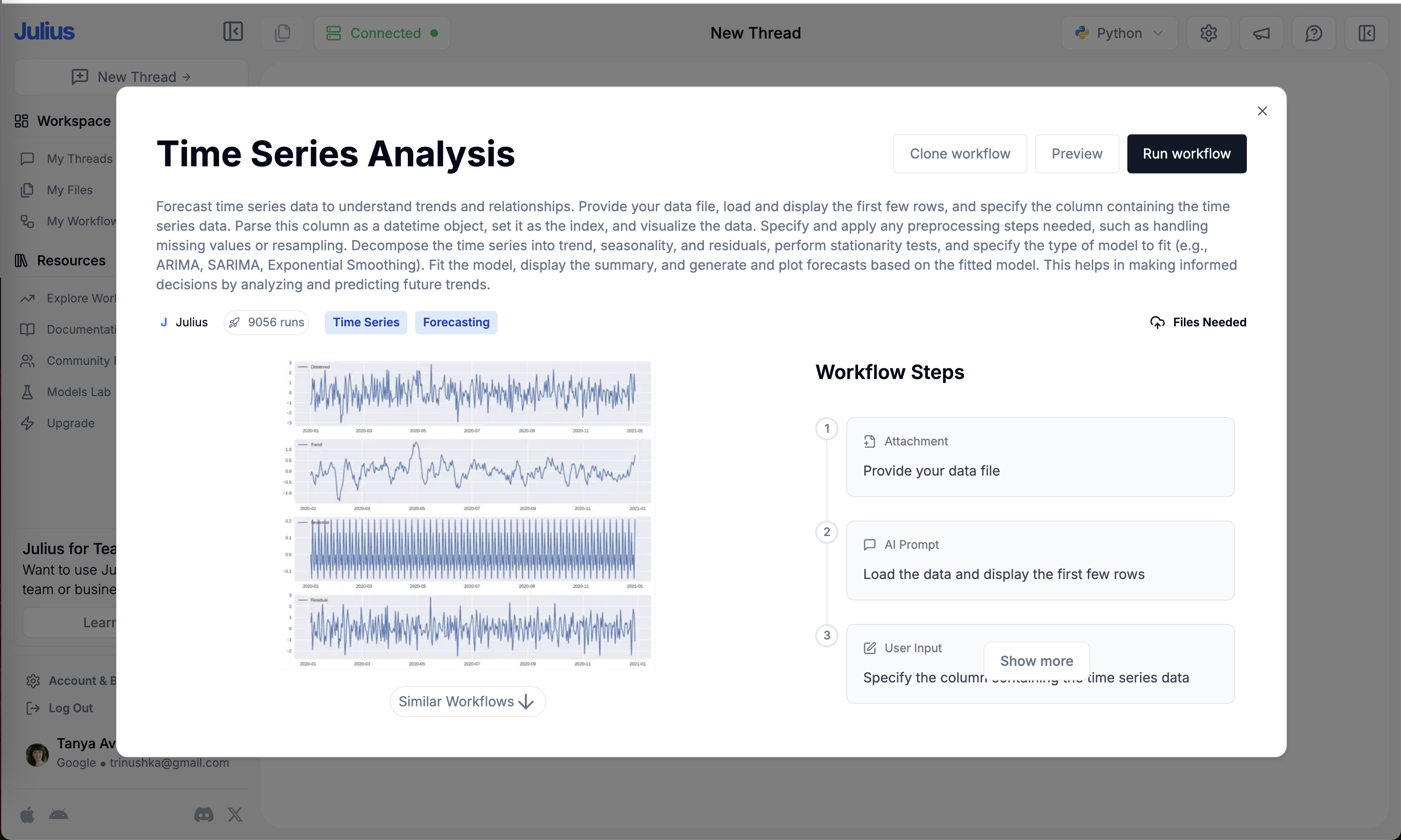
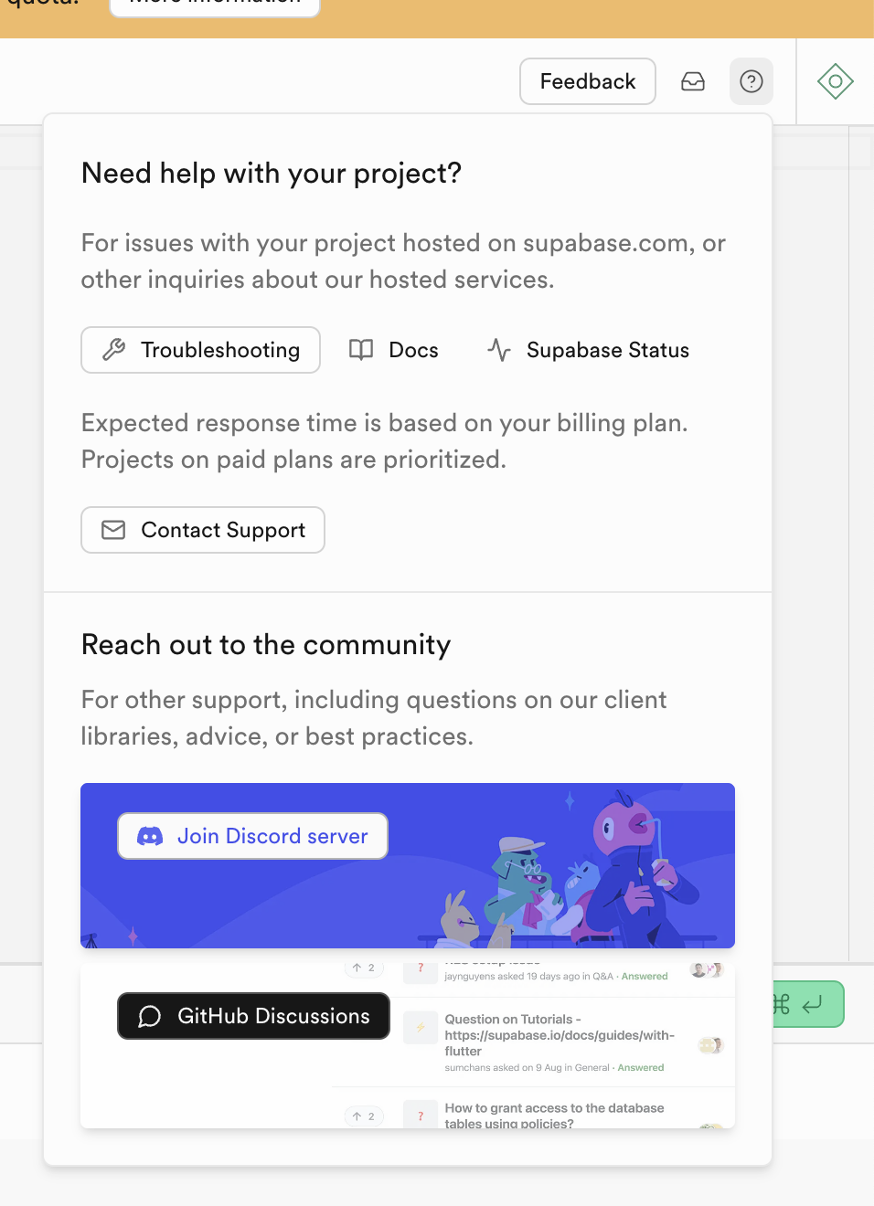
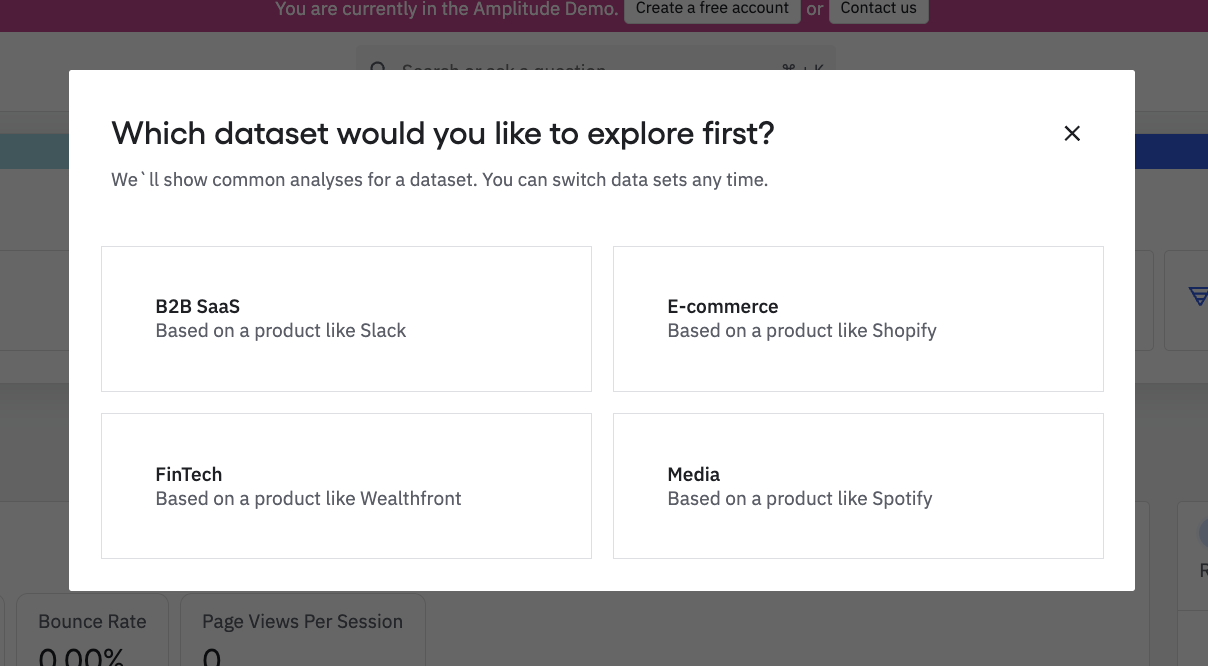
Users read visual polish as a sign of quality. On this site the label covers both sides: brand details that add character, and the small defects that break the impression, such as a close button sitting on a headline, pagination dots inside a button, a missing space in a welcome title, or a "Show more" button covering text.
Masaaki Kurosu and Kaori Kashimura at Hitachi (1995) had 252 people rate 26 ATM layouts and found that perceived beauty correlated more strongly with perceived ease of use than actual usability did. Noam Tractinsky and colleagues (2000) found that after people used ATM-like layouts, aesthetics still shaped how usable they thought the system was. B.J. Fogg's Stanford team (2003) found that the most common thing people mentioned when judging a site's credibility was its visual design. NN/g's Kate Moran adds the limit: polish buys tolerance for minor problems, not major ones.
On a paywall or a first screen, users have little else to judge you by. A layout bug or typo right before a payment request reads as "this company is careless", which is the opposite of what you want someone to feel before entering a card.
How to use it
- QA first-run, paywall and upgrade screens on the smallest supported device and in every language, looking for overlaps, clipping and typos.
- Spend polish where trust is decided: the first screen, the price block and the purchase button.
- In usability tests, compare what people did with what they said; praise for the visuals can hide a failed task.
Watch out
- Polish can mask real usability problems in testing, so teams ship flows that look good and still fail.
- Decoration that competes with the content or the call to action costs more than it adds.