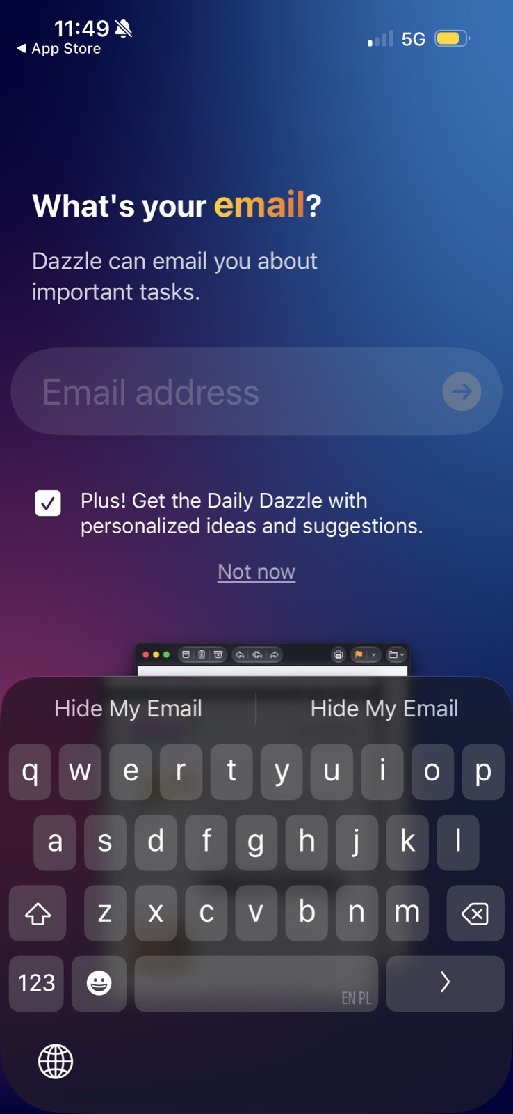
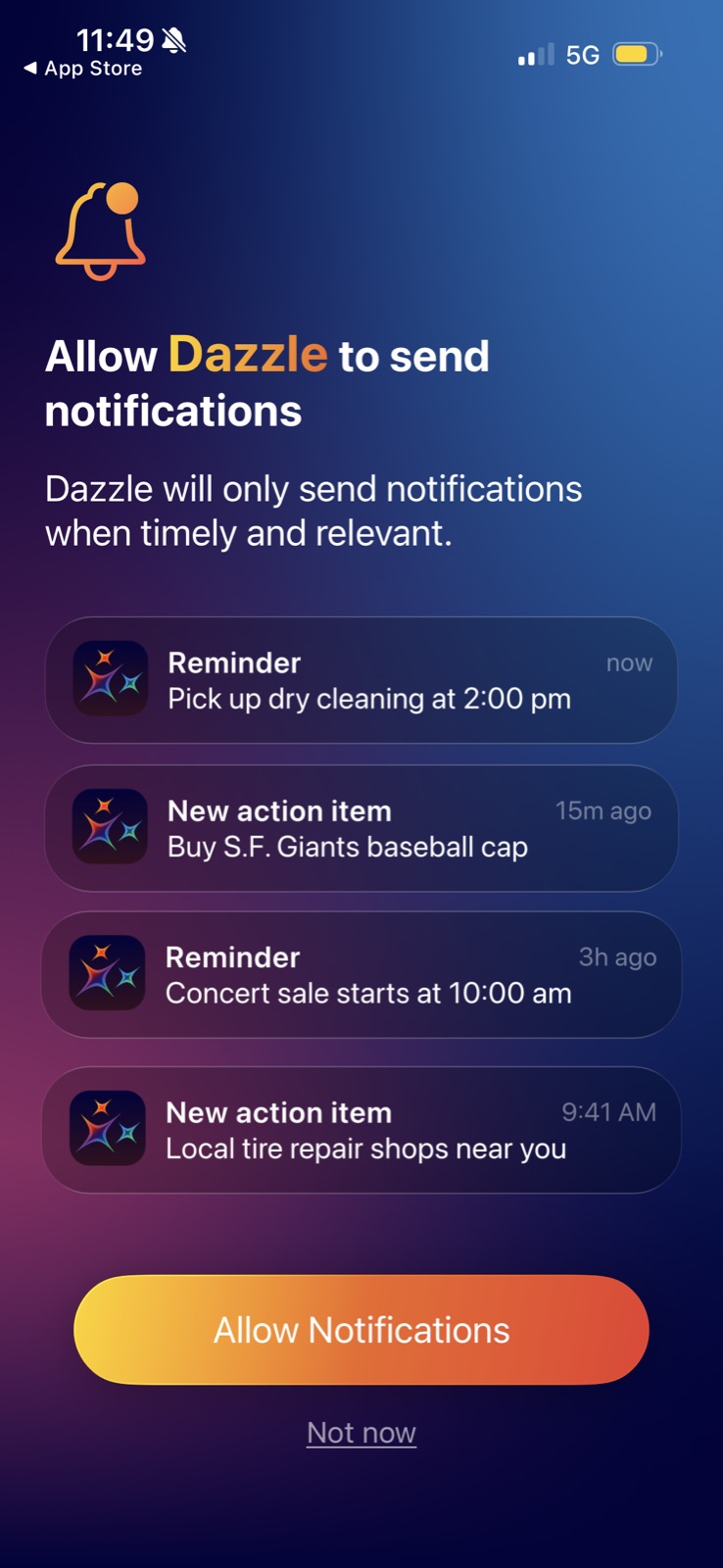
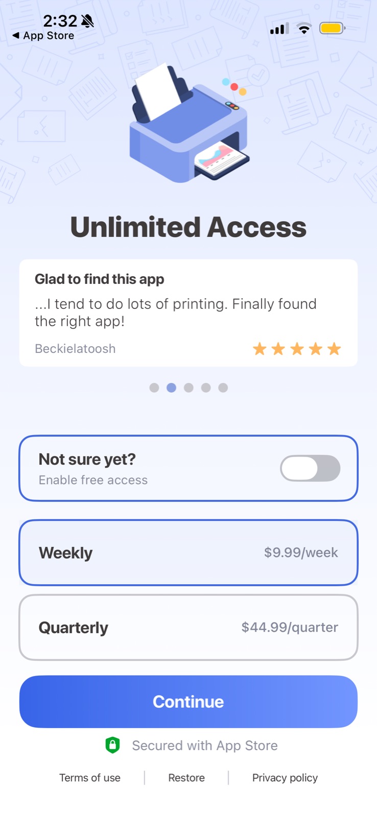
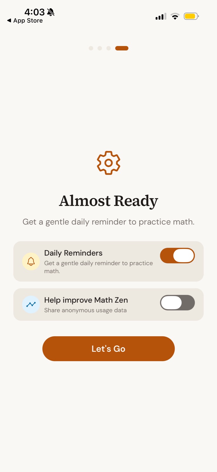
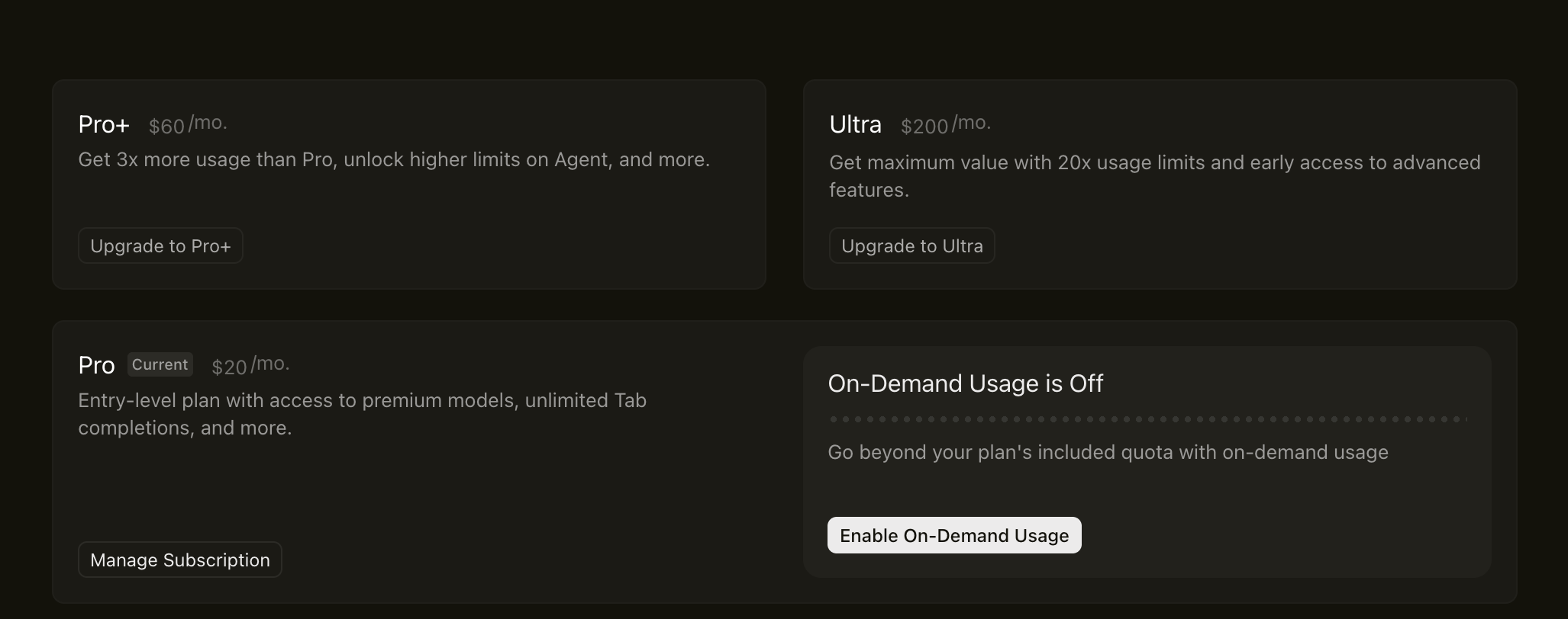
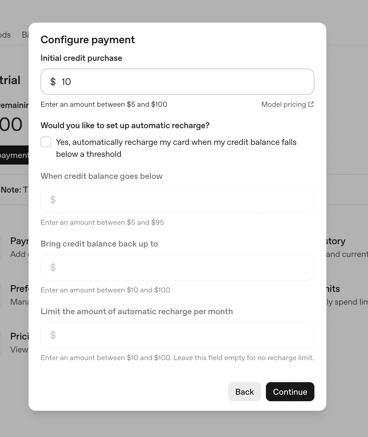
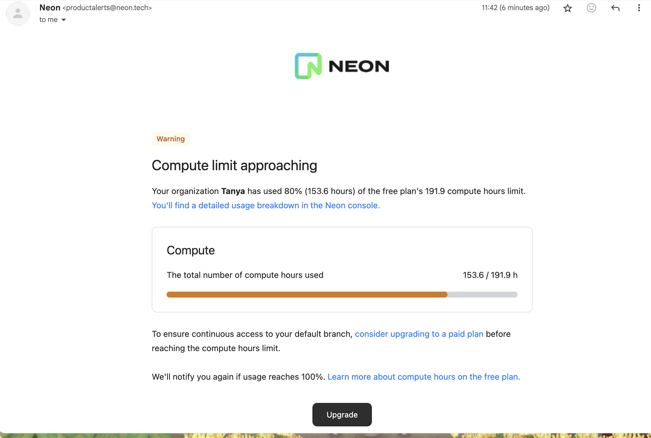
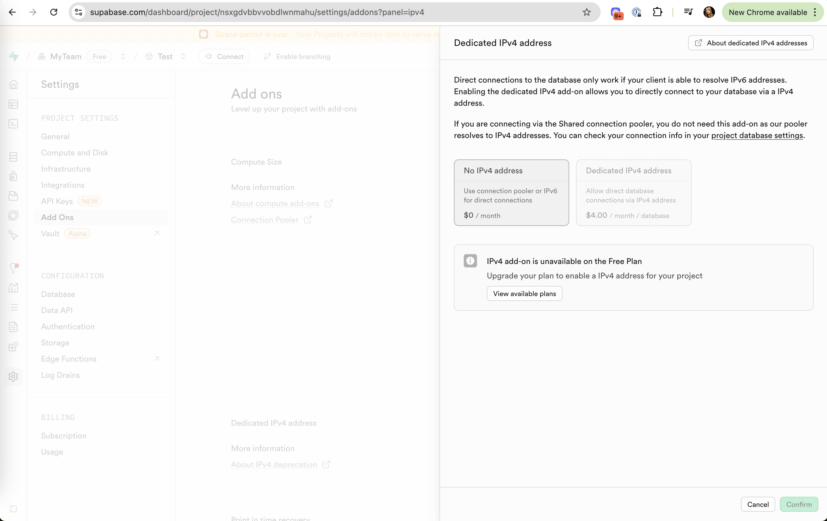
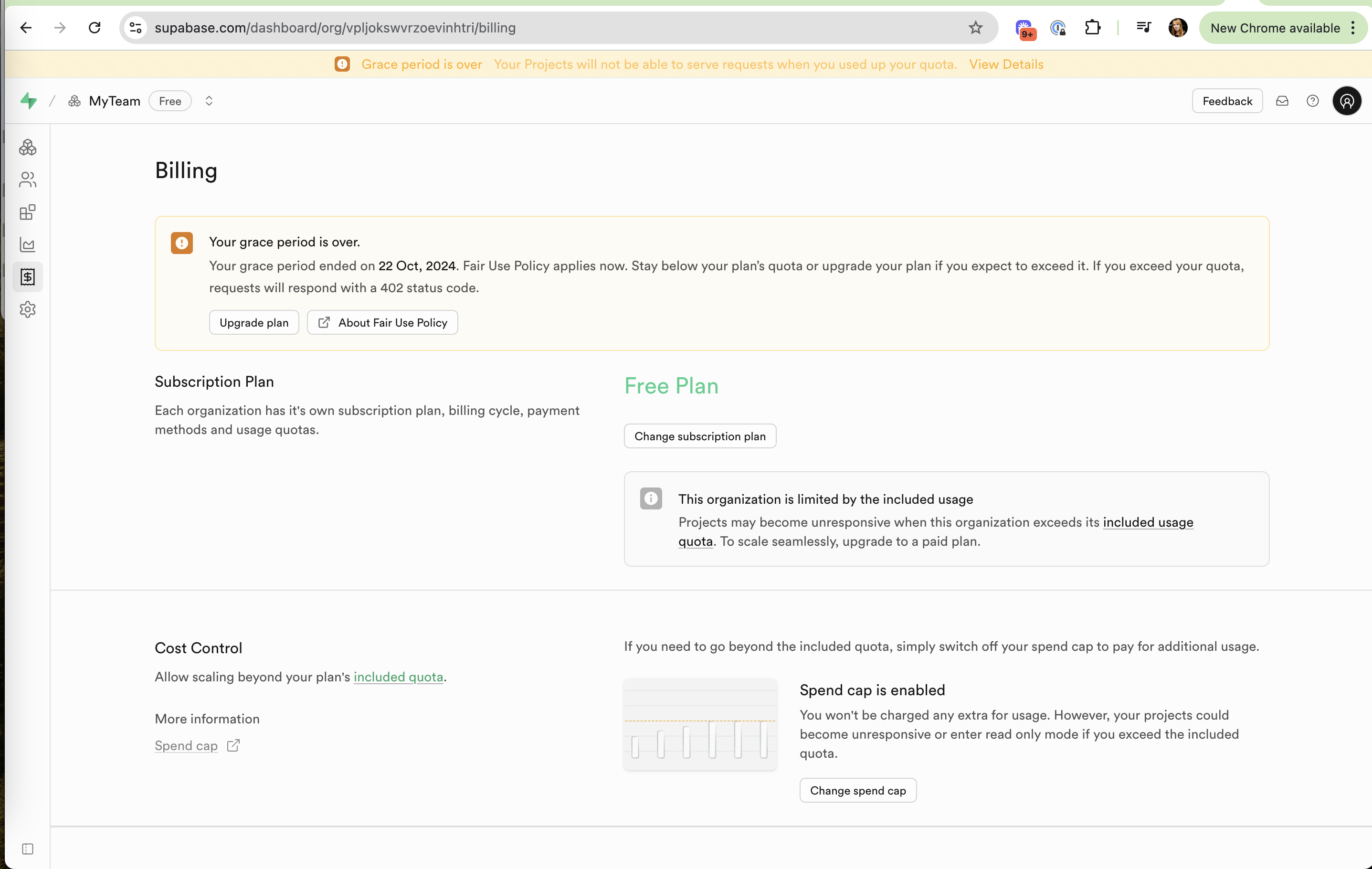
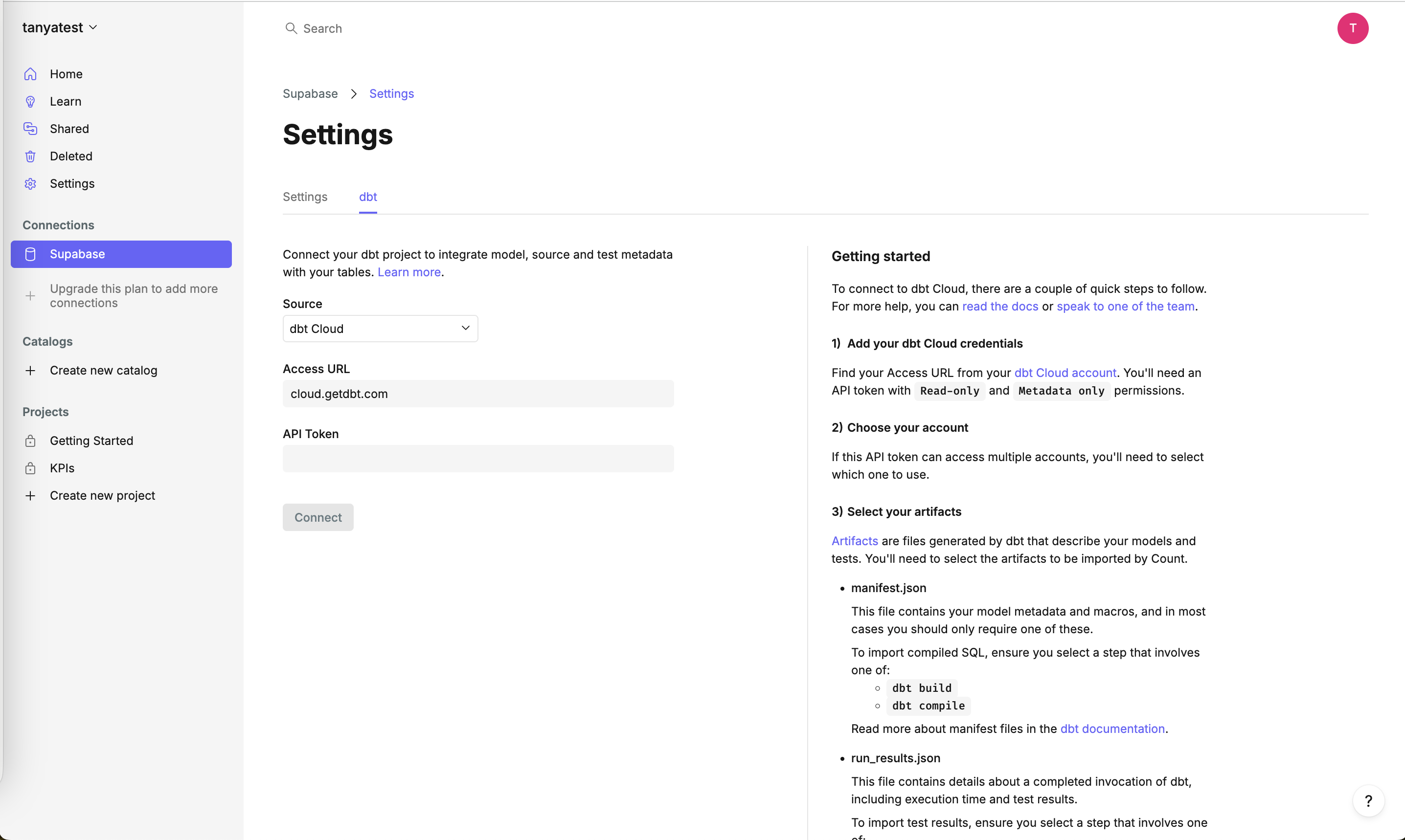
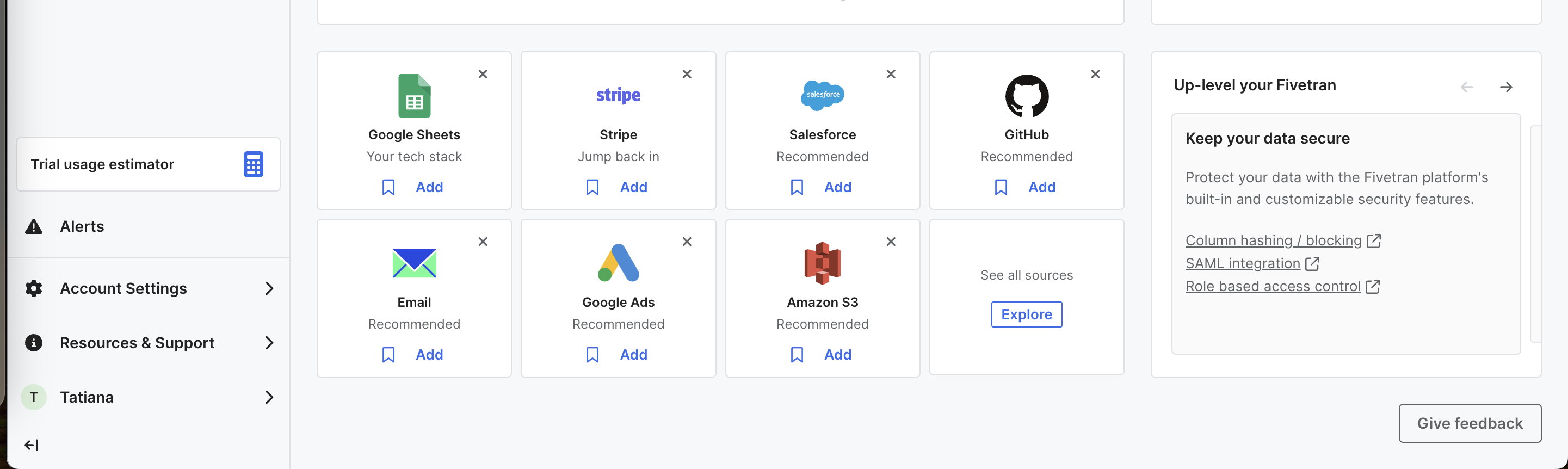
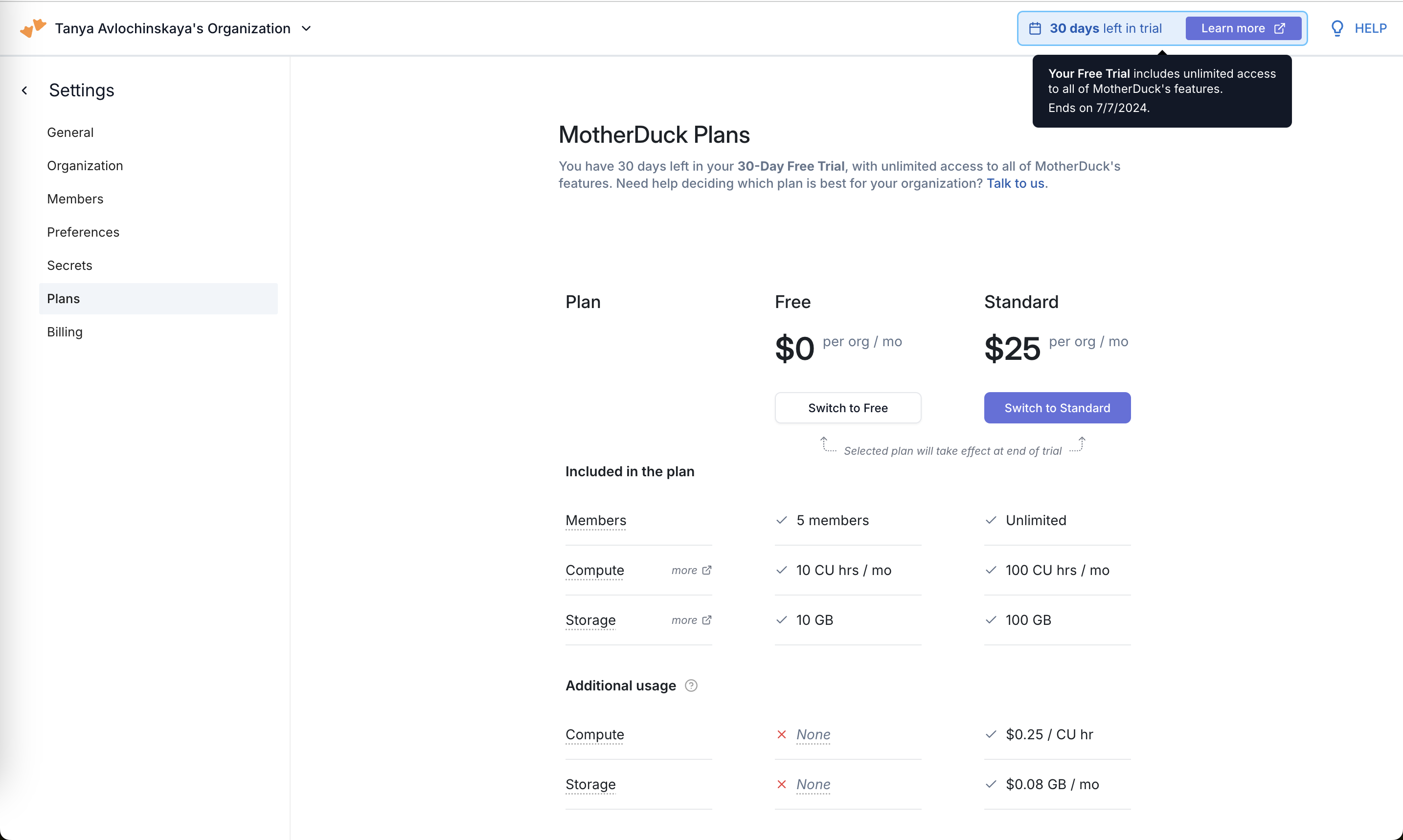
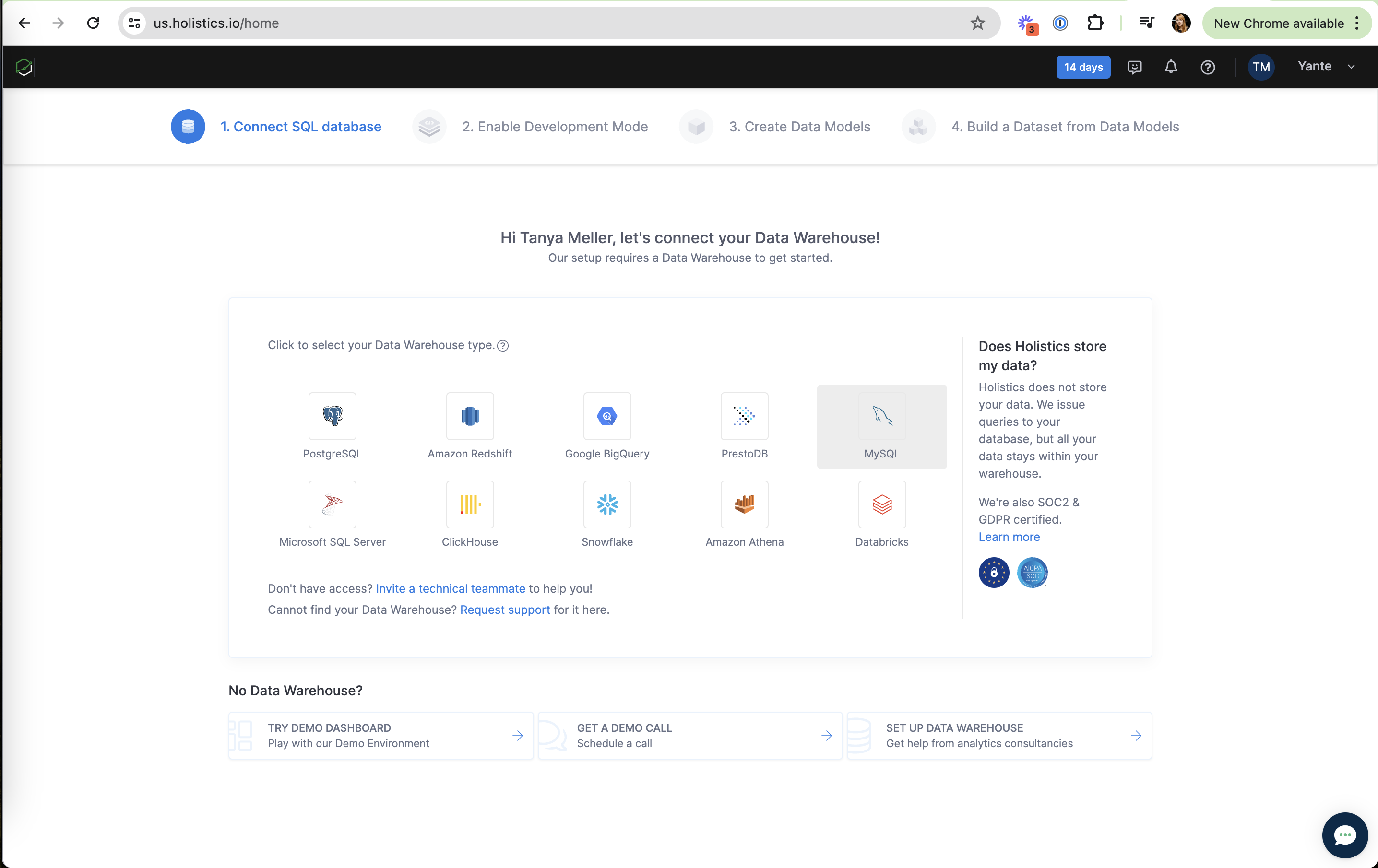
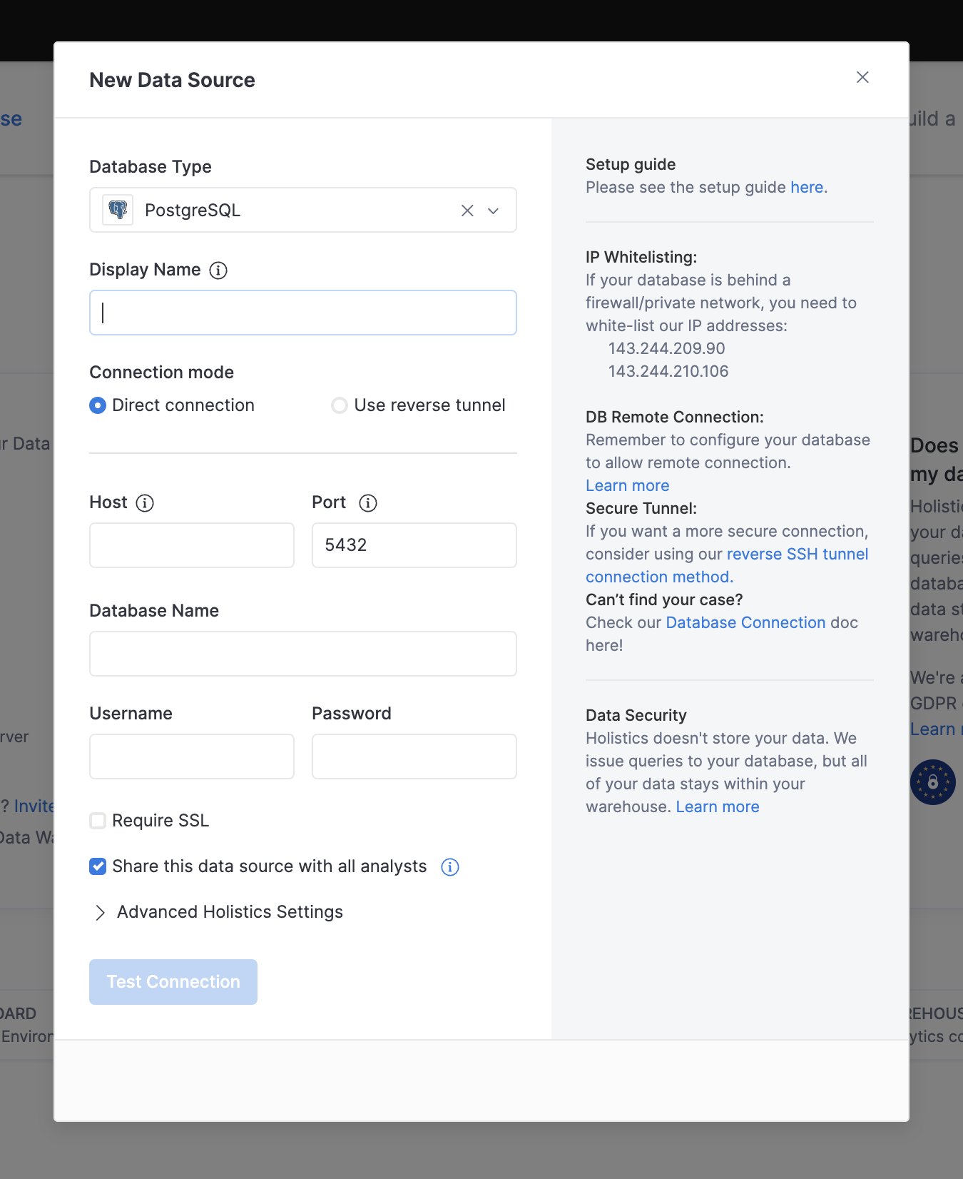
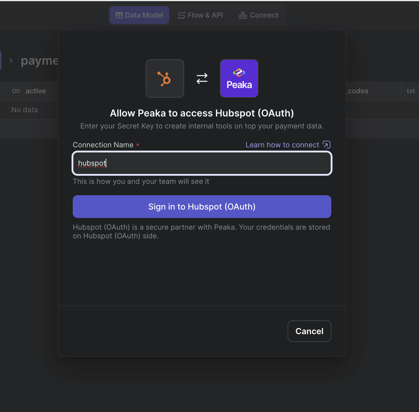
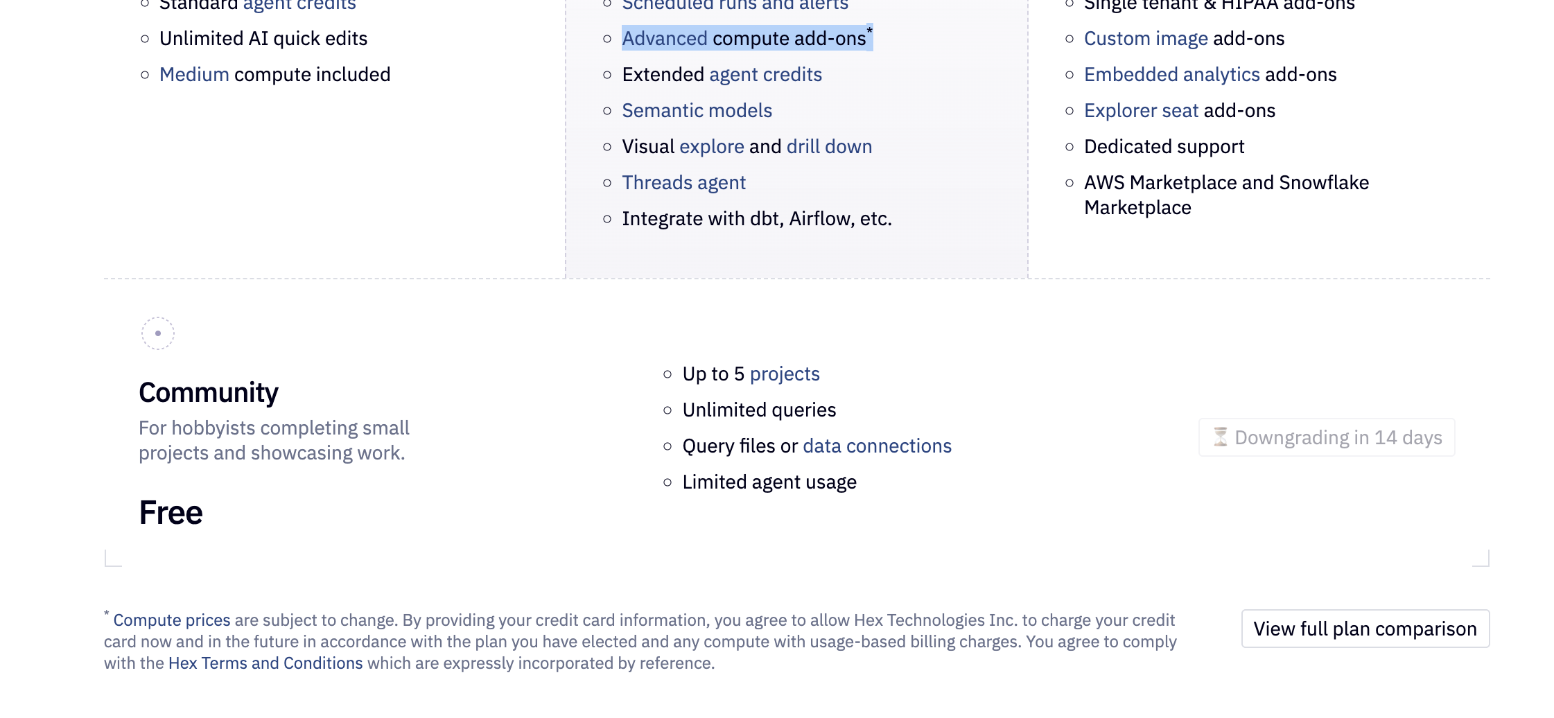
Before users hand over an email, a permission or a card, they ask whether the product is safe and honest. Trust signals answer that question on the screen: a promise about notification frequency, privacy-friendly defaults, opt-in overage billing, "Secured with App Store" under a buy button. On this site the label also covers objection handling and reassurance, and its failures: dense legal footers and small grey terms that raise doubt instead of settling it.
B.J. Fogg's Stanford survey of about 1,400 people (2001) found that sites gained credibility from showing a real organization behind them, ease of use and expertise, and lost it through amateur errors and aggressive commercial elements. Baymard Institute's checkout research finds that perceived security varies within a single page: concern rises at the card fields, and 19% of US shoppers in a 2025 survey had abandoned a checkout because they didn't trust the site with their card. NN/g lists up-front disclosure of costs and policies as one of four core credibility factors.
Trust is decided at specific moments: the permission prompt, the email field, the price block, the purchase button. A signal works best right next to the action that triggers the worry.
How to use it
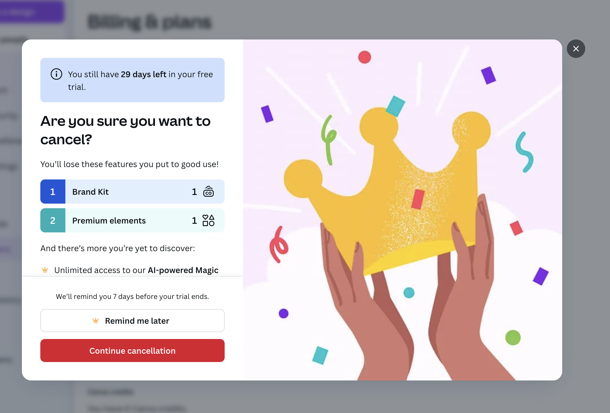
- Place reassurance next to the risky action: a privacy note under the email field, a cancellation promise next to the trial button, a payment badge by the card fields.
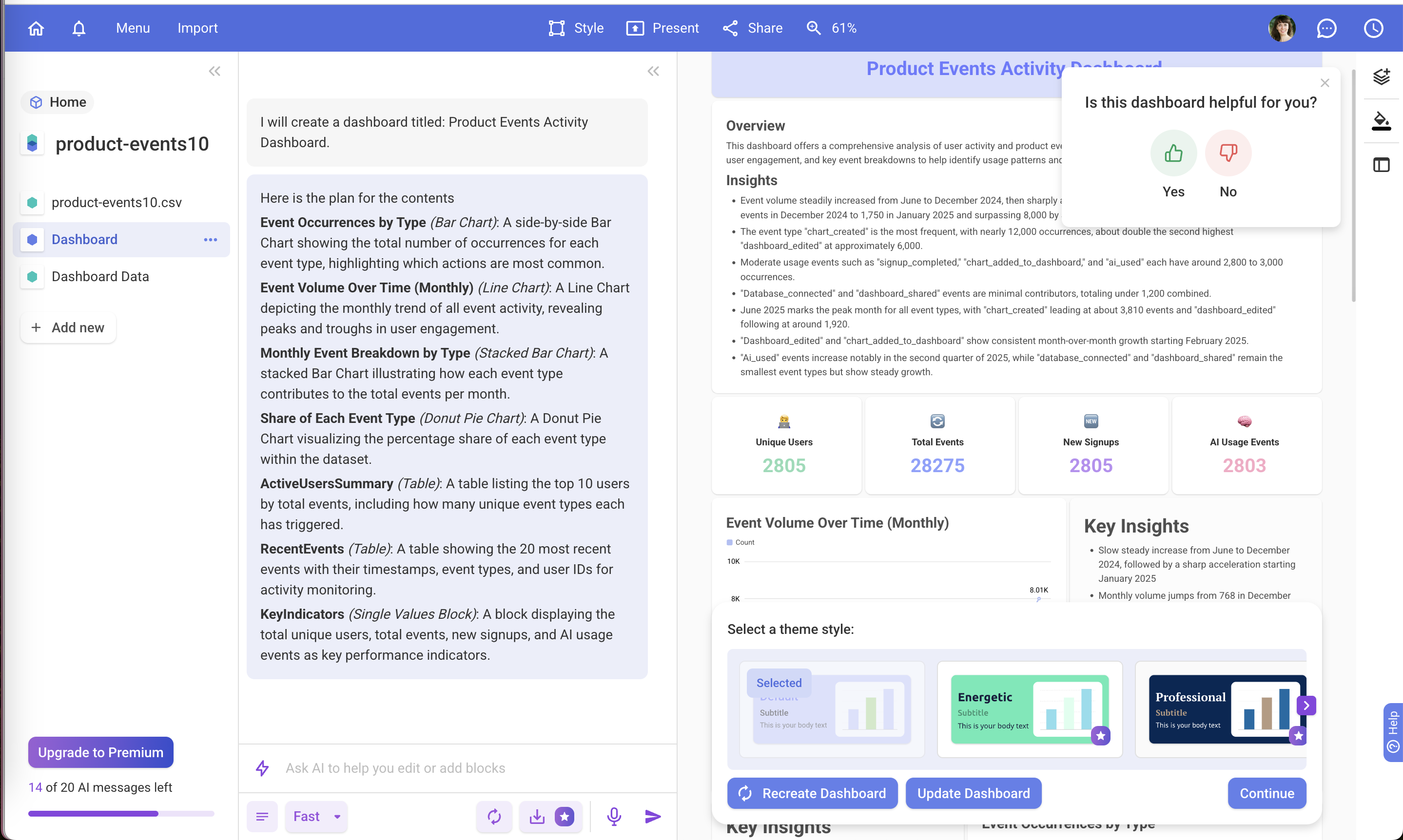
- Make costly options opt-in (overage billing, usage tracking) and say so plainly.
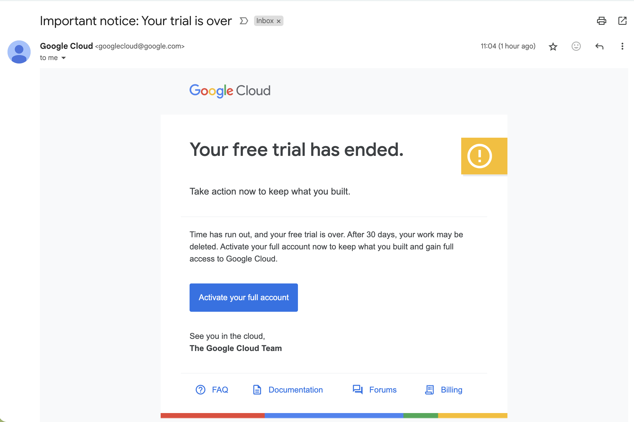
- State renewal date, price and how to cancel in readable text near the button, not in the footer.
Watch out
- Fake or decorative badges, invented user counts and unverifiable claims destroy trust once noticed.
- Reassurance that contradicts the fine print ("cancel anytime" above a non-refundable charge) is worse than no reassurance.