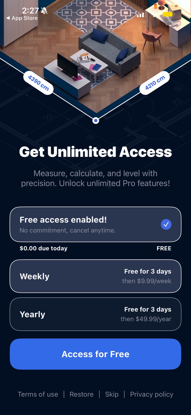
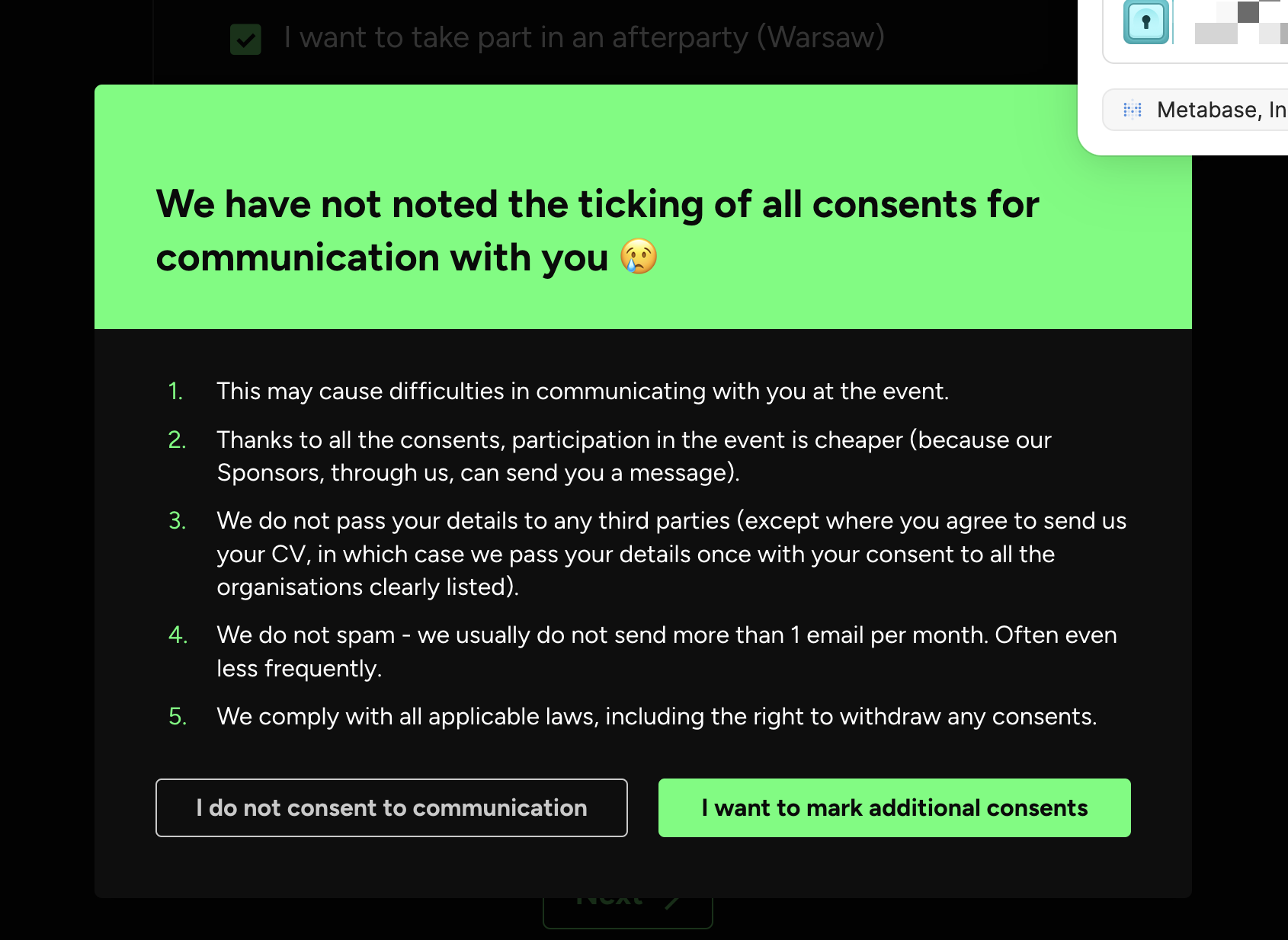
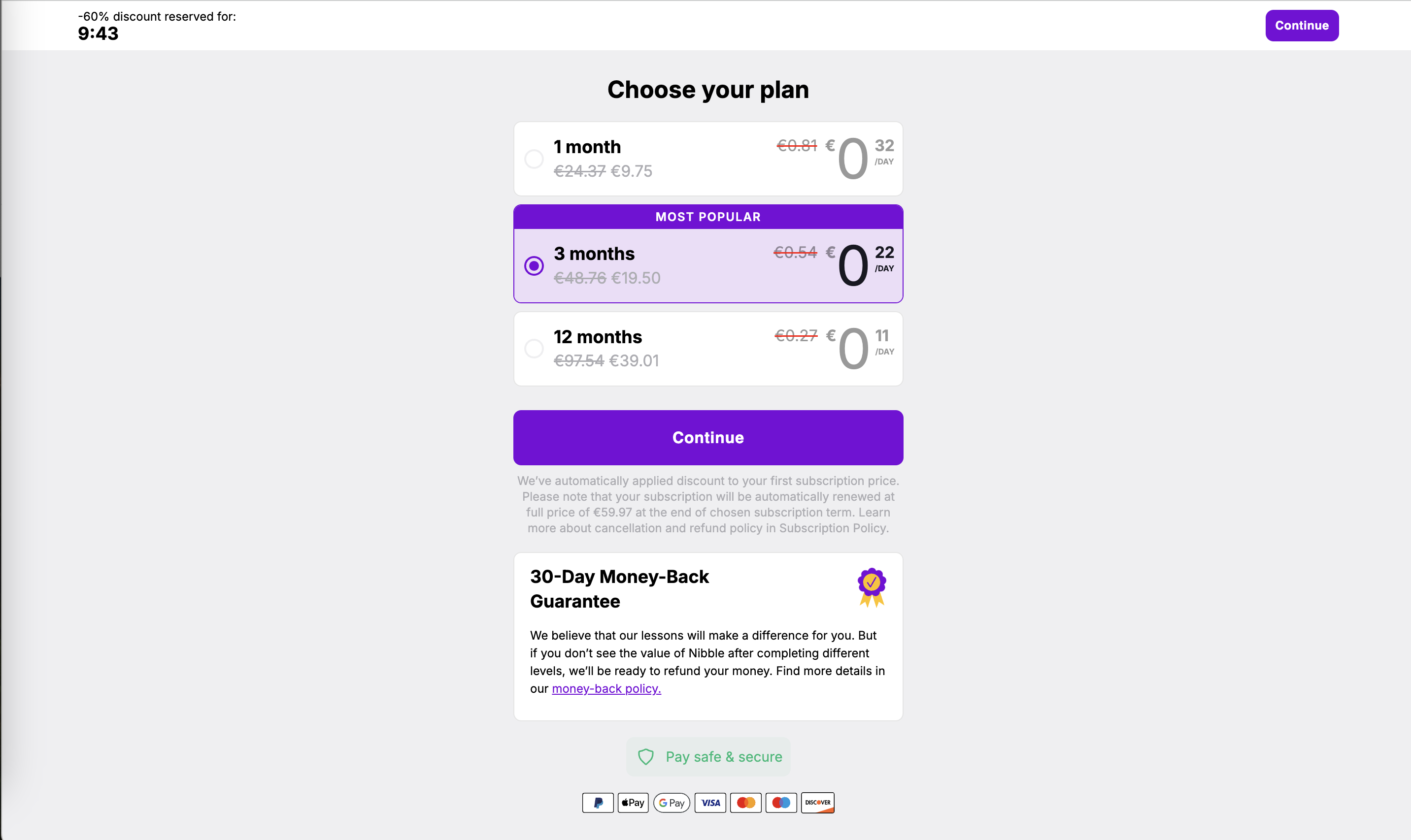
Dark patterns (also called deceptive patterns) exploit the same biases good design works with, but against the user's interest. On this site the examples are confirmshaming (guilt-trip copy or a crying emoji on the decline option), hidden exits (the only skip link tucked into a grey footer), and artificial urgency (a countdown on a "reserved" discount that has no real deadline).
Colin Gray and colleagues (CHI 2018) sorted practitioner examples into five strategies: nagging, obstruction, sneaking, interface interference and forced action. Arunesh Mathur and colleagues (CSCW 2019) crawled about 11,000 shopping sites and found 1,818 dark-pattern instances, including fake countdown timers, with 183 sites using outright deceptive claims. Jamie Luguri and Lior Strahilevitz (2021) tested them on a large US sample: mild dark patterns roughly doubled sign-ups for a dubious service and aggressive ones nearly quadrupled them, though aggressive versions also produced a strong backlash.
Paywalls and consent screens are where these show up most, because they sit at the money and data decisions. They lift short-term conversion and cost refunds, churn, reviews and, increasingly, regulatory risk.
How to use it
- Give the decline or skip option the same visibility as accept, in a predictable place, with neutral wording.
- Use timers and scarcity only when the deadline or limit is real and enforced.
- Test each paywall or consent screen by asking: would the user still make this choice if they fully understood it?
Watch out
- Treating "it converts" as proof a pattern is fine; the lift often comes from mistakes users later reverse or resent.
- Small copy choices add up: a guilt-laden decline link plus a preselected add-on plus a faint close button is a dark flow even if each piece seems minor.