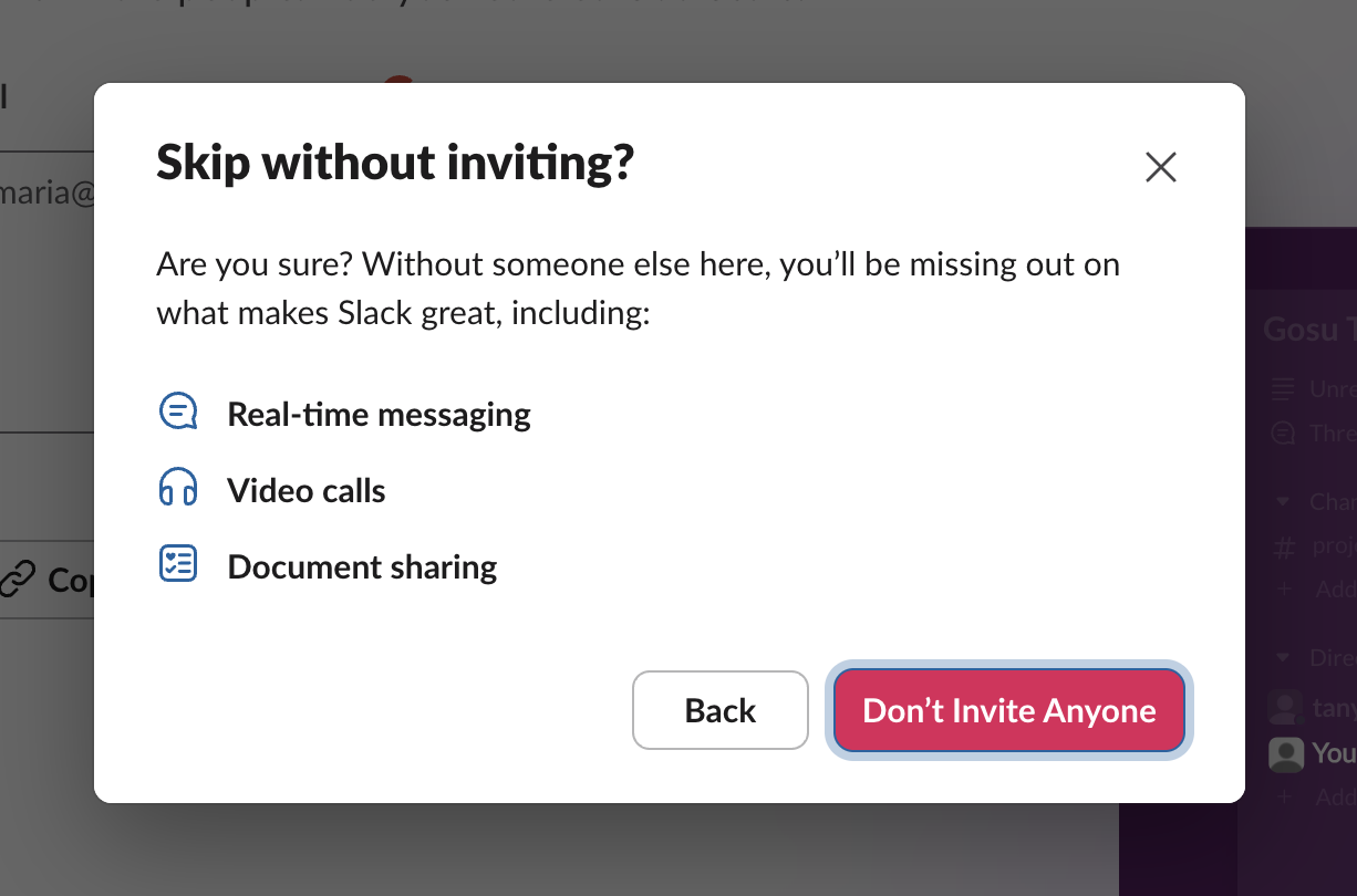
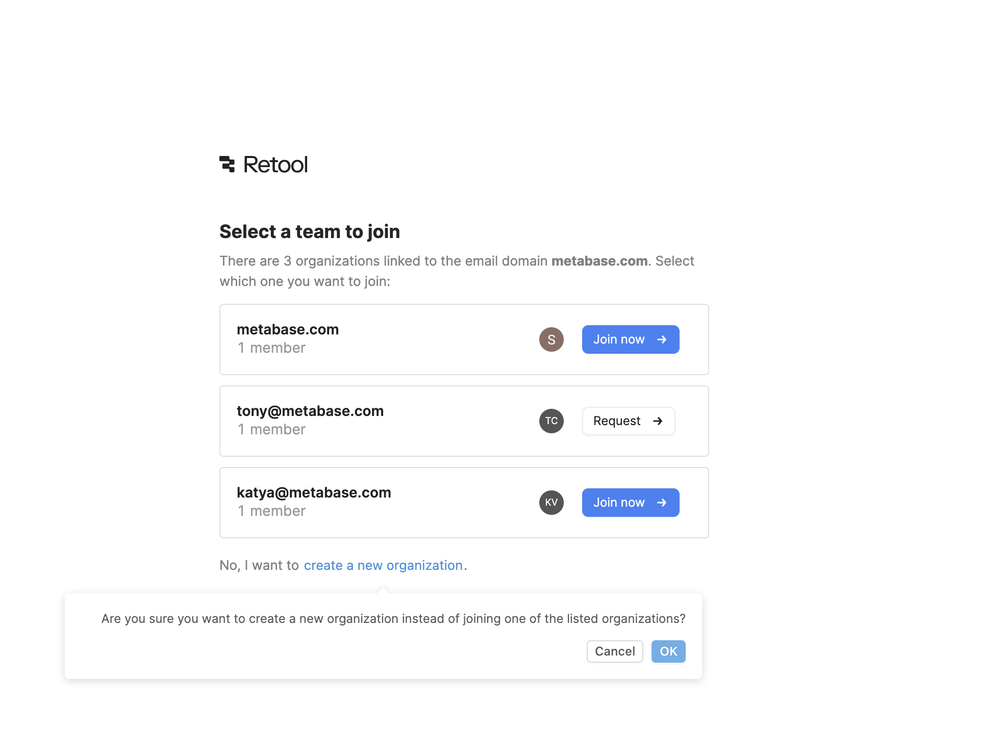
Most growth work removes steps. Positive friction adds one on purpose, at the few moments where a quick tap is likely to be a mistake: skipping team invites that predict whether a workspace survives, creating a duplicate organization when one already exists for your domain, or deleting something that can't be restored.
Anna Cox and colleagues at UCL (CHI 2016) called these "design frictions": small interruptions that move people from automatic to more mindful behavior, and argued that designers should use them selectively rather than treating all friction as bad. Jakob Nielsen's guidance on confirmation dialogs makes the cost explicit: confirmations work for serious or irreversible actions, but if you show them for routine ones, people learn to click through without reading.
In onboarding the right speed bump is usually one extra click with a clear reason, not a wall. It protects the user from a choice they would regret and protects activation metrics that depend on that choice.
How to use it
- Add friction only where the data shows a costly mistake, for example skipping a step that strongly predicts churn or creating a duplicate account.
- Make the pause specific: restate what will happen ("You'll create a new organization instead of joining Acme") and label buttons with outcomes, not Yes/No.
- Keep the bump to a single step and always leave the user free to continue.
Watch out
- Confirmations on routine actions train users to click through, so the one that matters gets ignored.
- Friction placed only on the exit (cancel, decline, downgrade) is obstruction, a dark pattern, not positive friction.