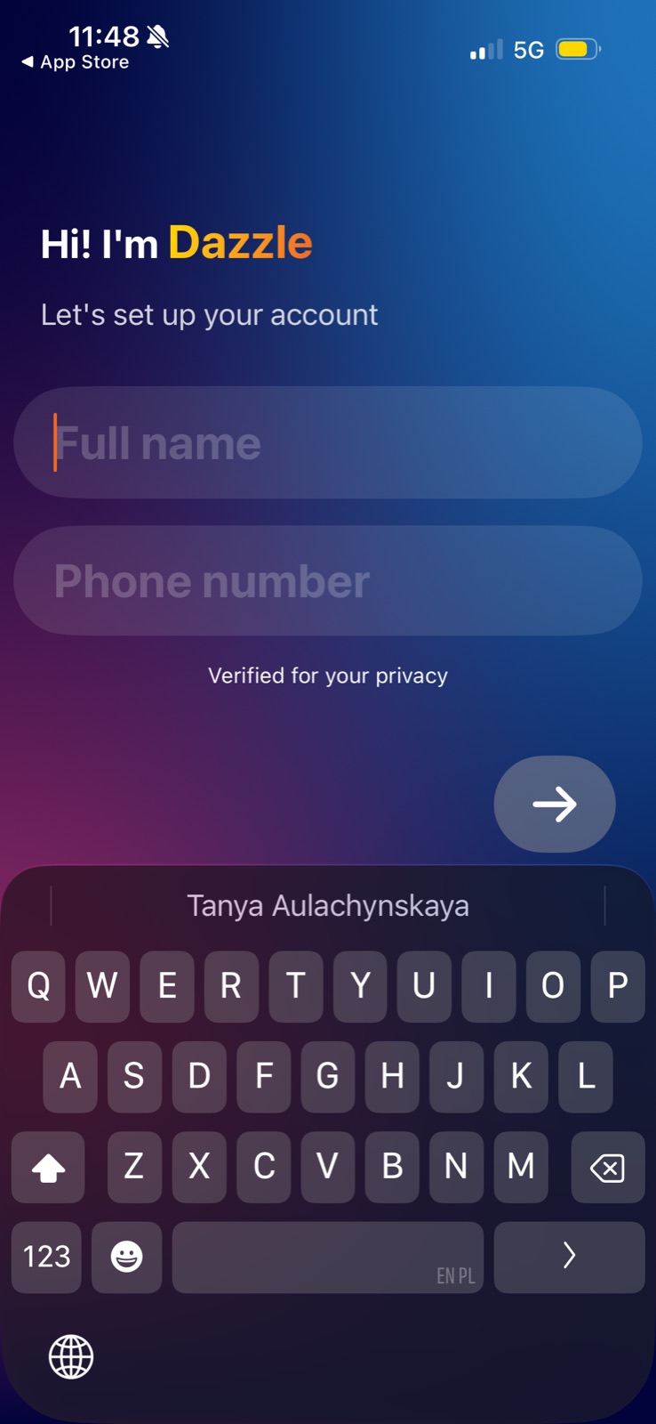
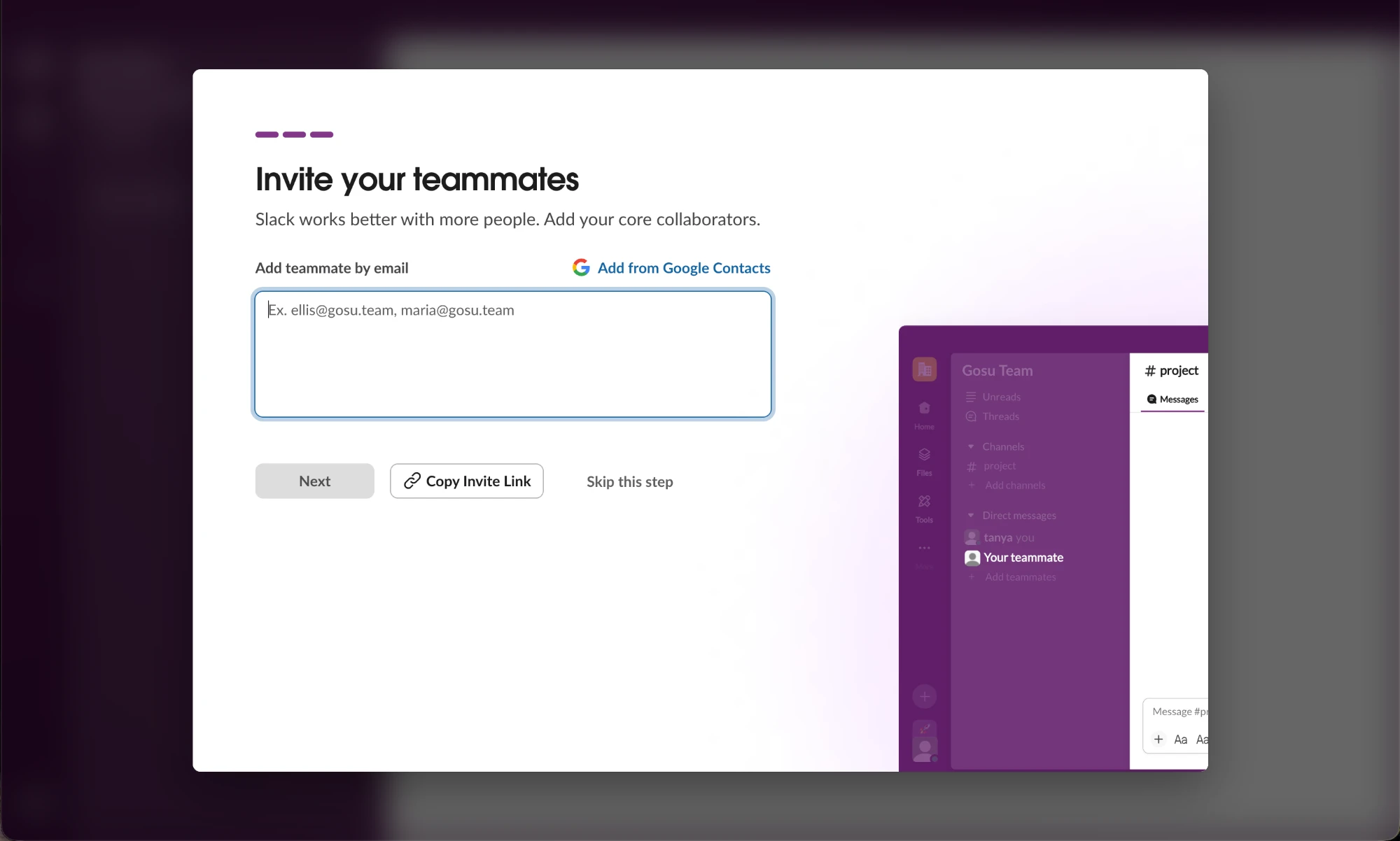
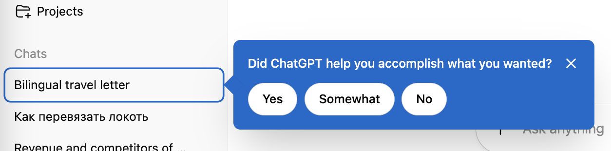
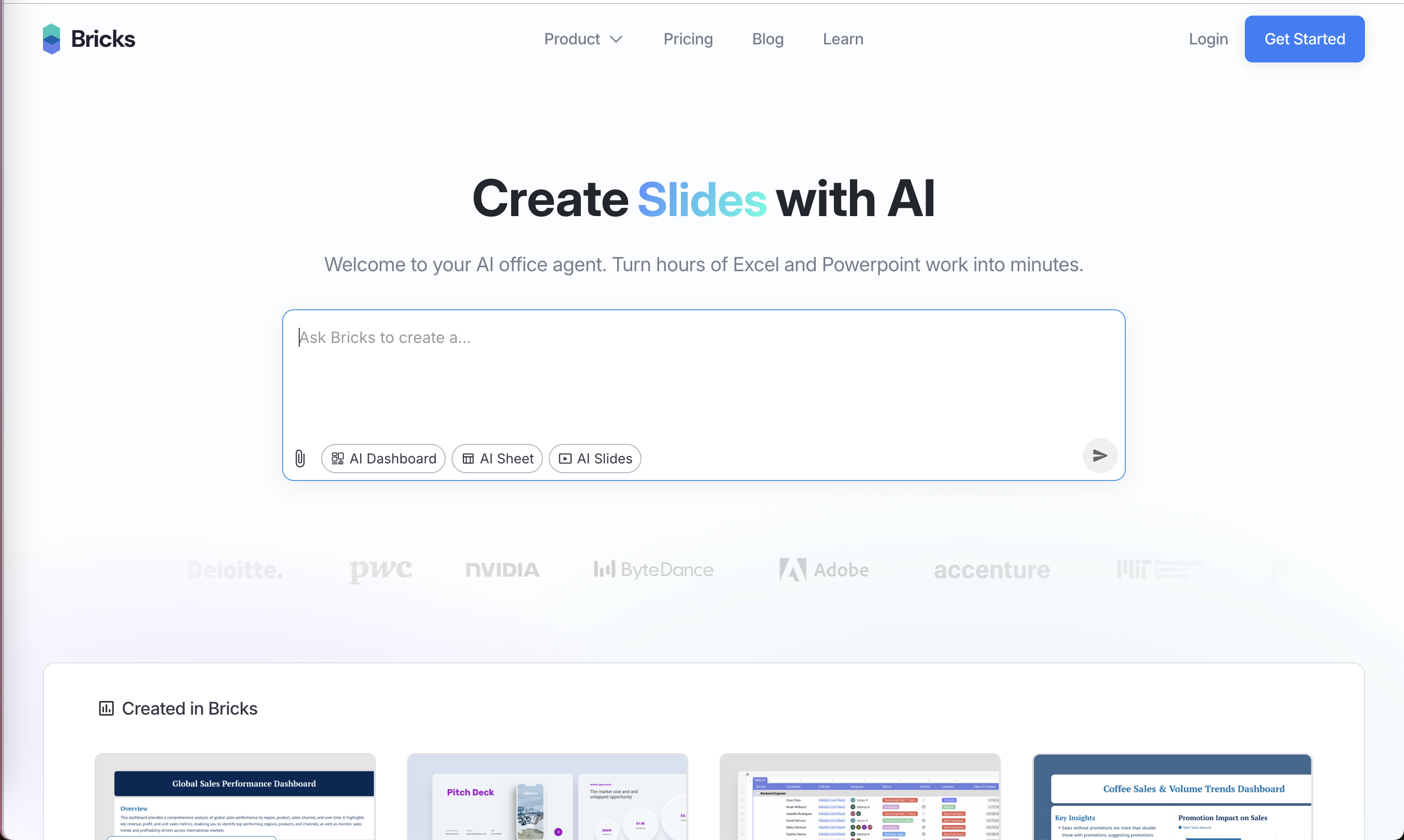
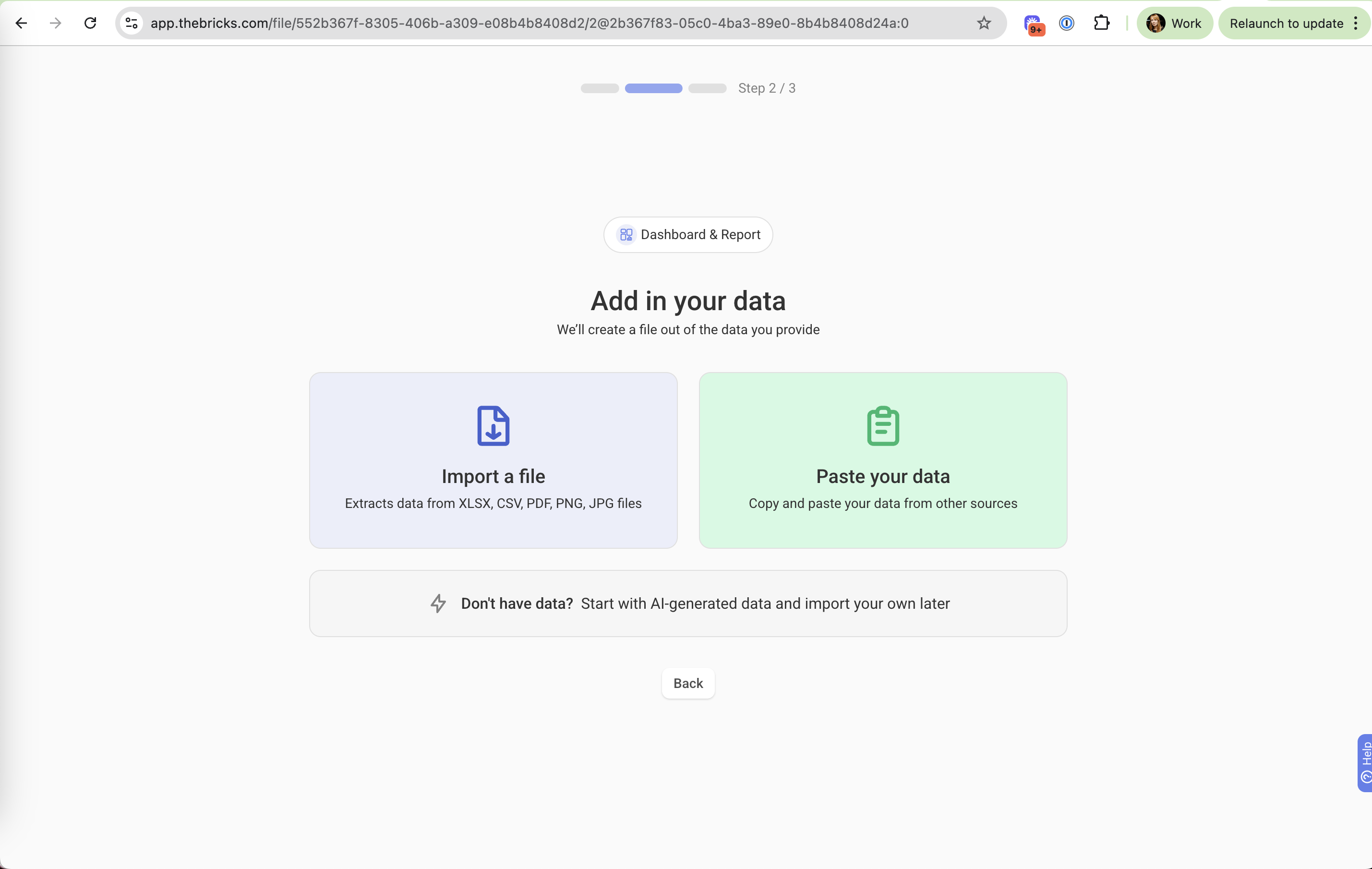
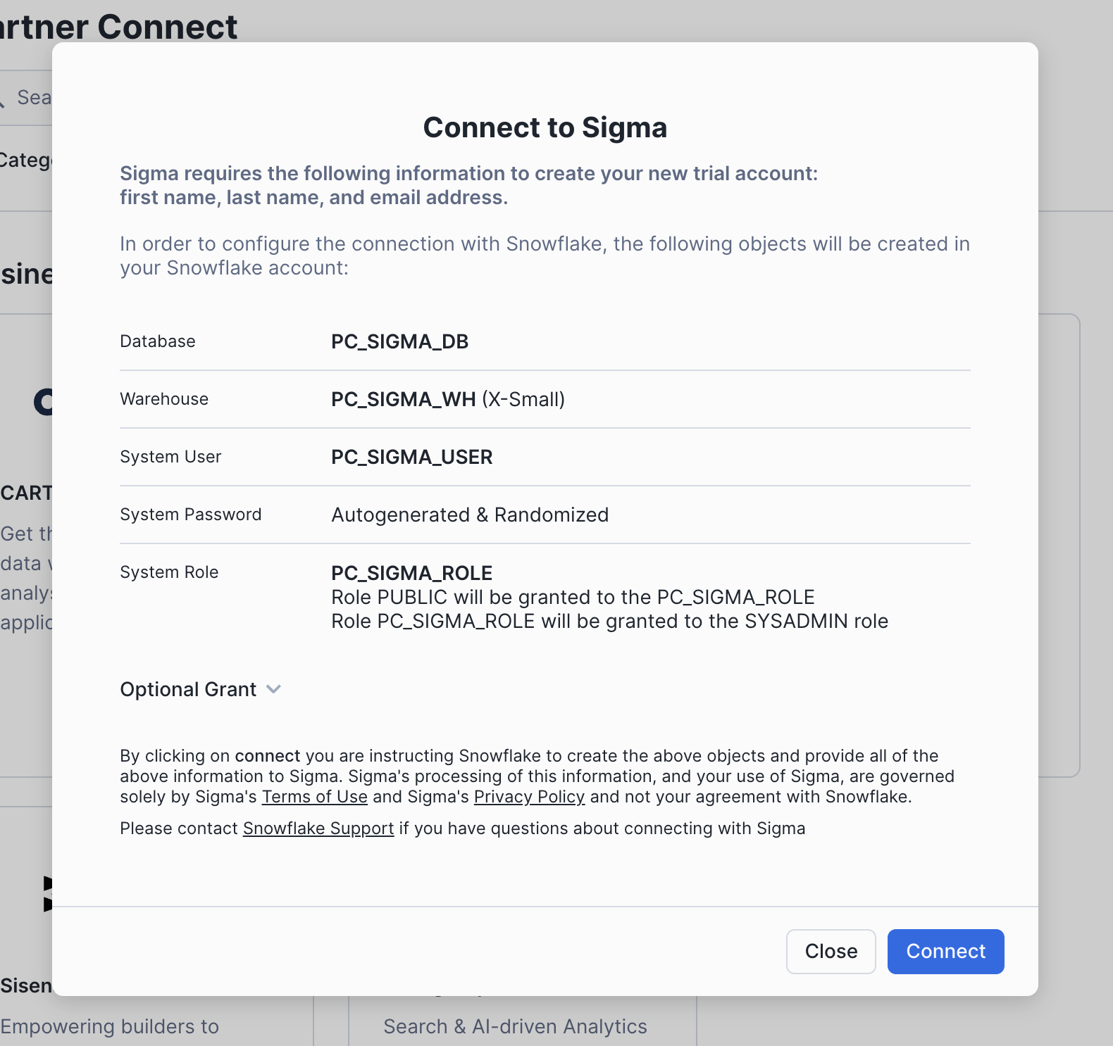
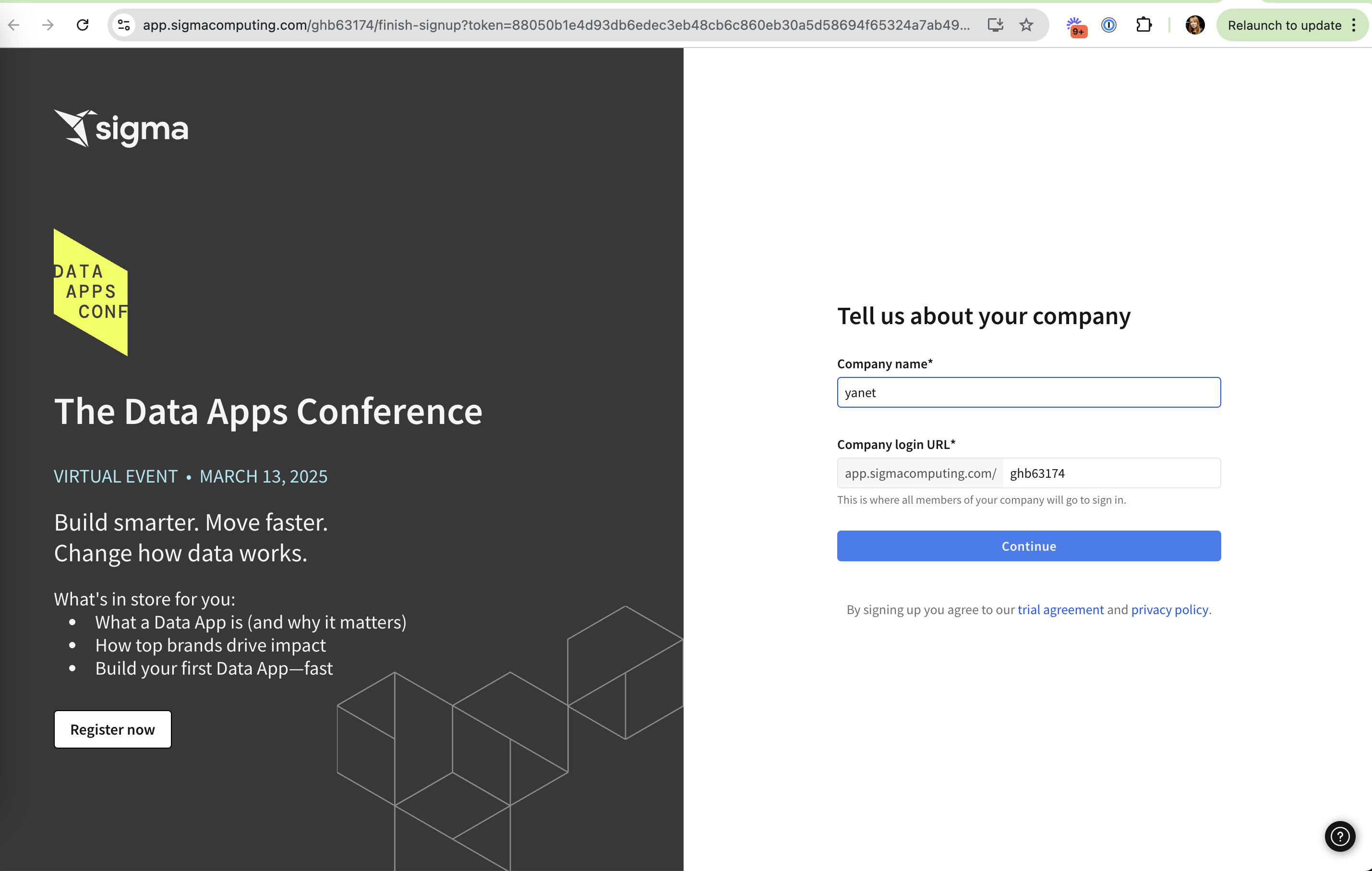
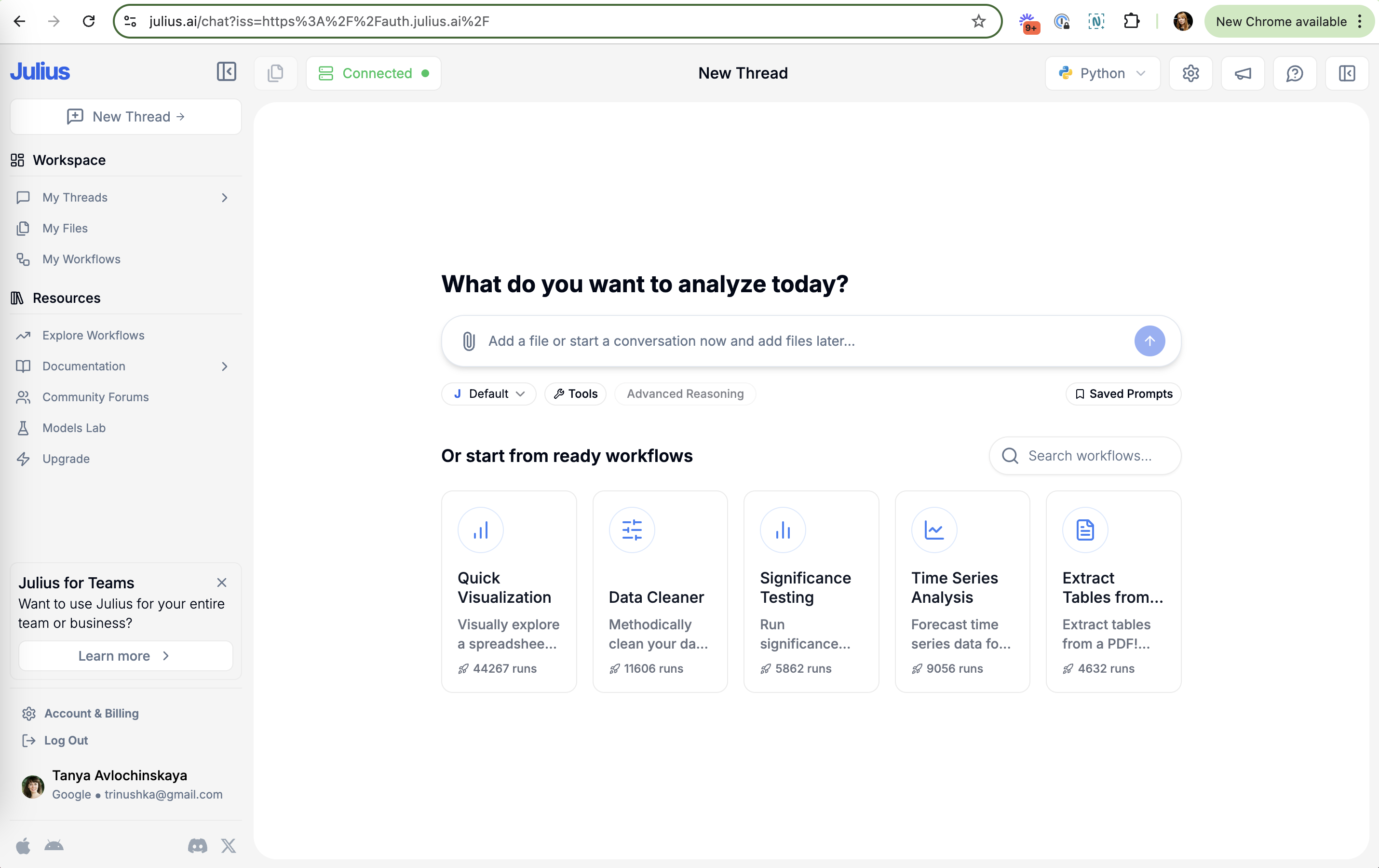
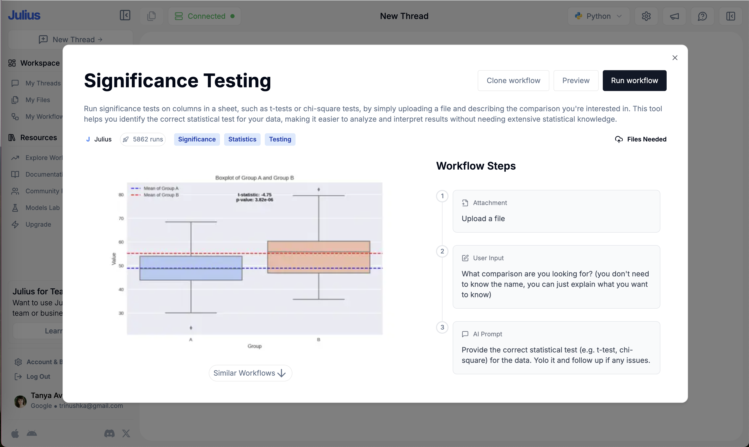
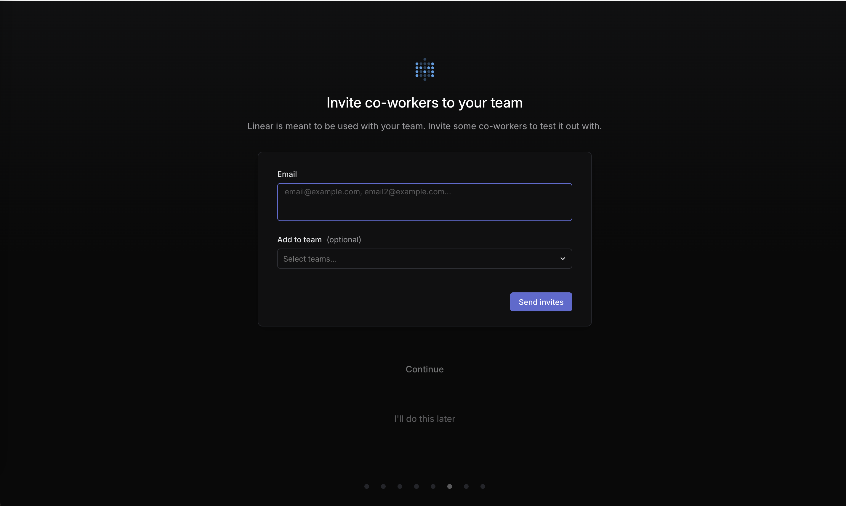
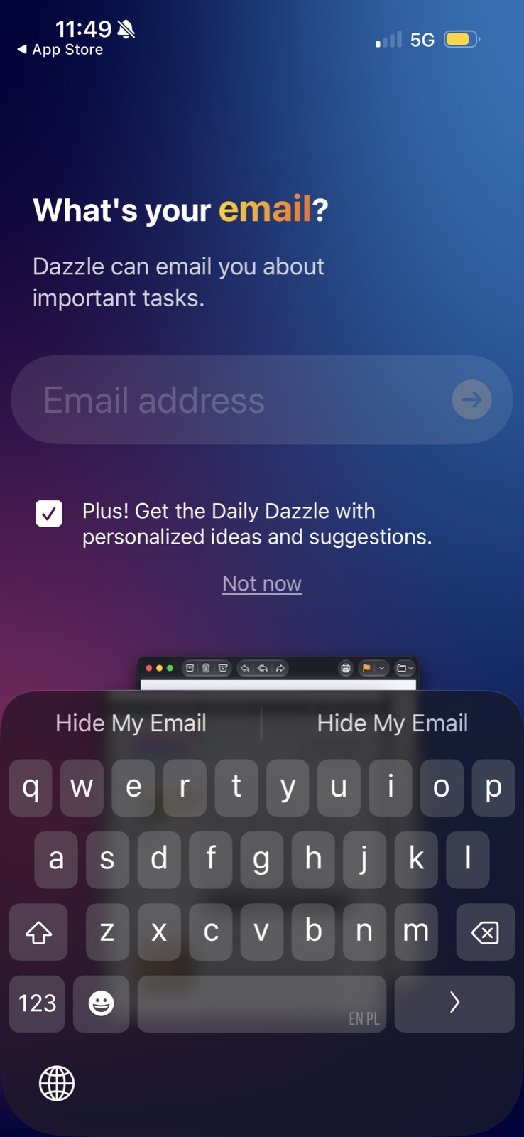
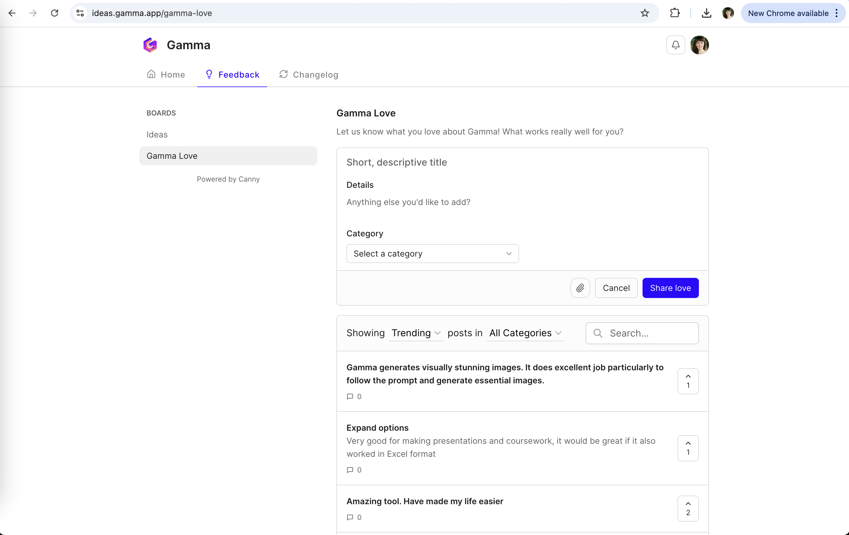
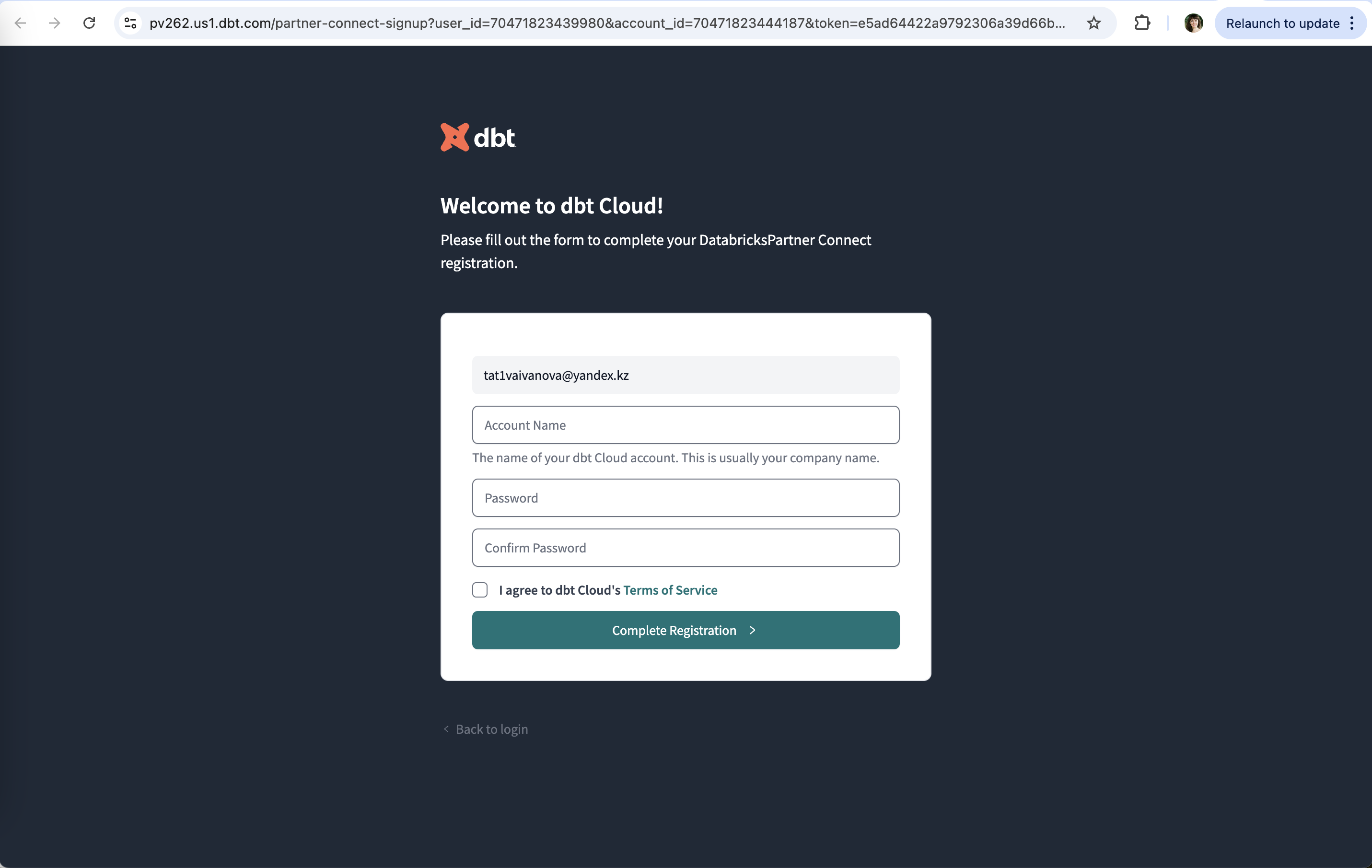
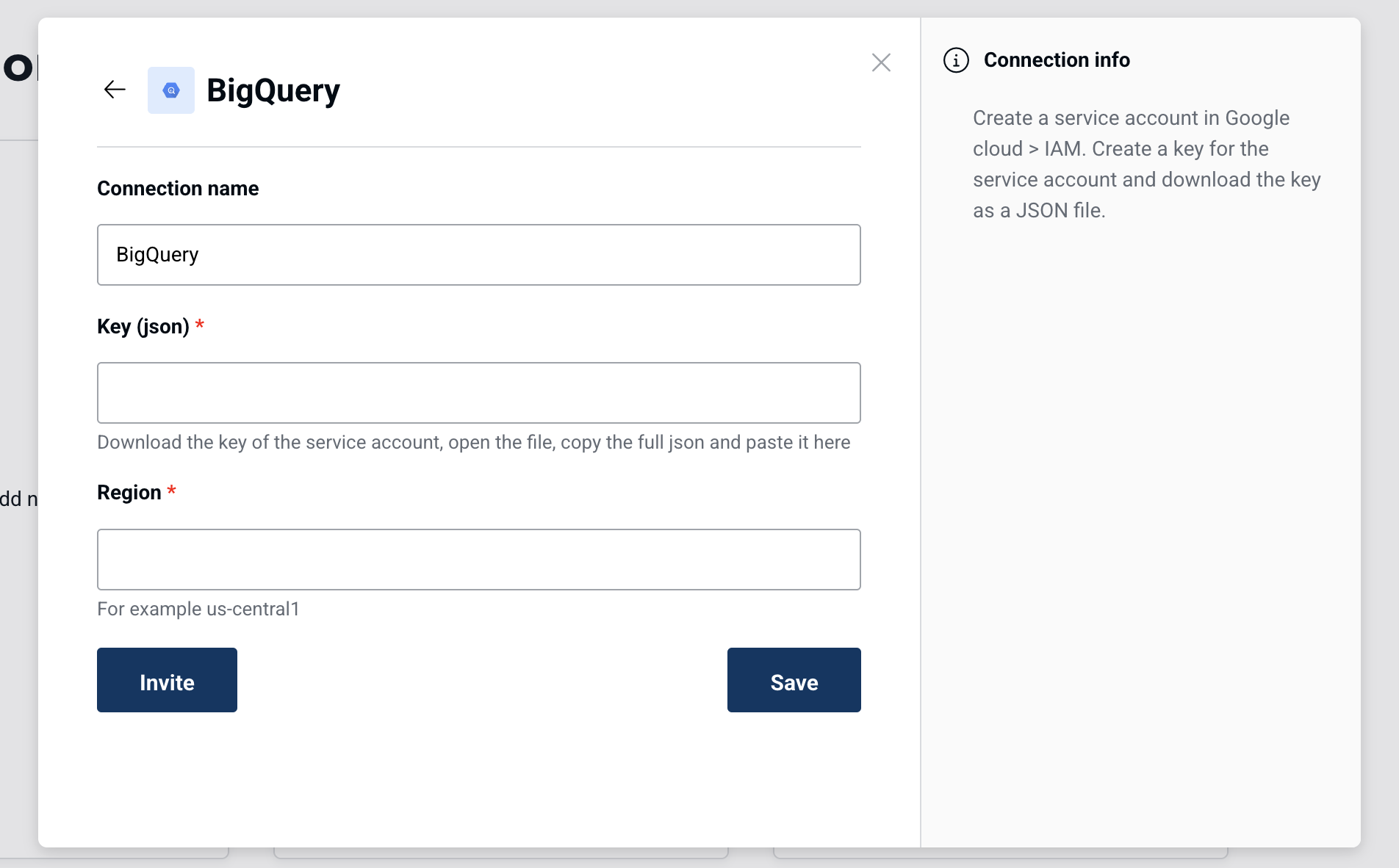
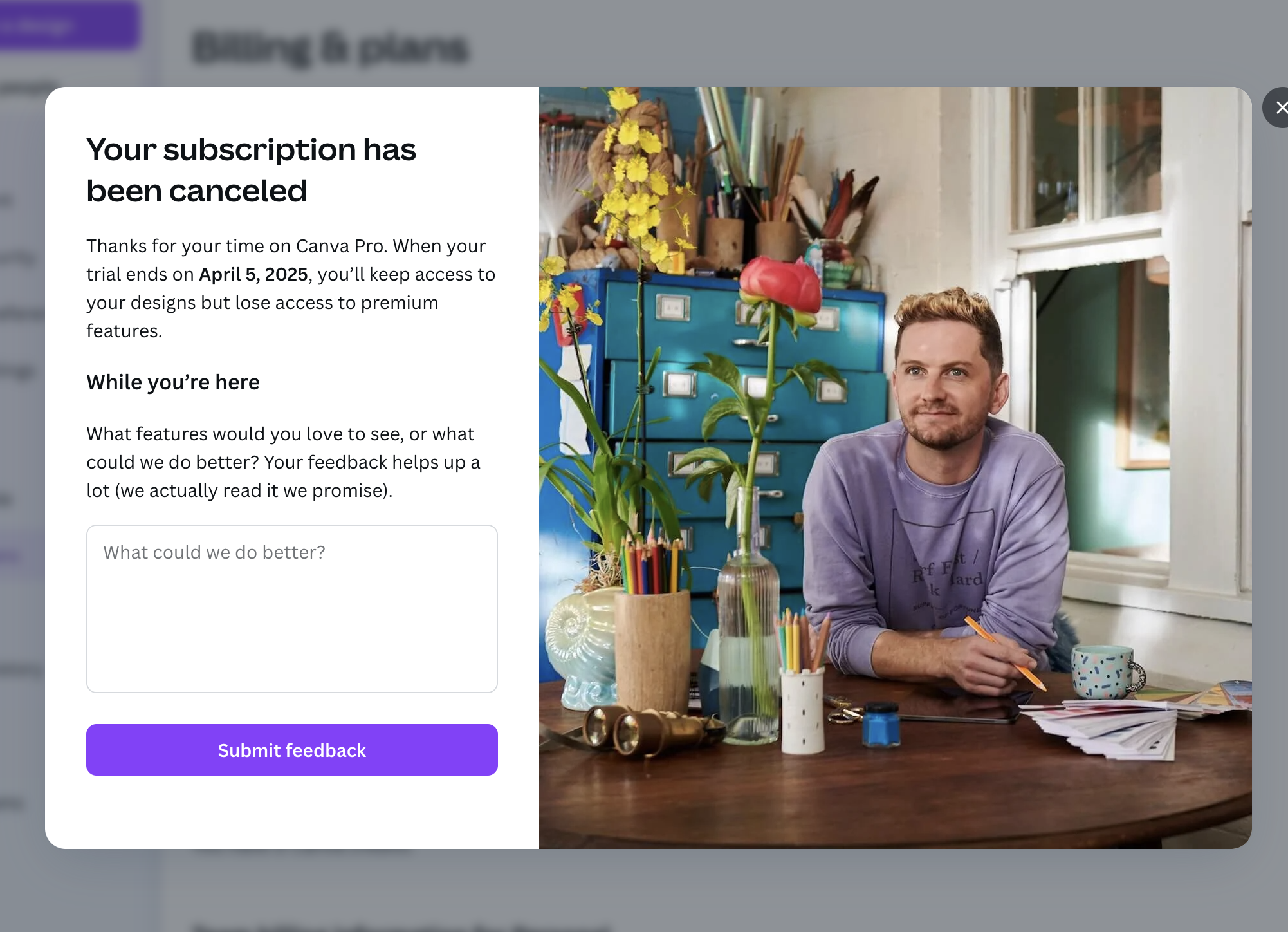
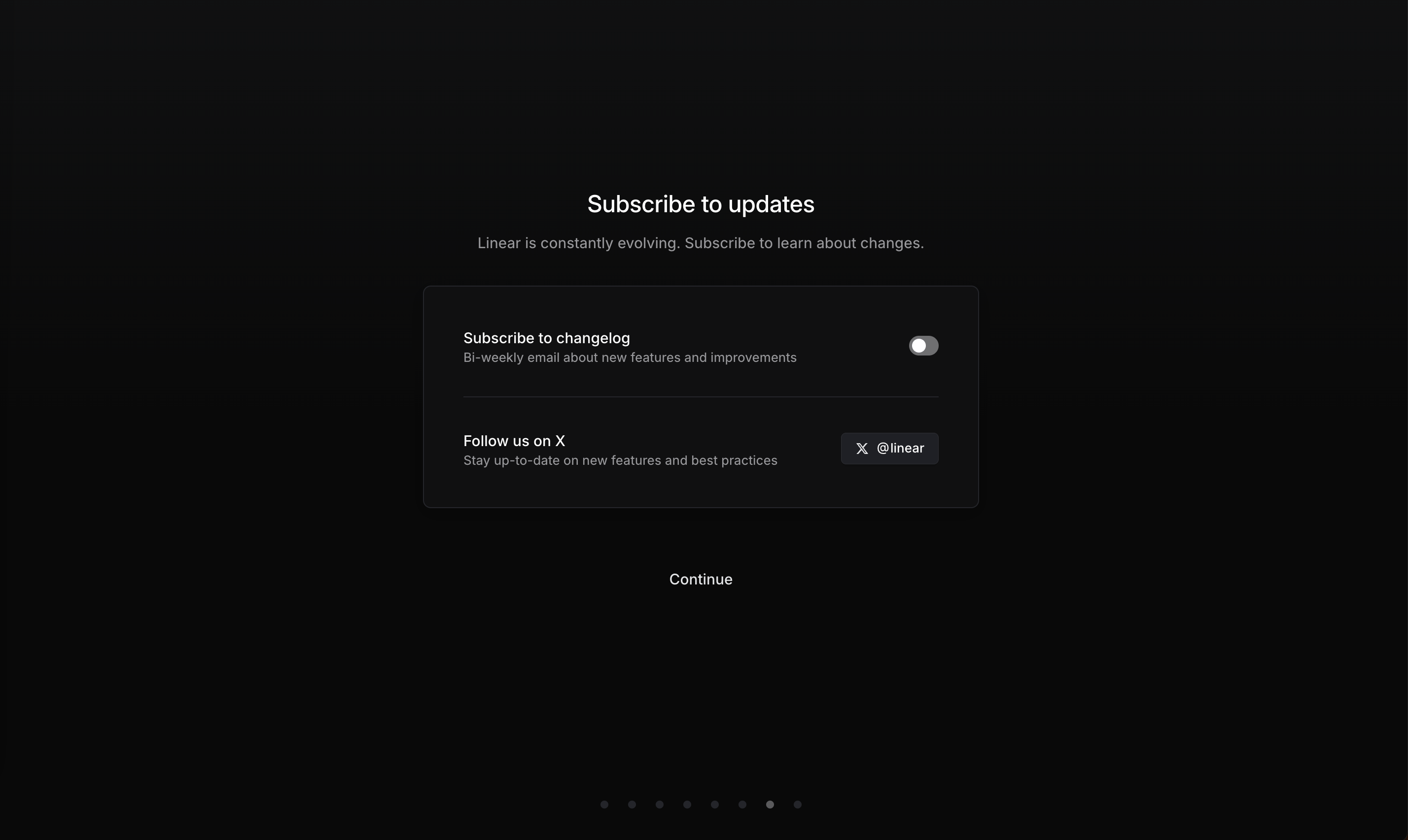
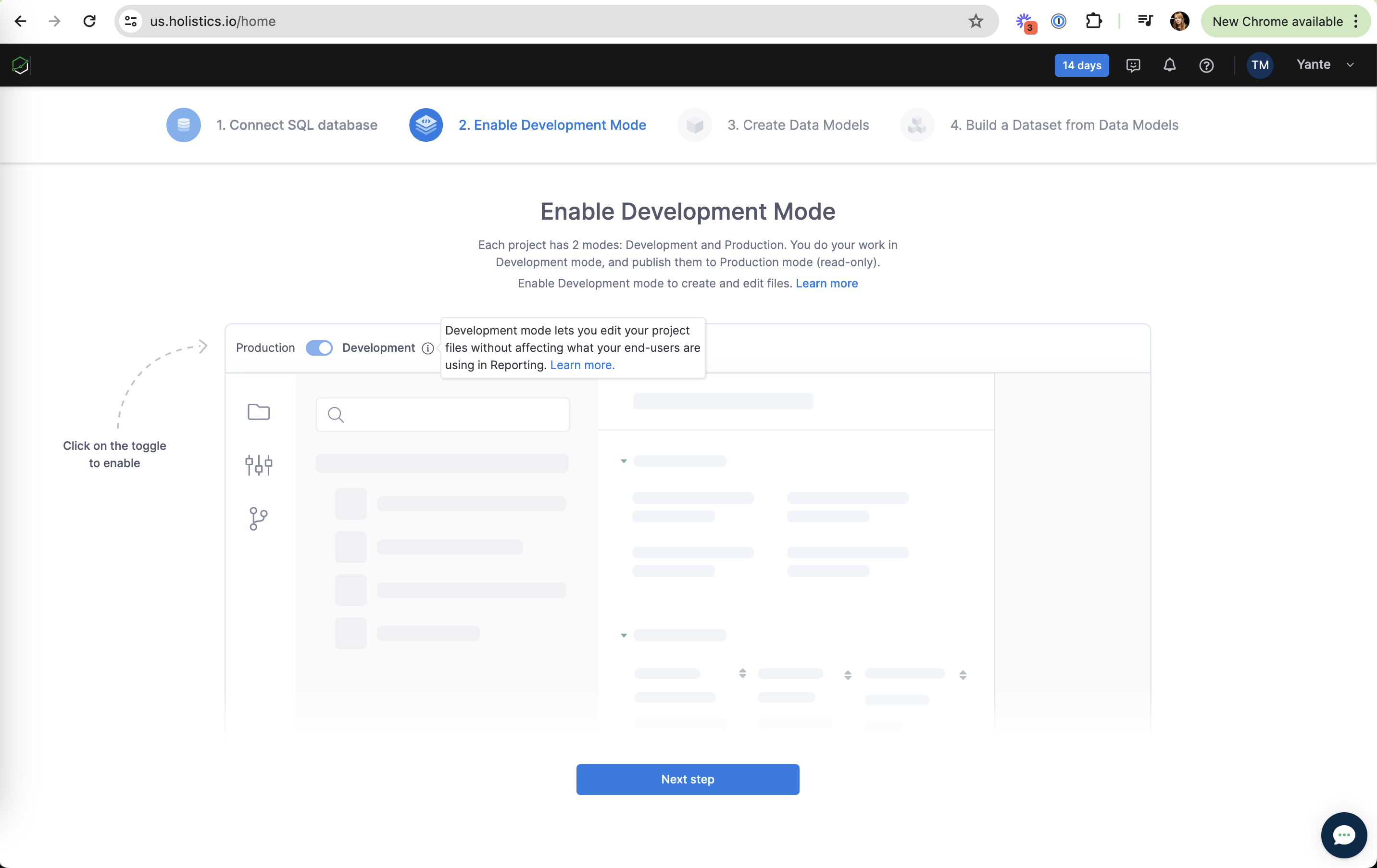
Friction is any effort a screen asks for that does not move the user toward their goal: retyping known data, leaving the page to find a setting, an extra confirmation, a form field nobody needs. NN/g calls the total of this mental and physical effort interaction cost, and notes that people tend to pick whatever path looks cheapest.
BJ Fogg's behavior model (2009) puts it plainly: a behavior happens when motivation, ability and a prompt meet at the same moment, and making a task easier (raising ability) can carry a user whose motivation is only moderate. Baymard Institute's checkout benchmark finds the average checkout still shows about 11 form fields when most sites need only 8, and that 17% of shoppers in its survey abandoned an order because checkout felt too long or complicated.
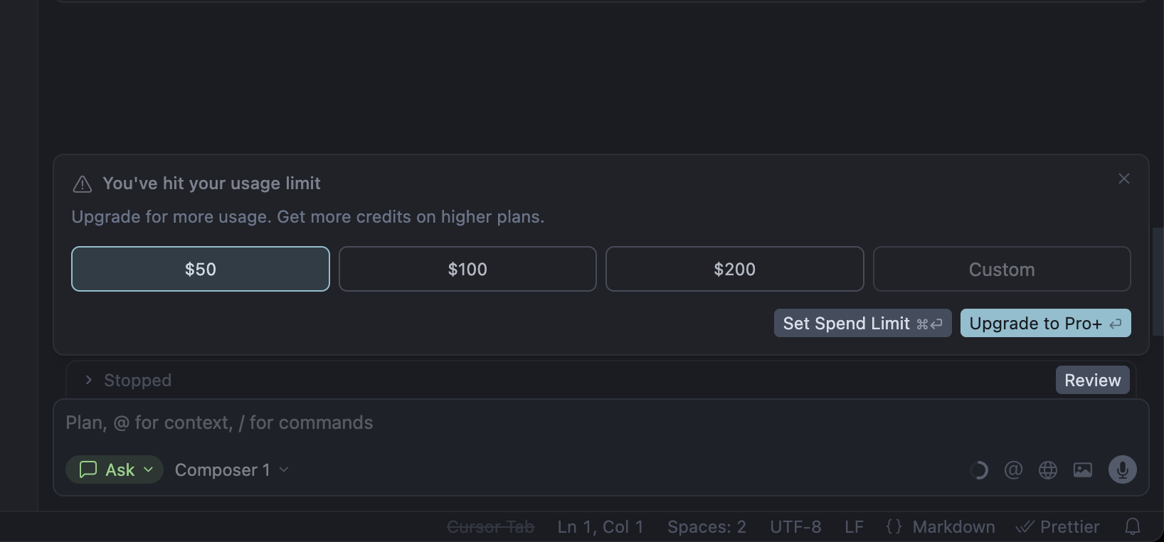
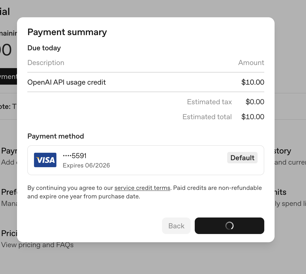
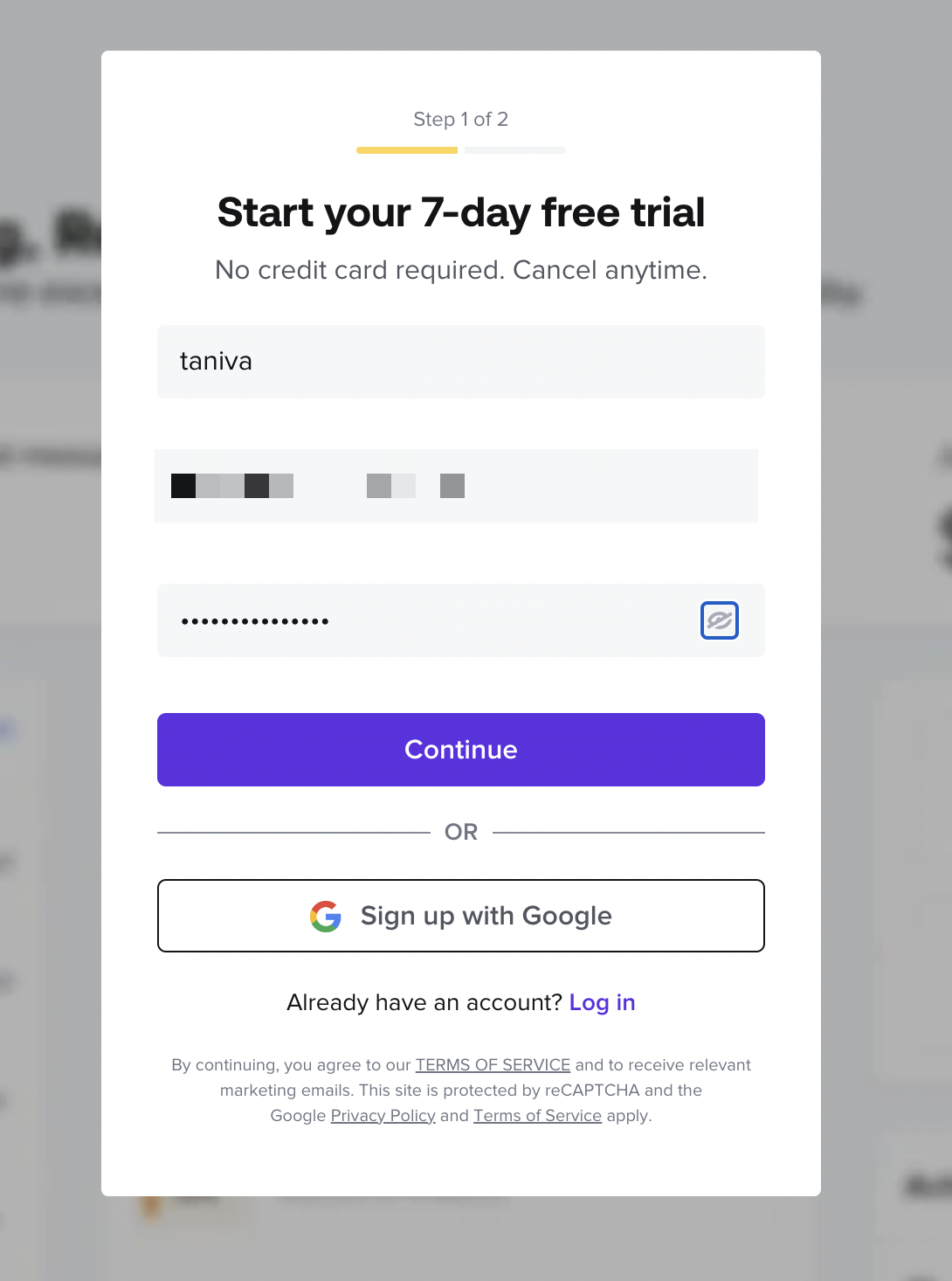
In onboarding and upsells the user's motivation is at its peak for a short window. One-tap sign-in, autofill, a saved card, or a budget preset next to the spend limit keep the action inside that window instead of sending people off to another page.
How to use it
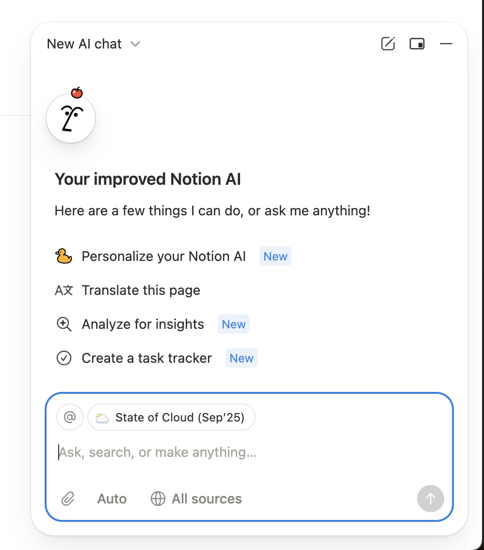
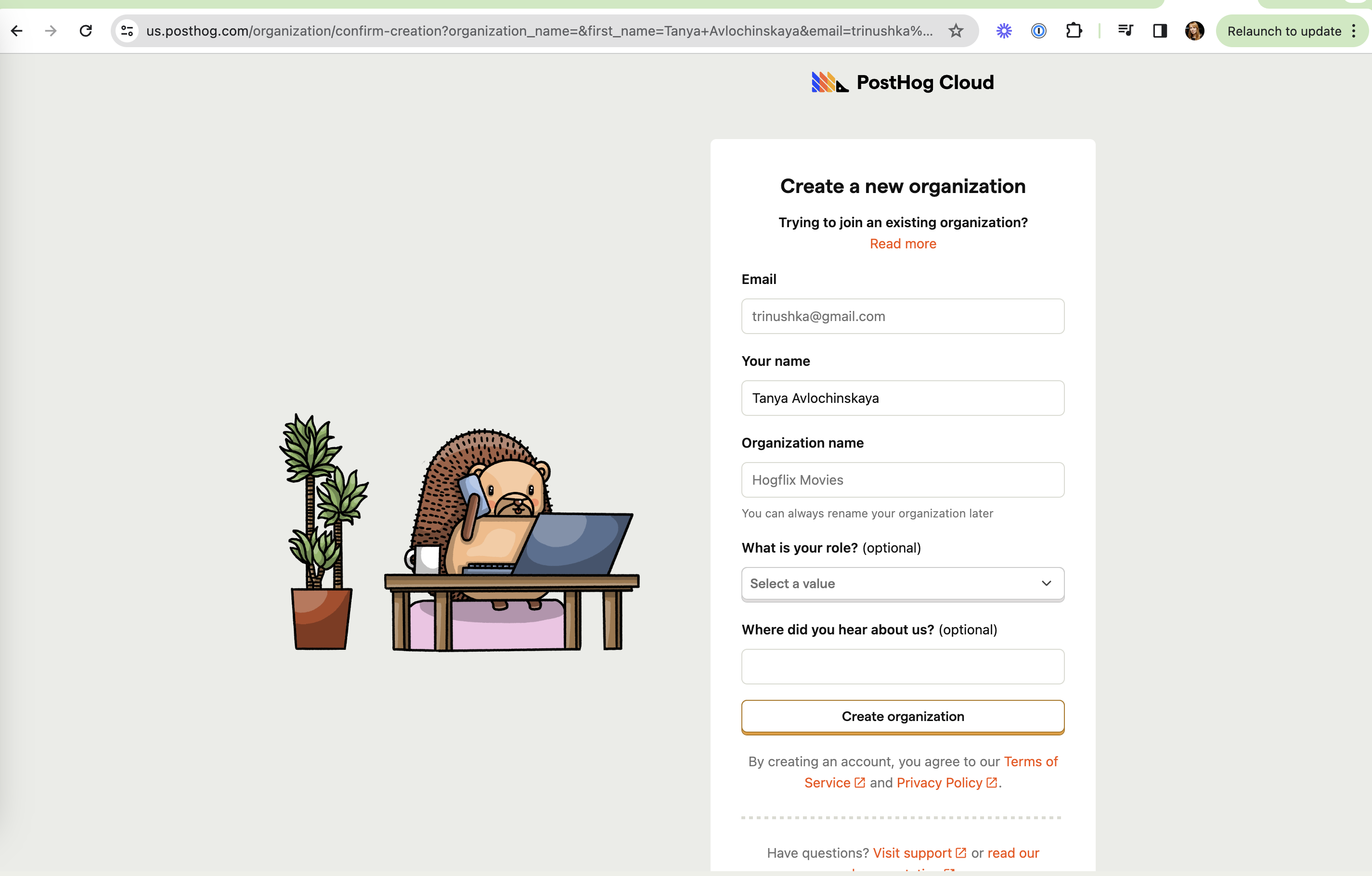
- Prefill anything you already know (email, name, company, current page) and let the OS autofill the rest with correct field types.
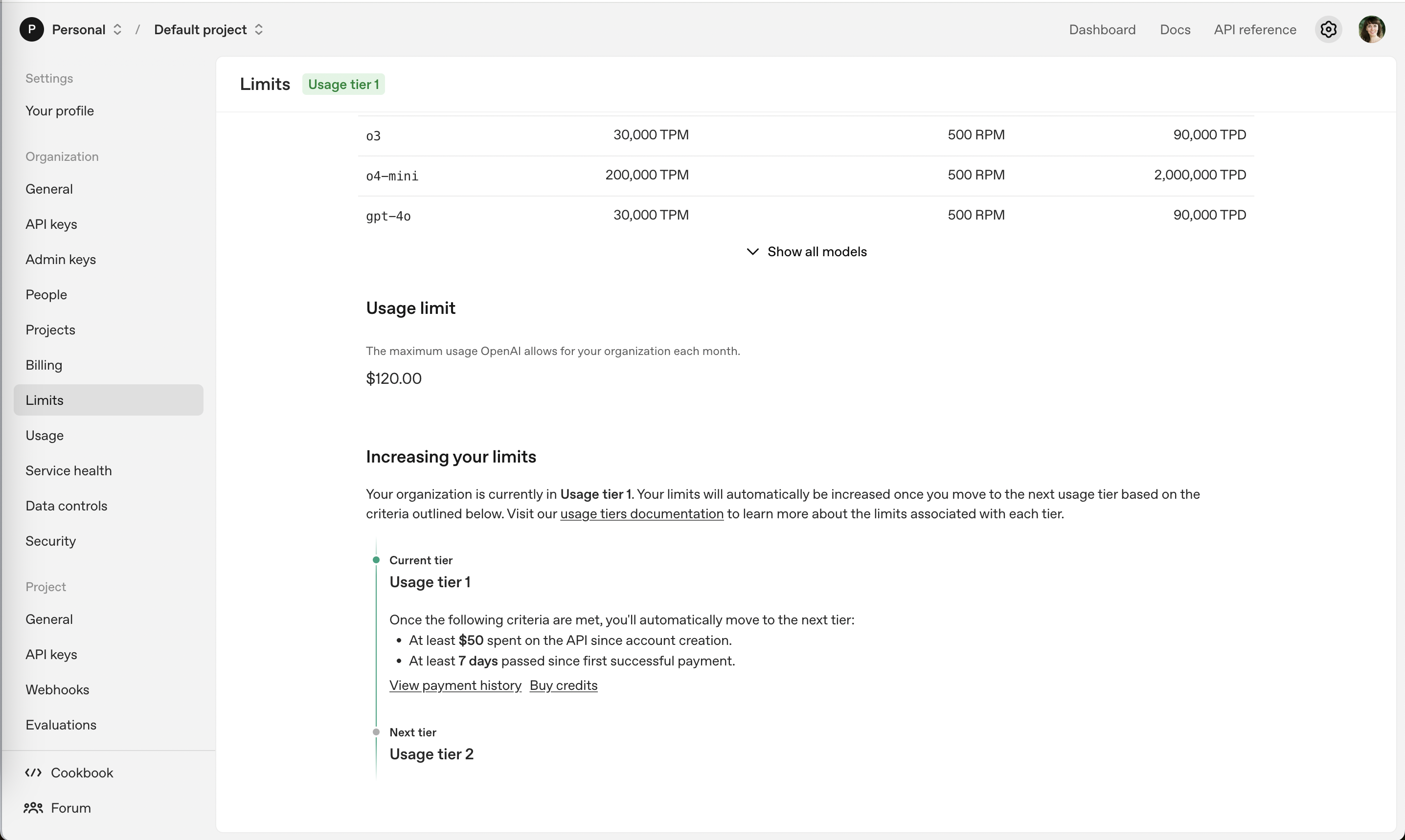
- Put the action where the need appears: a "Buy credits" button next to the usage limit, not a link to the billing page.
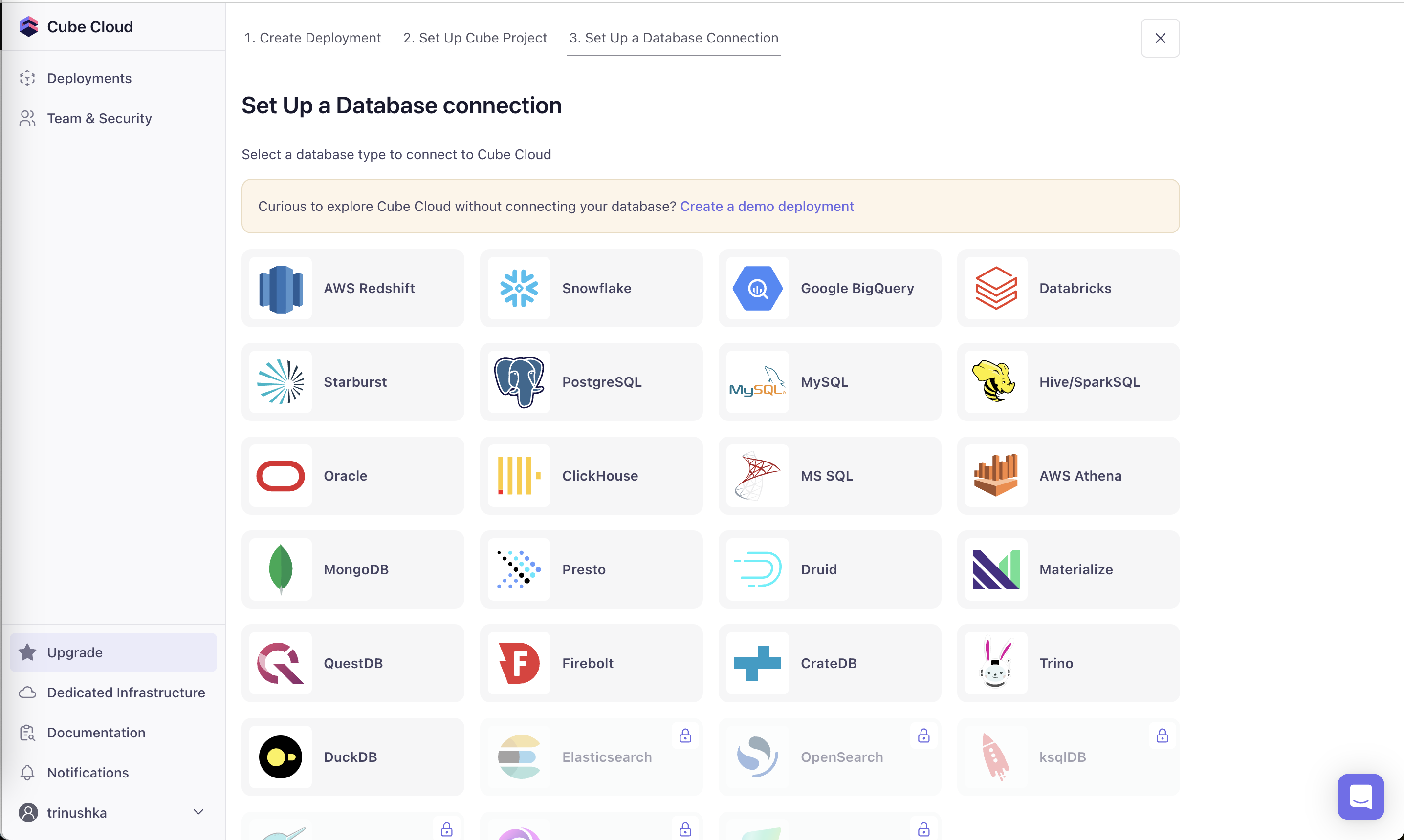
- Count the fields and steps on your signup or checkout and cut or defer every one that is not needed to deliver the first result.
Watch out
- Removing friction from decisions users should think about (one-click upgrades with no price shown, auto-renewal enabled silently) turns convenience into a trap; that is where Positive friction belongs.
- Hiding required information to make a flow look shorter just moves the effort to a later, more frustrating step.