Usability heuristic

Discoverability

Make features, options and content easy to come across, with clear cues that say what they are and why they are worth a click.

Discoverability Two versions of a mobile site header: one hides the sections behind a menu icon, the other shows them as tabs. 44% of people used the navigation when it was hidden and 89% when it was visible. Same sections, two menus People who used the navigation Hidden behind a menu icon Shop Sections stay out of sight until tapped Always visible as tabs Home Deals Orders Help Every section says what it is 44% 89% About twice the use when it is visible NN/g study of 179 users, two sites on mobile
Pernice and Budiu (NN/g, 2016): on mobile, 89% of people used the navigation on a site that showed it, 44% on one that hid it behind a menu icon.

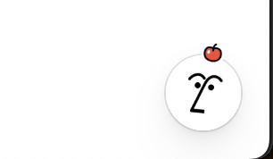
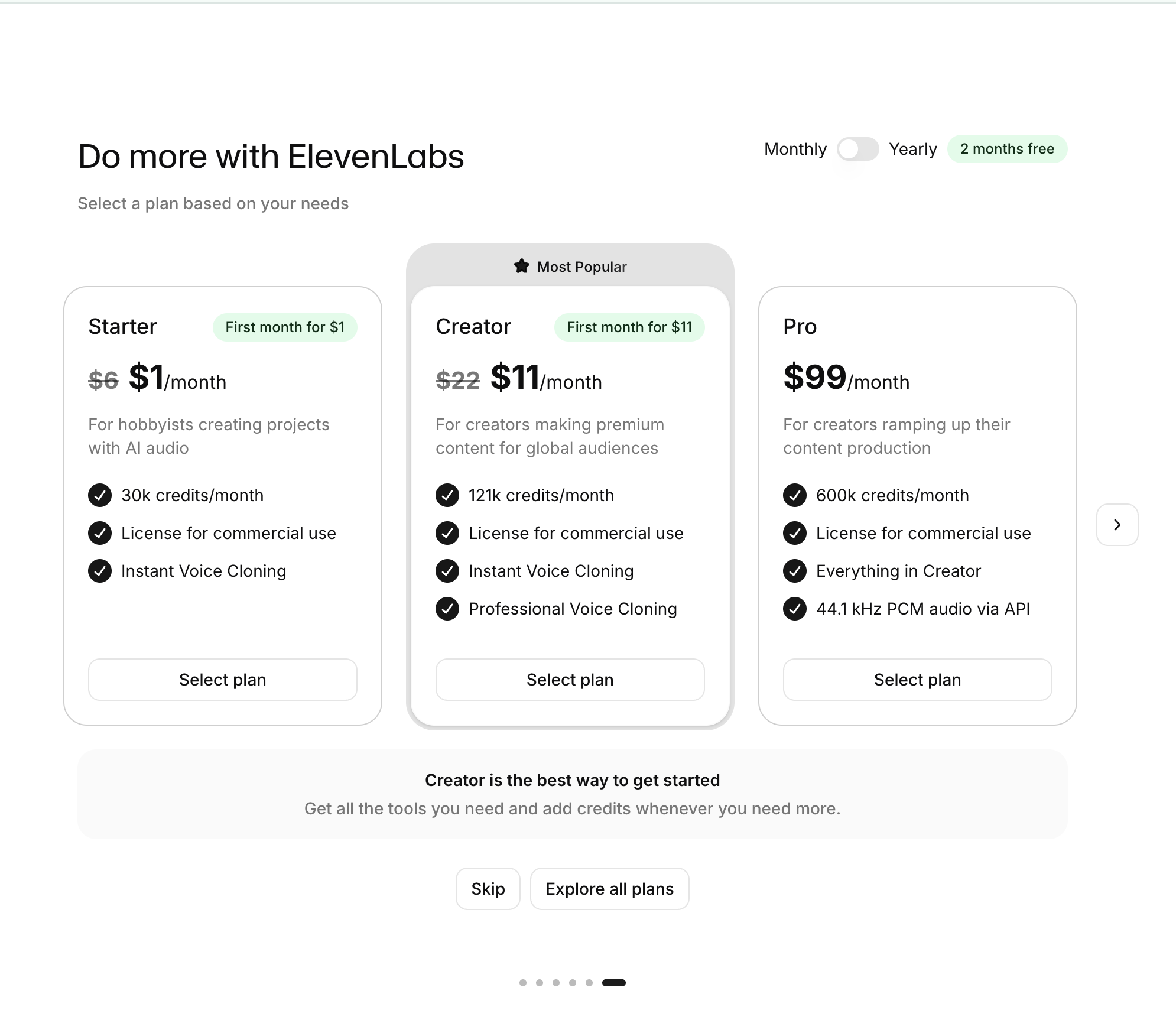
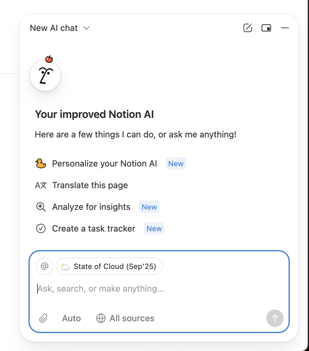
Discoverability is whether people come across something they did not know existed; findability is whether they can locate something they already expect. On this site the principle covers both, plus information scent and novelty cues: a plan hidden behind a carousel arrow fails it, while a small "New" tag on prompts, or a badge on the avatar people already click, passes it.

The theory behind it is information foraging (Pirolli and Card, 1999): people decide where to click by judging the "scent" of a cue, that is how likely it is to lead to what they want, and abandon paths whose scent is weak. NN/g's research applies this to labels and navigation. In a study of 179 users, sites with visible or combined navigation saw far more navigation use than sites that hid it behind a menu icon, for example 89% vs 44% on mobile between two sites.

For upsells and feature launches, a feature nobody finds might as well not exist. The best entry points sit where users already look, use words they would use, and show enough of the value that the click feels worth it.

How to use it

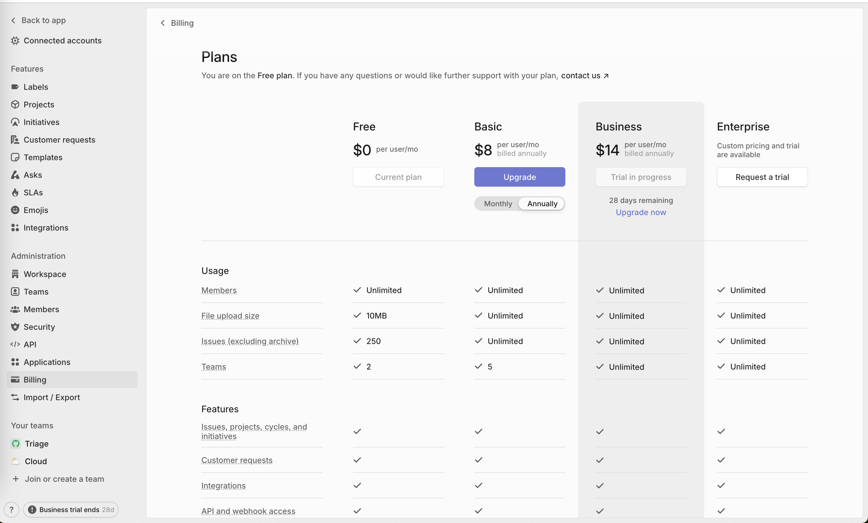
  • Show all plans on the pricing screen at once; do not hide one behind a swipe or arrow.
  • Announce new features at the entry point people already use (a tag, badge or suggested prompt), with a label that says what it does.
  • Write specific link and button labels ("Analyze for insights") instead of vague ones ("More", "Explore").

Watch out

  • Novelty cues with no explanation, like an icon change, may be read as decoration and missed.
  • Overusing "New" badges and red dots turns them into noise and trains people to ignore them.
Related

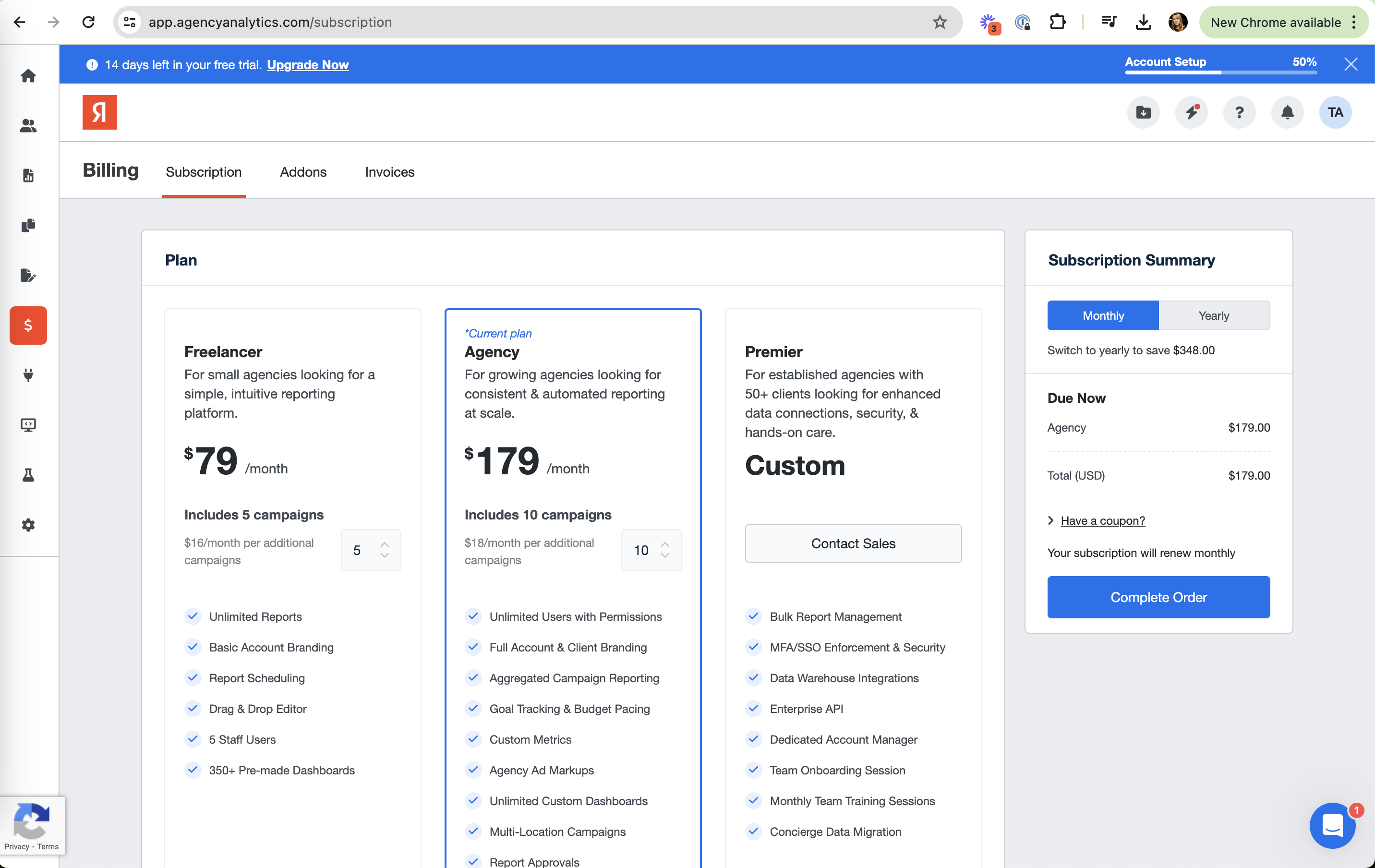
Discoverability in real products 14 working · 5 not

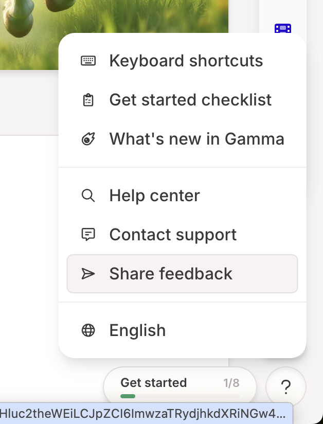
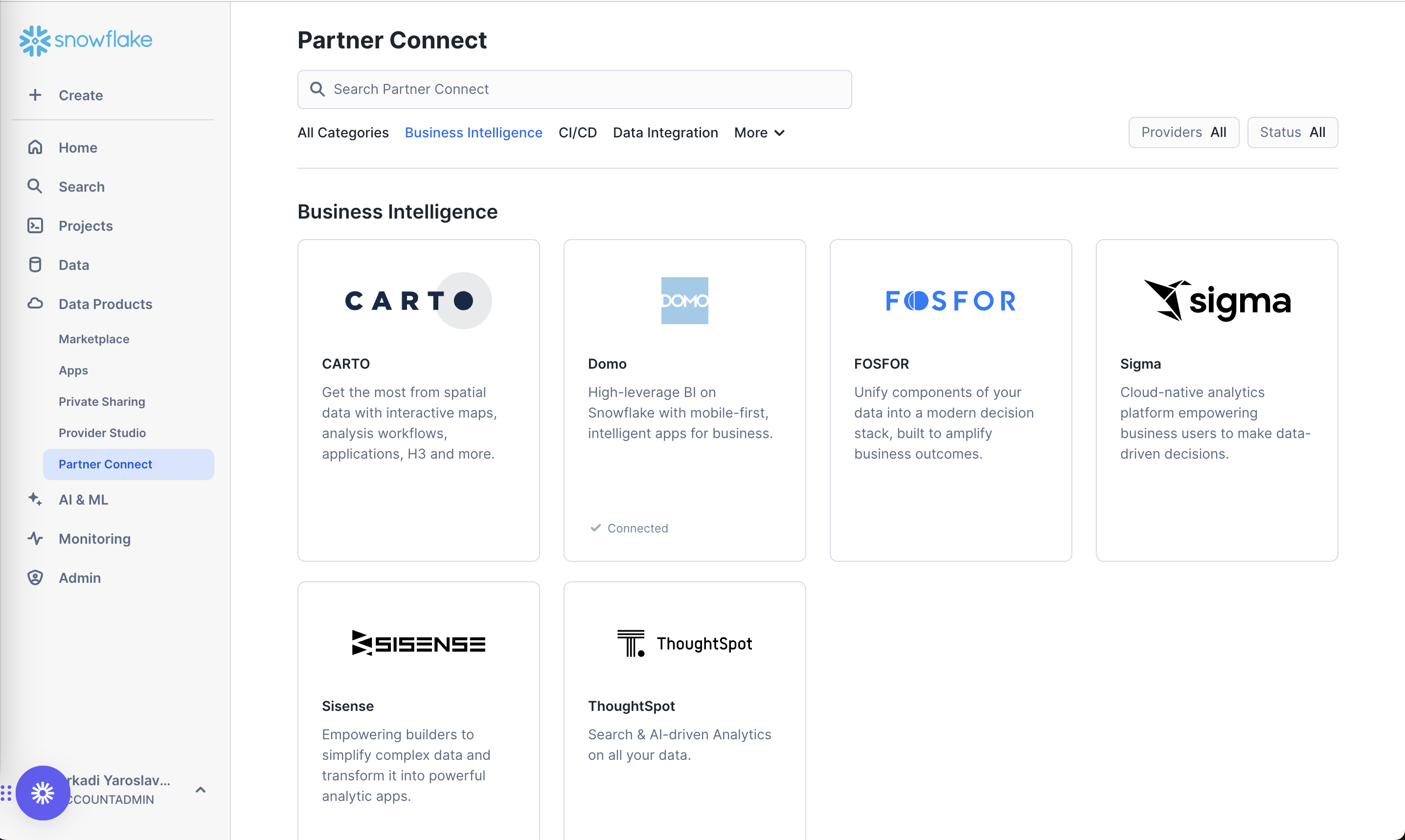
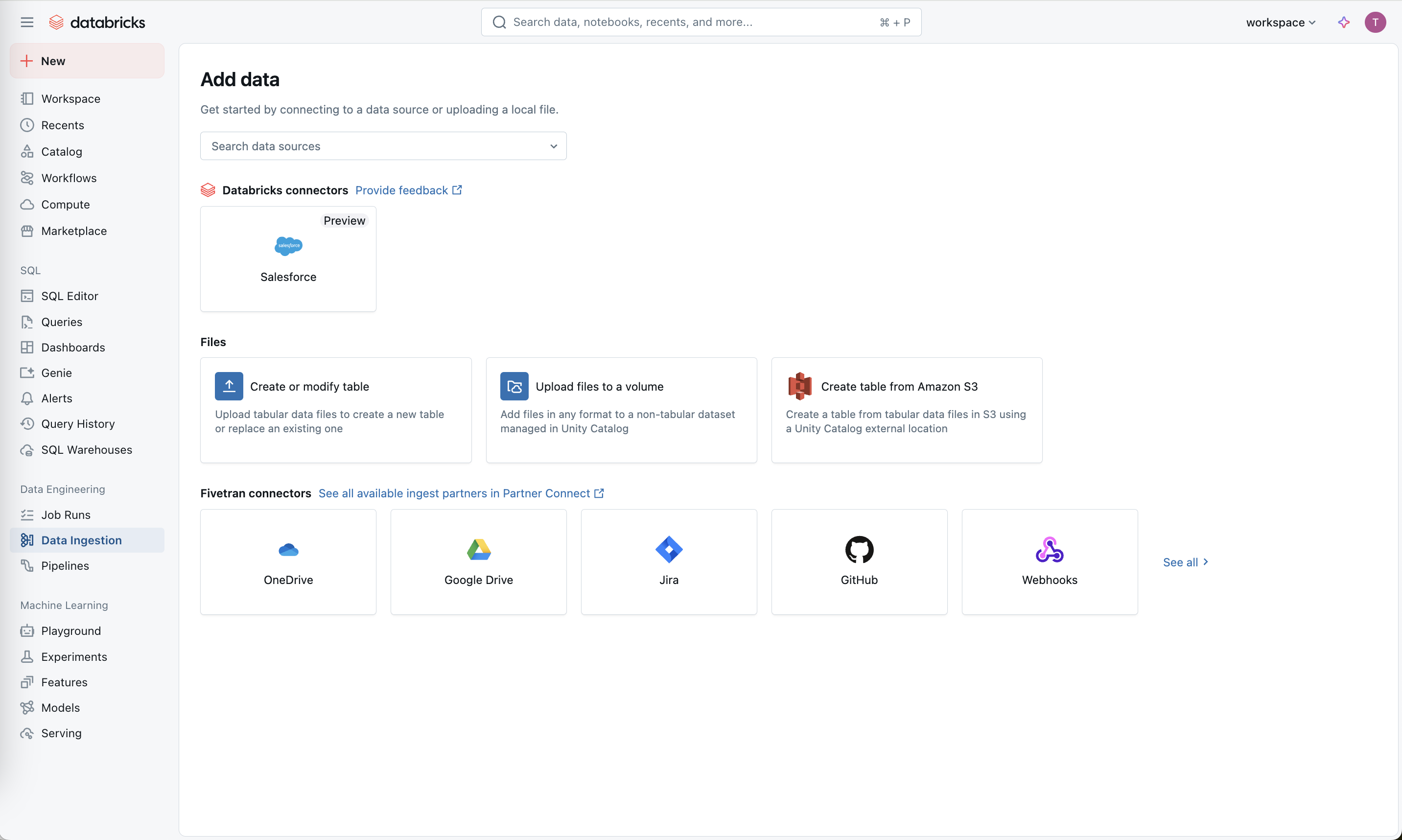
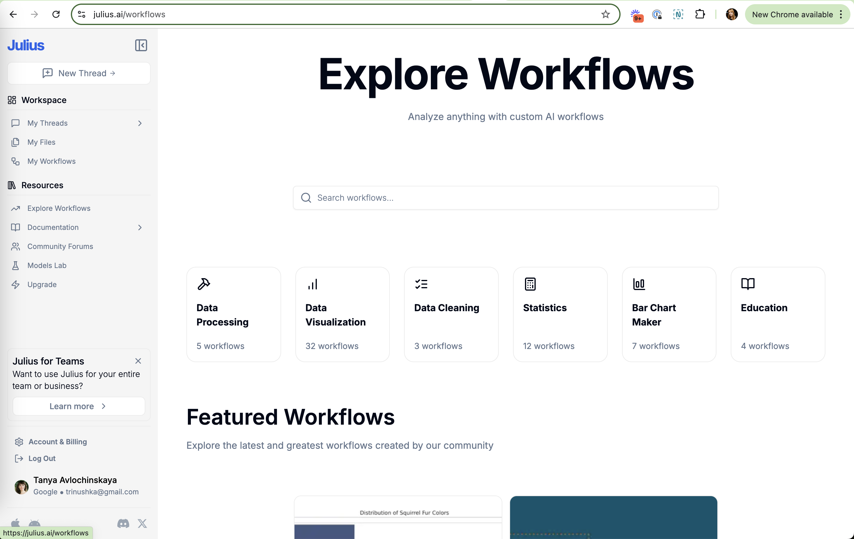
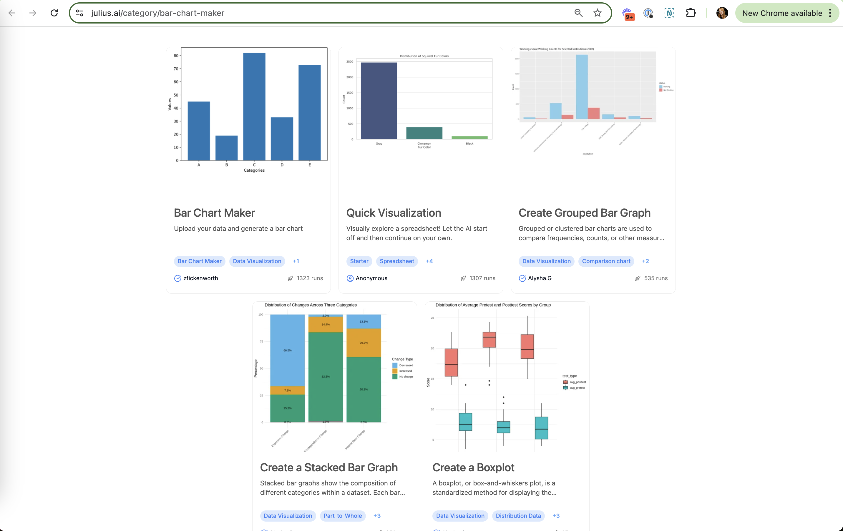
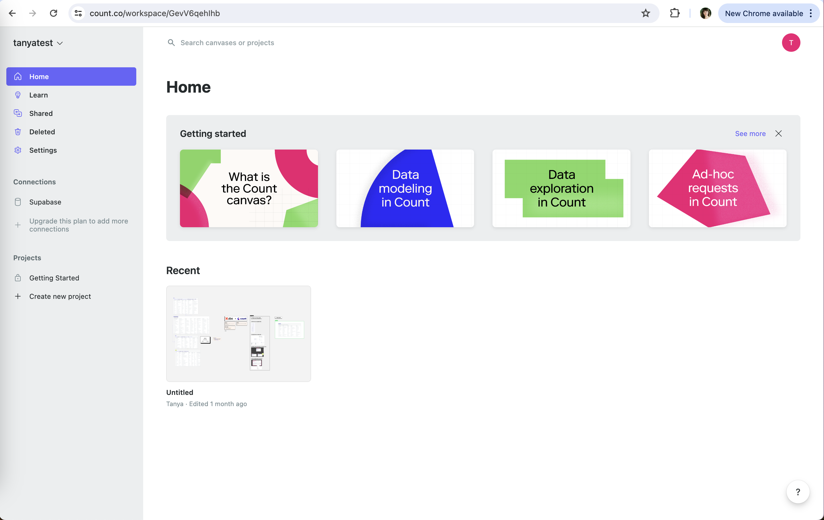
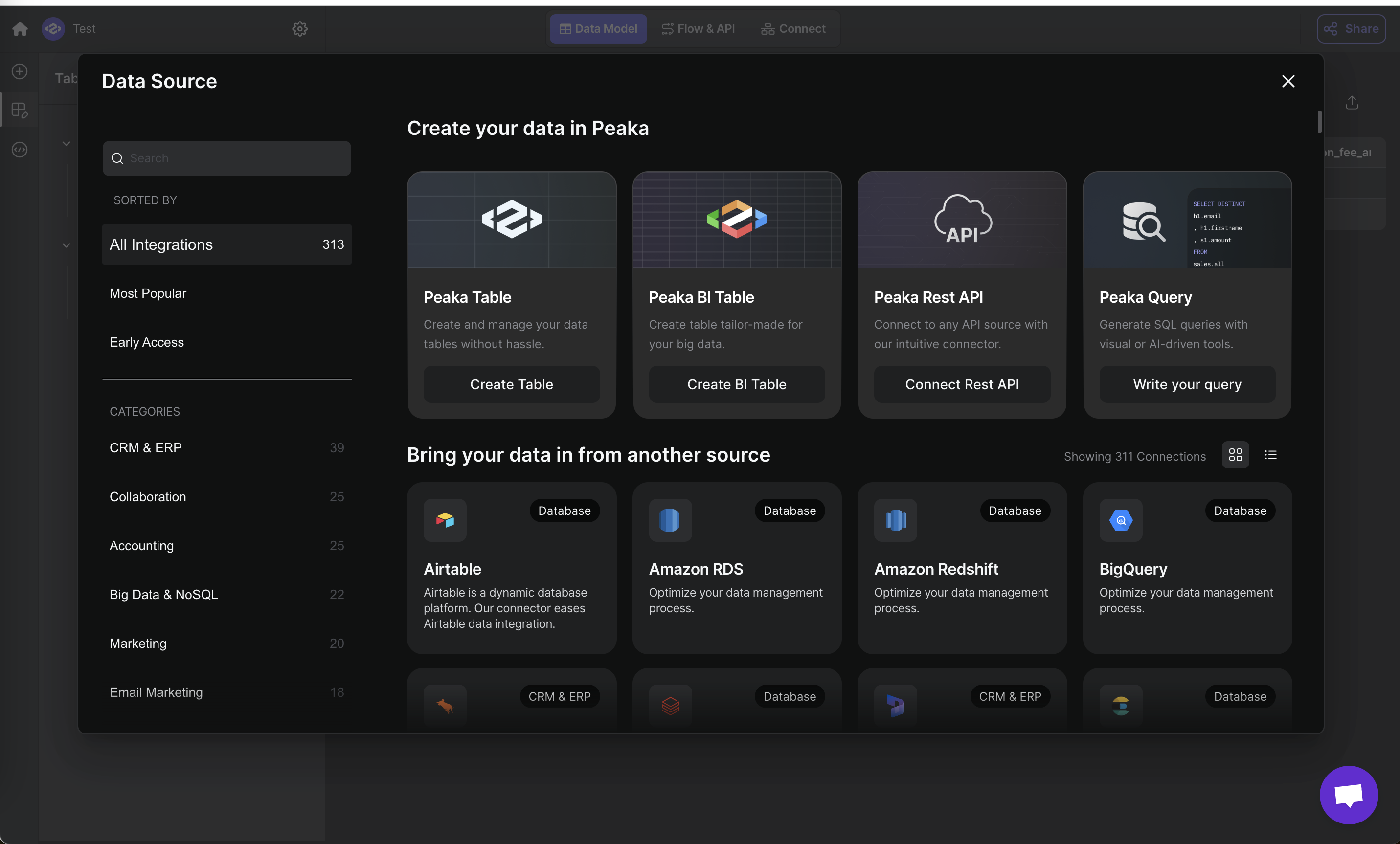
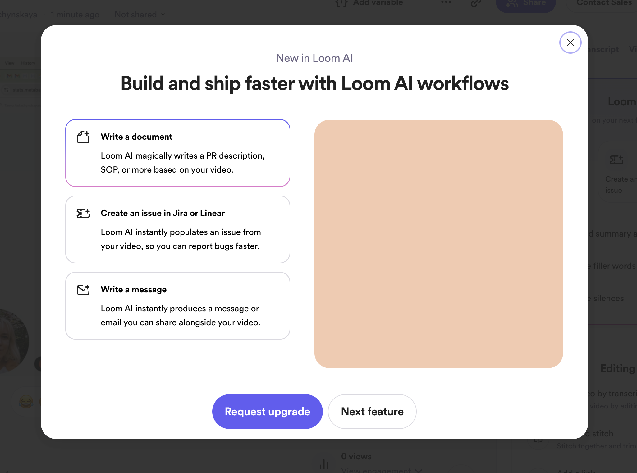
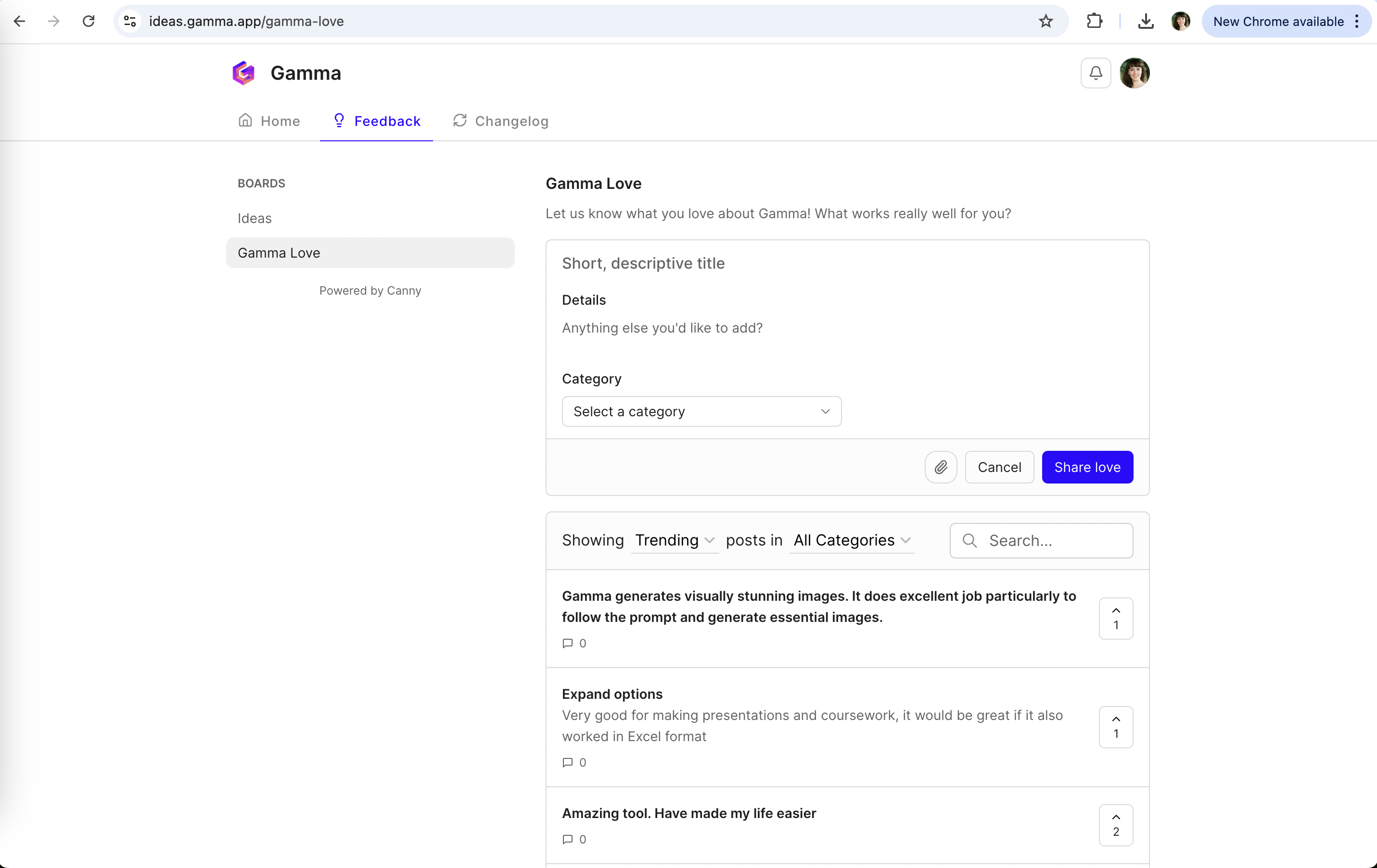
Notion: Same face, one new detail Notion (working) Same face, one new detail The apple on the avatar signals an update without a banner or modal. Notion: New abilities as prompts Notion (working) New abilities as prompts "Personalize", "Analyze for insights" and "Create a task tracker" carry New tags and are one click to try. Notion: Badge on the entry point Notion (working) Badge on the entry point The apple sits where users already click, unlike a red notification dot. Gamma: Share feedback next to support Gamma (working) Share feedback next to support Feedback sits with Help center and Contact support, where users already look when they have something to say. Snowflake: In the main nav Snowflake (working) In the main nav "Partner Connect" lives under Data Products, not in a marketing site. Snowflake: Grouped by job Snowflake (working) Grouped by job Tabs like "Business Intelligence" and "Data Integration" let users browse by what they need. Databricks: Search first Databricks (working) Search first "Search data sources" sits above the tiles for people who already know what they need. Linear: Pricing lives in settings Linear (working) Pricing lives in settings "Billing" sits under Administration, where admins already look when they want to change plans. Julius: Search first Julius (working) Search first A large search box fits people who arrive with a specific chart in mind. Julius: Categories with counts Julius (working) Categories with counts "Data Visualization 32 workflows" shows where the depth is. Julius: Keyword URL Julius (working) Keyword URL /category/bar-chart-maker matches what people type into Google. Count: Learn in the main nav Count (working) Learn in the main nav Learn sits right under Home, not hidden in a help menu. Peaka: Categories with counts Peaka (working) Categories with counts "All Integrations 313" and per-category counts help browse a long list. Loom: "New in" framing Loom (working) "New in" framing An eyebrow plus an outcome headline: "Build and ship faster". ElevenLabs: A plan hidden behind an arrow ElevenLabs (not working) A plan hidden behind an arrow A 4th plan sits off-screen behind a carousel arrow. Notion: Meaning isn't obvious Notion (not working) Meaning isn't obvious Without context, an apple on the face could be decoration rather than "new version". Gamma: Requests leak in Gamma (not working) Requests leak in "Expand options" asks for Excel export, so the love board still collects feature requests. Gamma: Behind a "?" Gamma (not working) Behind a "?" Feedback is one of seven items in a help menu, so happy users who aren't stuck may never open it. AgencyAnalytics: Paywall is easy to miss AgencyAnalytics (not working) Paywall is easy to miss Plans sit under Billing > Subscription; the trial banner is the main way in.