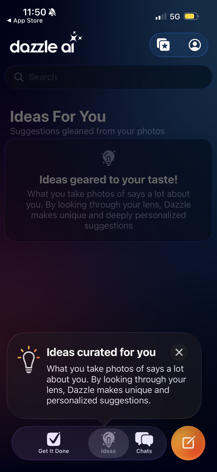
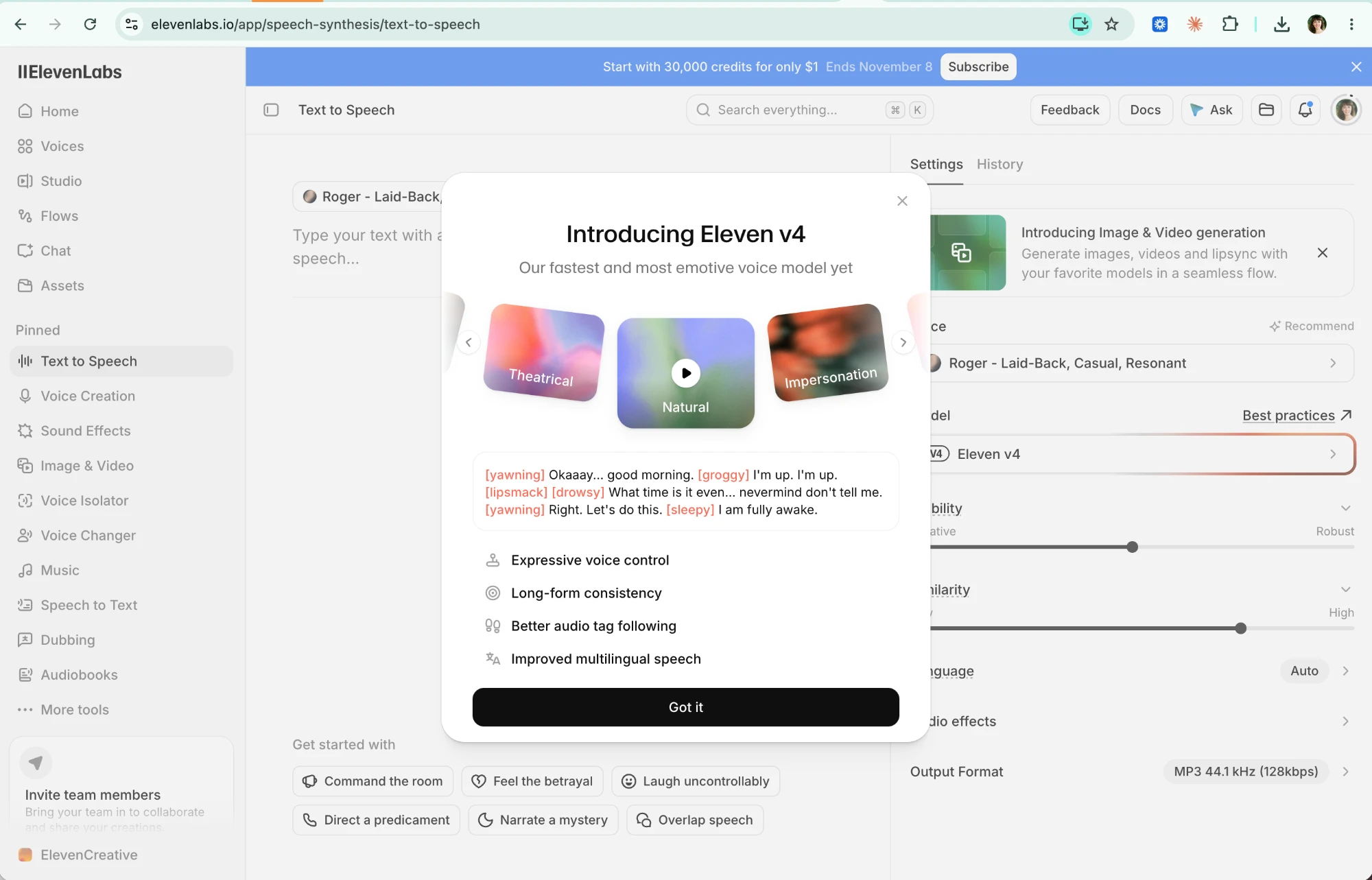
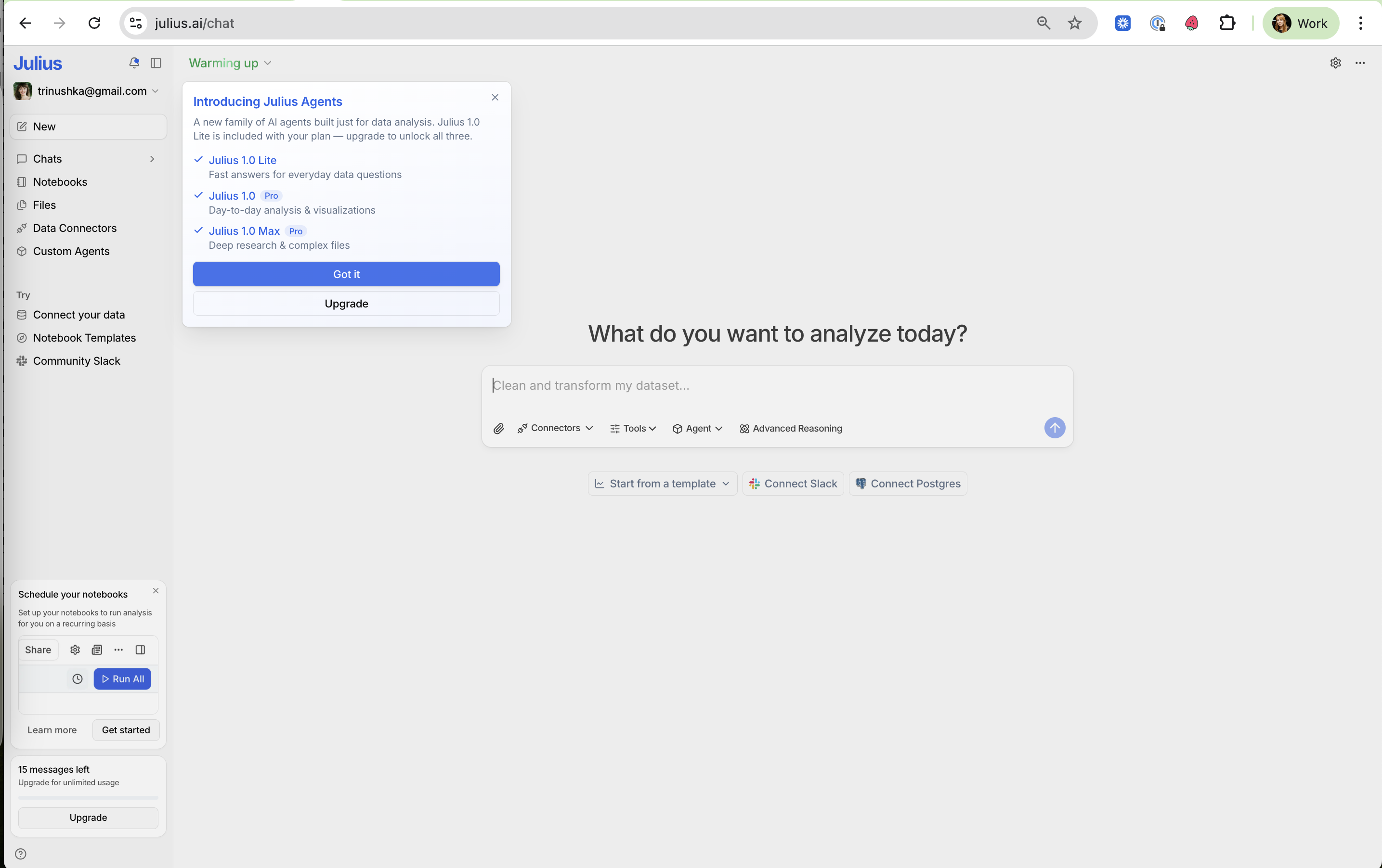
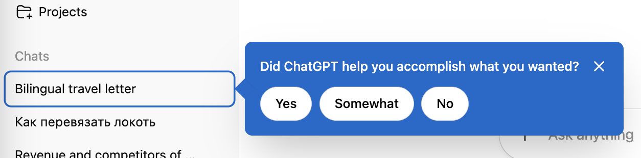
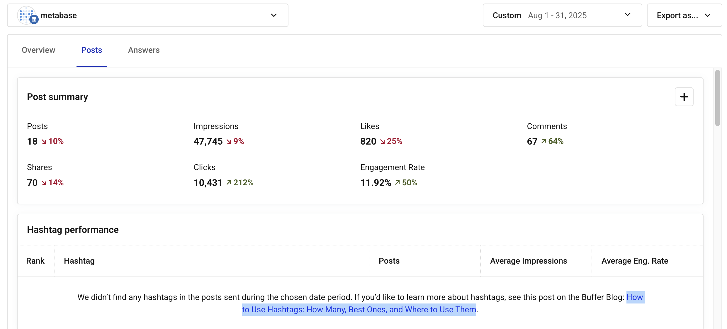
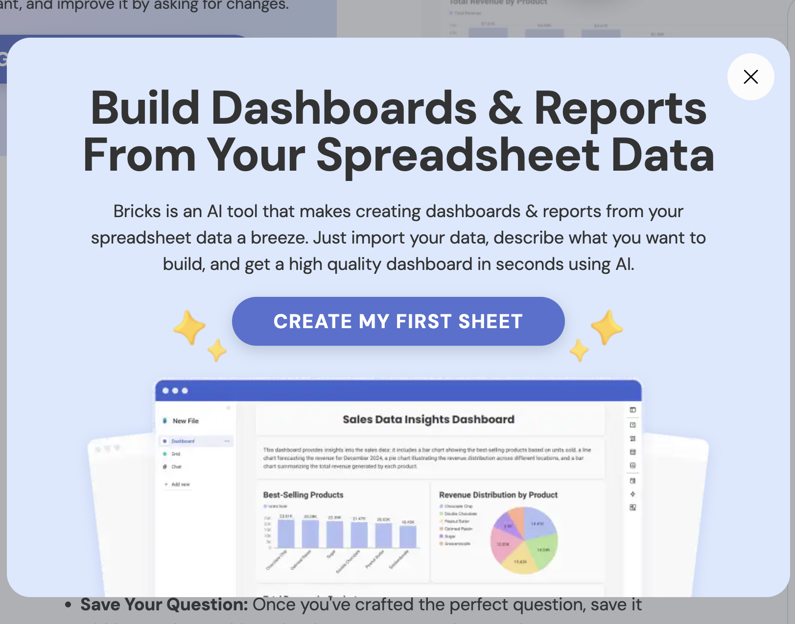
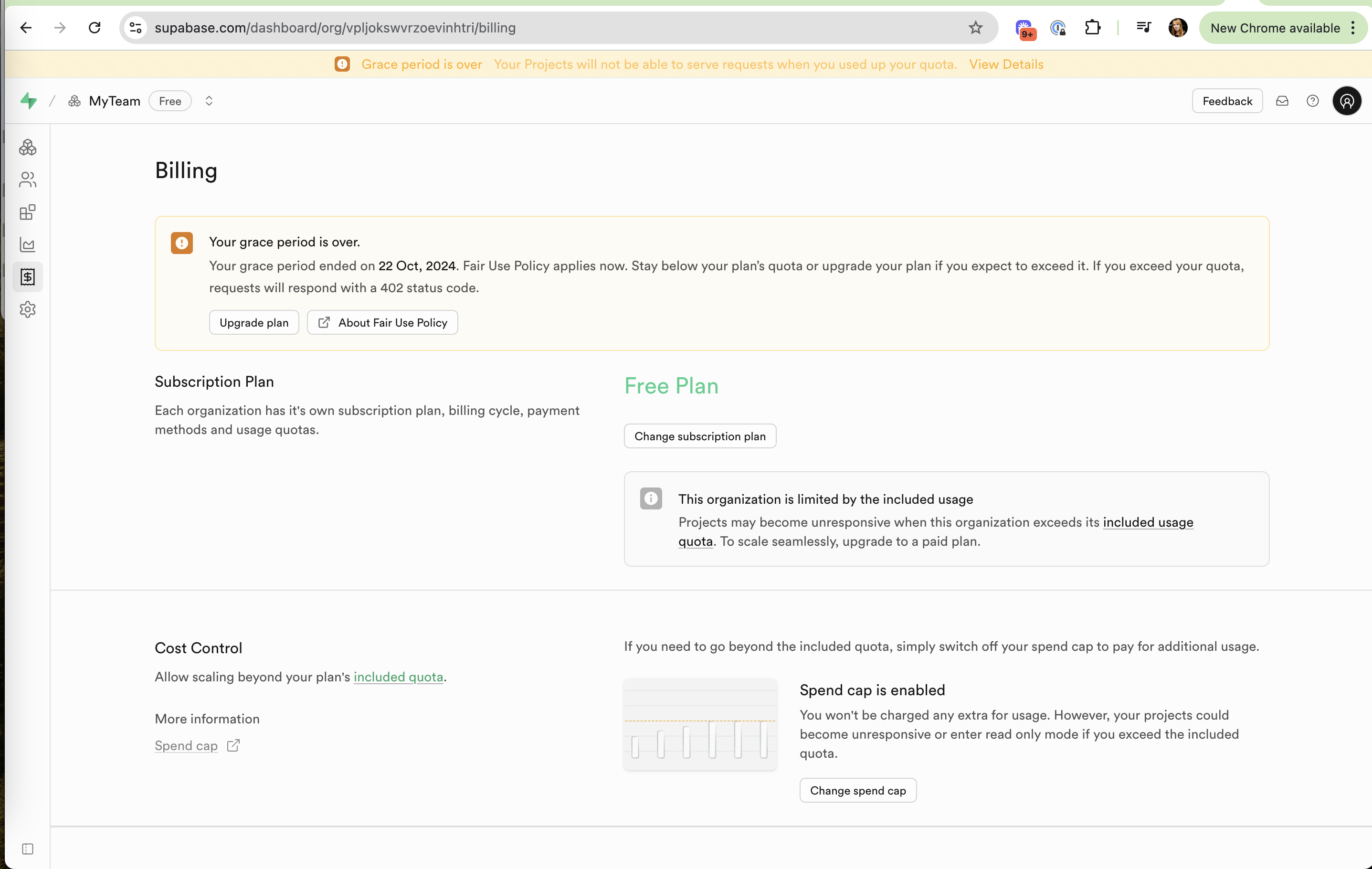
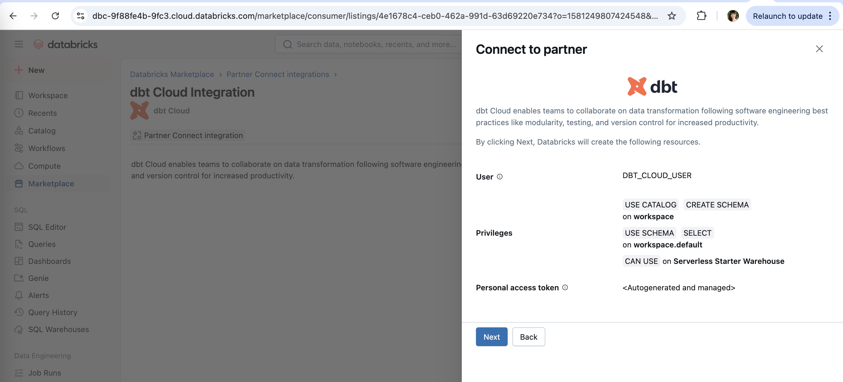
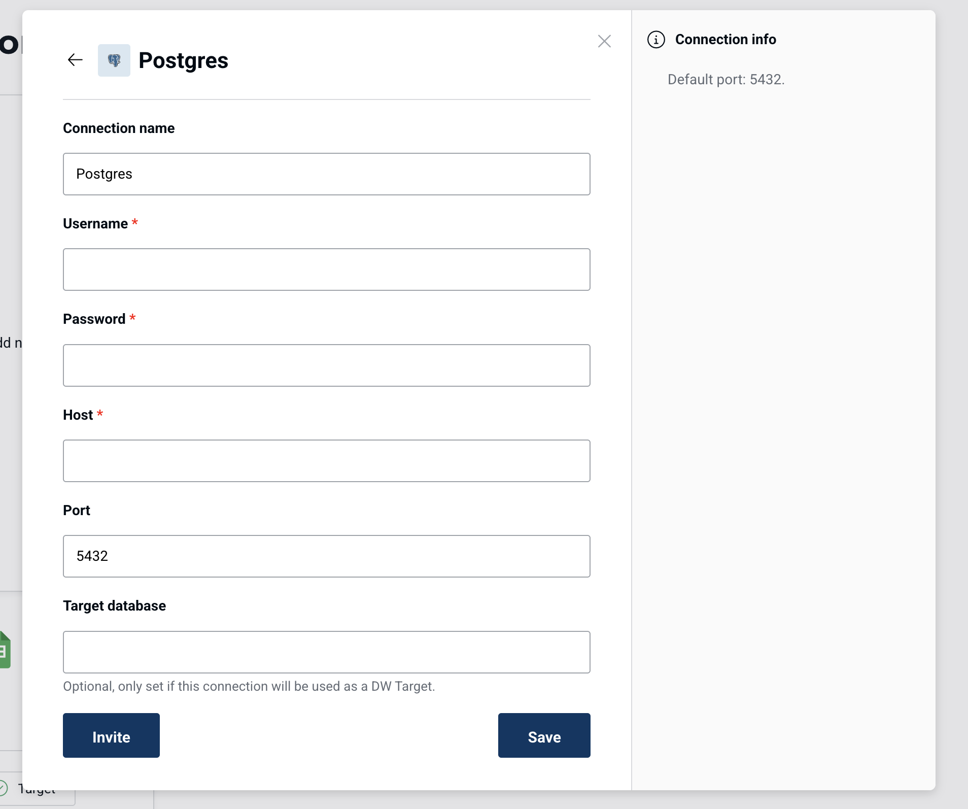
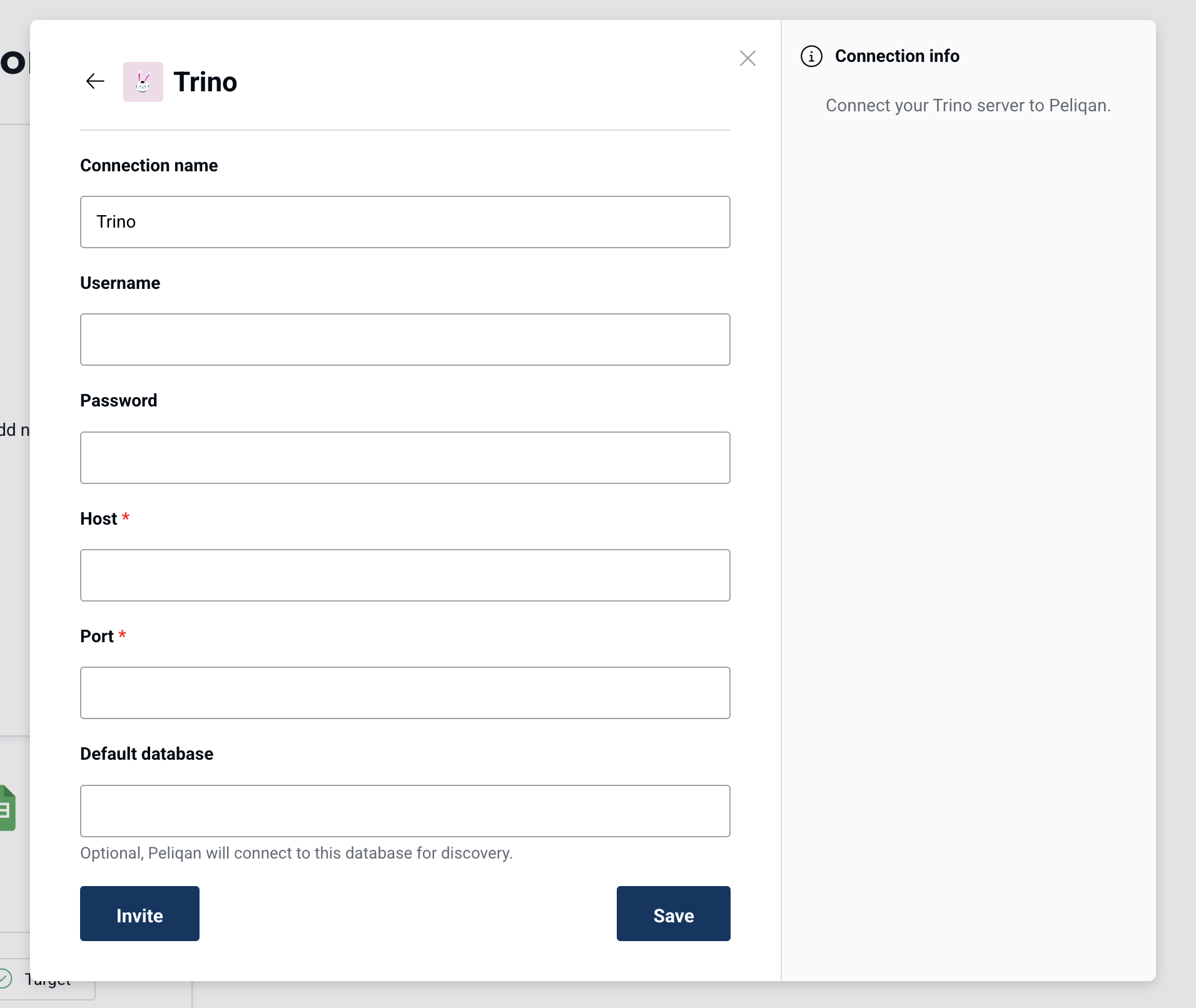
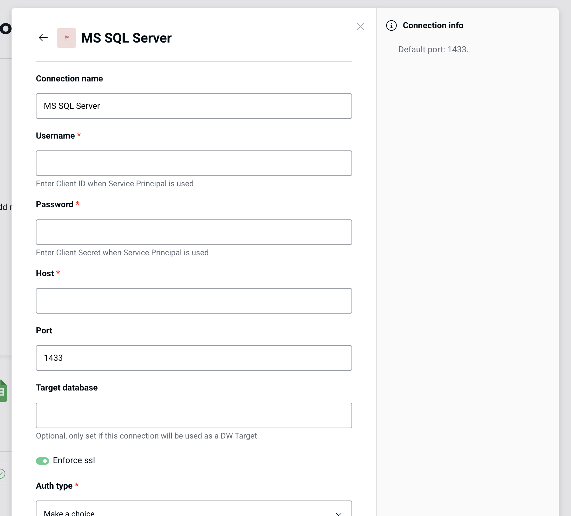
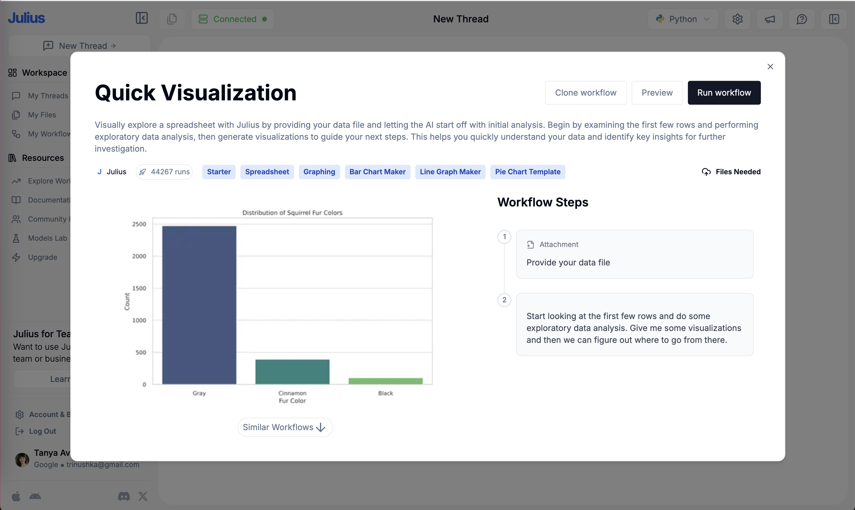
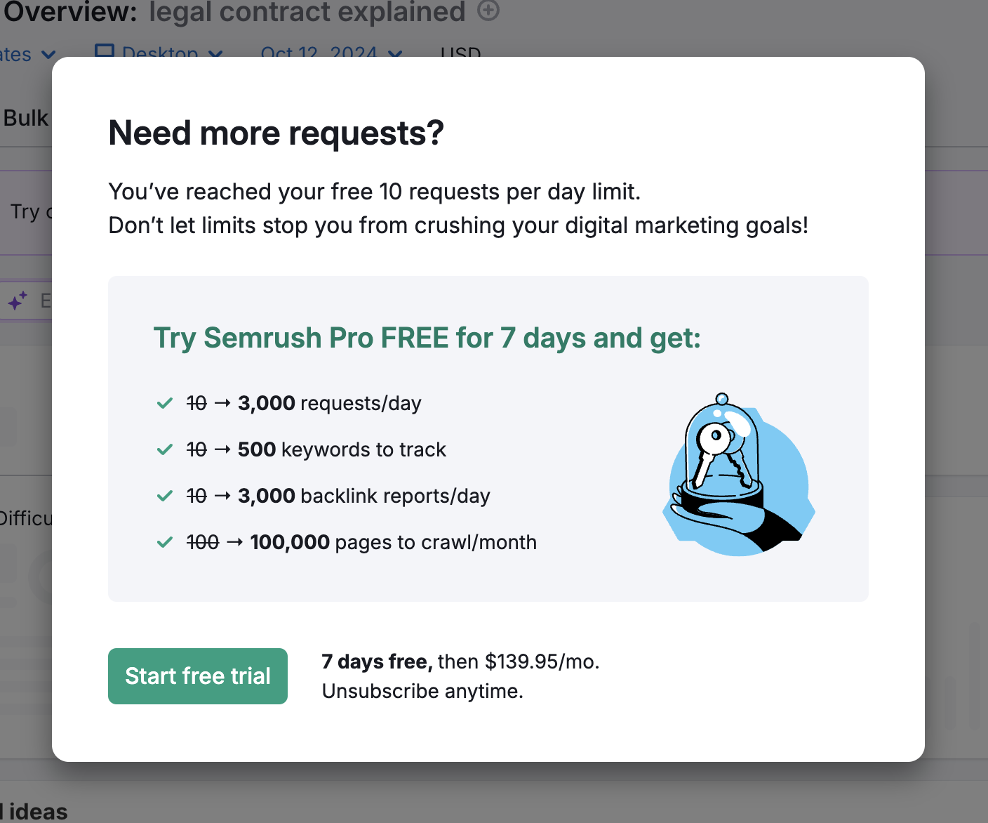
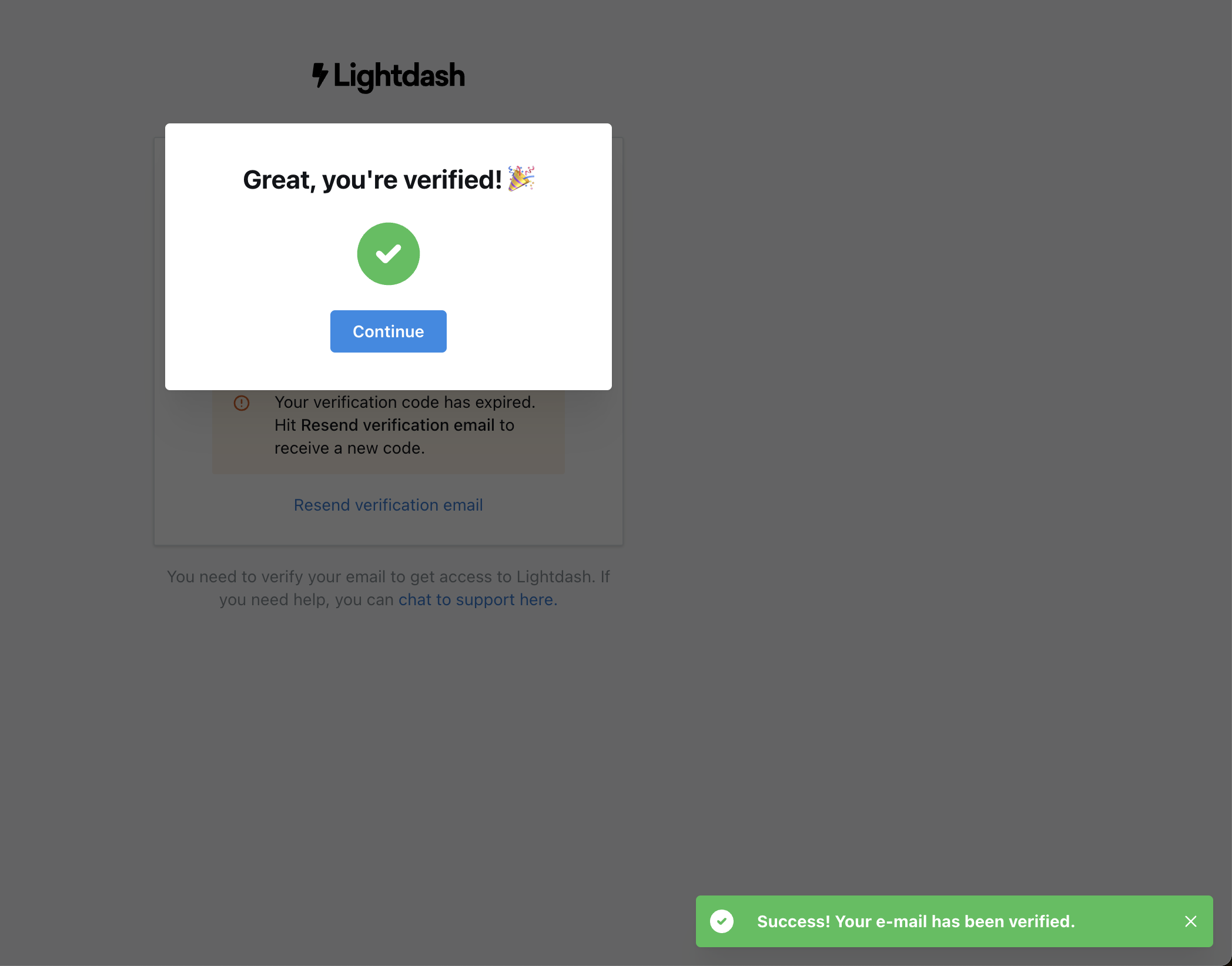
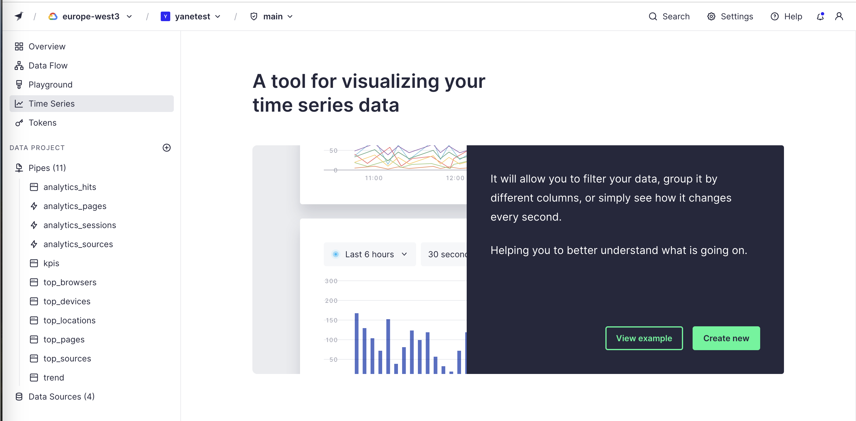
Signal is what helps the user right now; noise is everything else on the screen: duplicate copy, empty columns, decorative extras, a third announcement on the same first visit. On this site the term also covers interruptions (a modal over the input the user is about to use) and alert fatigue (so many nudges that people stop reading any of them).
Nielsen's eighth usability heuristic, aesthetic and minimalist design, states that every extra unit of information competes with the relevant units and reduces their visibility. Research on interruptions shows the cost: Mark, Gudith and Klocke found that people who were interrupted finished tasks just as well and even faster, but reported more stress, frustration, time pressure and effort.
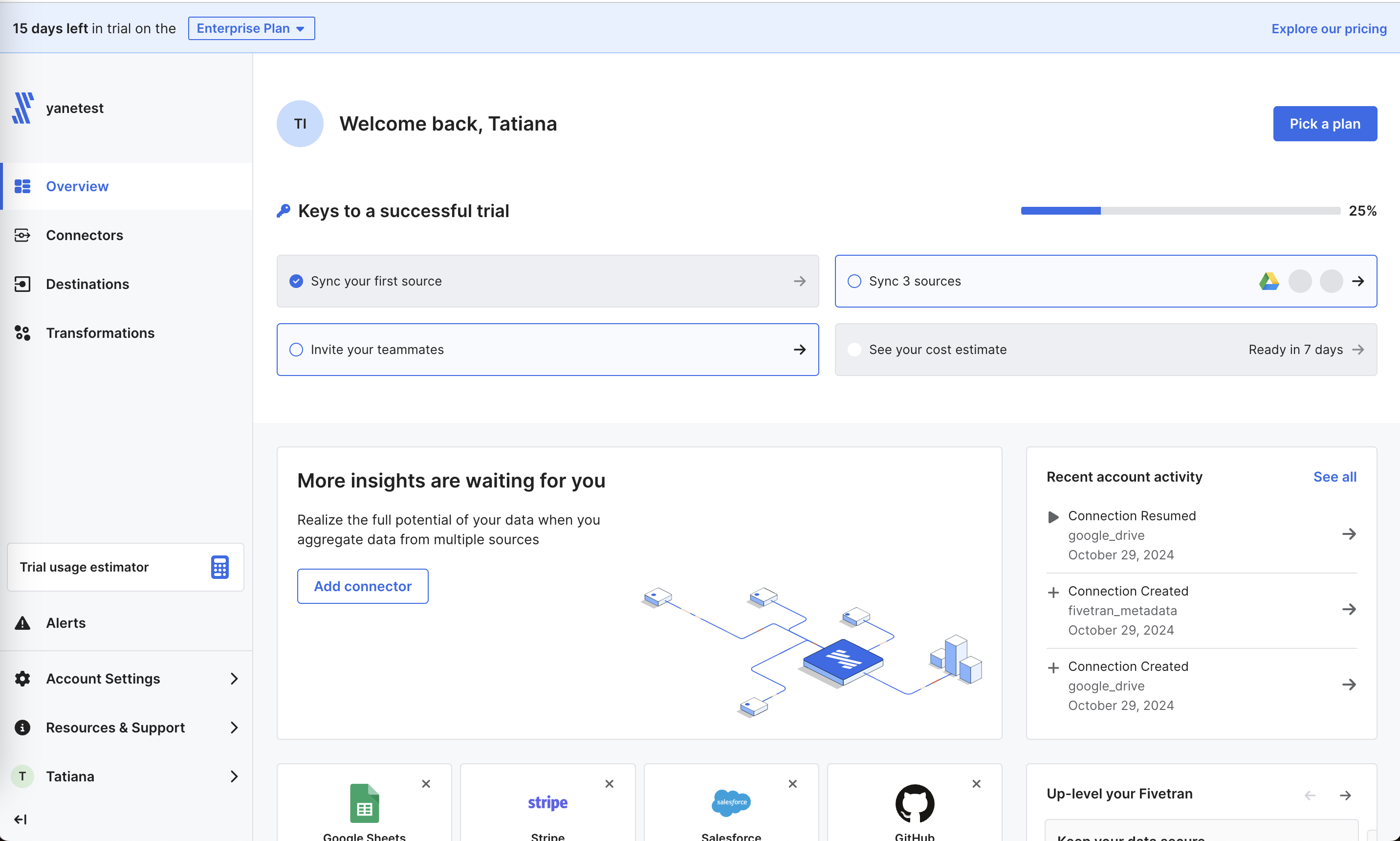
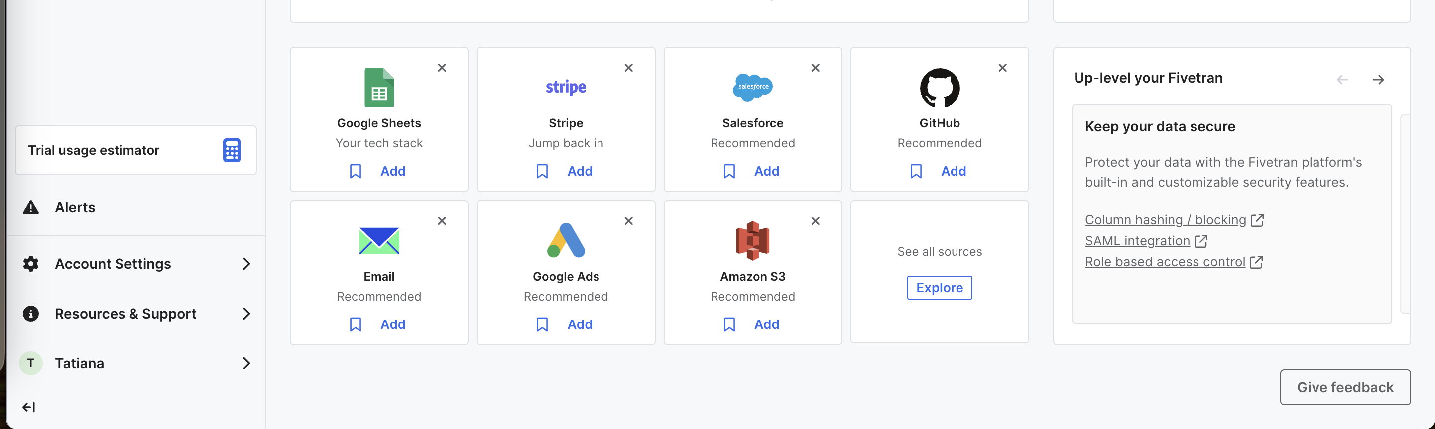
First sessions are where products pile on the most: a welcome modal, a banner, a checklist, a tooltip and an upgrade card at once. Each one lowers the chance the others are read. Upsells suffer most, because a promo that competes with three other prompts reads as one more thing to dismiss.
How to use it
- Allow one announcement per screen on first load; queue the rest for later sessions or moments of need.
- Never cover the main input or the content the user came to read with a modal; use an inline or side placement instead.
- Remove duplicated copy, empty table columns and placeholder sections until they have something to show.
Watch out
- Minimalism that removes needed information, such as hiding prices or limits to make a screen look clean.
- Alert fatigue: if every update is marked urgent, users learn to dismiss everything, including the one that matters.