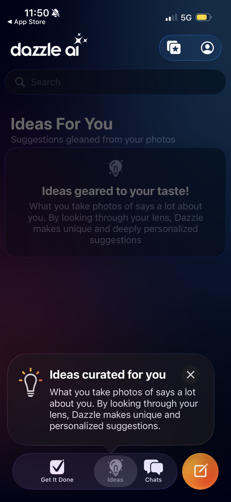
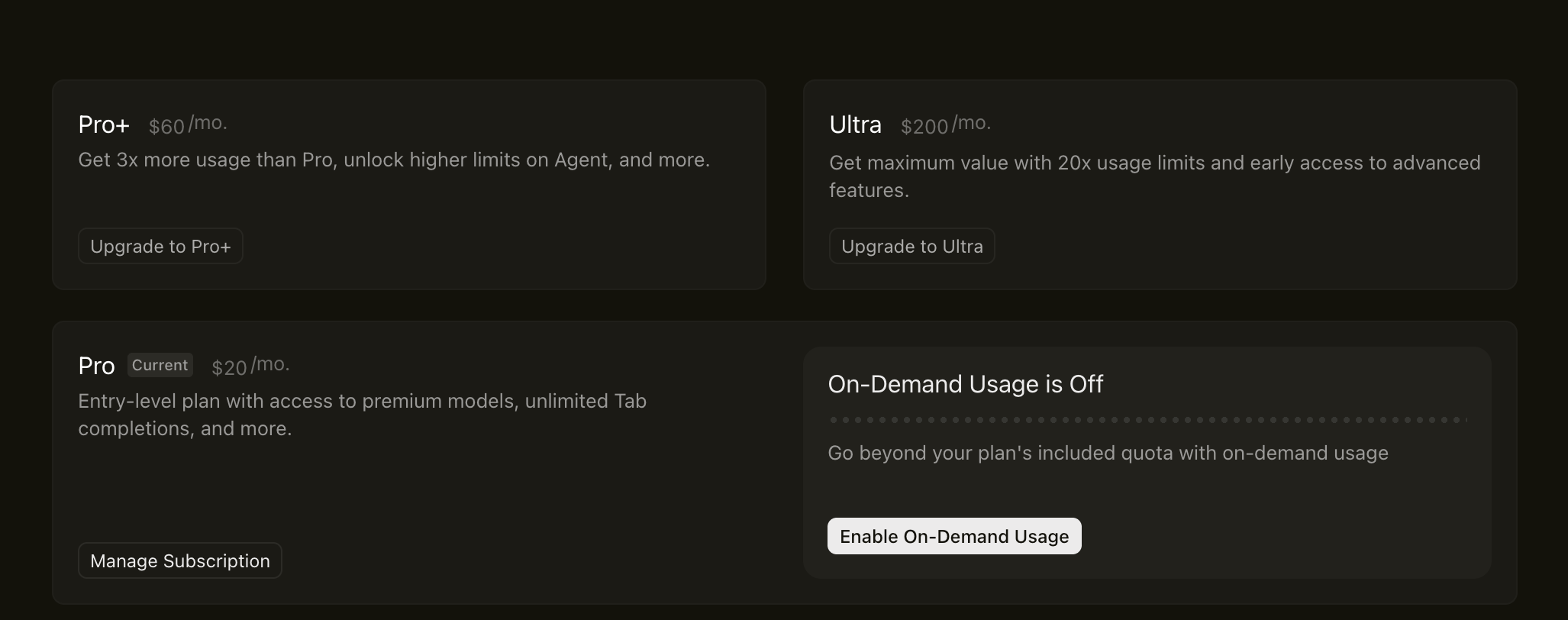
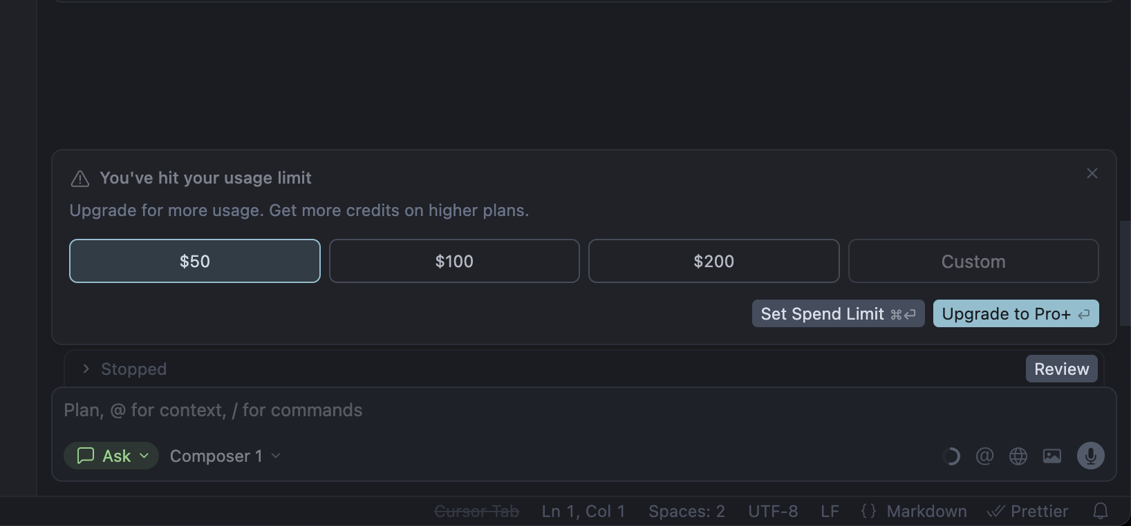
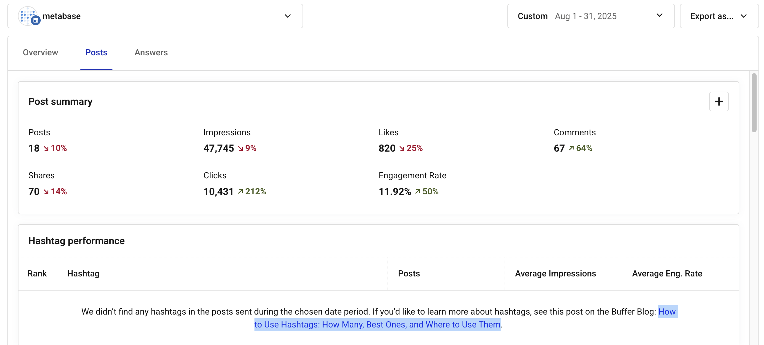
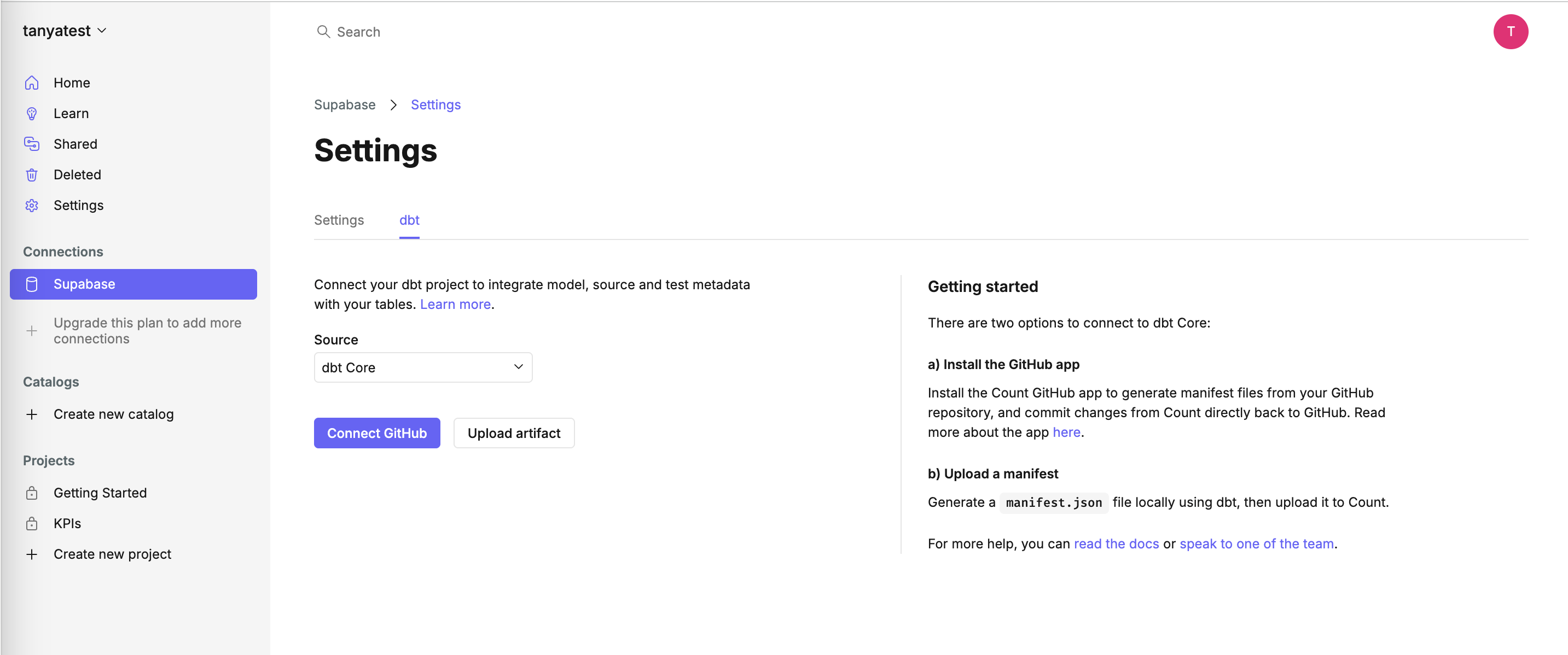
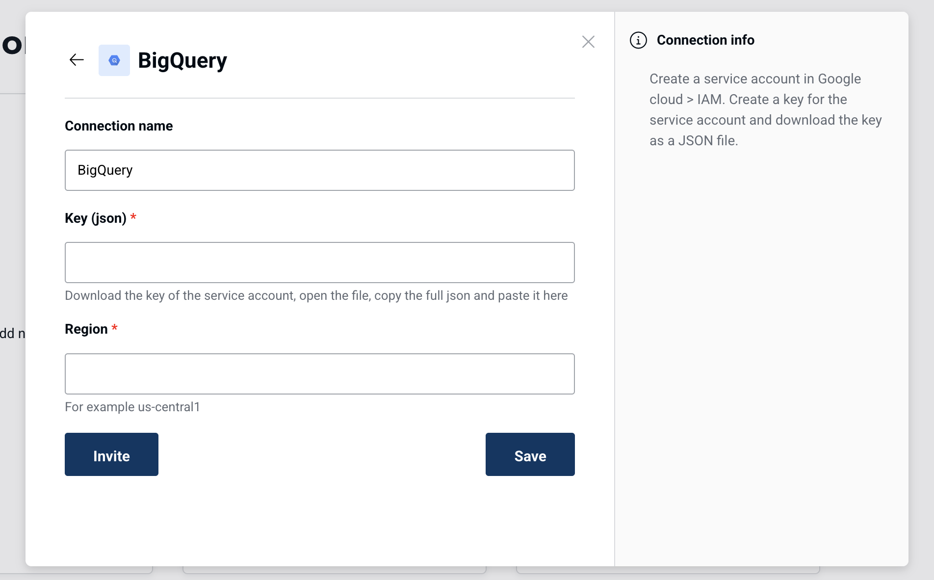
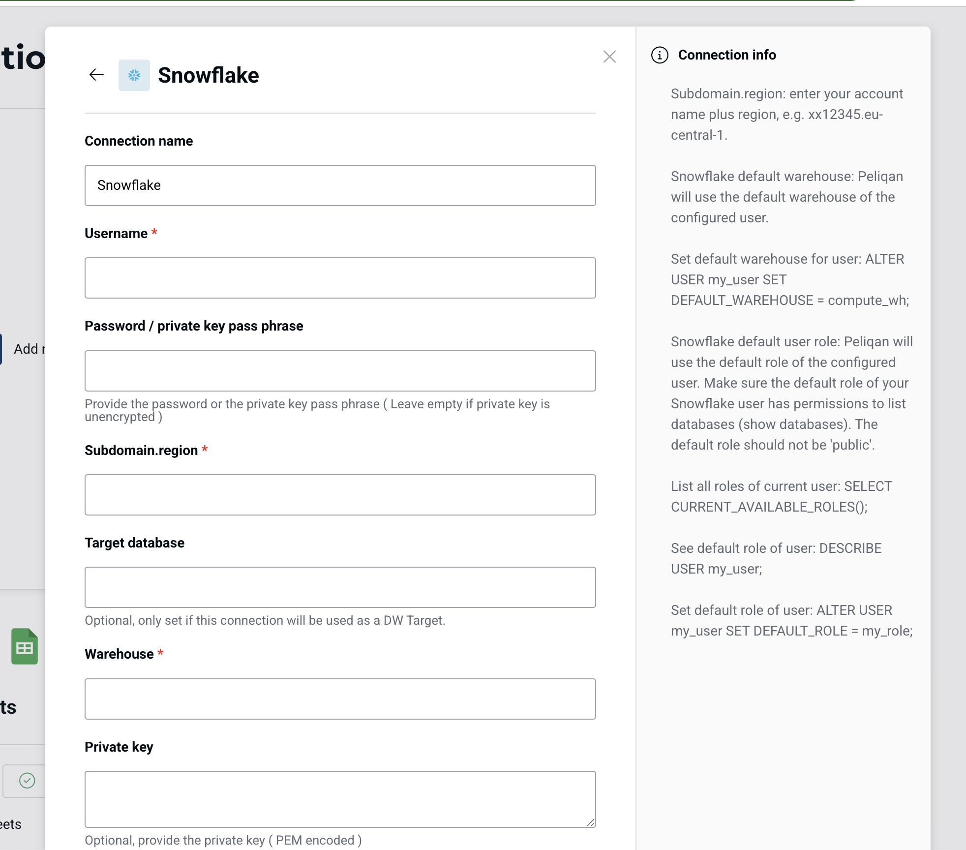
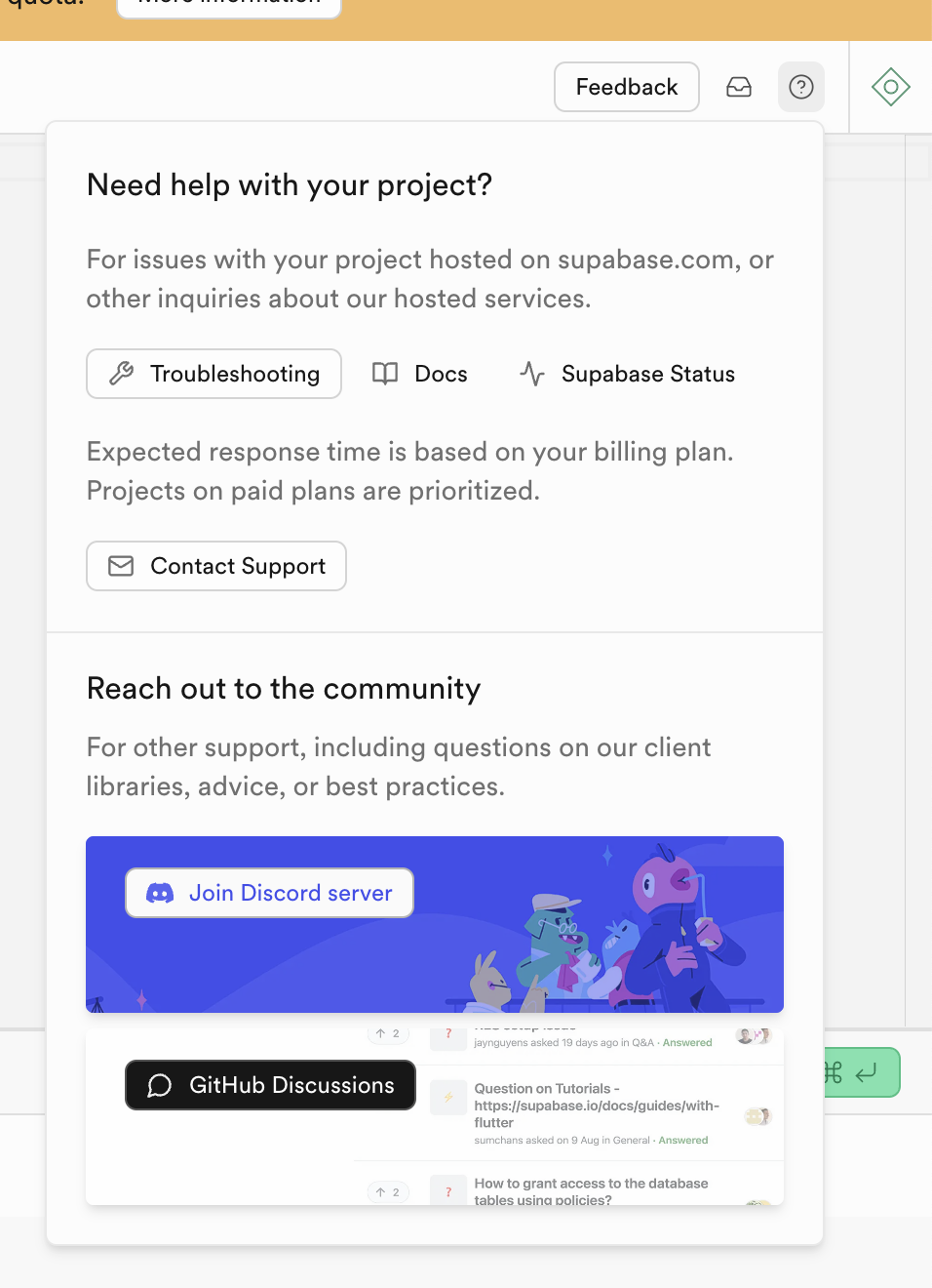
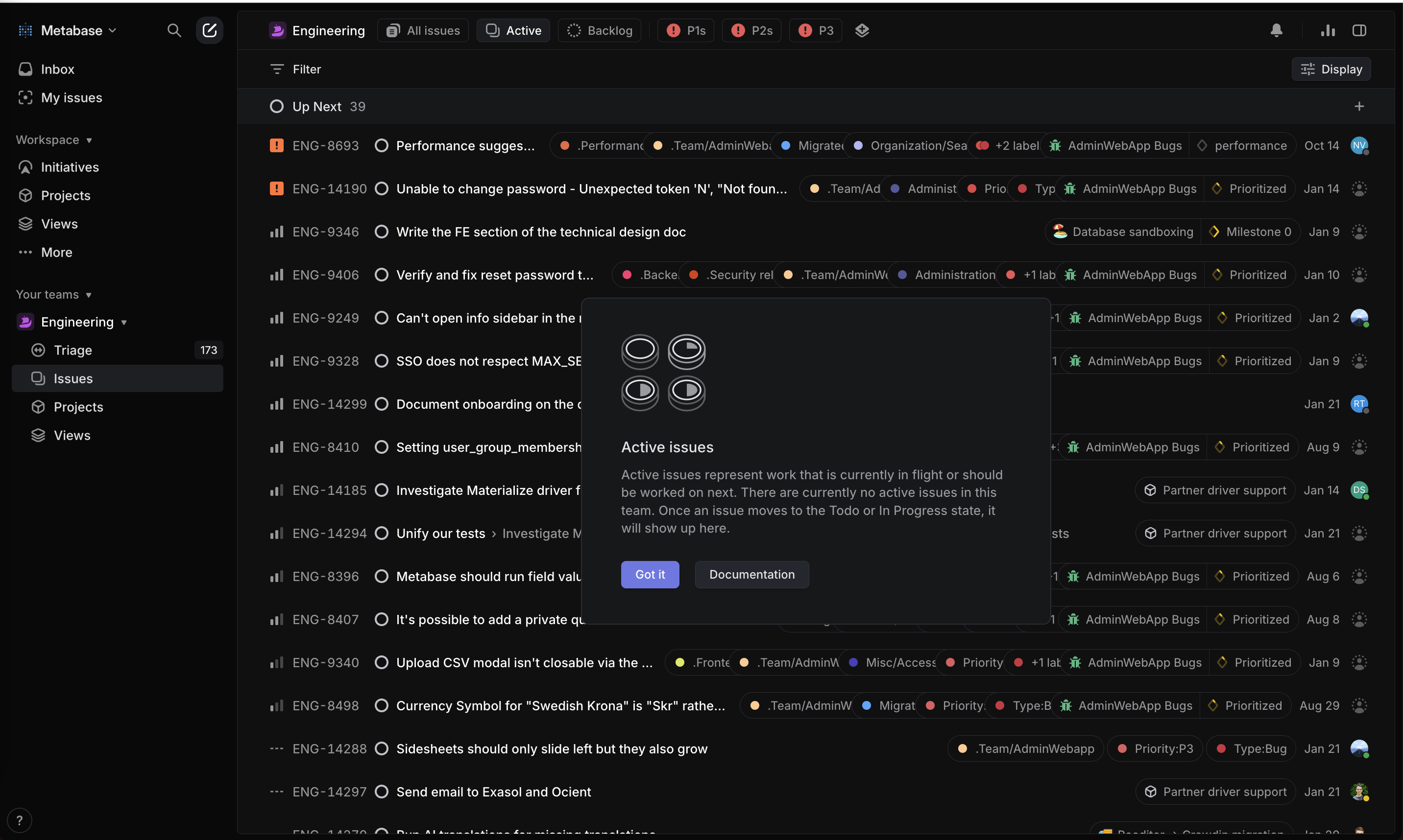
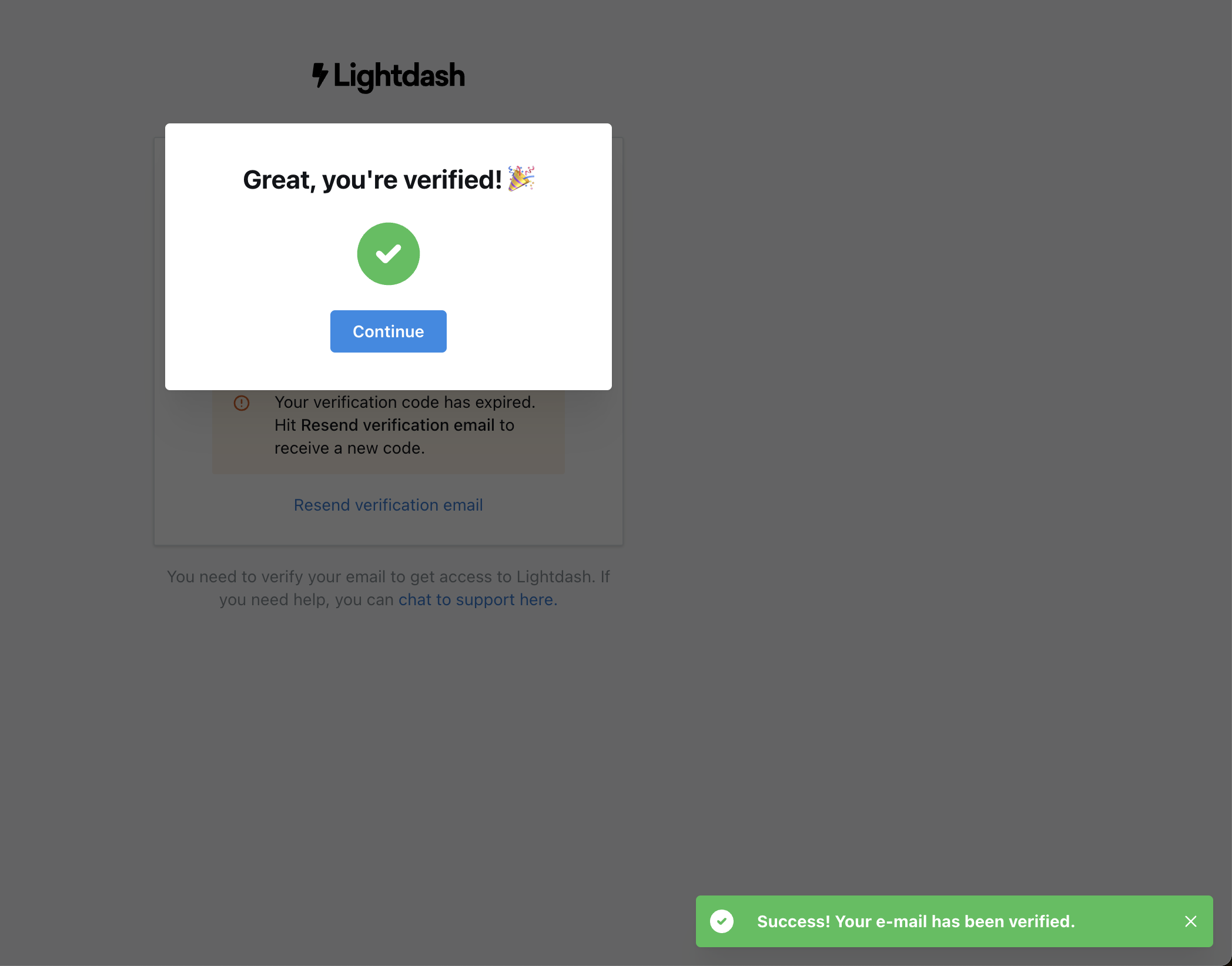
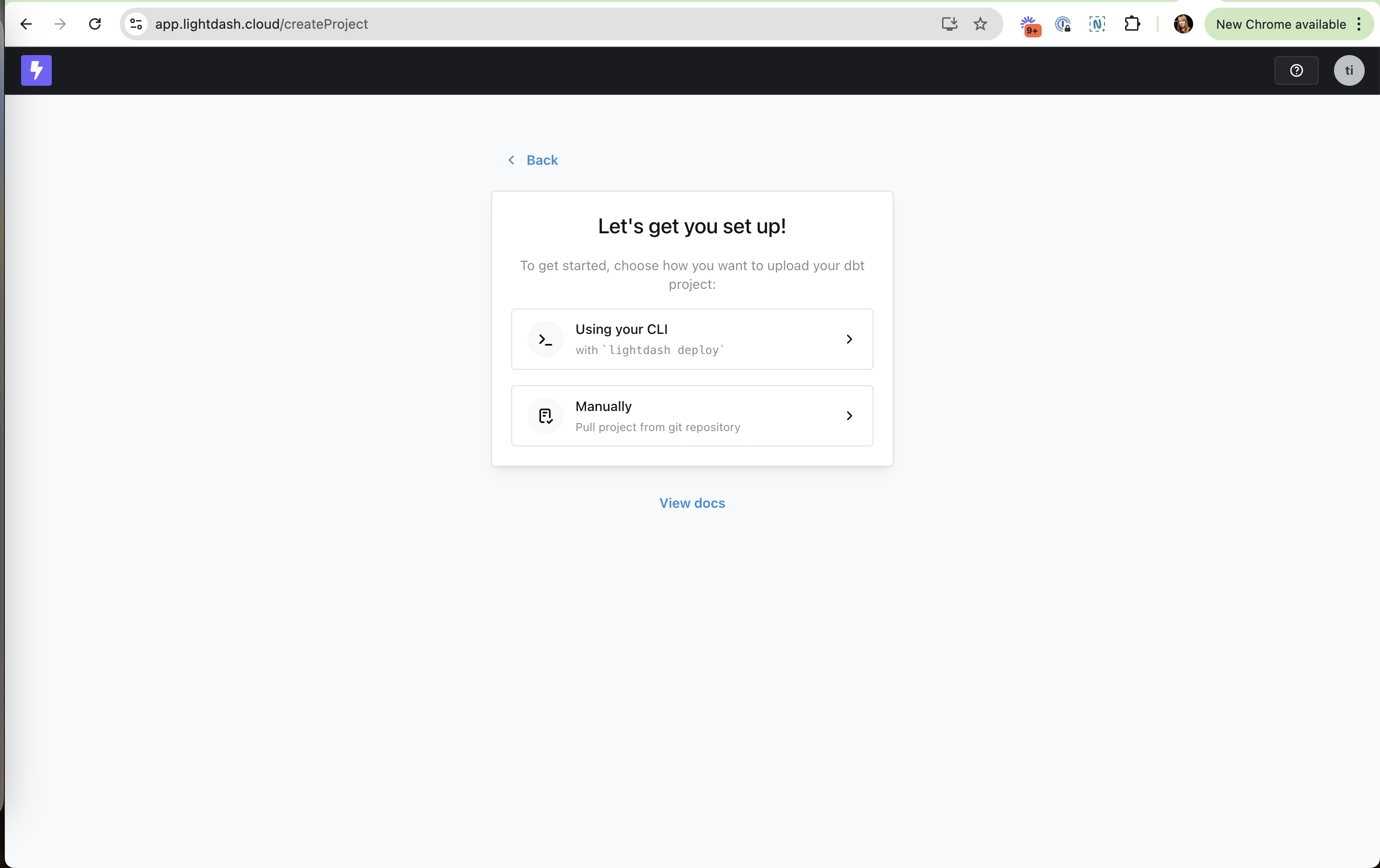
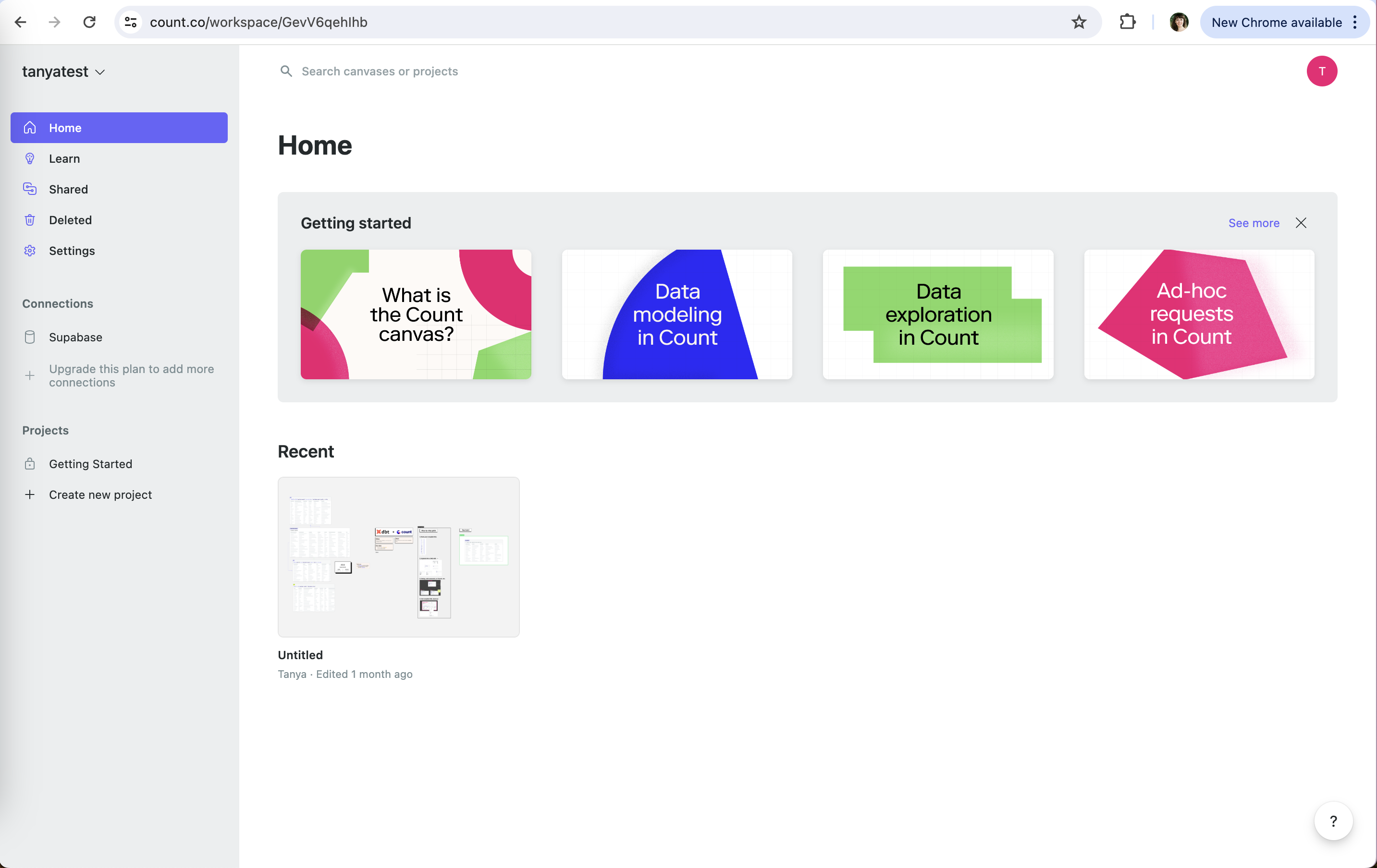
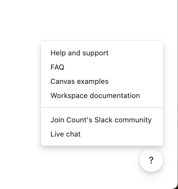
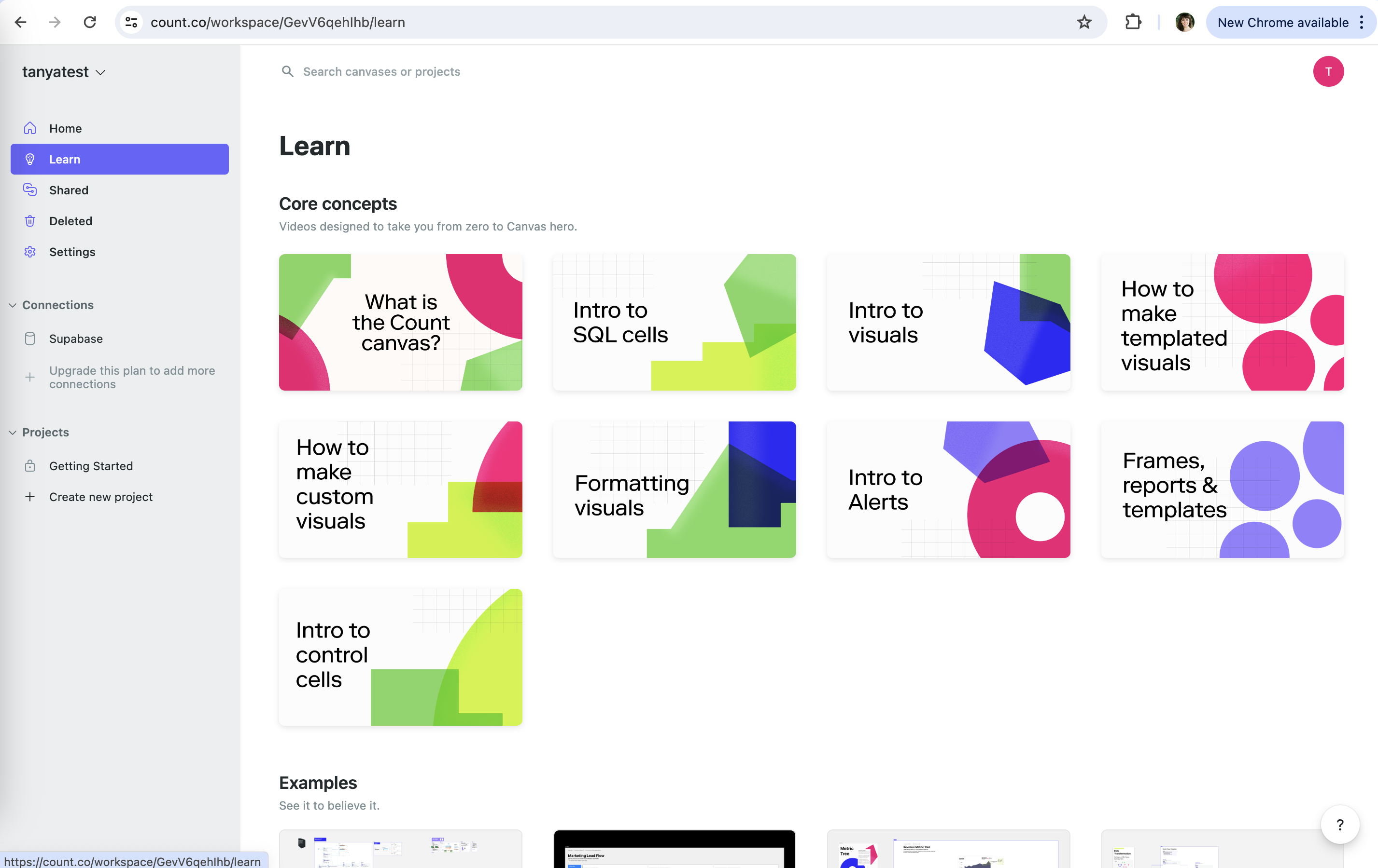
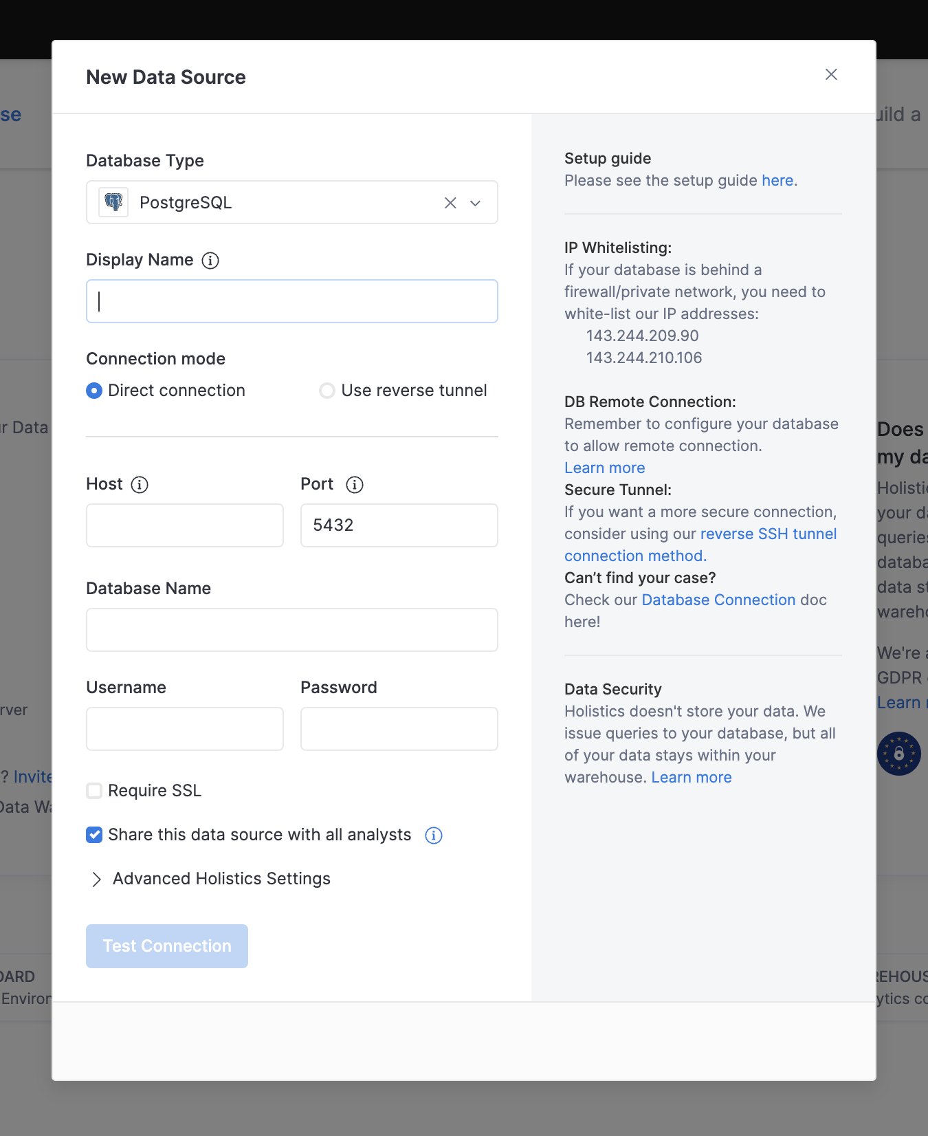
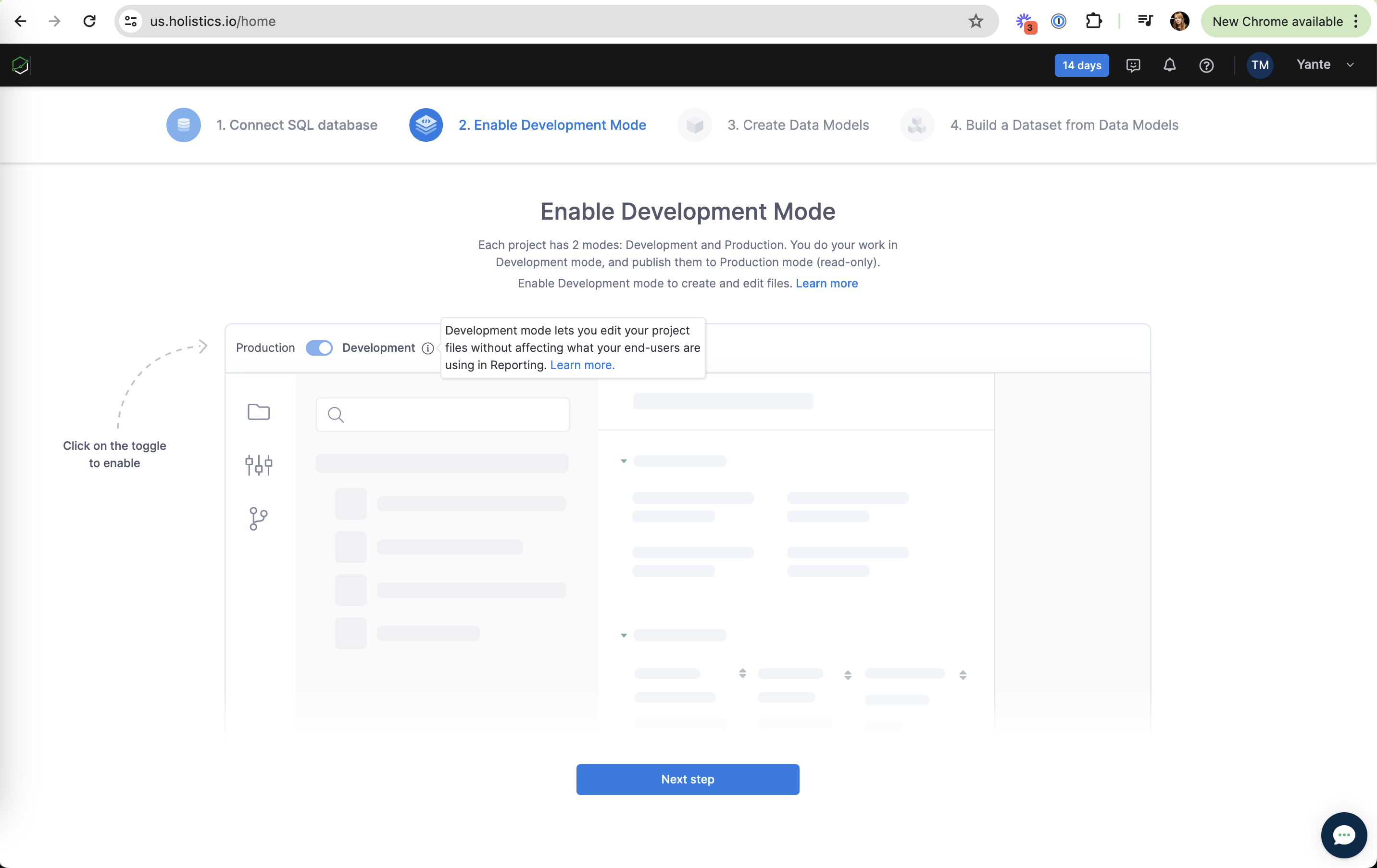
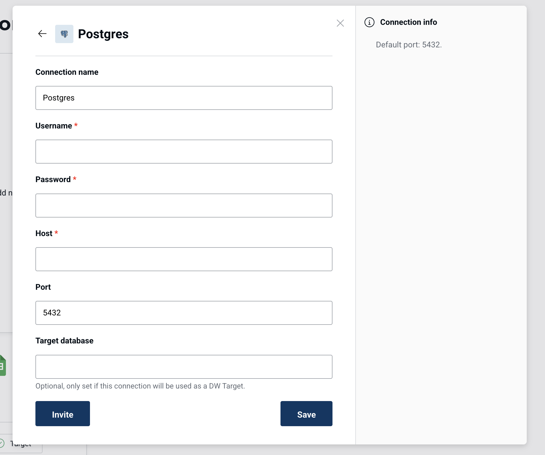
Contextual help puts the explanation next to the thing it explains, at the moment the user reaches it: a coach mark on the actual tab, a helper line under a confusing field, a limit message inside the chat where work just stopped. On this site the label also covers support paths, learning resources linked from empty states, and orientation cues like a "Current plan" tag.
John Carroll and Mary Beth Rosson (1987) described the "paradox of the active user": people skip manuals and start working, even though learning first would save time. Nielsen's heuristic 10 says the best system needs no explanation, and when help is needed it should be tied to the user's task. NN/g's Page Laubheimer distinguishes "push" help (tutorials shown regardless of what you are doing, often skipped and forgotten) from "pull" help triggered by what the user is doing, which works better but requires the product to infer intent.
Onboarding carousels are push help. They delay value and are forgotten by the time the user needs them. Contextual help moves the same content to the step where it matters, which also cuts support tickets.
How to use it
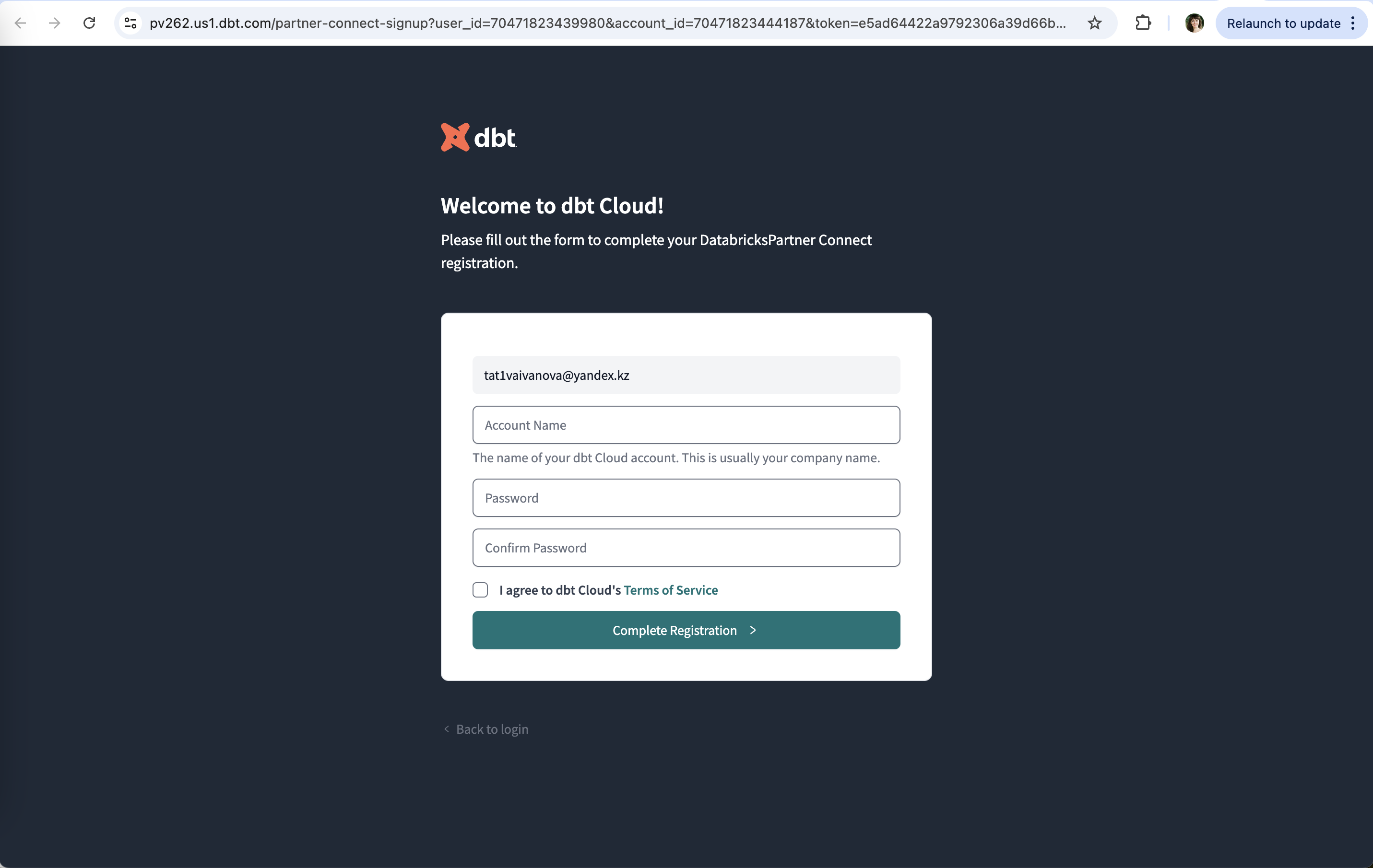
- Put a one-line helper under any field users are likely to hesitate on ("This is usually your company name").
- Run tours as coach marks in the real UI, one at a time, each tied to an action the user can take right there.
- When a limit or error stops the user, explain it where it happened and offer the next step (upgrade, docs link, contact) in the same place.
Watch out
- Tips that pop up without a trigger, or that can't be dismissed, become interruptions.
- Explaining obvious controls adds noise; save help for genuinely unfamiliar or high-stakes steps.