Onboarding checklist and a ticking trial offer
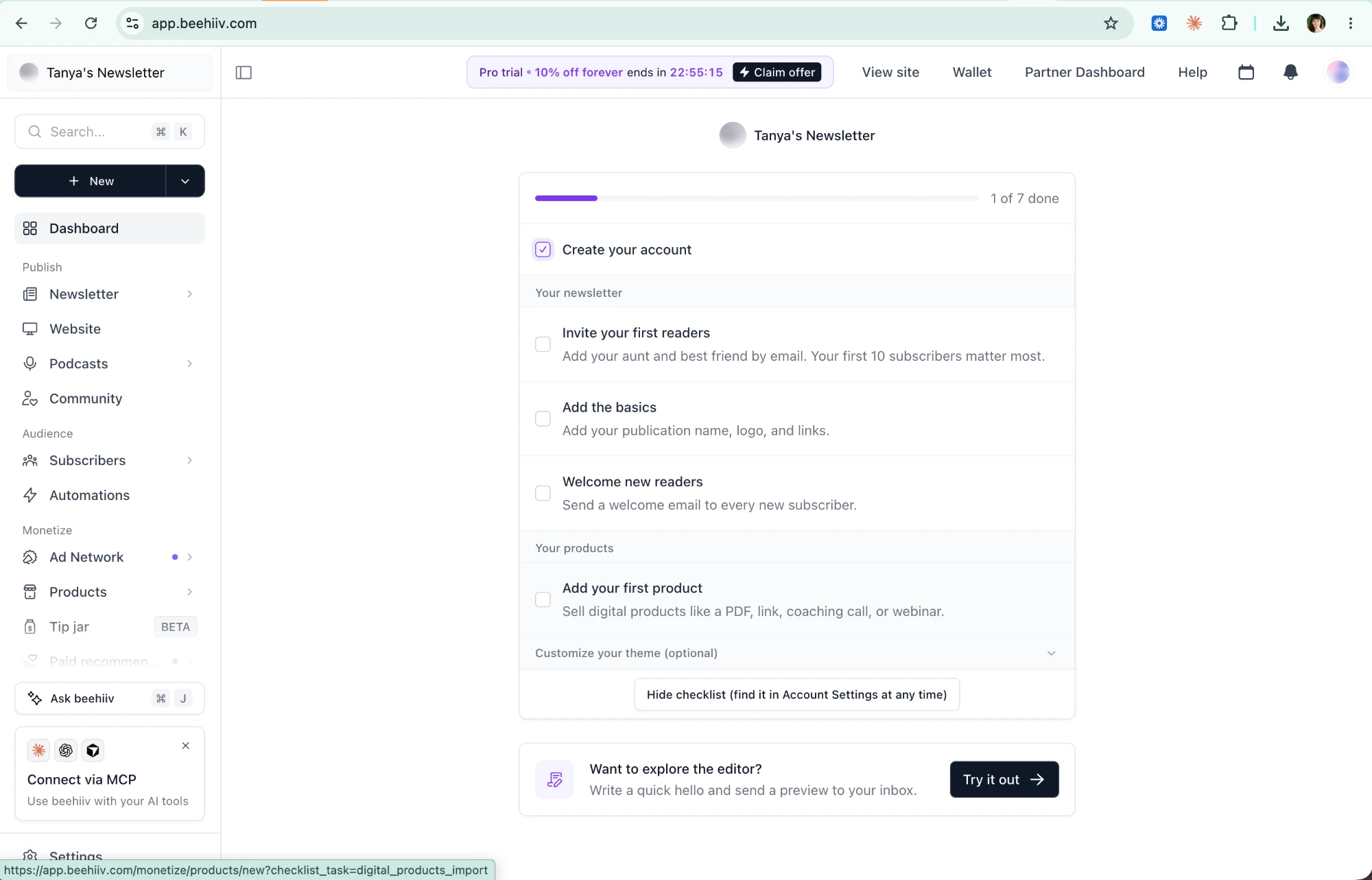
The upsell stays out of the way in a header pill with a live countdown, while the page focuses on getting your newsletter set up.
Dashboard checklist
Setup comes first and the offer stays peripheral, but the countdown makes sure you notice it.
- 1
-
2
1 of 7 already done (working)
Account creation counts as a step, so you start with progress.
-
3
Human copy (working)
"Add your aunt and best friend… your first 10 subscribers matter most."
- 4
- 5
-
6
Sidebar overload on day one (not working)
Ad Network, Products, Tip jar and Paid recommendations, before you have a single reader.
Claim offer → Compare plans
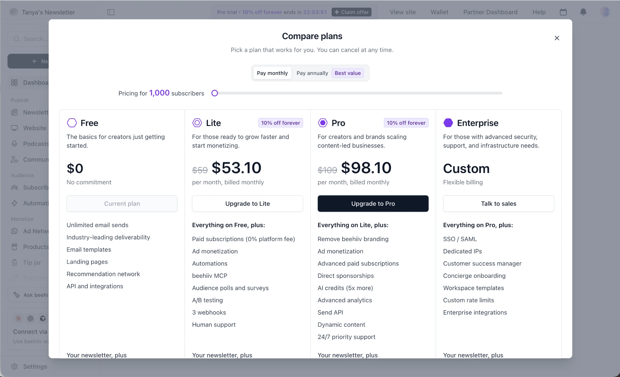
The plans modal scales prices to your audience and points you at Pro.
-
7
Price by subscriber count (working)
A slider ties price to your audience size, the value metric that matters.
-
8
Only Pro gets the dark CTA (working)
One button stands out, so the target plan is unmistakable.
-
9
"Everything on Lite, plus:" (working)
Each tier lists only what's new, so comparing is easy.
- 10
-
11
10% feels small (not working)
$59 → $53.10 is a weak anchor; the odd cents read as computed, not generous.
-
12
Pro has no reason label (not working)
Pro is emphasized but never says why, unlike "Most Popular" or "Recommended".
-
13
The list runs below the fold (not working)
Four columns of features continue past the modal's edge.
Takeaways from beehiiv
- Keep the upsell peripheral but alive: a countdown pill outperforms a blocking modal during setup.
- Start the checklist with a step already done.
- Price on the value metric (subscribers), and label the plan you want people to pick.