Social proof first, lifetime decoy at the paywall
Sober Tracker opens on ratings and recovery stories, then uses a lifetime plan to make a trial on the yearly plan feel like the obvious pick.
Welcome to Sober Tracker
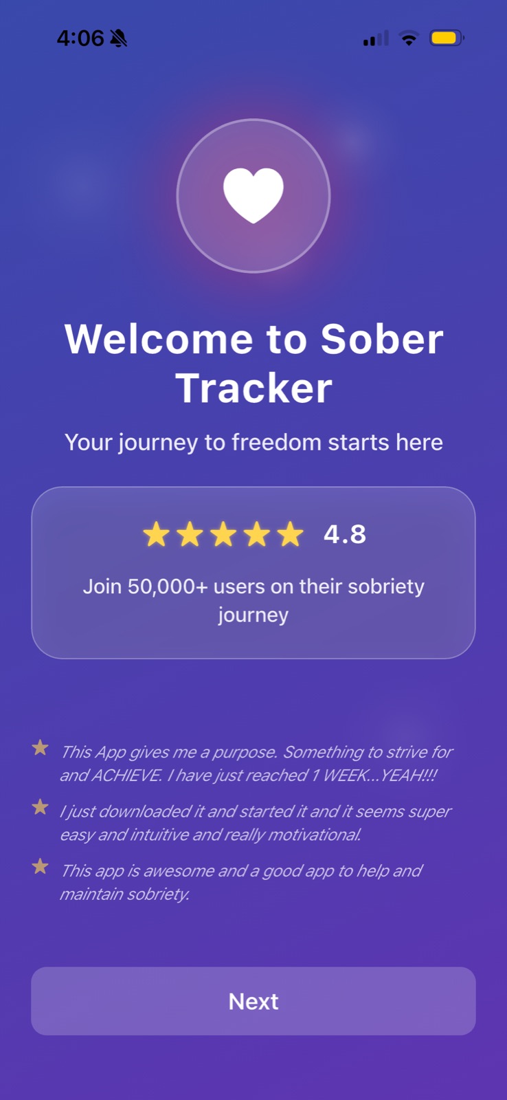
The welcome screen is almost all proof: a 4.8 rating, a user count and three short testimonials.
-
1
Identity framing (working)
"Your journey to freedom starts here" frames sobriety as a gain, not a restriction.
-
2
Rating plus crowd size (working)
4.8 stars and "Join 50,000+ users" tell a hesitant user they are not alone.
-
3
Stories of progress (working)
"I have just reached 1 WEEK" shows the outcome a new user hopes for.
-
4
Washed-out Next button (not working)
The CTA is a muted purple on purple, the weakest element on the screen.
Built for the Hard Days
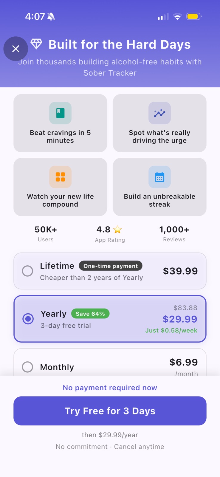
The paywall pairs outcome-led feature tiles with three plans, Yearly preselected with a 3-day free trial.
-
5
Close button on the headline (not working)
The X sits on top of "Built" and the subtitle, which looks like a layout bug.
-
6
Outcomes, not features (working)
"Beat cravings in 5 minutes" and "Build an unbreakable streak" speak to the user's struggle.
-
7
Lifetime as a decoy (working)
$39.99 "Cheaper than 2 years of Yearly" makes $29.99/year look small.
-
8
Yearly preselected (working)
Struck-through $83.88, "Save 64%" and "Just $0.58/week" stack three price frames.
-
9
Monthly cut off (not working)
The sticky footer hides most of the Monthly row, so its terms are hard to read.
-
10
Risk spelled out (working)
"No payment required now" above the button and "then $29.99/year" below it.
Takeaways from Sober Tracker
- For a sensitive habit, lead onboarding with peers' progress before asking for anything.
- A lifetime plan priced just above yearly works as an anchor; label the comparison so users do the math in your favor.
- Check sticky footers and close buttons on small screens: overlap reads as broken.